【前端基础】19、CSS的flex布局
一、FlexBox概念
FlexBox翻译为弹性盒子。- 弹性盒子是一种用于按行或按列布局元素的一维布局方式。
- 元素可以膨胀以填充额外的空间,收缩以适应更小的空间。
- 我们使用
FlexBox来进行布局的方案称为flex布局。
二、flex布局的重要概念
- 两个重要的概念
- 开启
flex布局的元素叫做flex container flex container里面的子元素叫做flex item
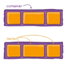
- 开启
- 当
flex container中的子元素变成flex item时,具备以下特点flex item的布局将受到flex container属性设置来控制和布局。flex item不再严格区分块元素和行内级元素。flex item默认情况下是包裹 内容的,但是可以设置宽度和高度。
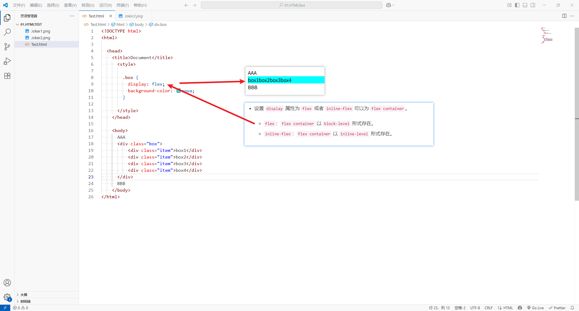
- 设置
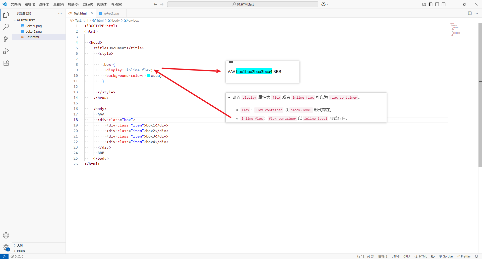
display属性为flex或者inline-flex可以为flex container。flex:flex container以block-level形式存在。inline-flex:flex container以inline-level形式存在。
- 案例1:设置
display属性为flex
<!DOCTYPE html>
<html><head><title>Document</title><style>.box {display: flex;background-color: aqua;}</style></head><body>AAA<div class="box"><div class="item">box1</div><div class="item">box2</div><div class="item">box3</div><div class="item">box4</div></div>BBB</body>
</html>
- 案例2:设置
display属性为inline-flex
<!DOCTYPE html>
<html><head><title>Document</title><style>.box {display: inline-flex;background-color: aqua;}</style></head><body>AAA<div class="box"><div class="item">box1</div><div class="item">box2</div><div class="item">box3</div><div class="item">box4</div></div>BBB</body>
</html>
三、flex的布局模型
- 默认以
main axis方向排序
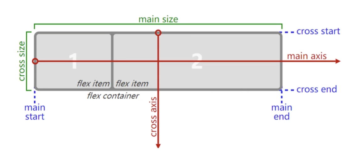
- 应用在
flex container上的css属性flex-flowflex-directionflex-wrapjustify-contentalign-itemsalign-content
- 应用在
flex item上的css属性flex-growflex-basisflex-shrinkorderalign-selfflex
四、应用在 flex container 上的 css 属性
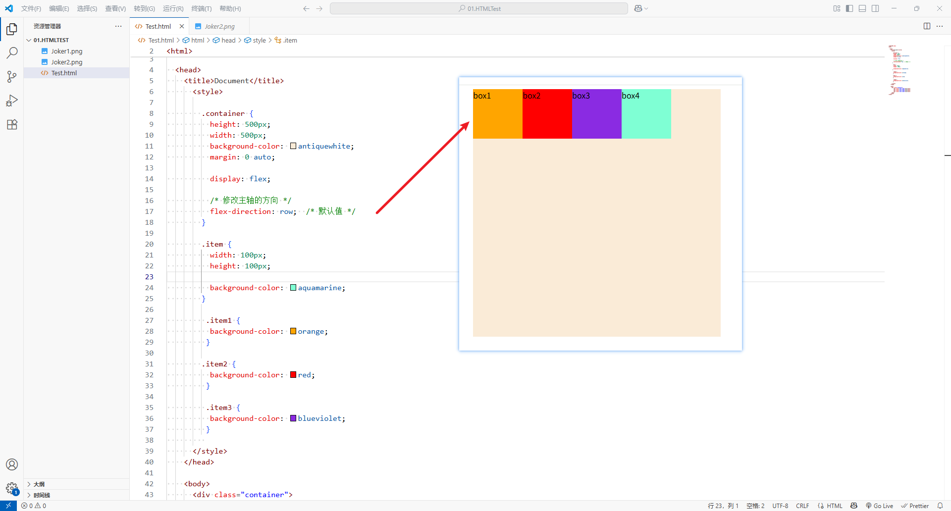
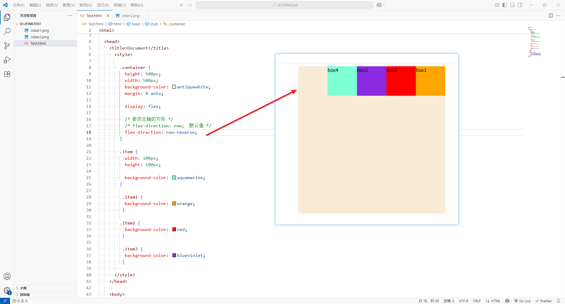
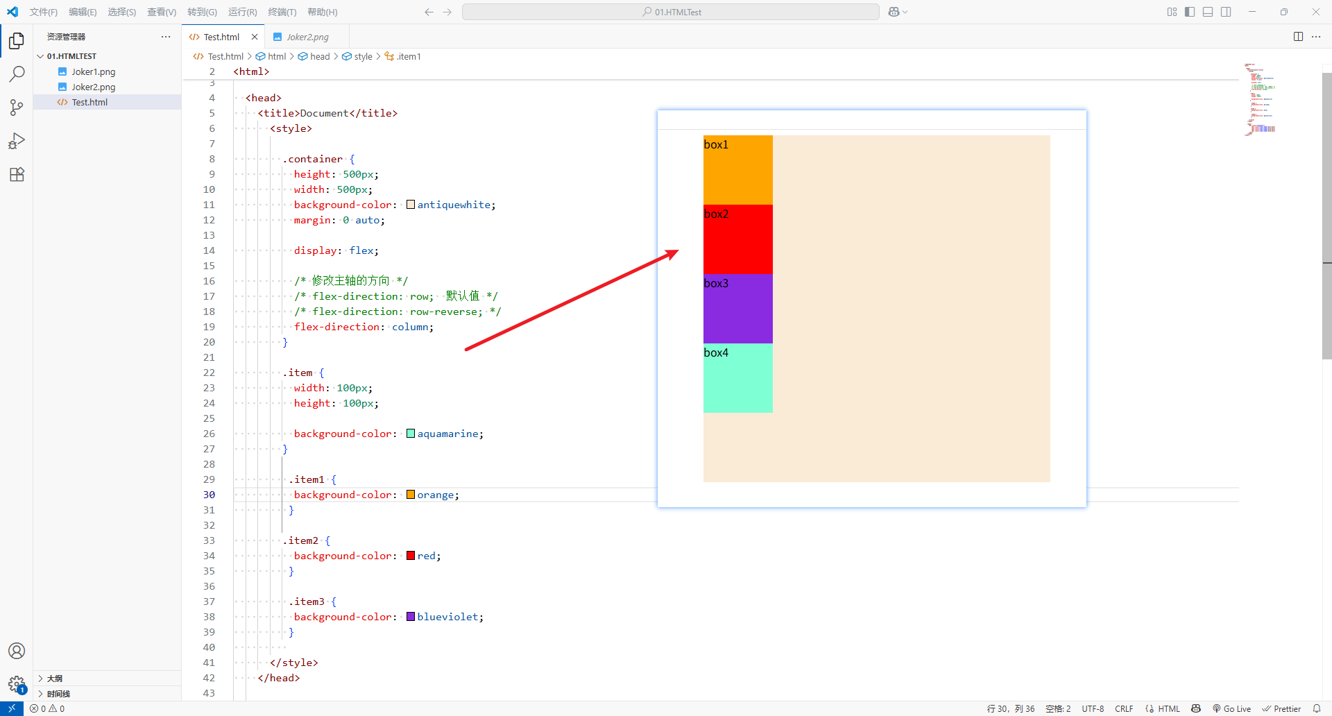
1、flex-direction
flex itsms默认都是沿着main axis(主轴)从main start开始往main end方向排布-
flex-direction决定了main axis的方向,有四个取值
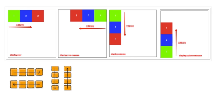
-
row(默认值)
-
row-reverse:row的反转
-
column:列成为主轴方向
-
column-reverse:列主轴反转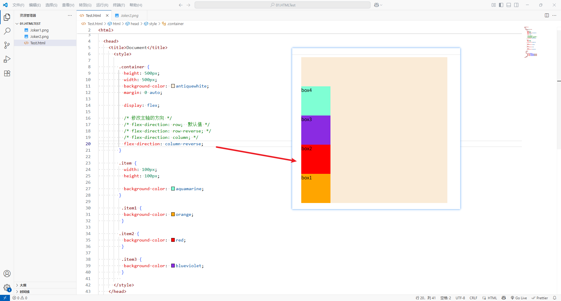
-
-
<!DOCTYPE html>
<html><head><title>Document</title><style>.container {height: 500px;width: 500px;background-color: antiquewhite;margin: 0 auto;display: flex;/* 修改主轴的方向 *//* flex-direction: row;  默认值 *//* flex-direction: row-reverse; *//* flex-direction: column; */flex-direction: column-reverse;}.item {width: 100px;height: 100px;background-color: aquamarine;}.item1 {background-color: orange;}.item2 {background-color: red;}.item3 {background-color: blueviolet;}</style></head><body><div class="container"><div class="item item1">box1</div><div class="item item2">box2</div><div class="item item3">box3</div><div class="item item4">box4</div></div></body>
</html>
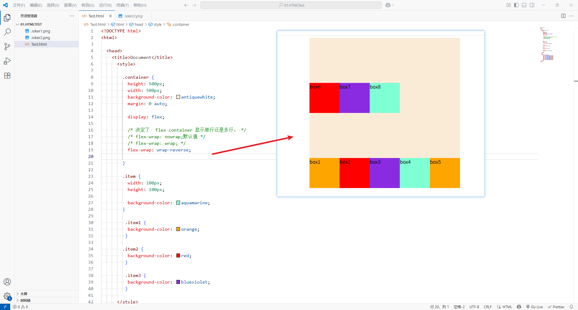
2、flex-wrap
-
flex-wrap决定了flex container显示单行还是多行。
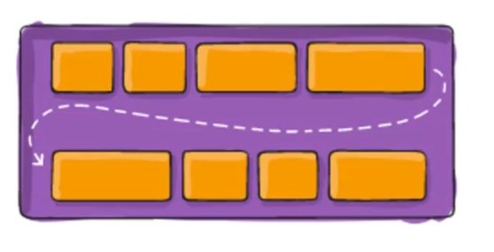
-
nowrap:(默认值)单行
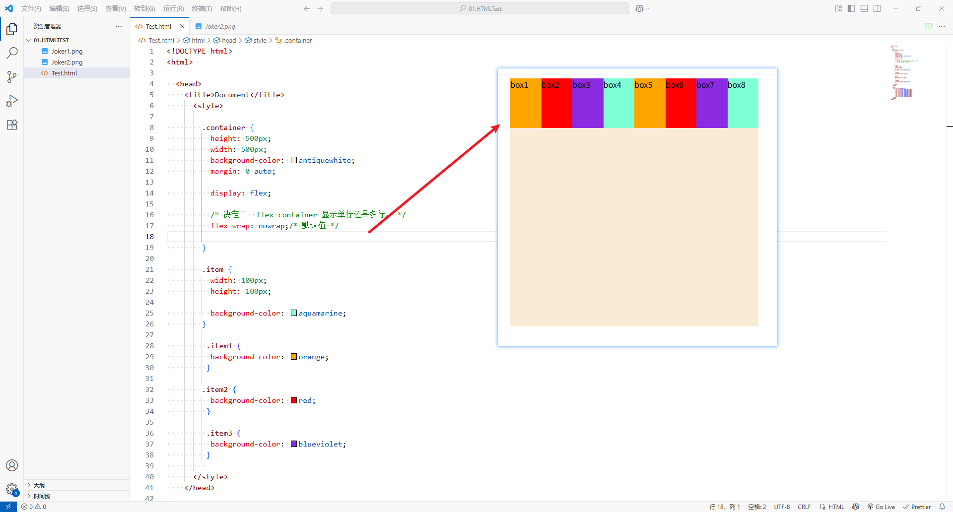
-
wrap:多行
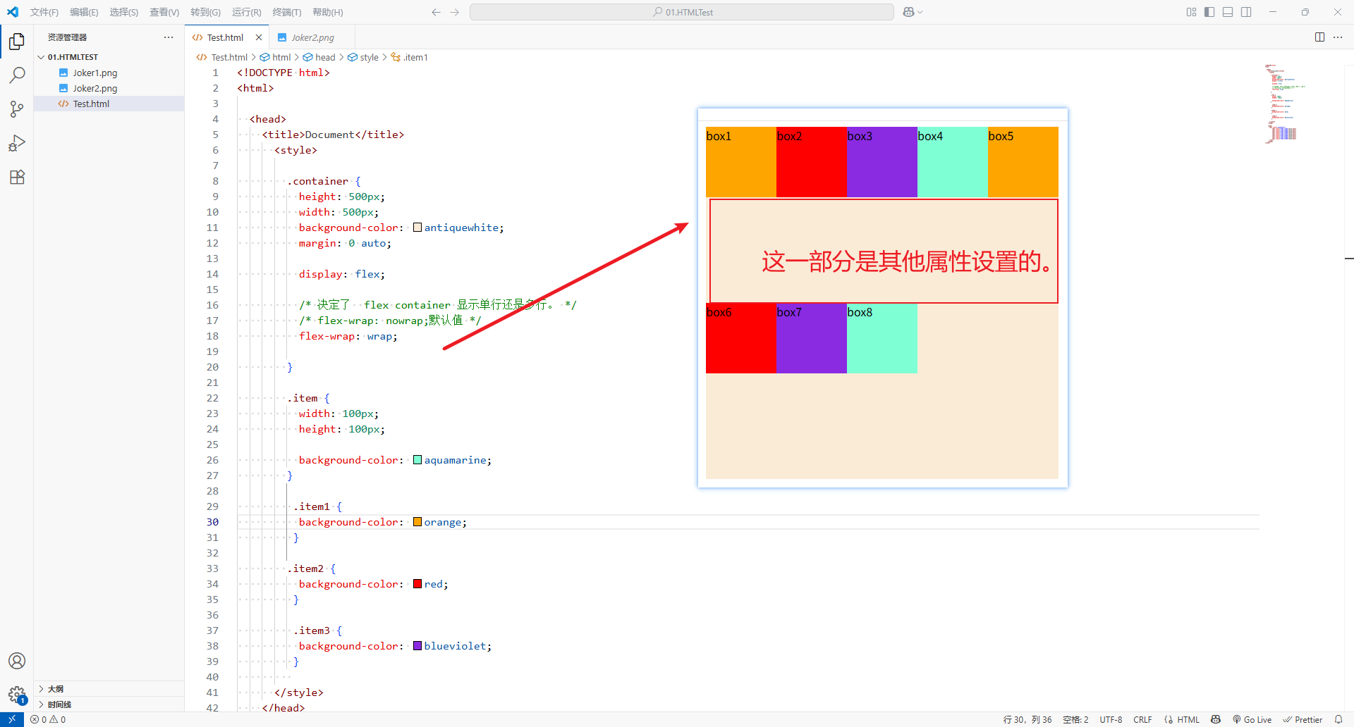
-
wrap-reverse:多行(对比wrap,cross start与 )
-
<!DOCTYPE html>
<html><head><title>Document</title><style>.container {height: 500px;width: 500px;background-color: antiquewhite;margin: 0 auto;display: flex;/* 决定了  flex container 显示单行还是多行。 *//* flex-wrap: nowrap;默认值 *//* flex-wrap: wrap; */flex-wrap: wrap-reverse;}.item {width: 100px;height: 100px;background-color: aquamarine;}.item1 {background-color: orange;}.item2 {background-color: red;}.item3 {background-color: blueviolet;}</style></head><body><div class="container"><div class="item item1">box1</div><div class="item item2">box2</div><div class="item item3">box3</div><div class="item item4">box4</div><div class="item item1">box5</div><div class="item item2">box6</div><div class="item item3">box7</div><div class="item item4">box8</div></div></body>
</html>
3、flex-flow
-
flex-flow属性是flex-direction和flex-wrap的缩写。
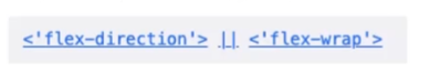
- 顺序任何,并且都可以省略
- 顺序任何,并且都可以省略
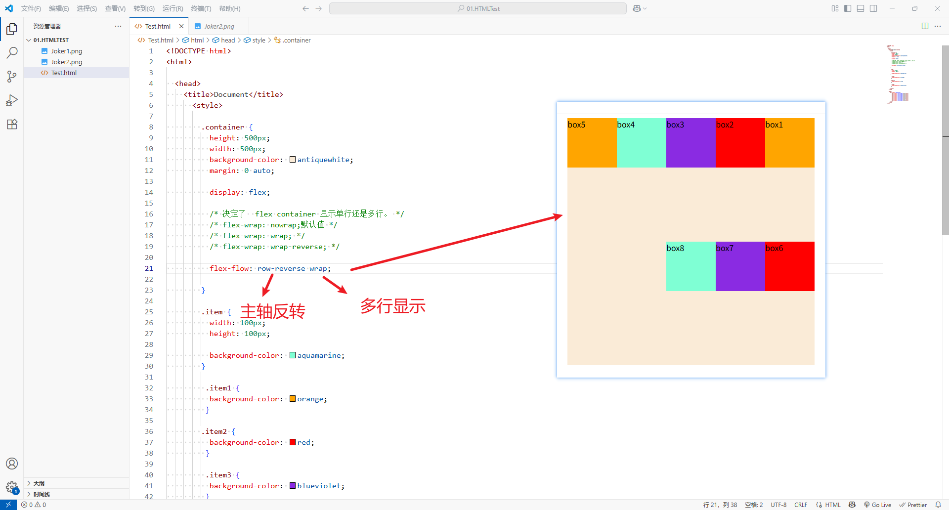
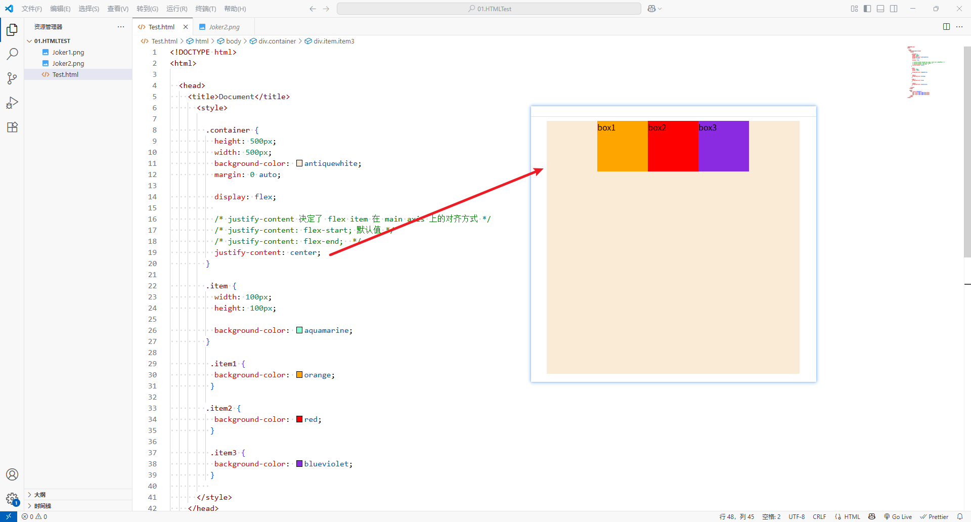
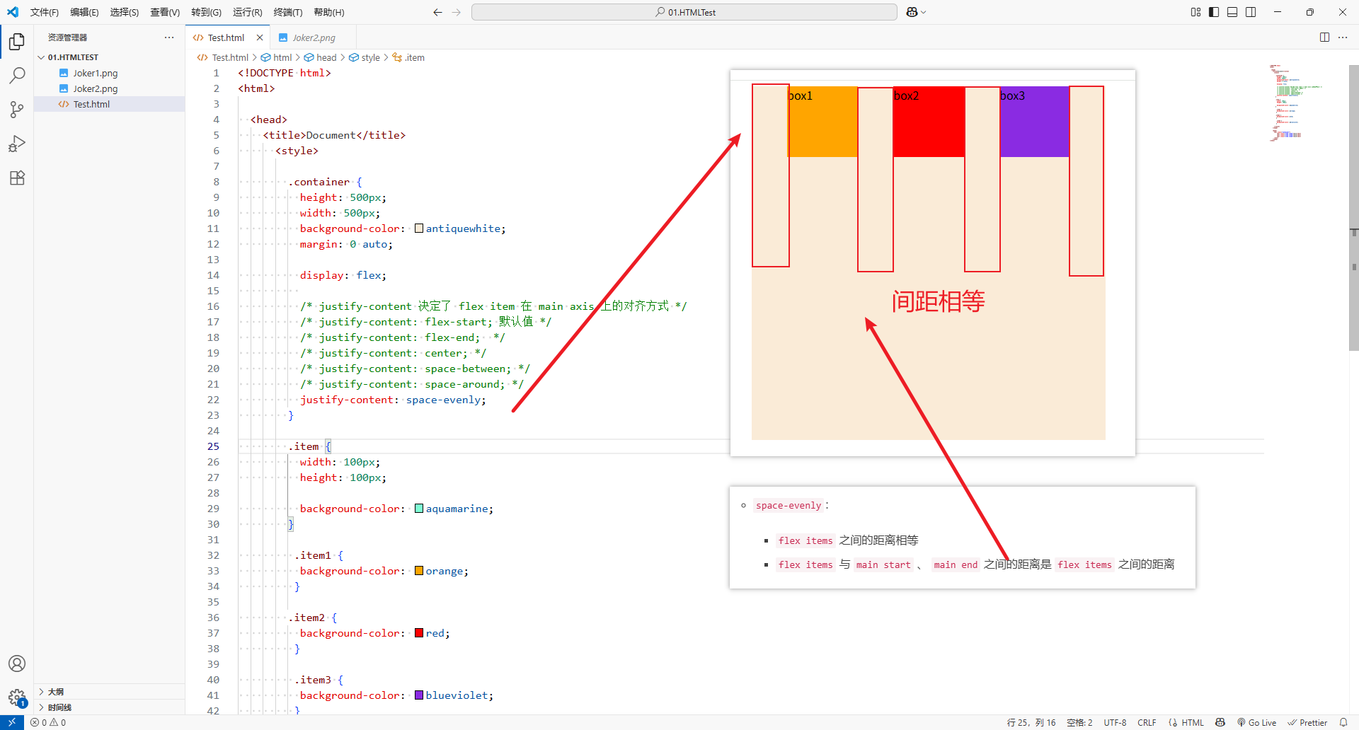
4、justify-content
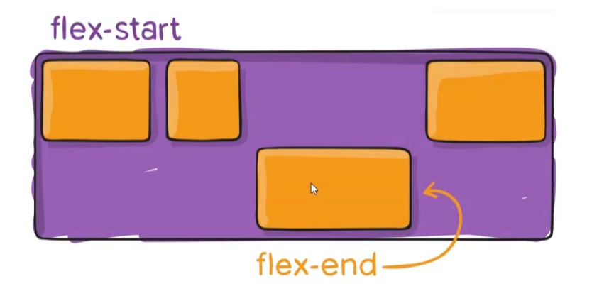
justify-content决定了flex item在main axis上的对齐方式-
flex-start:(默认值)与main start对齐
-
flex-end:与main end对齐
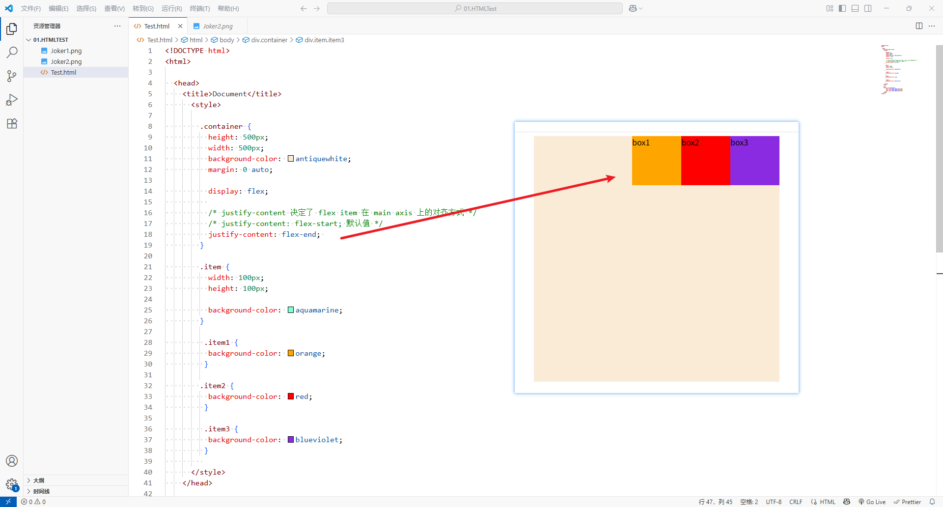
-
center: 居中
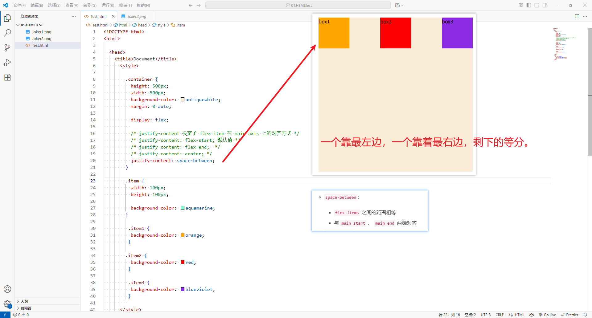
-
space-between:flex items之间的距离相等- 与
main start、main end两端对齐
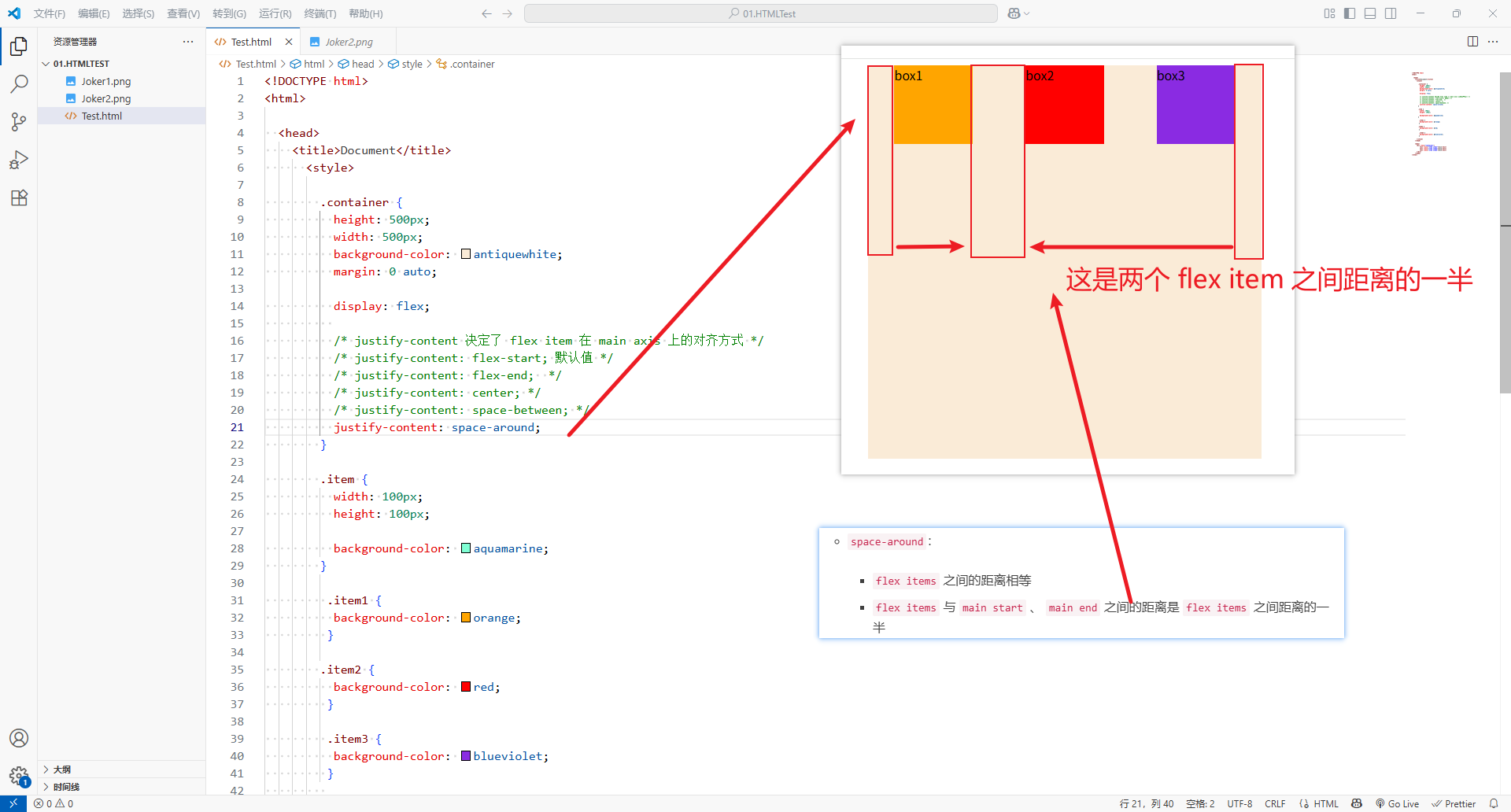
-
space-around:flex items之间的距离相等flex items与main start、main end之间的距离是flex items之间距离的一半
-
space-evenly:flex items之间的距离相等flex items与main start、main end之间的距离是flex items之间的距离
-
<!DOCTYPE html>
<html><head><title>Document</title><style>.container {height: 500px;width: 500px;background-color: antiquewhite;margin: 0 auto;display: flex;/* justify-content 决定了 flex item 在 main axis 上的对齐方式 *//* justify-content: flex-start; 默认值 *//* justify-content: flex-end;  *//* justify-content: center; *//* justify-content: space-between; *//* justify-content: space-around; */justify-content: space-evenly;}.item {width: 100px;height: 100px;background-color: aquamarine;}.item1 {background-color: orange;}.item2 {background-color: red;}.item3 {background-color: blueviolet;}</style></head><body><div class="container"><div class="item item1">box1</div><div class="item item2">box2</div><div class="item item3">box3</div></div></body>
</html>
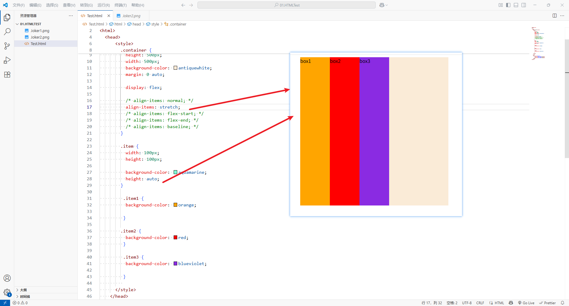
5、align-item
align-item决定了flex items在cross axis上的对齐方式
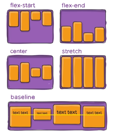
-
-
normal:弹性布局中,效果和strench一样
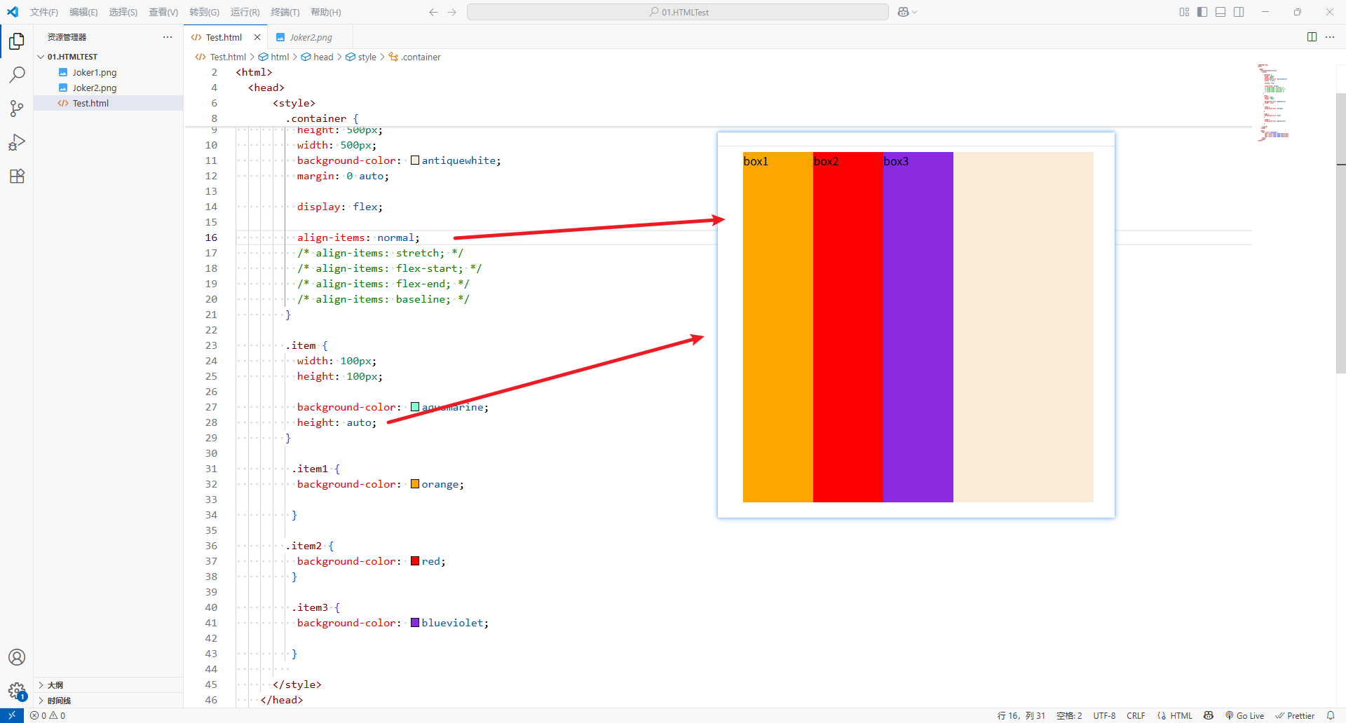
-
stretch:当flex items在cross axis方向的size为auto时候,会自动拉伸至填充flex container
-
flex-start:与cross start对齐
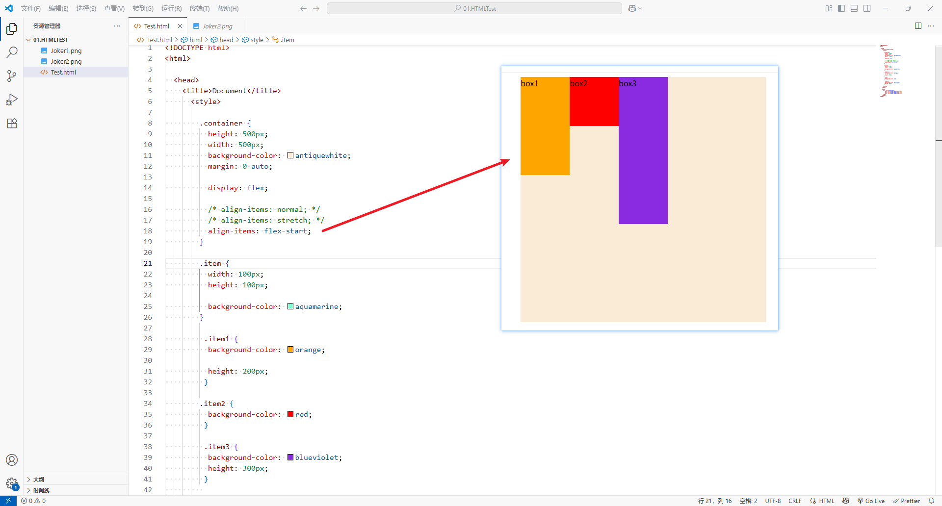
-
flex-end:与cross end对齐
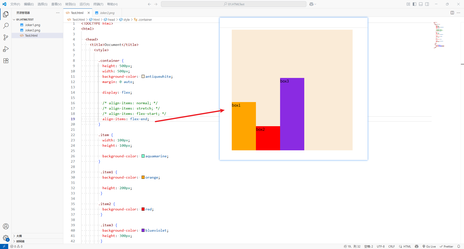
-
center:居中对齐
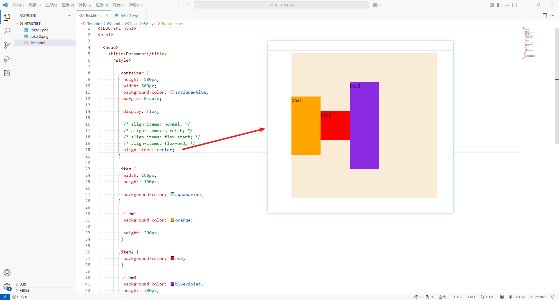
-
baseline:于基准线对齐
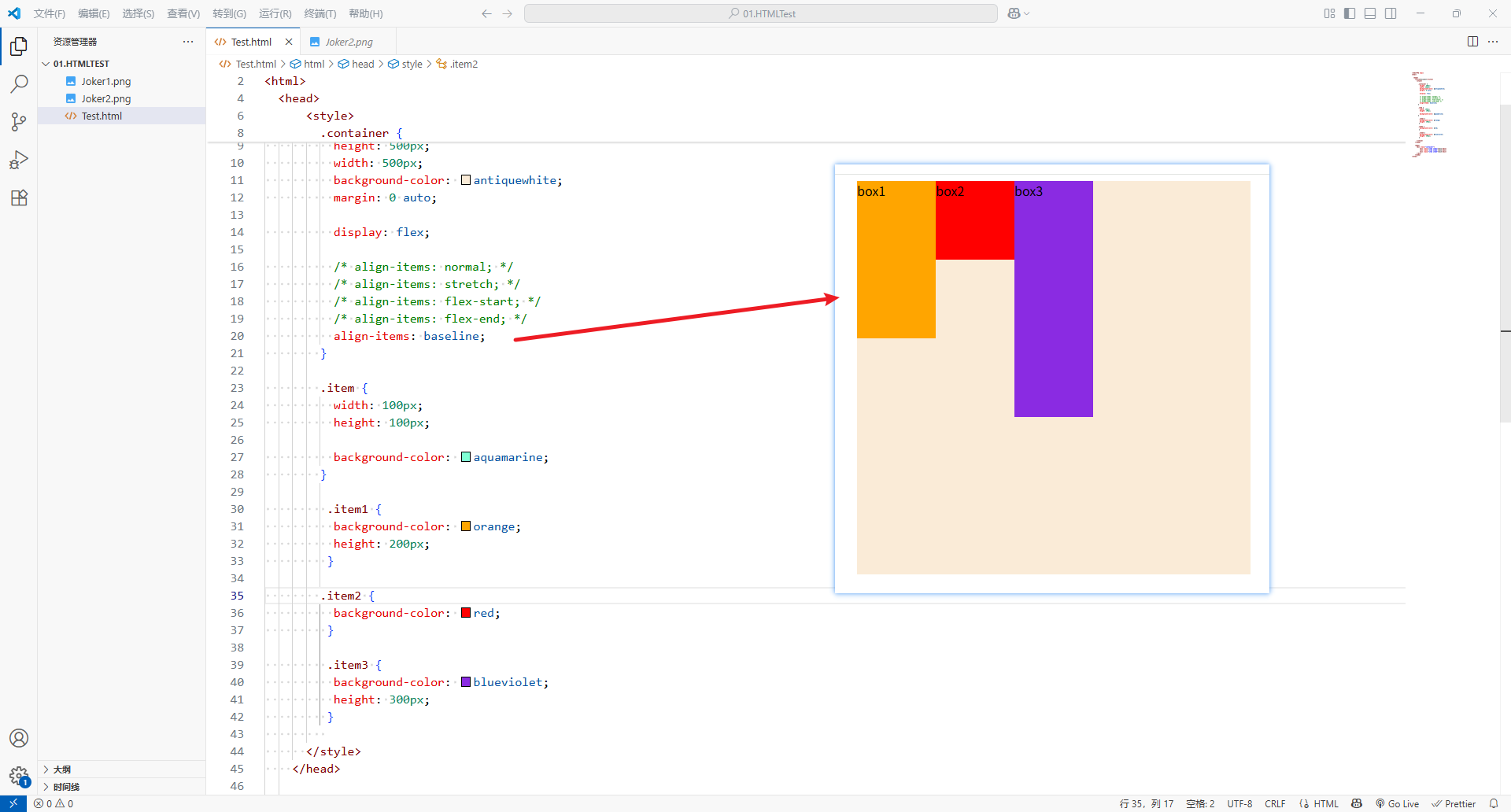
-
<!DOCTYPE html>
<html><head><title>Document</title><style>.container {height: 500px;width: 500px;background-color: antiquewhite;margin: 0 auto;display: flex;align-items: normal;/* align-items: stretch; *//* align-items: flex-start; *//* align-items: flex-end; *//* align-items: baseline; */}.item {width: 100px;height: 100px;background-color: aquamarine;height: auto;}.item1 {background-color: orange;}.item2 {background-color: red;}.item3 {background-color: blueviolet;}</style></head><body><div class="container"><div class="item item1">box1</div><div class="item item2">box2</div><div class="item item3">box3</div></div></body>
</html>
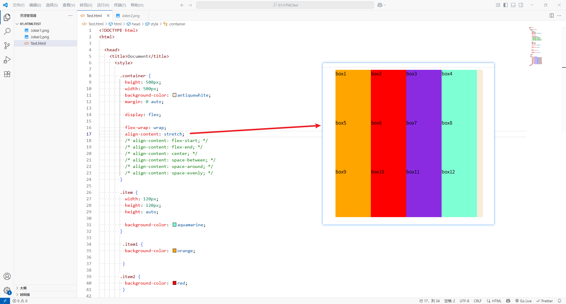
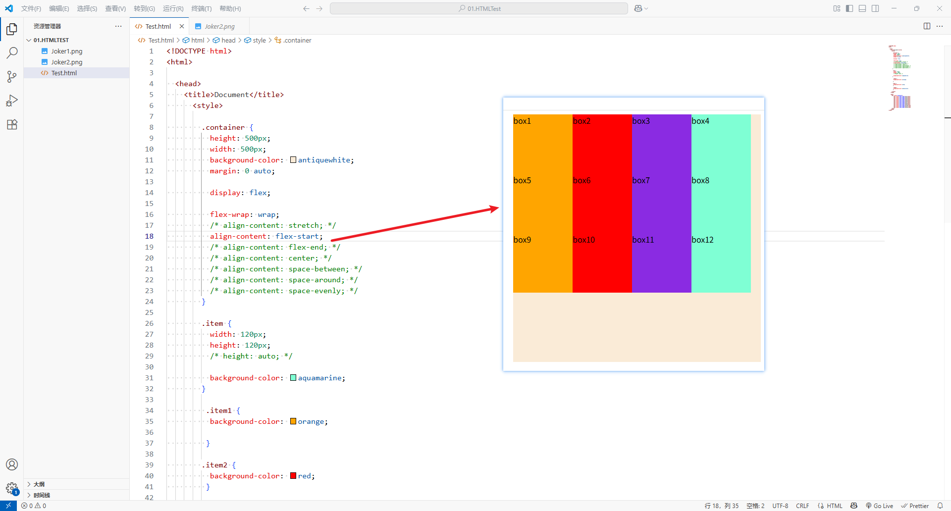
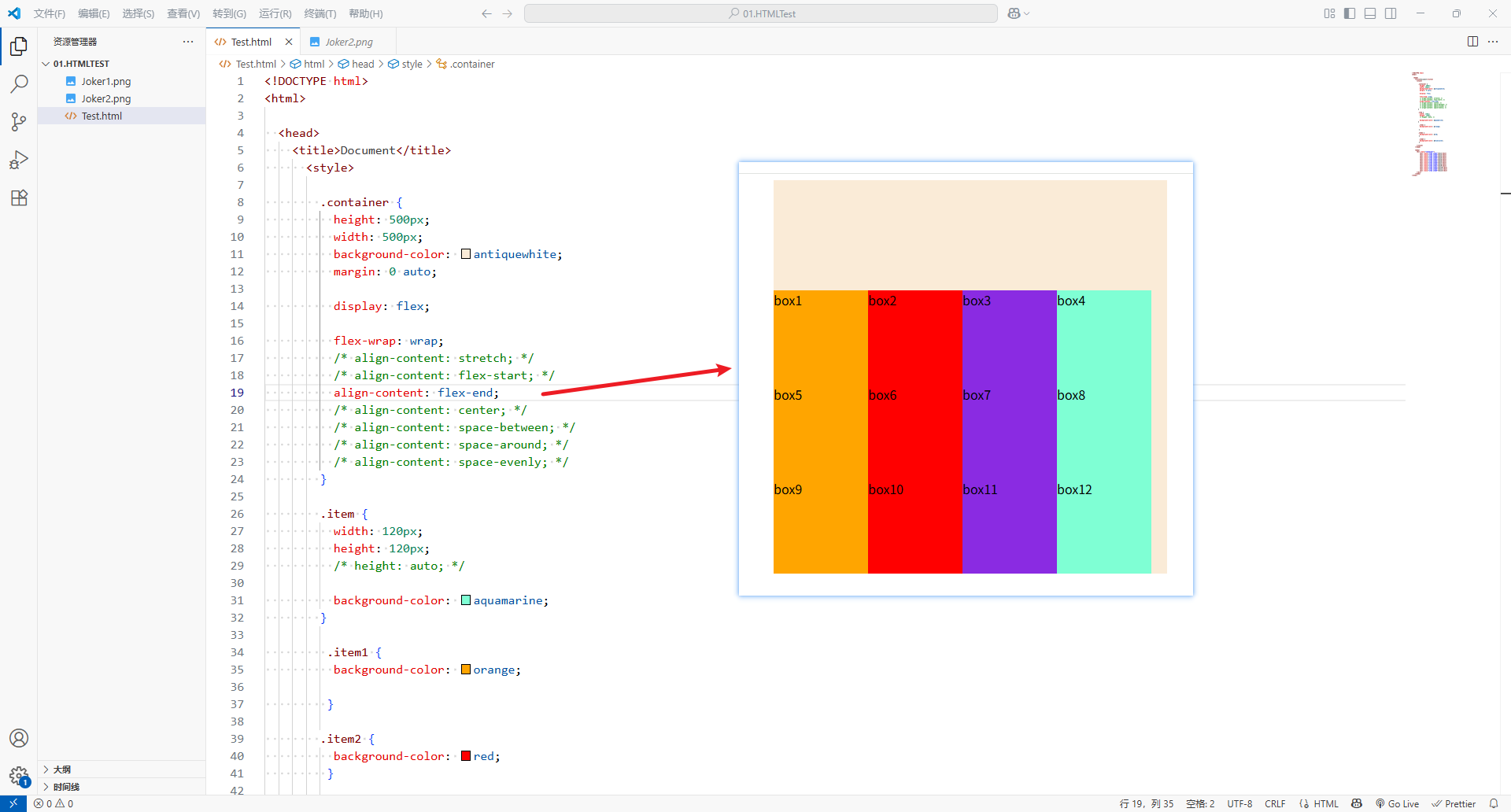
6、align-content
-
align-content决定了多行flex items在cross axis上的对齐方式,用法和justify-content类似
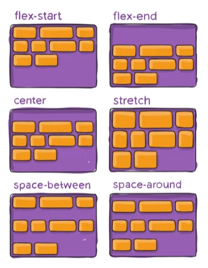
-
stretch:(默认值),与align-item的stretch类似
-
flex-strat:与cross start对齐
-
flex-end:与cross end对齐
-
center:居中对齐
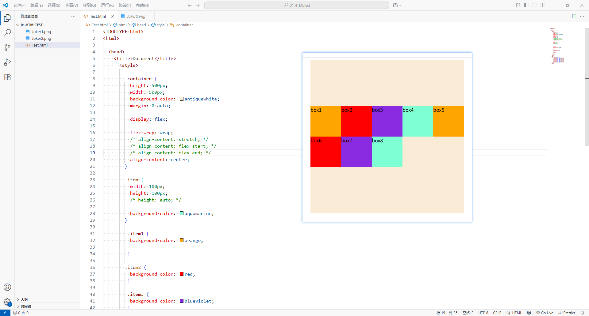
-
space-between:flex items之间的距离相等flex items与cross start和cross end对齐
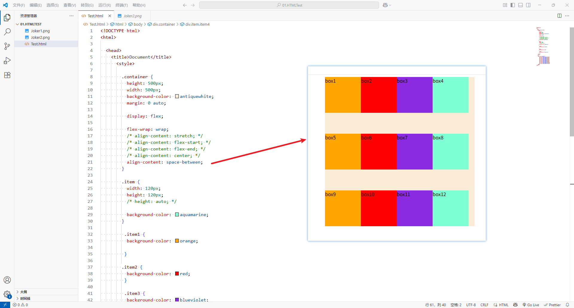
-
space-around:flex items之间的距离相等flex items与cross start和cross end之间的距离是flex items之间距离的一半
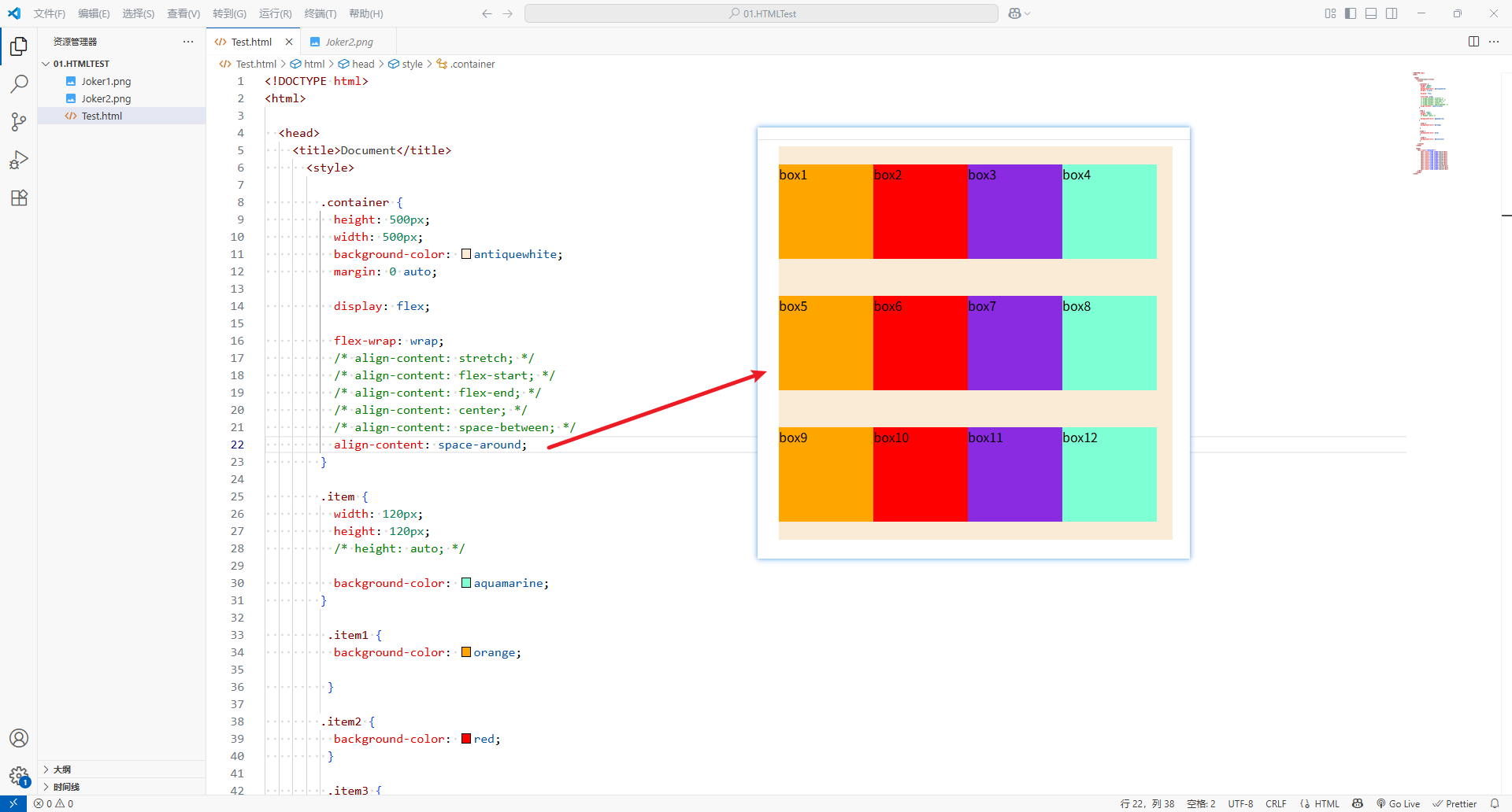
-
space-evenly:flex items之间的距离相等flex items与cross start和cross end之间的距离 等于flex items之间的距离
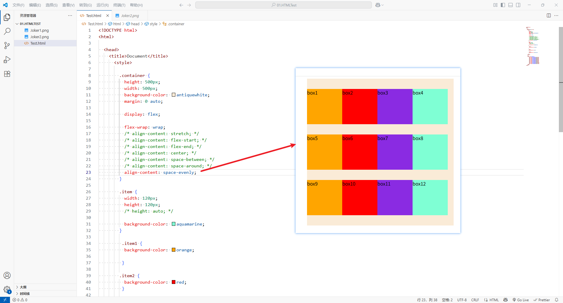
-
<!DOCTYPE html>
<html><head><title>Document</title><style>.container {height: 500px;width: 500px;background-color: antiquewhite;margin: 0 auto;display: flex;flex-wrap: wrap;align-content: stretch;/* align-content: flex-start; *//* align-content: flex-end; *//* align-content: center; *//* align-content: space-between; *//* align-content: space-around; *//* align-content: space-evenly; */}.item {width: 120px;height: 120px;height: auto;background-color: aquamarine;}.item1 {background-color: orange;}.item2 {background-color: red;}.item3 {background-color: blueviolet;}</style></head><body><div class="container"><div class="item item1">box1</div><div class="item item2">box2</div><div class="item item3">box3</div><div class="item item4">box4</div><div class="item item1">box5</div><div class="item item2">box6</div><div class="item item3">box7</div><div class="item item4">box8</div><div class="item item1">box9</div><div class="item item2">box10</div><div class="item item3">box11</div><div class="item item4">box12</div></div></body>
</html>
五、应用在 flex item 上的 css 属性
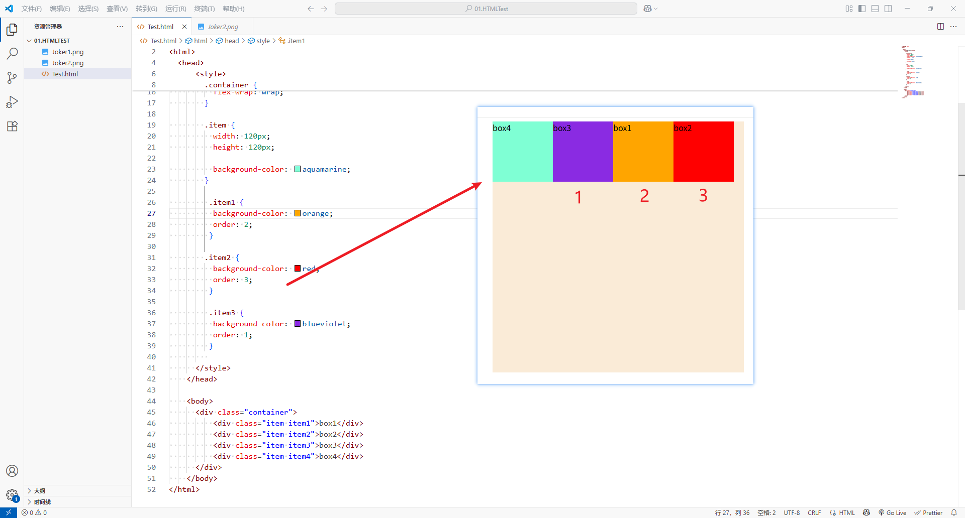
1、order
-
order决定了flex item的排列顺序
- 可以设置任意整数(正整数、负整数、0),值越小就越
- 数字越小,位置越靠前;数字越大,位置越靠后
- 默认值是
0
<!DOCTYPE html>
<html><head><title>Document</title><style>.container {height: 500px;width: 500px;background-color: antiquewhite;margin: 0 auto;display: flex;flex-wrap: wrap;}.item {width: 120px;height: 120px;background-color: aquamarine;}.item1 {background-color: orange;order: 2;}.item2 {background-color: red;order: 3;}.item3 {background-color: blueviolet;order: 1;}</style></head><body><div class="container"><div class="item item1">box1</div><div class="item item2">box2</div><div class="item item3">box3</div><div class="item item4">box4</div></div></body>
</html>
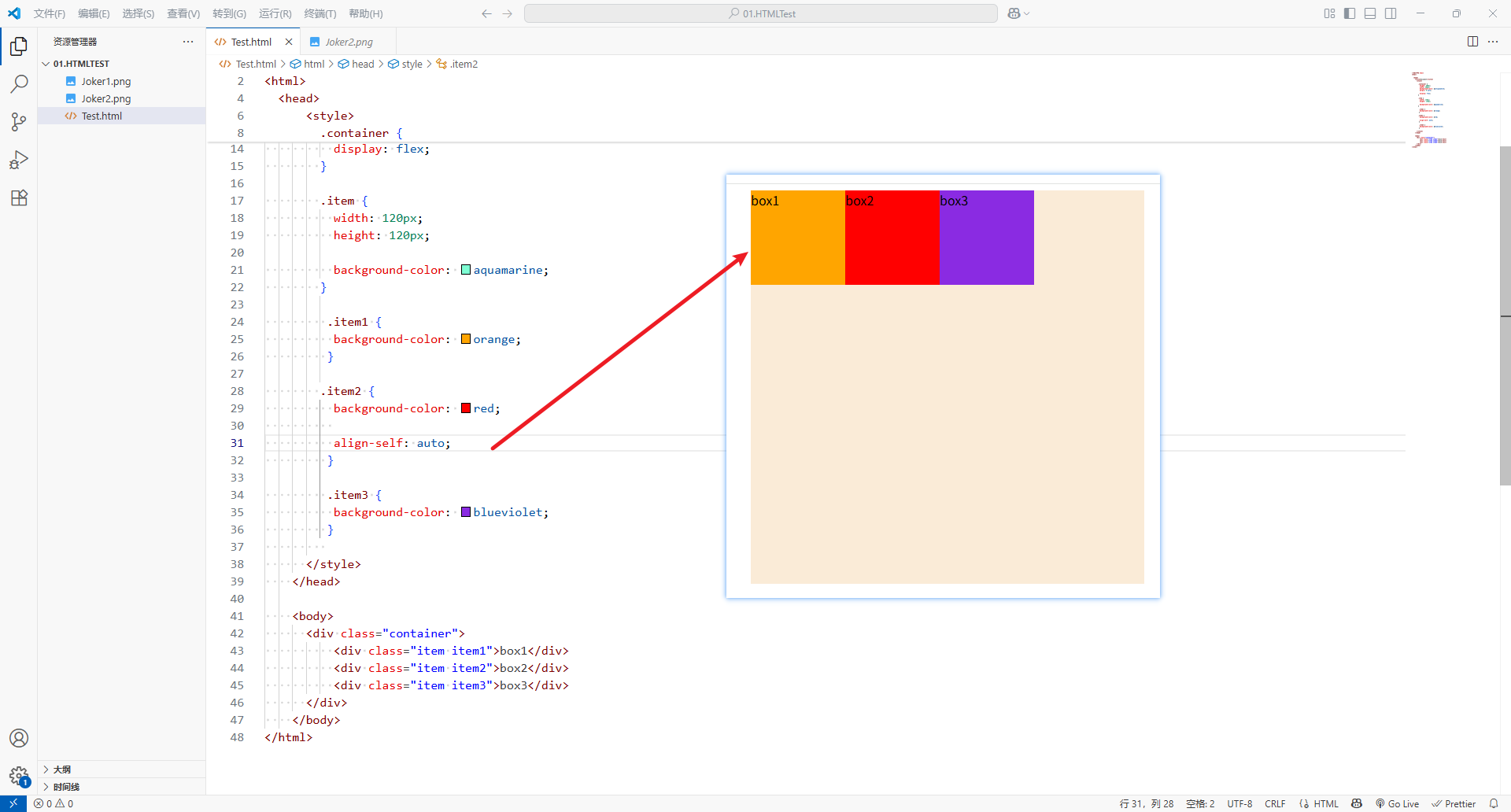
2、align-self
-
flex-items可以通过align-self覆盖flex container设置的align-items
-
auto:遵从flex container设置的align-items
-
可以设置的值,效果和
align-items一致-
stretch
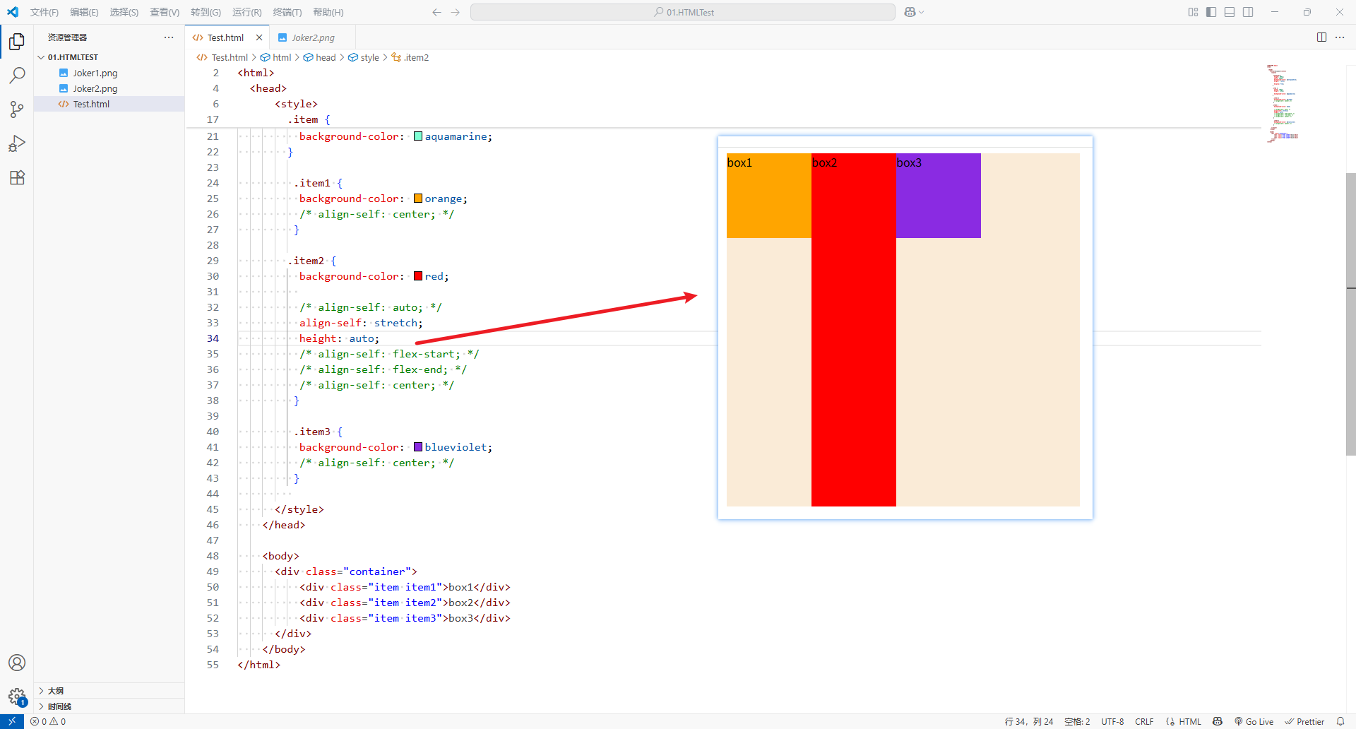
-
flex-start
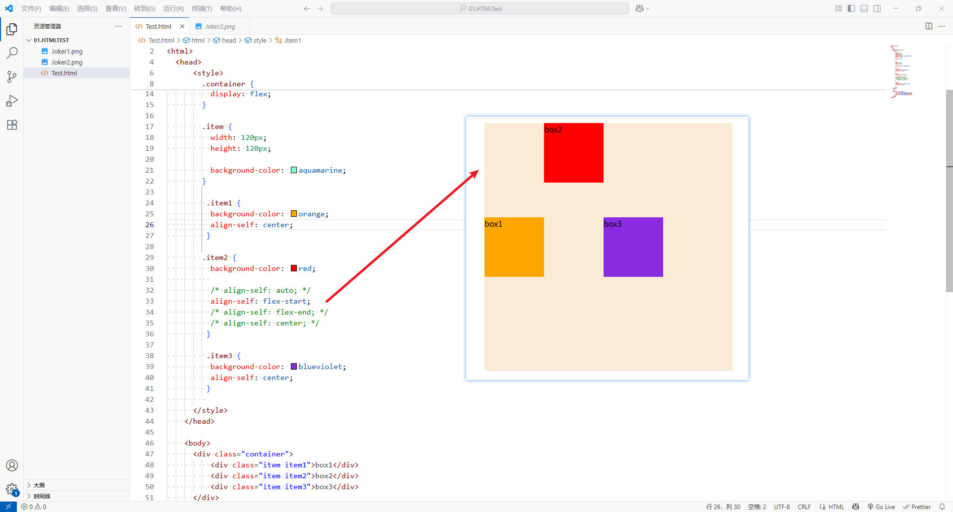
-
flex-end
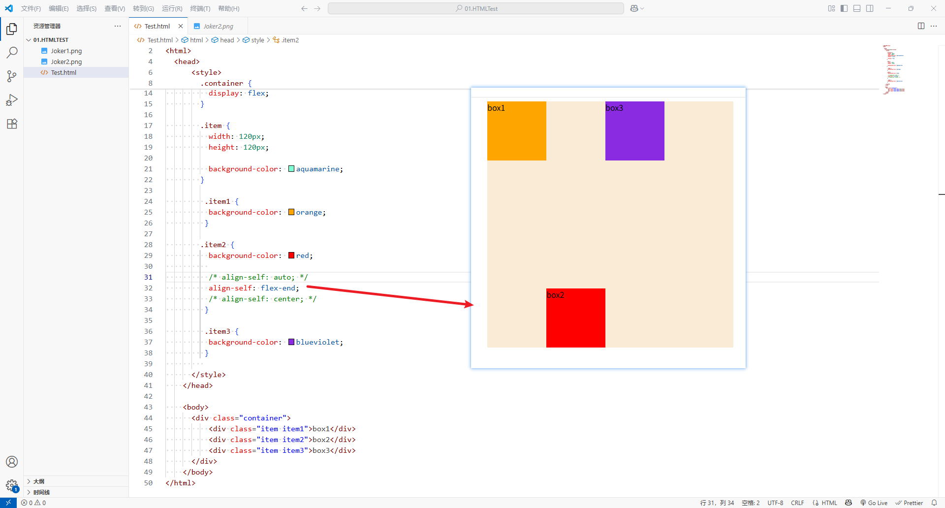
-
center
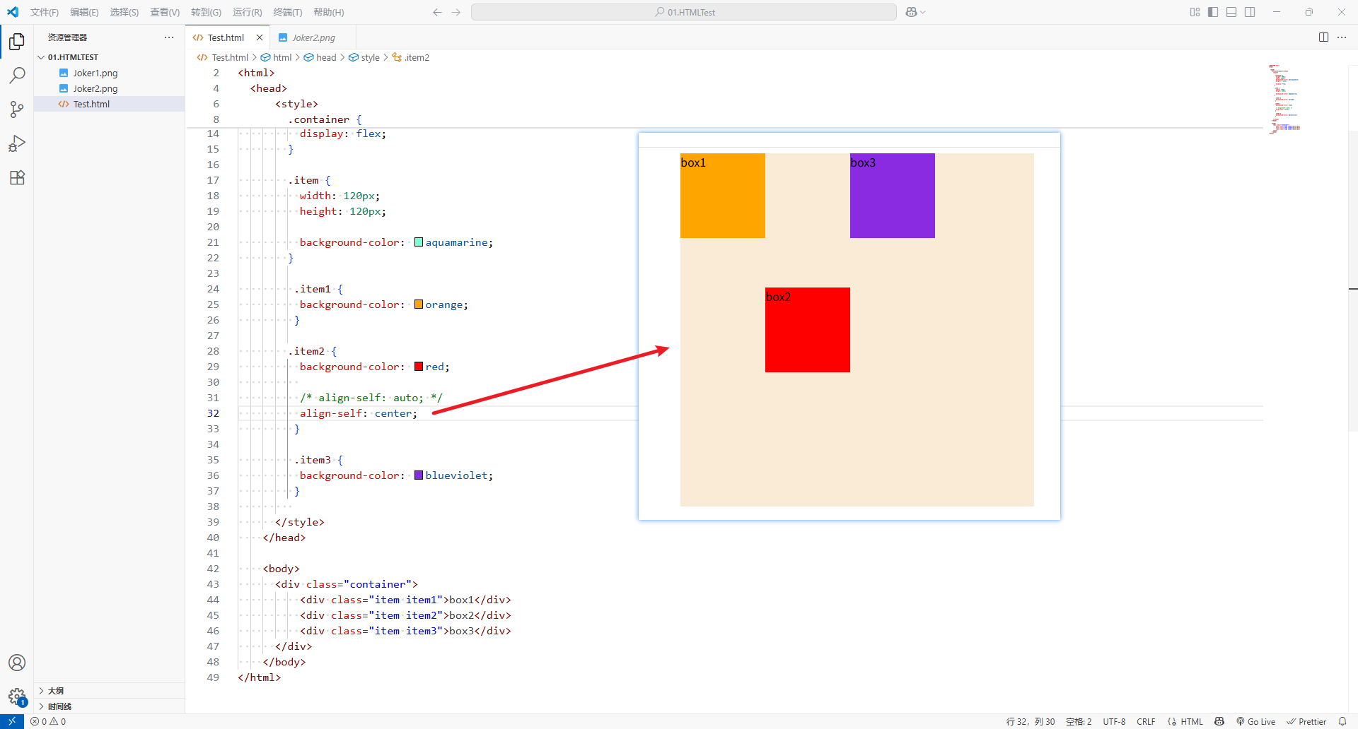
-
baseline
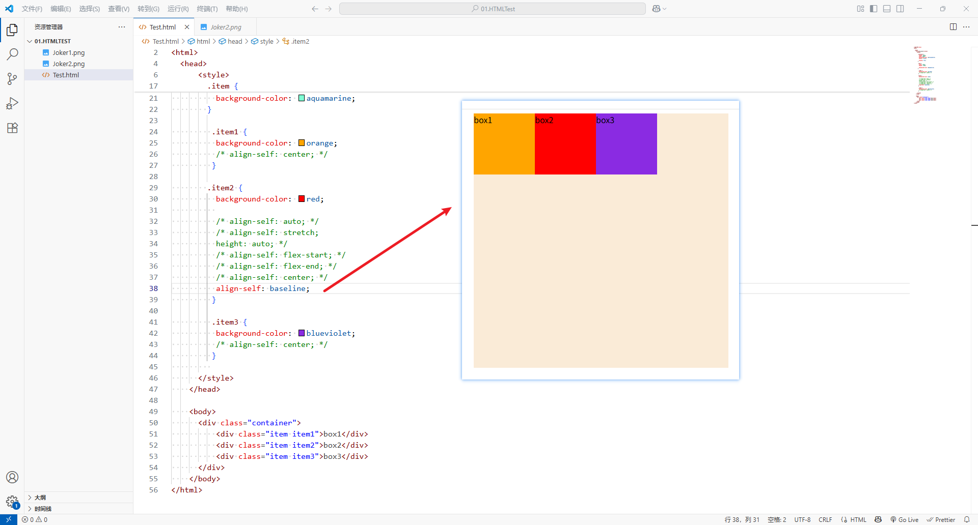
-
-
<!DOCTYPE html>
<html><head><title>Document</title><style>.container {height: 500px;width: 500px;background-color: antiquewhite;margin: 0 auto;display: flex;}.item {width: 120px;height: 120px;background-color: aquamarine;}.item1 {background-color: orange;/* align-self: center; */}.item2 {background-color: red;/* align-self: auto; *//* align-self: stretch;height: auto; *//* align-self: flex-start; *//* align-self: flex-end; *//* align-self: center; */align-self: baseline;}.item3 {background-color: blueviolet;/* align-self: center; */}</style></head><body><div class="container"><div class="item item1">box1</div><div class="item item2">box2</div><div class="item item3">box3</div></div></body>
</html>
3、flex-grow
-
flex-grow决定了flex items如何拓展(拉伸、增长)
- 可以设置任意非负数(正小数、正整数、
0),默认值是0 - 当
flex container在main axis上有剩余size时,flex-grow才会生效
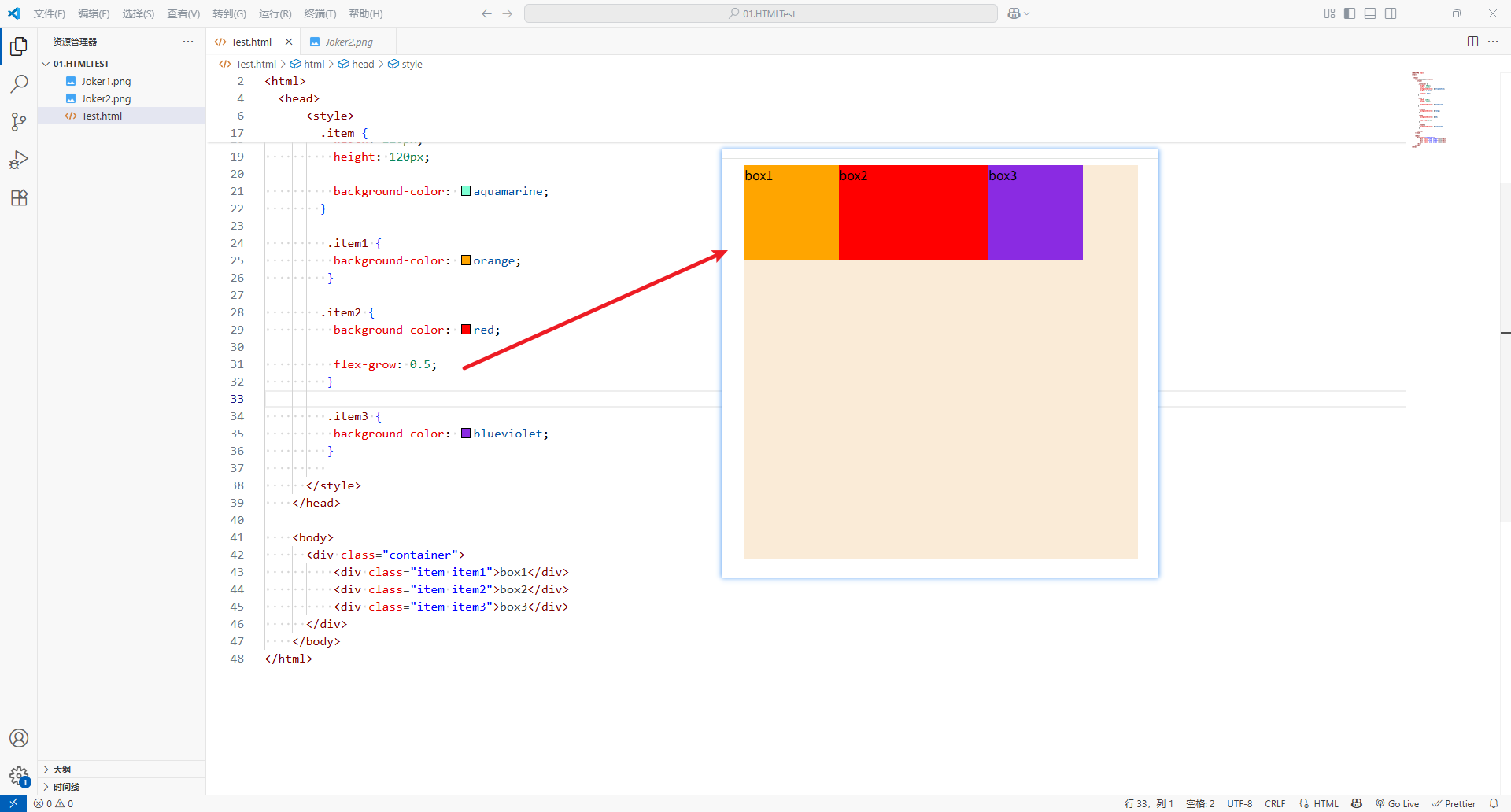
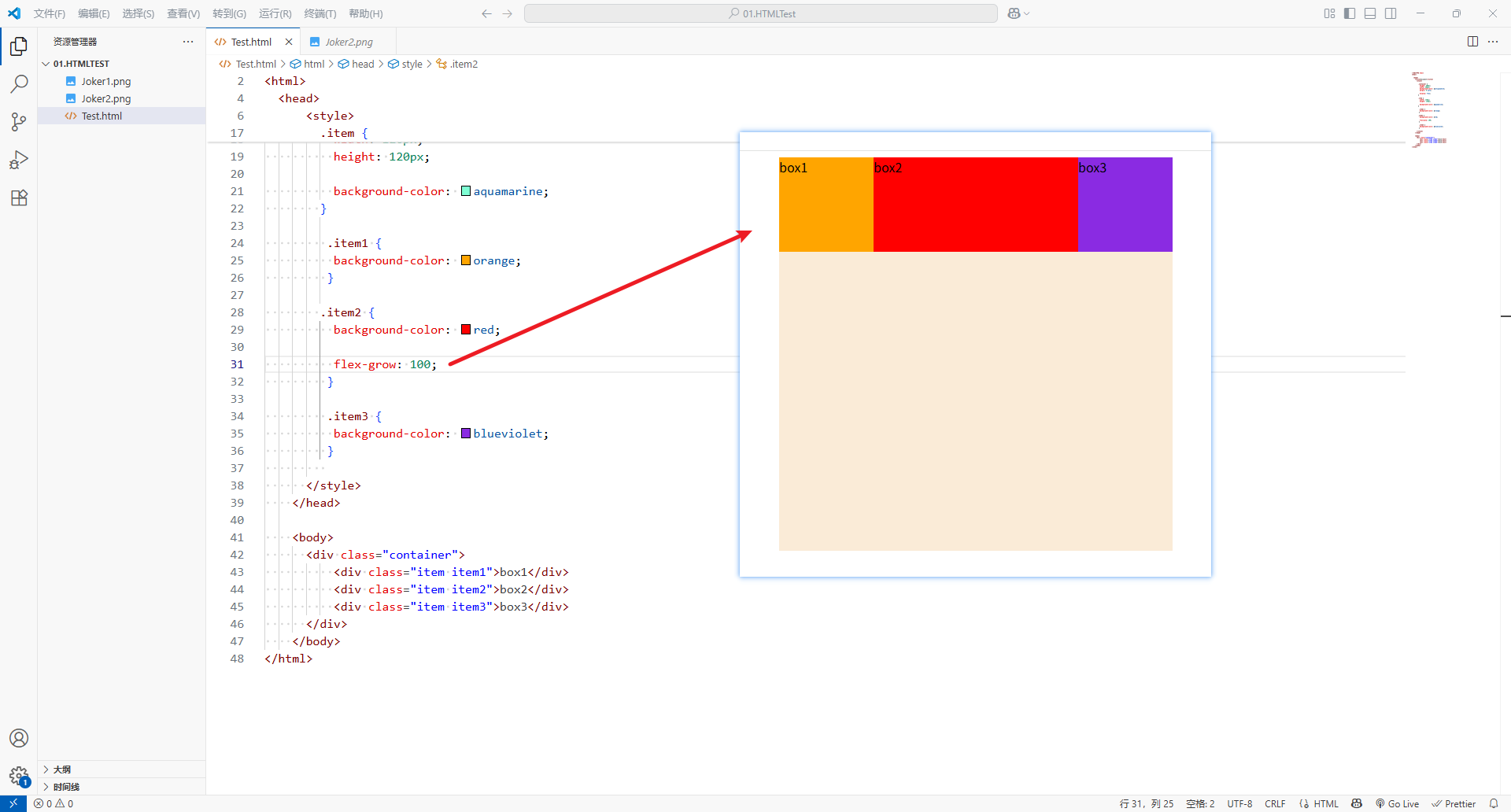
- 如果所有
flex items的flex-grow总和sum超过1,每个flex item拓展的 size 为:flex container 的剩余 size * ( flex-grow / sum )
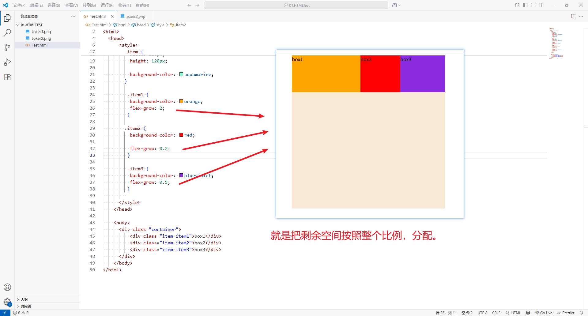
- 可以设置任意非负数(正小数、正整数、
-
flex items拓展后的最终size不能超过max-width/max-height
<!DOCTYPE html>
<html><head><title>Document</title><style>.container {height: 500px;width: 500px;background-color: antiquewhite;margin: 0 auto;display: flex;}.item {width: 120px;height: 120px;background-color: aquamarine;}.item1 {background-color: orange;flex-grow: 2;}.item2 {background-color: red;flex-grow: 0.2;}.item3 {background-color: blueviolet;flex-grow: 0.5;}</style></head><body><div class="container"><div class="item item1">box1</div><div class="item item2">box2</div><div class="item item3">box3</div></div></body>
</html>
4、flex-shrink
-
flex-shrink决定了flex items如何收缩(缩小)- 可以设置任意非负数(正小数、正整数、
0),默认值是1 - 当
flex items在main axis上 超过了flex container的size时,flex-shrink才会生效
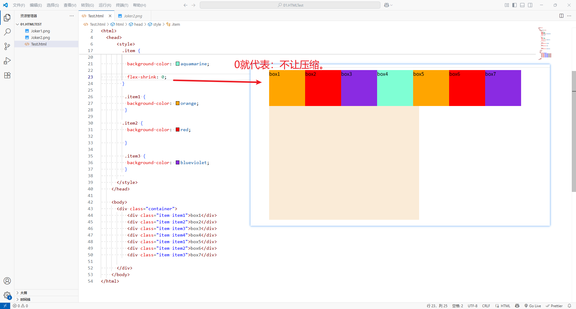
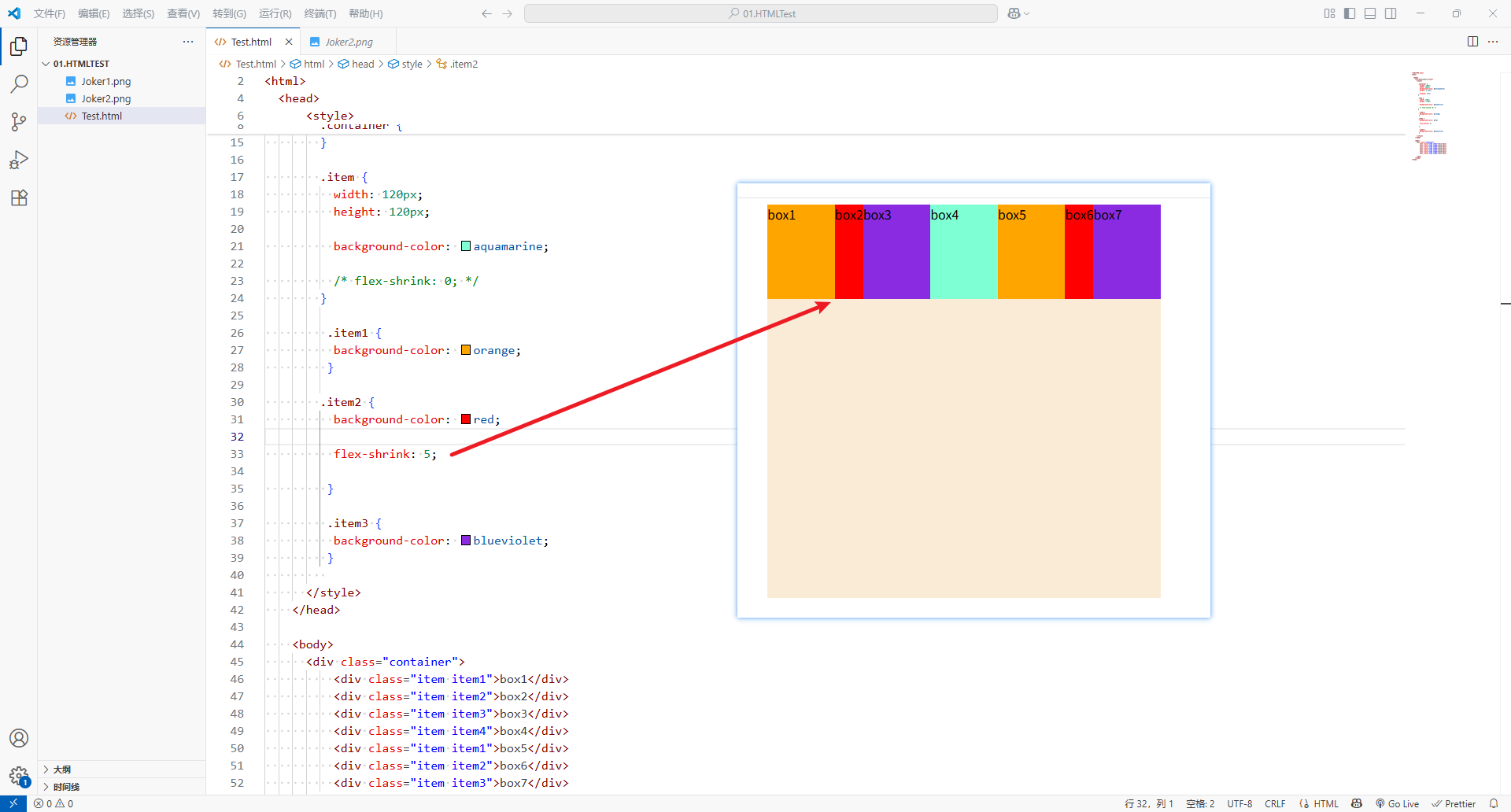
- 可以设置任意非负数(正小数、正整数、
-
如果所有
flex items的flex-shrink总和sum超过1,每个flex item收缩的 size 为:flex items超出flex container 的 size*收缩比例(flex-shrink) / sum -
flex items收缩后的最终size不能超过min-width/min-height
<!DOCTYPE html>
<html><head><title>Document</title><style>.container {height: 500px;width: 500px;background-color: antiquewhite;margin: 0 auto;display: flex;}.item {width: 120px;height: 120px;background-color: aquamarine;/* flex-shrink: 0; */}.item1 {background-color: orange;}.item2 {background-color: red;flex-shrink: 5;}.item3 {background-color: blueviolet;}</style></head><body><div class="container"><div class="item item1">box1</div><div class="item item2">box2</div><div class="item item3">box3</div><div class="item item4">box4</div><div class="item item1">box5</div><div class="item item2">box6</div><div class="item item3">box7</div></div></body>
</html>
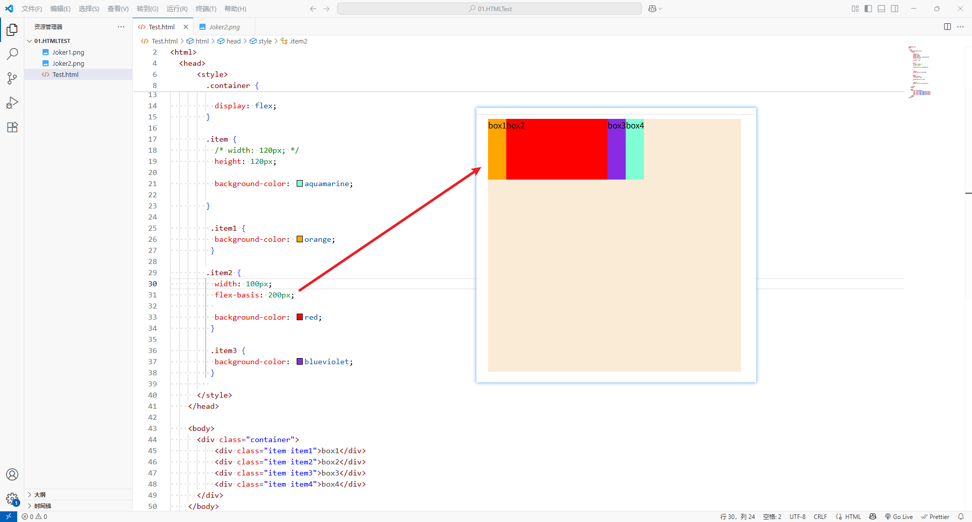
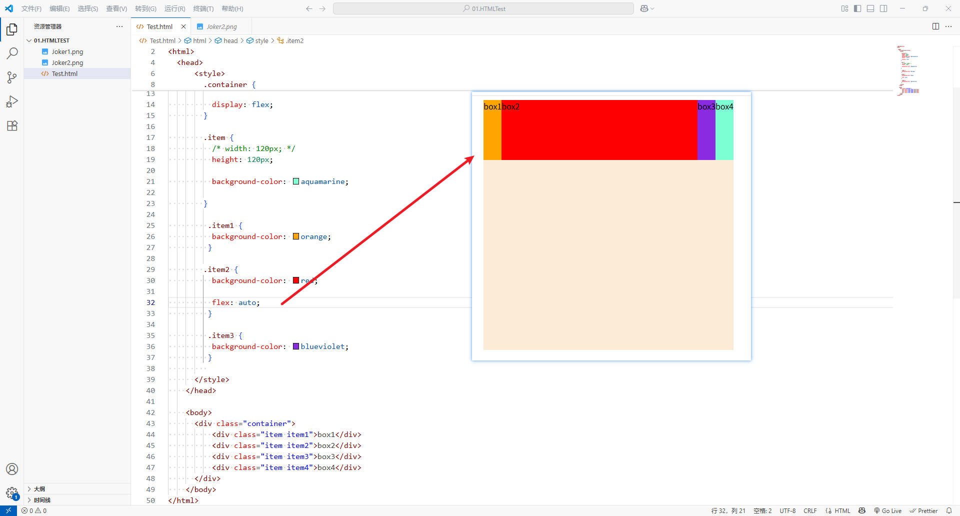
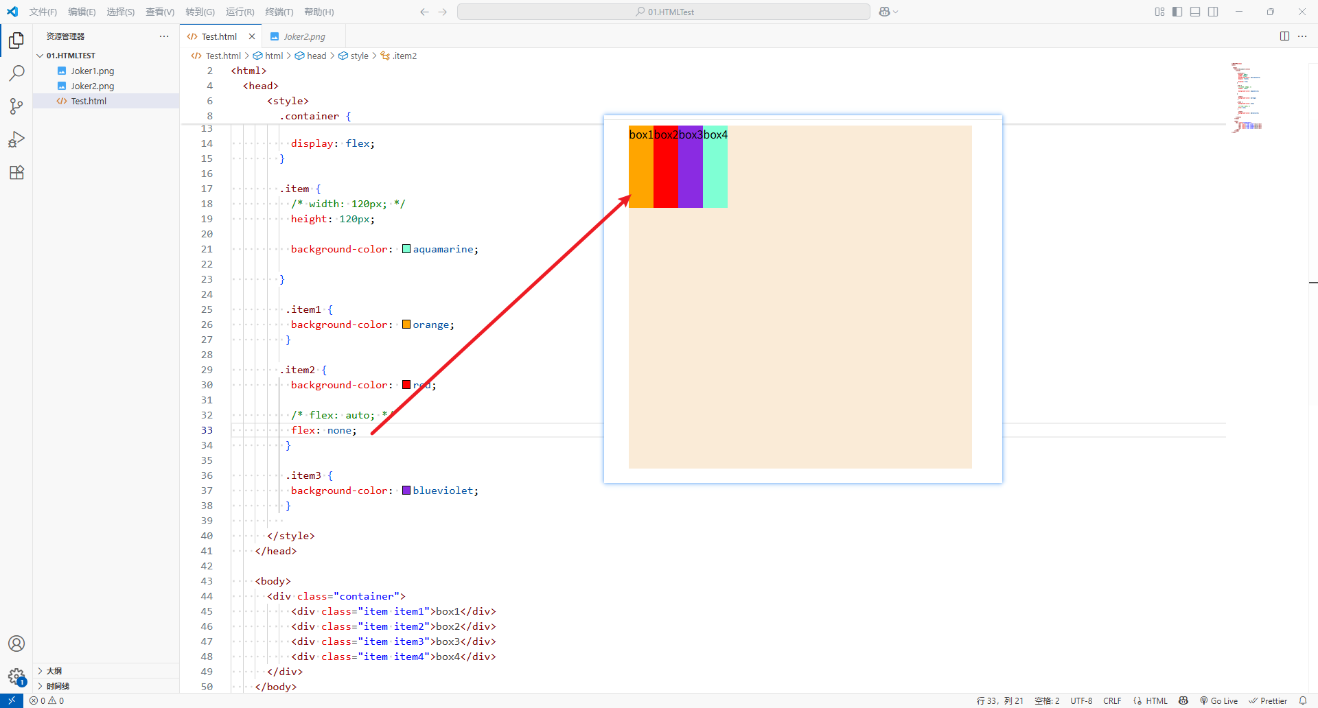
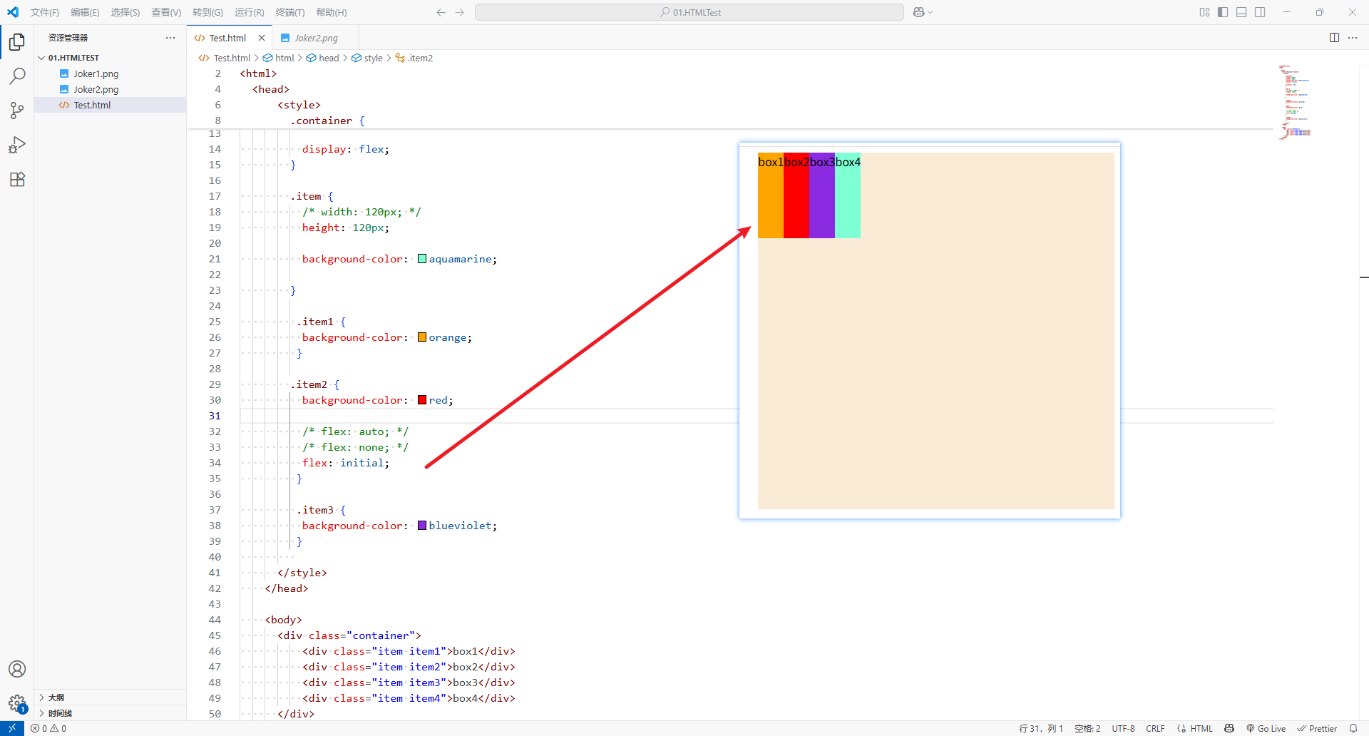
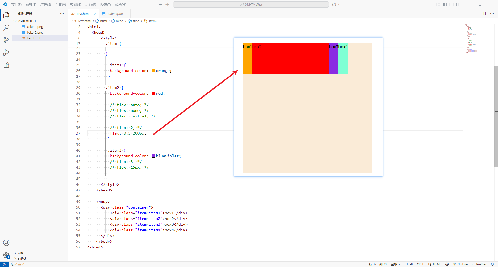
5、flex-basis
flex-basis用来设置flex items在main axis方向上的base sizeauto:默认值- 具体的宽度数值(100px)
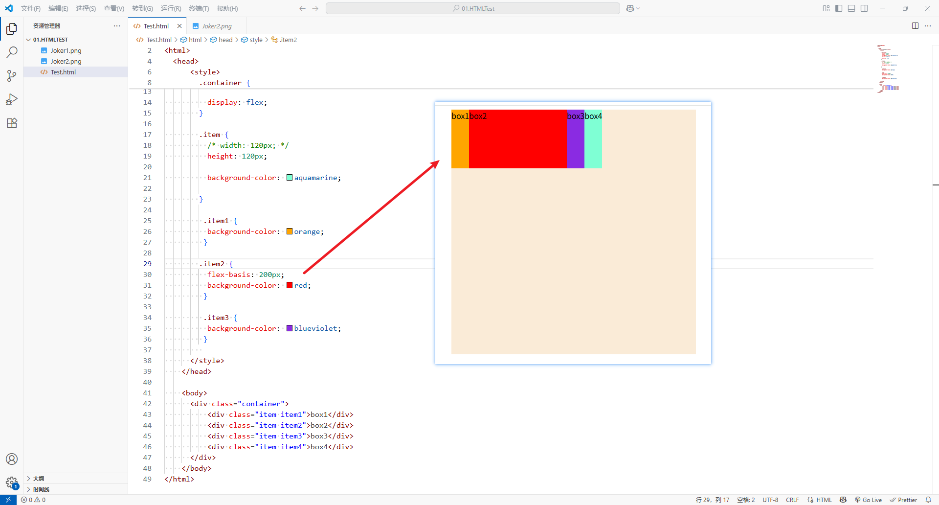
- 决定
flex-basis最终 base size 的因素,优先级从高到低:max-width、max-height、min-width、min-heightflex-basiswidth、height- 内容本身的
size
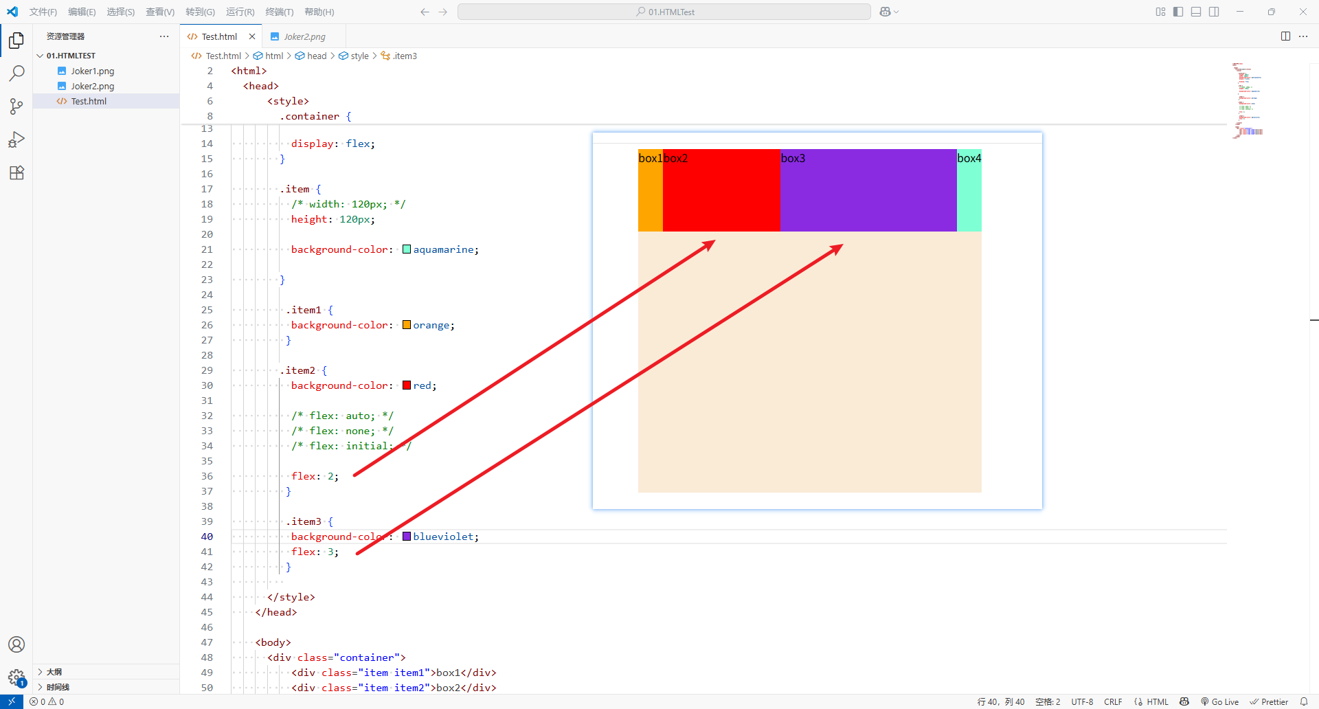
6、flex属性
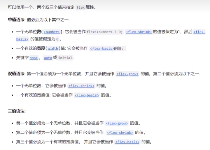
-
flex属性是flex-grow、flex-shrink、flex-basis的简写,flex可以指定1个、2个或者3个值。
-
单值语法,值必须是以下其中之一:
-
一个无单位数(
<number>):它会被当作flex-grow的值
-
一个有效宽度值(
width):它会被当作flex-basis的值 -
关键字:
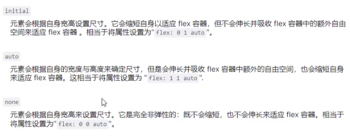
none、auto或initial
-
-
双值语法,第一个值必须为一个无单位数(
<number>),并且会被当作flex-grow的值- 第二个值必须是以下之一:
- 一个无单位数,它会被当作
flex-shrink的值 - 一个有效宽度值(
width):它会被当作flex-basis的值
- 一个无单位数,它会被当作
- 第二个值必须是以下之一:
-
三值语法:
- 第一个值必须是一个无单位数(
<number>),并且它会被当作flex-grow的值 - 第二个值必须是一个无单位数(
<number>),并且它会被当作flex-shrink的值 - 第三个值必须是一个有效宽度值(
width),并且它会被当作flex-basis的值
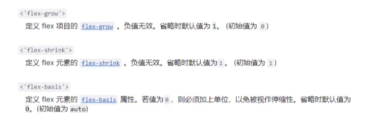
- 第一个值必须是一个无单位数(
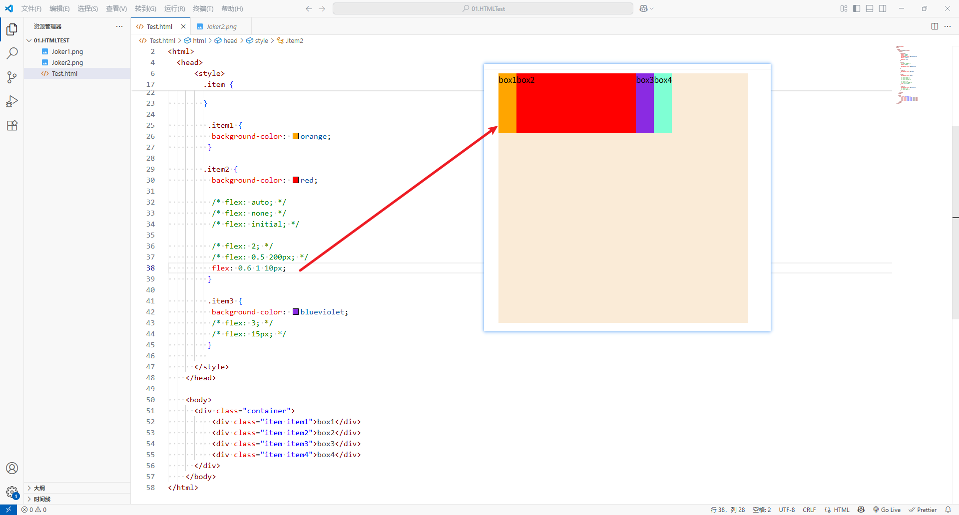
<!DOCTYPE html>
<html><head><title>Document</title><style>.container {height: 500px;width: 500px;background-color: antiquewhite;margin: 0 auto;display: flex;}.item {/* width: 120px; */height: 120px;background-color: aquamarine;}.item1 {background-color: orange;}.item2 {background-color: red;/* flex: auto; *//* flex: none; *//* flex: initial; *//* flex: 2; *//* flex: 0.5 200px; */flex: 0.6 1 10px;}.item3 {background-color: blueviolet;/* flex: 3; *//* flex: 15px; */}</style></head><body><div class="container"><div class="item item1">box1</div><div class="item item2">box2</div><div class="item item3">box3</div><div class="item item4">box4</div></div></body>
</html>
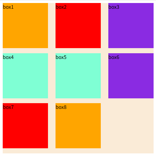
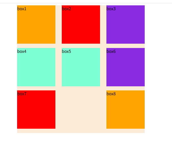
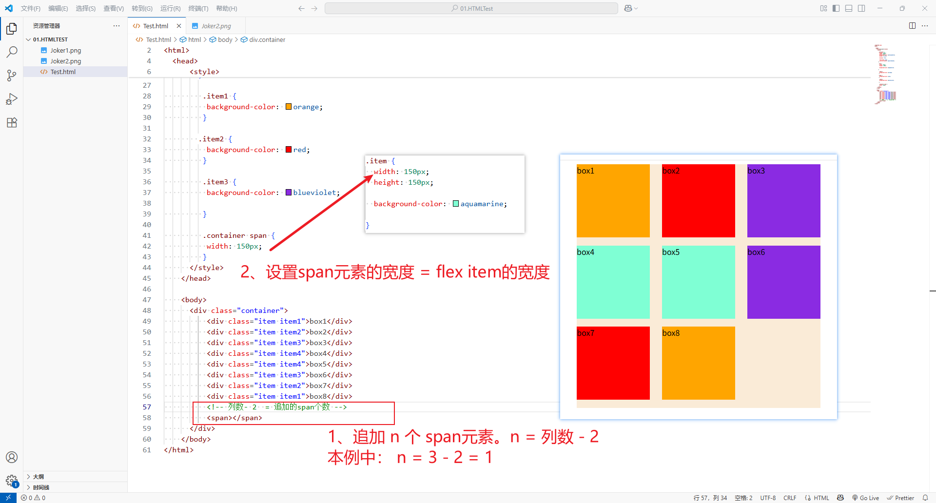
六、flex布局中使用justify-content后,最后一行的布局问题
1、问题
-
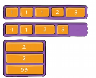
想要的结果:
-
使用
justify-content: space-between;后实际结果:
2、解决方法
- 在最后追加
n个span元素。n 的值 = 列数 - 2。 - 设置
span元素的宽度 =flex item的宽度
※ span 换成 i 元素也行。
<!DOCTYPE html>
<html><head><title>Document</title><style>.container {height: 500px;width: 500px;background-color: antiquewhite;margin: 0 auto;display: flex;flex-wrap: wrap;justify-content: space-between;}.item {width: 150px;height: 150px;background-color: aquamarine;}.item1 {background-color: orange;}.item2 {background-color: red;}.item3 {background-color: blueviolet;}.container span {width: 150px;}</style></head><body><div class="container"><div class="item item1">box1</div><div class="item item2">box2</div><div class="item item3">box3</div><div class="item item4">box4</div><div class="item item4">box5</div><div class="item item3">box6</div><div class="item item2">box7</div><div class="item item1">box8</div><!-- 列数- 2  = 追加的span个数 --><span></span></div></body>
</html>