QML开发:QML中的基本元素
文章目录
- 一、概述
- 二、可视化元素(Visual Elements)
- 2.1 基础视觉元素(常用于布局和显示)
- 2.1.1 元素 Item 的介绍和使用
- 2.1.2 元素 Rectangle 的介绍和使用
- 2.1.3 元素 Image 的介绍和使用
- 2.1.4 元素 Text 的介绍和使用
- 2.2 交互元素(用于接收用户操作)
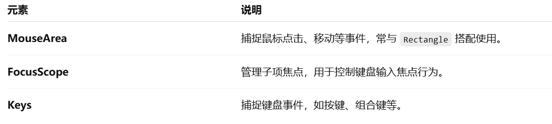
- 2.2.1 元素 MouseArea 介绍和使用
- 2.2.2 元素 FocusScope的介绍和使用
一、概述
在 QML 中,基本元素(Basic Elements) 是构建 UI 界面的核心组件。QML 采用声明式语法,通过这些元素定义界面结构、行为和交互。元素可以被分为可视化元素与非可视化元素。一个可视化元素(例如矩形框Rectangle)有着几何形状并且可以在屏幕上显示。一个非可视化元素(例如计时器Timer)提供了常用的功能,通常用于操作可视化元素。
二、可视化元素(Visual Elements)
2.1 基础视觉元素(常用于布局和显示)

2.1.1 元素 Item 的介绍和使用
在 QML 中,Item 是最基础的可视元素之一,许多其他图形元素(如 Rectangle、Image、Text 等)都直接或间接继承自 Item。它本身不绘制任何内容,但可以用于组织、布局和管理子项。
基本介绍:
Item {id: rootItemwidth: 200height: 100
}
- Item 代表一个矩形区域,它本身不可见。
- 可以包含子元素,是容器型组件。
- 具有基本的坐标属性(x, y, width, height,anchors 等)。
- 常用于组合多个组件或布局结构中。
常用属性:

常见用途:
用作容器,组织子元素
Item {width: 300; height: 100Rectangle {width: 100; height: 100; color: "red"}Rectangle {x: 120width: 100; height: 100; color: "blue"}
}
用于布局锚定
Item {width: 200; height: 200Rectangle {width: 50; height: 50; color: "green"anchors.centerIn: parent}
}
示例演示:
import QtQuick 2.15
import QtQuick.Window 2.15Window {width: 400height: 300visible: truetitle: qsTr("Item 示例")// Item 是一个无可视外观的容器Item {id: containerwidth: 300height: 200anchors.centerIn: parent// 第一个子元素Rectangle {width: 100height: 100color: "lightblue"x: 0y: 0}// 第二个子元素Rectangle {width: 100height: 100color: "lightgreen"x: 120y: 50}}
}
效果如下:

2.1.2 元素 Rectangle 的介绍和使用
Rectangle 是 QML 中最常用的可视化元素之一,用于绘制一个矩形区域。它可以设置颜色、大小、圆角、边框、渐变、阴影等属性,常用于 UI 中的背景、按钮、面板等组件。
基本语法:
Rectangle {width: 200height: 100color: "lightblue"
}
常用属性说明:

示例 1:简单矩形
Rectangle {width: 150height: 80color: "orange"
}
示例 2:带边框和圆角
Rectangle {width: 200height: 100color: "white"radius: 10border.color: "black"border.width: 2
}
示例 3:渐变背景
Rectangle {width: 200height: 100gradient: Gradient {GradientStop { position: 0.0; color: "red" }GradientStop { position: 1.0; color: "yellow" }}
}
示例 4:响应点击
Rectangle {width: 100height: 100color: "lightgray"MouseArea {anchors.fill: parentonClicked: {parent.color = "green"}}
}
2.1.3 元素 Image 的介绍和使用
Image 是 QML 中用于显示图像的元素。它继承自 Item,可以加载本地图片或网络图片,支持缩放、填充模式、异步加载、缓存等功能。
基本语法:
Image {source: "my_picture.png"width: 100height: 100
}
常用属性:

fillMode 填充模式:

示例 1:加载本地图片
Image {source: "qrc:/images/logo.png"width: 100height: 100fillMode: Image.PreserveAspectFit
}
示例 2:加载网络图片
Image {source: "https://example.com/image.jpg"asynchronous: truecache: truewidth: 200height: 150
}
示例 4:点击更换图片
Image {id: dynamicImagesource: "img1.png"width: 100height: 100MouseArea {anchors.fill: parentonClicked: {dynamicImage.source = "img2.png"}}
}
2.1.4 元素 Text 的介绍和使用
在 QML 中,Text 元素用于显示一段文本,是最基本的文字展示组件,具有强大的排版和样式能力。
基本语法:
Text {text: "Hello, QML!"font.pixelSize: 20color: "black"
}
常用属性:

wrapMode 换行模式:

示例一:显示带样式的文本
Text {text: "欢迎使用 QML!"color: "#1684DF"font.pixelSize: 24font.bold: trueanchors.centerIn: parent
}
示例二:多行文本 + 自动换行
Text {text: "这是一段很长的文本,用于测试自动换行是否有效。"width: 200wrapMode: Text.Wrap
}
示例三:超出省略显示(elide)
Text {text: "这是一个超出显示宽度的文本"width: 150elide: Text.ElideRight
}
示例四:HTML 文本支持
Text {text: "<b>加粗</b> <i>斜体</i> <font color='red'>红色</font>"textFormat: Text.RichText
}
示例五:点击文本实现交互
Text {id: clickableTexttext: "点击我"color: "blue"MouseArea {anchors.fill: parentonClicked: {clickableText.text = "你点击了我!"}}
}
2.2 交互元素(用于接收用户操作)
2.2.1 元素 MouseArea 介绍和使用
在 QML 中,MouseArea 是一个 用于处理鼠标交互的基础元素,常用于响应点击、按下、释放、移动等事件。
基本语法:
MouseArea {anchors.fill: parent   // 鼠标区域覆盖整个父项onClicked: {console.log("鼠标被点击了")}
}
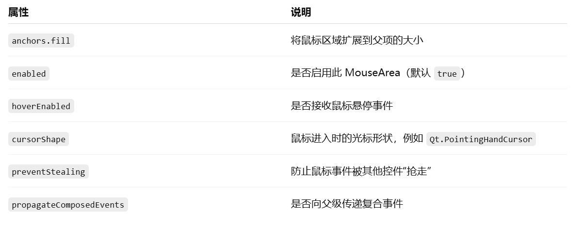
常用属性说明:
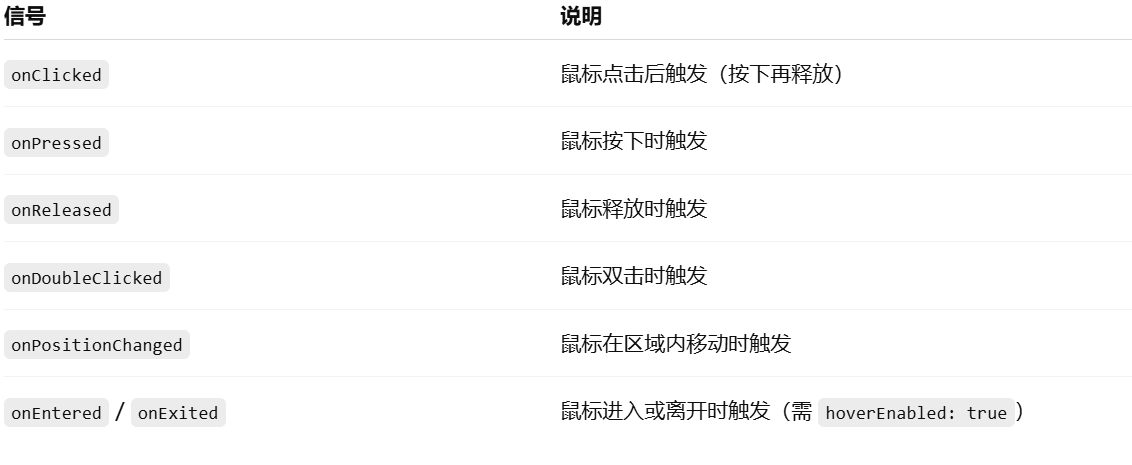
常用信号(事件):
示例:点击改变颜色
Rectangle {width: 200; height: 200color: "lightblue"MouseArea {anchors.fill: parentonClicked: {parent.color = "lightgreen"console.log("点击了矩形")}}
}
示例:悬停改变鼠标样式
Rectangle {width: 100; height: 100; color: "lightgray"MouseArea {anchors.fill: parenthoverEnabled: truecursorShape: Qt.PointingHandCursoronEntered: console.log("鼠标进入区域")onExited: console.log("鼠标离开区域")}
}
示例:获取鼠标位置
MouseArea {anchors.fill: parentonPositionChanged: {console.log("鼠标位置:", mouse.x, mouse.y)}
}
2.2.2 元素 FocusScope的介绍和使用
在 QML 中,FocusScope 是一个 专门用于组织焦点(Focus)管理的容器元素。当你在组件中有多个可以获取焦点的子项时,使用 FocusScope 可以更清晰地控制哪个子控件获取焦点,避免焦点混乱。FocusScope 继承自 Item,本身不会获得焦点,但它能确保它内部的某个元素获得焦点时,焦点不会被传递到 FocusScope 外部。
基本语法:
FocusScope {Rectangle {width: 200; height: 40; color: "lightblue"TextInput {id: input1anchors.centerIn: parentfocus: true  // 初始获得焦点}}
}
示例1:多个输入框
FocusScope {width: 300; height: 100Column {spacing: 10TextInput {id: input1width: 200; height: 30placeholderText: "输入框 1"focus: true}TextInput {id: input2width: 200; height: 30`在这里插入代码片`placeholderText: "输入框 2"}}
}
说明:这个 FocusScope 确保焦点不会传递到它之外,而是在 input1 和 input2 内部管理。
示例2:在组件中封装 FocusScope
// MyInputField.qml
FocusScope {width: 200; height: 40Rectangle {anchors.fill: parentcolor: "white"; border.color: "gray"TextInput {id: inputanchors.fill: parentanchors.margins: 4focus: true}}
}
// main.qml
Column {spacing: 20MyInputField {}MyInputField {}
}
说明:即使你复用了 MyInputField,FocusScope 也能确保每个组件内部焦点独立。
注意事项:
- 不能仅靠 focus: true 管理多个控件焦点,需要用 FocusScope 做容器。
- 使用 Keys.onPressed 等键盘事件时,焦点必须在某个 focus: true 的控件上。
- 一个组件内部只能有一个主动获取焦点的控件,多个控件都设置 focus: true 会导致焦点冲突。