python自学笔记9 Seaborn可视化
Seaborn:统计可视化利器
作为基于 Matplotlib 的高级绘图库,有一下功能:

一元特征数据
直方图
import matplotlib.pyplot as plt
import pandas as pd
import seaborn as sns # import os
# # 如果文件夹不存在,创建文件夹
# if not os.path.isdir("Figures"):
# os.makedirs("Figures")# 导入鸢尾花数据
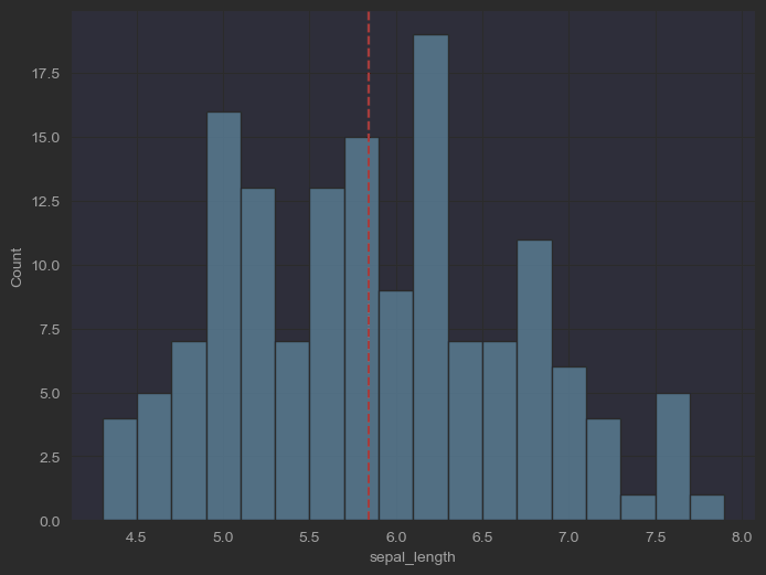
iris_sns = sns.load_dataset("iris") iris_sns# 绘制花萼长度样本数据直方图
fig, ax = plt.subplots(figsize = (8, 6))sns.histplot(data=iris_sns, x="sepal_length", binwidth=0.2, ax = ax) # 纵轴三个选择:频率、概率、概率密度ax.axvline(x = iris_sns.sepal_length.mean(), color = 'r', ls = '--') # 增加均值位置竖直参考线# 参考https://seaborn.pydata.org/tutorial/distributions.html
效果:

代码演示如下图所示:
# 绘制花萼长度样本数据直方图, 考虑鸢尾花分类
fig, ax = plt.subplots(figsize = (8,6))
sns.histplot(data = iris_sns, x="sepal_length",
hue = 'species', binwidth=0.2, ax = ax,
element="step", stat = 'density')
# 纵轴为概率密度
如果要分组的话使用如下代码:
fig, ax = plt.subplots(figsize=(8, 6))
sns.histplot(data=iris_sns,          # 数据源(DataFrame)x="sepal_length",       # 指定x轴为花萼长度hue='species',          # 按鸢尾花种类分组着色binwidth=0.2,           # 直方图条柱宽度为0.2ax=ax,                  # 指定绘图坐标轴element="step",         # 直方图样式为阶梯线stat='density'          # 纵轴显示密度而非计数
)
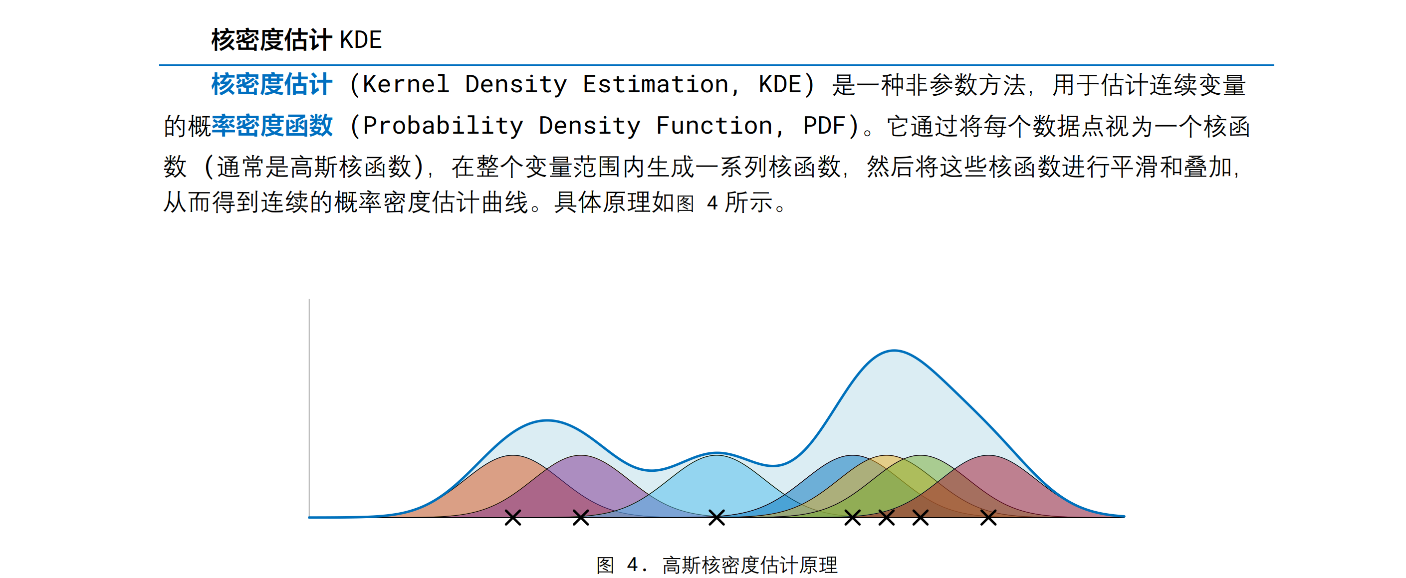
核密度估计KDE
将每个点变成一个高斯核函数(就是高斯分布的那个函数形式),然后再叠加
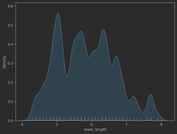
# 绘制花萼长度样本数据,高斯核密度估计
fig, ax = plt.subplots(figsize = (8,6))sns.kdeplot(data=iris_sns, x="sepal_length", 	# 生成核密度曲线bw_adjust=0.3, fill = True)			# 调整曲率,填充区域
sns.rugplot(data=iris_sns, x="sepal_length")	# 生产毛毯图(小刺)
效果:
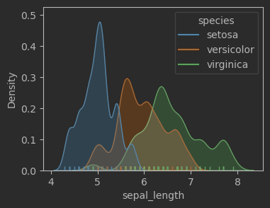
# 绘制花萼长度样本数据,高斯核密度估计,考虑鸢尾花类别
fig, ax = plt.subplots(figsize = (8,6))sns.kdeplot(data=iris_sns, x="sepal_length", hue = 'species', # 各自的分布bw_adjust=0.5, fill = True)
sns.rugplot(data=iris_sns, x="sepal_length", hue = 'species')# fig.savefig('Figures\一元,kdeplot + rugplot + hue.svg', format='svg')
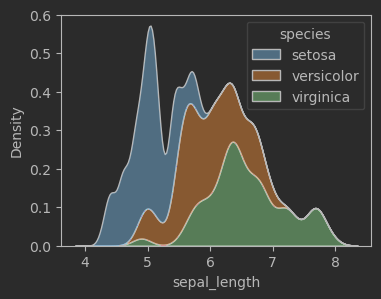
# 绘制花萼长度样本数据,高斯核密度估计,考虑鸢尾花类别,堆叠
fig, ax = plt.subplots(figsize = (8,6))sns.kdeplot(data=iris_sns, x="sepal_length", hue="species", multiple="stack", 		# 设置叠加属性bw_adjust=0.5)
效果:
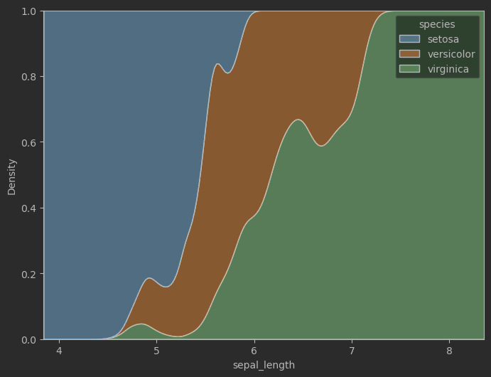
# 绘制后验概率 (成员值)fig, ax = plt.subplots(figsize = (8,6))
sns.kdeplot(data=iris_sns, x="sepal_length", hue="species", bw_adjust=0.5,multiple = 'fill')			# 设置叠加效果
效果:
分散点图/蜂群图

较小的数据使用:seaborn.stripplot() 蜂群图
较大的数据使用:seaborn.swarmplot() 分散点图
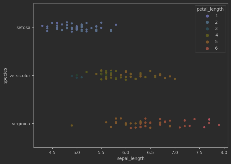
# 绘制鸢尾花花萼长度分散点图
fig, ax = plt.subplots(figsize = (8,6))
sns.stripplot(data=iris_sns, x="sepal_length", y="species", hue="petal_length", palette="RdYlBu_r", ax = ax)
效果:
# 绘制花萼长度样本数据, 蜂群图
fig, ax = plt.subplots(figsize = (8,4))
sns.swarmplot(data=iris_sns, x="sepal_length", ax = ax)
# 绘制花萼长度样本数据, 蜂群图, 考虑分类
fig, ax = plt.subplots(figsize = (8,4))
sns.swarmplot(data=iris_sns, x="sepal_length", y = 'species',
hue = 'species', ax = ax)
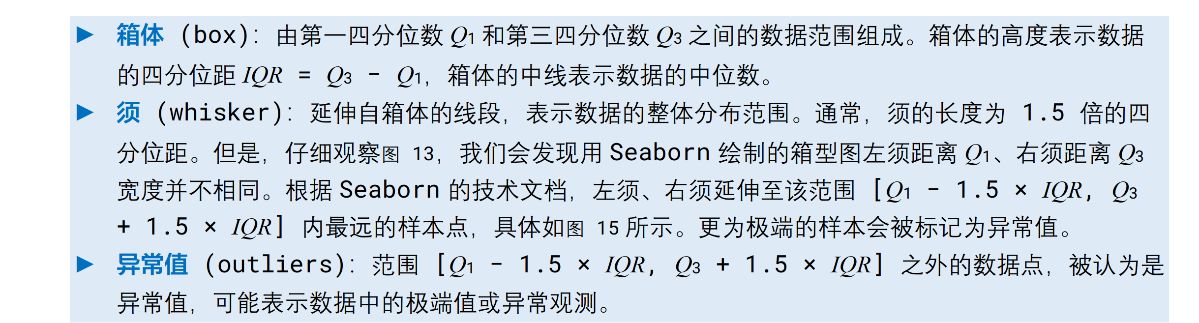
箱型图
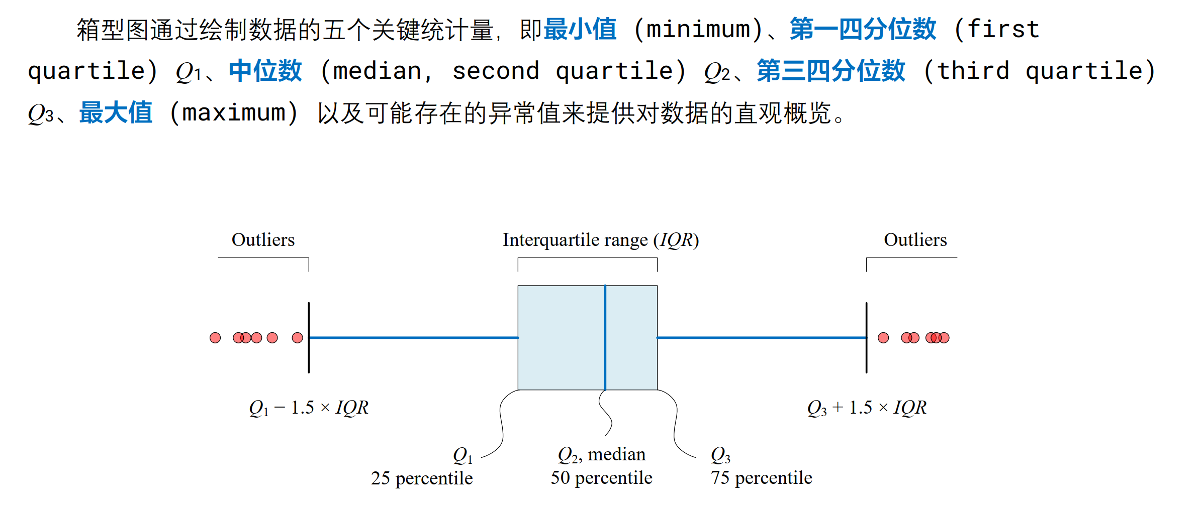
包含元素:
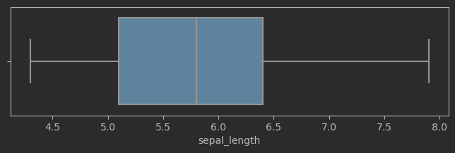
# 绘制鸢尾花花萼长度箱型图
fig, ax = plt.subplots(figsize = (8,2))
sns.boxplot(data=iris_sns, x="sepal_length", ax = ax)
效果:
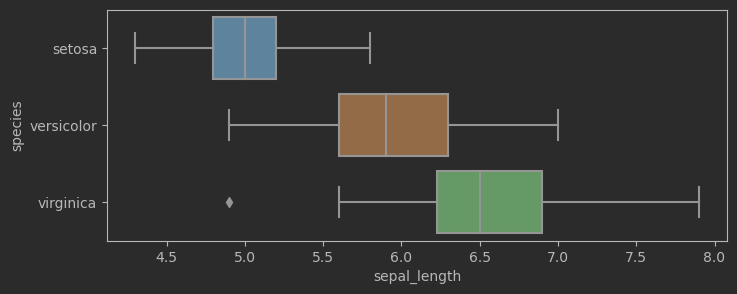
# 绘制鸢尾花花萼长度箱型图,考虑鸢尾花分类
fig, ax = plt.subplots(figsize = (8,3))
sns.boxplot(data=iris_sns, x="sepal_length", y = 'species', ax = ax)
效果:
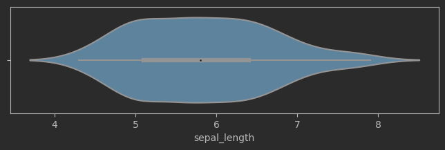
小提琴图
可以看成用核密度曲线优化的箱线图
# 绘制花萼长度样本数据,小提琴图
fig, ax = plt.subplots(figsize = (8,2))
sns.violinplot(data=iris_sns, x="sepal_length", ax = ax)
效果:
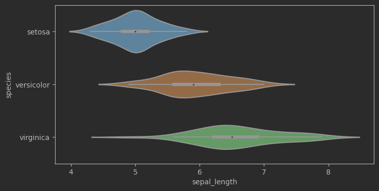
# 绘制花萼长度样本数据,小提琴图,考虑分类
fig, ax = plt.subplots(figsize = (8,4))
sns.violinplot(data=iris_sns, x="sepal_length", y="species", ax = ax)
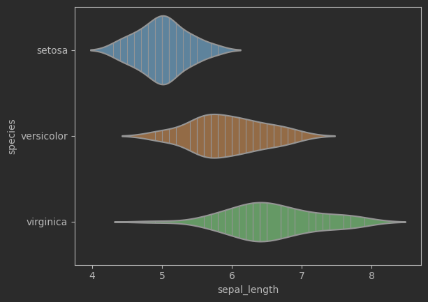
sns.violinplot(data=iris_sns, x="sepal_length", y="species", inner = 'stick')
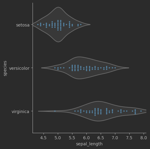
# 蜂群图 + 小提琴图,考虑鸢尾花分类sns.catplot(data=iris_sns, x="sepal_length", y="species", kind="violin", color=".9", inner=None)sns.swarmplot(data=iris_sns, x="sepal_length", y="species", size=3)
二元特征数据
散点图
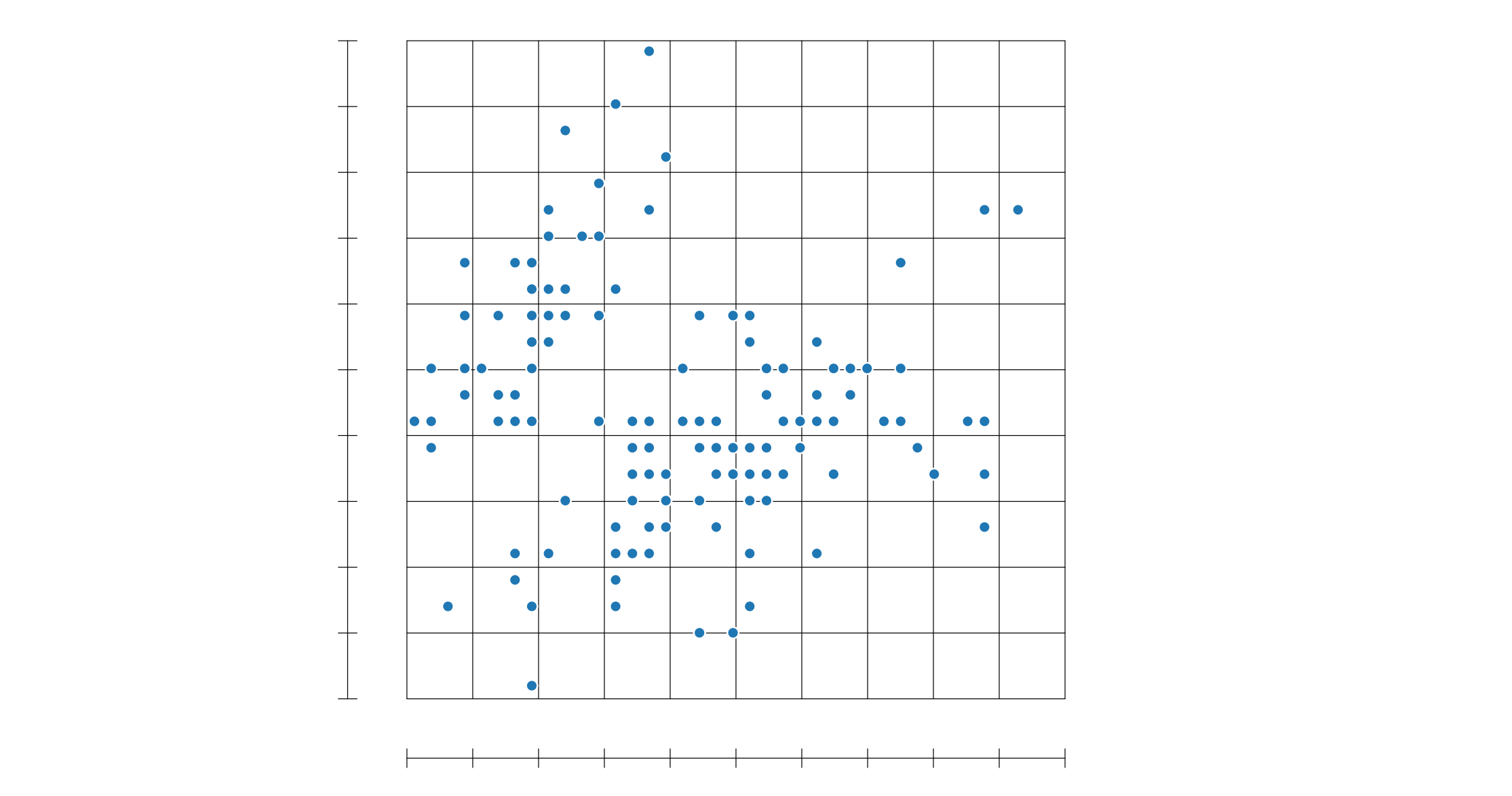
通过散点图可以简要查看两个维度是否有何关系
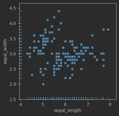
# 鸢尾花散点图 + 毛毯图
fig, ax = plt.subplots(figsize = (4,4))sns.scatterplot(data=iris_sns, x="sepal_length", y="sepal_width")
sns.rugplot(data=iris_sns, x="sepal_length", y="sepal_width")
效果:
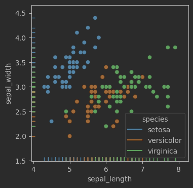
fig, ax = plt.subplots(figsize = (4,4))sns.scatterplot(data=iris_sns, x="sepal_length", y="sepal_width", hue = 'species')
sns.rugplot(data=iris_sns, x="sepal_length", y="sepal_width", hue = 'species')fig.savefig('Figures\二元,scatterplot + rugplot + hue.svg', format='svg')
效果:
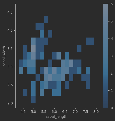
二元直方热图
二维散点图转化为直方图后效果并不清晰

因此采用二维热力图:
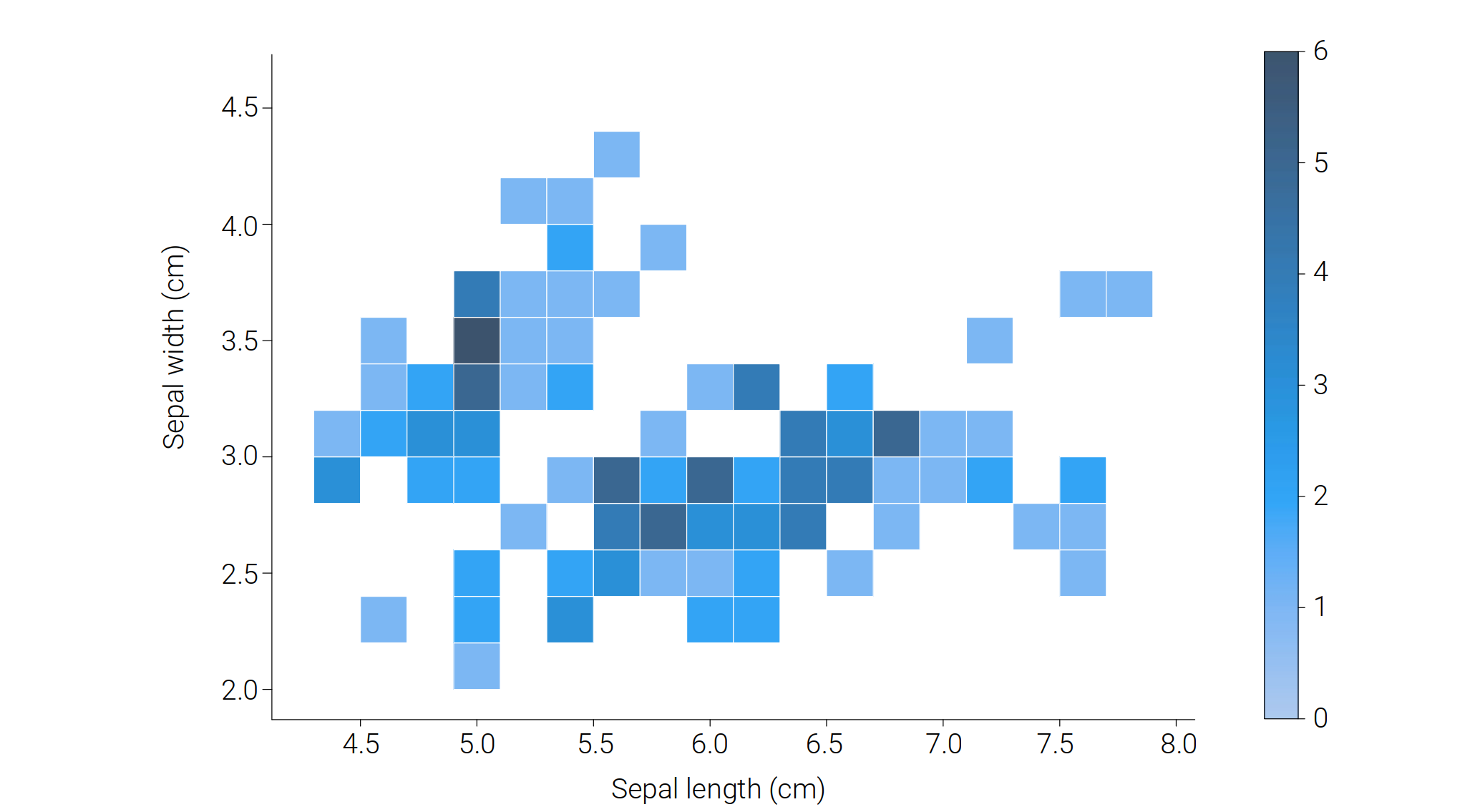
# 鸢尾花二元频率直方热图sns.displot(data=iris_sns, x="sepal_length", y="sepal_width", binwidth=(0.2, 0.2), cbar=True)
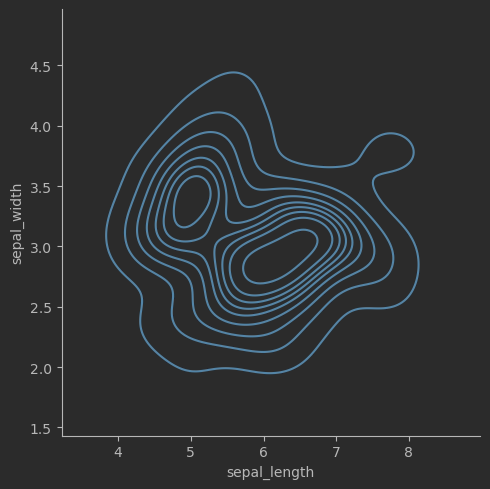
联合分布 KDE
使用高斯核函数可以估算联合分布,这样的联合分布可以用等高线图表示。
# 联合分布概率密度等高线
sns.displot(data=iris_sns, x="sepal_length", y="sepal_width", kind="kde")
效果:
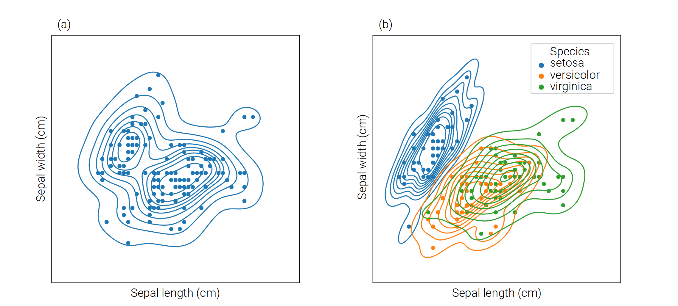
# 联合分布概率密度等高线,考虑分布
sns.kdeplot(data=iris_sns, x="sepal_length", y="sepal_width", hue = 'species')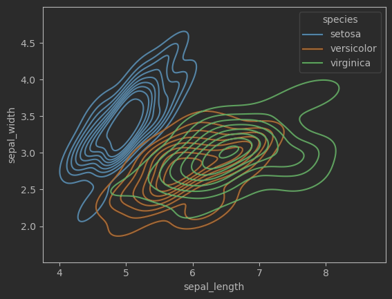
联合分布+边缘分布
看图即可懂:
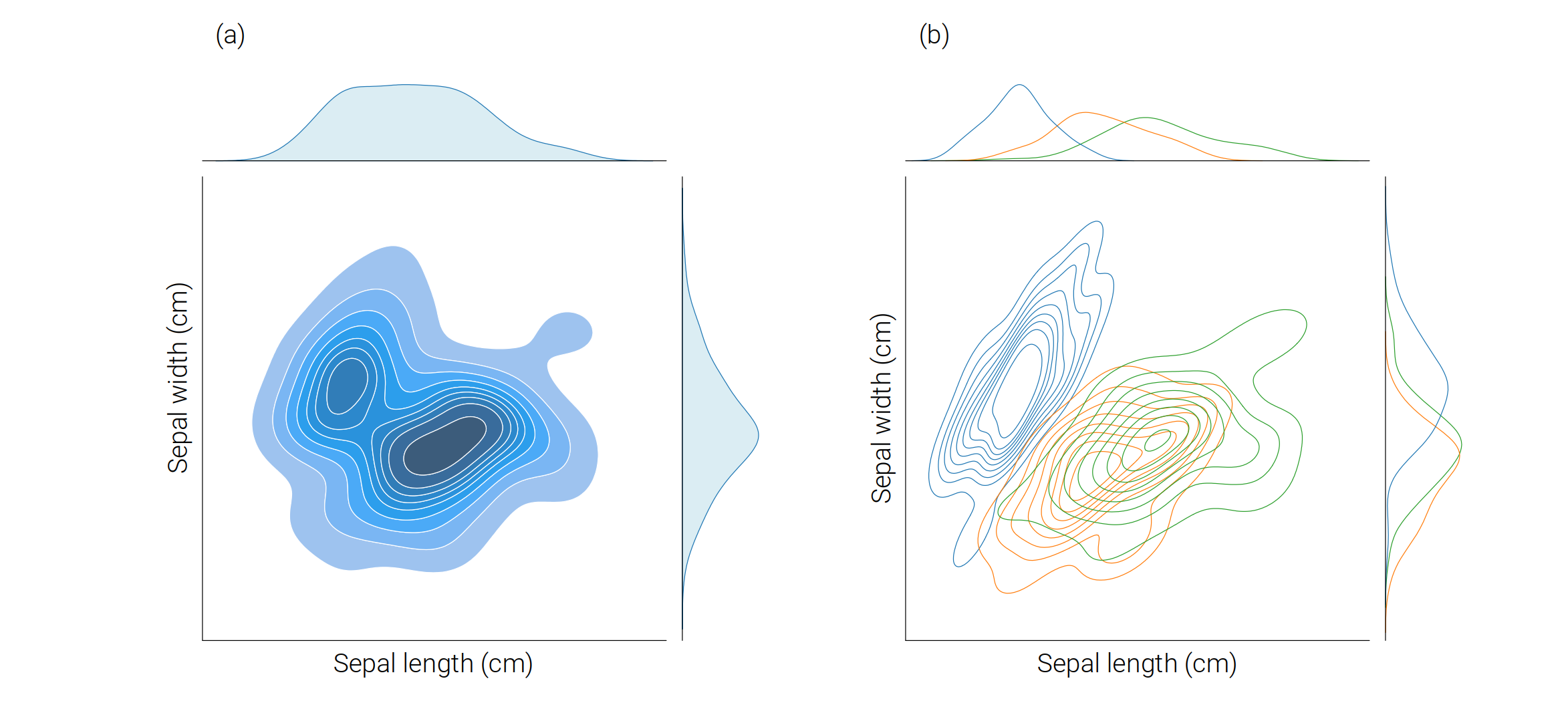
# 联合分布、边缘分布
sns.jointplot(data=iris_sns, x="sepal_length", y="sepal_width", kind = 'kde', fill = True)
这里仅放示范代码,其他代码查看附件。
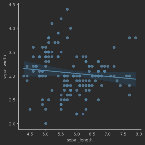
线性回归
# 可视化线性回归关系
sns.lmplot(data=iris_sns, x="sepal_length", y="sepal_width")
效果:
多元特征数据
可以用一元可视化方案展现多元特诊
首先将宽格式转化为长格式。
原来的宽格式:

iris_melt = pd.melt(iris_sns, "species", var_name="measurement")
iris_melt
通过代码结果可以查看长数据:

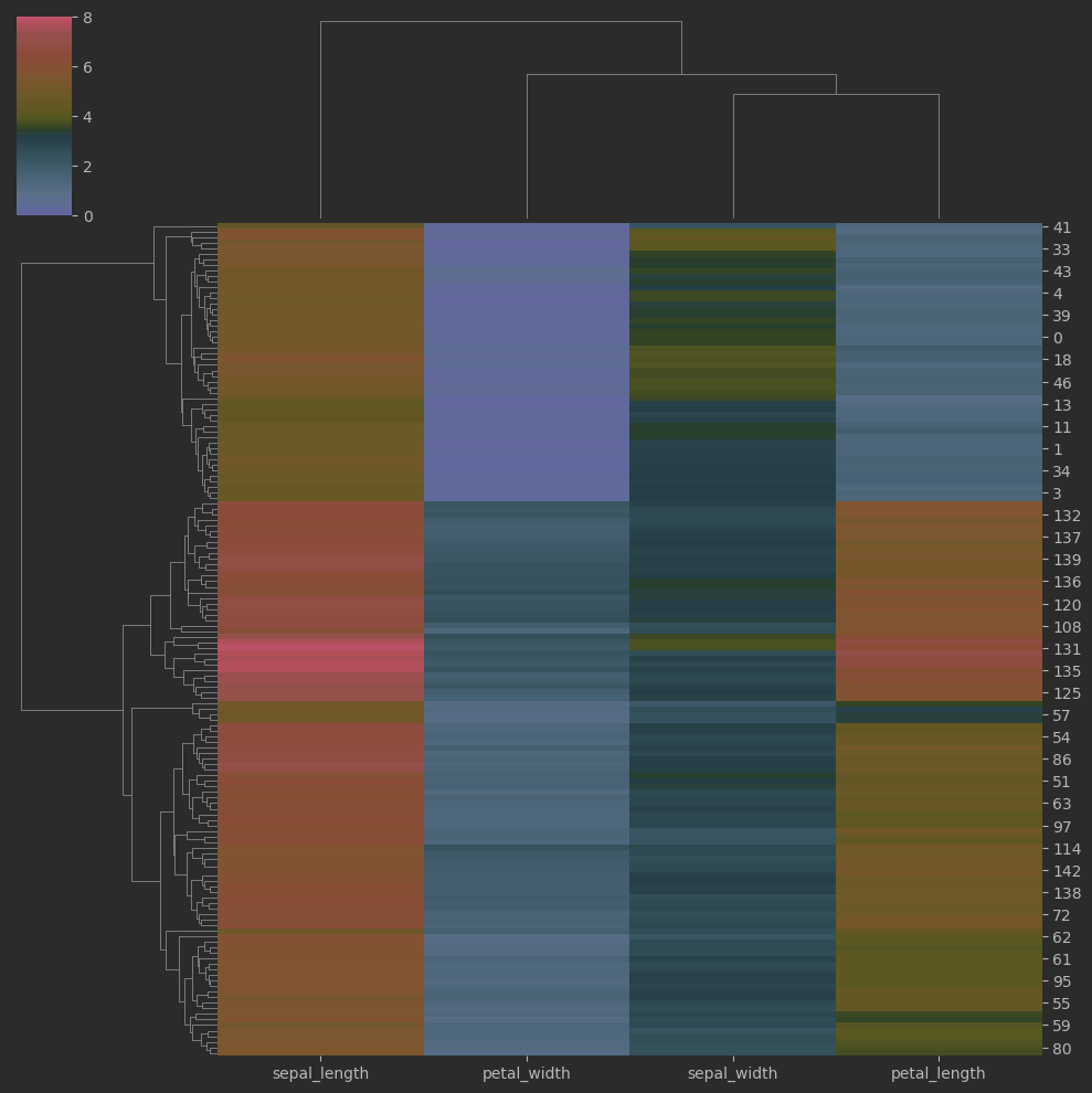
聚类热图
# 聚类热图
sns.clustermap(iris_sns.iloc[:,:-1], cmap = 'RdYlBu_r', vmin = 0, vmax = 8)
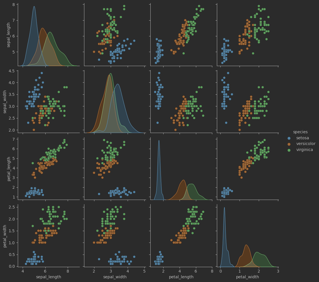
成对特征散点图
sns.pairplot(iris_sns)
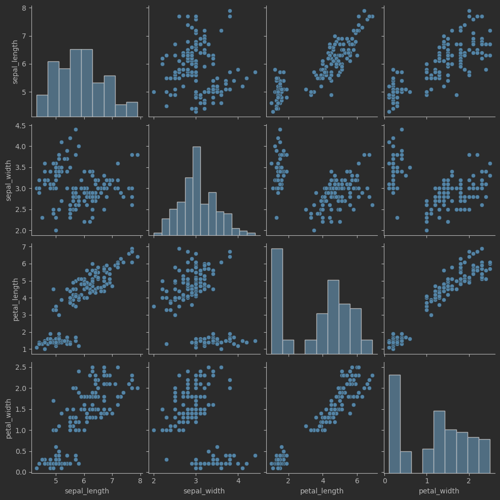
# 绘制成对特征散点图
sns.pairplot(iris_sns, hue = 'species')
效果:
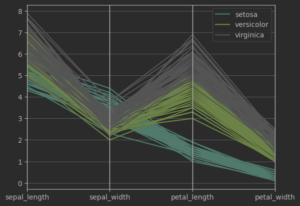
平行坐标图
from pandas.plotting import parallel_coordinates
# 可视化函数来自pandas
parallel_coordinates(iris_sns, 'species', colormap=plt.get_cmap("Set2"))
plt.show()