机器学习sklearn:聚类
分成聚合和分类,无监督学习。相似的为一类可以方便地对图像进行压缩
一、四簇分成三簇
1、生成四簇
from sklearn.datasets import make_blobs
import matplotlib.pyplot as plt
#创建数据集,n_features代表是二维
X, y = make_blobs(n_samples=500,n_features=2,centers=4,random_state=1)  # X是坐标,y是标签
fig, ax1 = plt.subplots(1)  # 创建图形和子图
ax1.scatter(X[:, 0], X[:, 1]    # 横纵坐标,marker='o' #点的形状,s=8 #点的大小)
plt.show()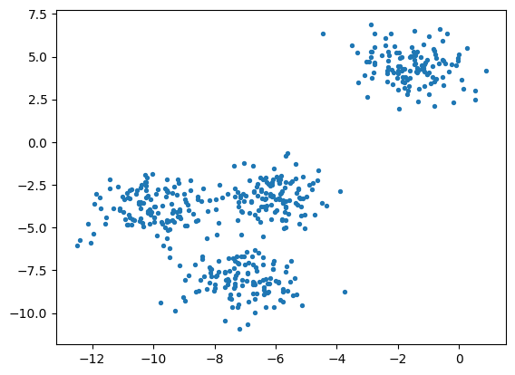
2、四簇标出来
color = ["red","pink","orange","gray"]
fig, ax1 = plt.subplots(1)
for i in range(4):ax1.scatter(X[y==i, 0], X[y==i, 1]  # y是标签,按照标签进行分,marker='o' #点的形状,s=8 #点的大小,c=color[i])
plt.show()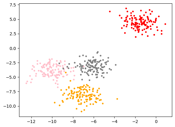
3、使用KMeans将四簇聚合为三簇
from sklearn.cluster import KMeans
n_clusters = 3
cluster = KMeans(n_clusters=n_clusters, random_state=0).fit(X)  # 对每个样本进行预测
y_pred = cluster.labels_
y_pred  # 聚类后每个样本的所属簇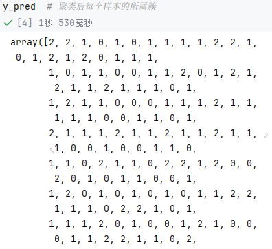
--这里KMeans中的labels_和fit_predict是等效的,毕竟都是那些数据生成的
pre = cluster.fit_predict(X)
pre == y_pred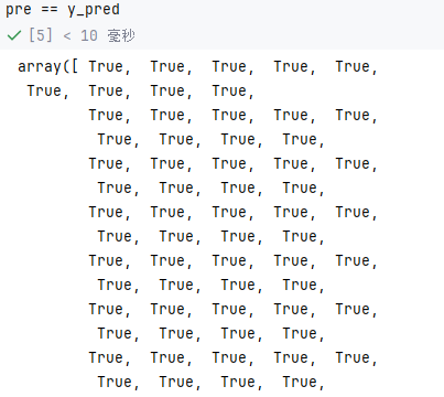
-- 可以查看簇心
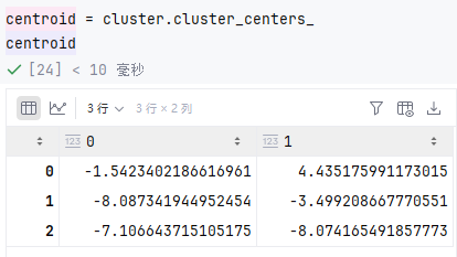
-- 簇心平方和越小越好
inertia = cluster.inertia_  # 样本到簇心平方和,越小越好
inertia
4、将这聚合的三簇和簇心画出来
# 画出分类和簇心
color = ["red","pink","orange","gray"]
fig, ax1 = plt.subplots(1)
for i in range(n_clusters):ax1.scatter(X[y_pred==i, 0], X[y_pred==i, 1],marker='o',s=8,c=color[i])
ax1.scatter(centroid[:,0],centroid[:,1]
,marker="x"
,s=15
,c="black")
plt.show()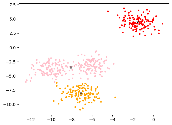
5、聚合效果评判
轮廓系数越接近1越好
# 轮廓系数,接近1最好
from sklearn.metrics import silhouette_score
from sklearn.metrics import silhouette_samplessilhouette_score(X,y_pred)
calinski_harabasz_score越大越好
# 越大越好
from sklearn.metrics import calinski_harabasz_score
X
y_pred
calinski_harabasz_score(X, y_pred)
二、样例:画出轮廓系数图和聚类分布图
from sklearn.cluster import KMeans
from sklearn.metrics import silhouette_samples, silhouette_score
import matplotlib.pyplot as plt
import matplotlib.cm as cm
import numpy as np
n_clusters = 4# 画布设置
fig, (ax1, ax2) = plt.subplots(1, 2)    # ax1是轮廓图
fig.set_size_inches(18, 7)
ax1.set_xlim([-0.1, 1])
ax1.set_ylim([0, X.shape[0] + (n_clusters + 1) * 10])# 聚类算法
clusterer = KMeans(n_clusters=n_clusters, random_state=10).fit(X)
cluster_labels = clusterer.labels_
silhouette_avg = silhouette_score(X, cluster_labels)    # 轮廓系数平均值(大于0.5才好,小于0.2就没有明显聚类结构)
print("For n_clusters =", n_clusters,
"The average silhouette_score is :", silhouette_avg)
sample_silhouette_values = silhouette_samples(X, cluster_labels)    # 每个样本的轮廓系数,X依旧是上面人造数据# 画出左侧轮廓图
y_lower = 10
# 遍历每个簇
for i in range(n_clusters):ith_cluster_silhouette_values = sample_silhouette_values[cluster_labels == i]   # 当前簇的全部轮廓系数ith_cluster_silhouette_values.sort()    # 排序size_cluster_i = ith_cluster_silhouette_values.shape[0] # 当前簇的样本数,确定图像高度y_upper = y_lower + size_cluster_i  # y轴范围color = cm.nipy_spectral(float(i)/n_clusters)   # 一个簇一个颜色ax1.fill_betweenx(np.arange(y_lower, y_upper),ith_cluster_silhouette_values,facecolor=color,alpha=0.7)   # 画这个簇的条形图ax1.text(-0.05, y_lower + 0.5 * size_cluster_i, str(i))y_lower = y_upper + 10ax1.set_title("The silhouette plot for the various clusters.")
ax1.set_xlabel("The silhouette coefficient values")
ax1.set_ylabel("Cluster label")
ax1.axvline(x=silhouette_avg, color="red", linestyle="--")
ax1.set_yticks([])
ax1.set_xticks([-0.1, 0, 0.2, 0.4, 0.6, 0.8, 1])
colors = cm.nipy_spectral(cluster_labels.astype(float) / n_clusters)# 右侧数据分布图
ax2.scatter(X[:, 0], X[:, 1],marker='o',s=8,c=colors)
centers = clusterer.cluster_centers_
# Draw white circles at cluster centers
ax2.scatter(centers[:, 0], centers[:, 1], marker='x',
c="red", alpha=1, s=200)
ax2.set_title("The visualization of the clustered data.")
ax2.set_xlabel("Feature space for the 1st feature")
ax2.set_ylabel("Feature space for the 2nd feature")
plt.suptitle(("Silhouette analysis for KMeans clustering on sample data "
"with n_clusters = %d" % n_clusters),
fontsize=14, fontweight='bold')
plt.show()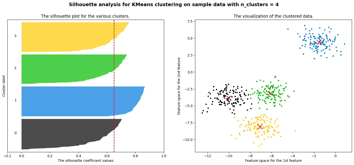
三、用聚类实现图像的压缩
概述:就是颜色相近的簇一块,相似的用同一种颜色表示
使用图像:
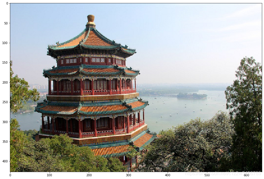
1、加载图像
import numpy as np
import matplotlib.pyplot as plt
from sklearn.cluster import KMeans
from sklearn.metrics import pairwise_distances_argmin
from sklearn.datasets import load_sample_image
from sklearn.utils import shuffle
import pandas as pdchina = load_sample_image("china.jpg")
newimage = china.reshape((427 * 640,3)) # 降维为2D
plt.figure(figsize=(15,15))
plt.imshow(china)
2、图像预处理:归一化和降维
n_clusters = 64
china = np.array(china, dtype=np.float64) / china.max()     # 像素归一化
w, h, d = original_shape = tuple(china.shape)       # 宽高,d是通道数
assert d == 3   # 确认是rgb三通道
image_array = np.reshape(china, (w * h, d))     # 将像素点rgb值,变成有对应的特征,给china降维成二维
3、使用Kmeans压缩
# 抽部分聚类再拓展全图这样比直接簇成64更快
image_array_sample = shuffle(image_array, random_state=0)[:1000]    # 随机抽1000个
kmeans = KMeans(n_clusters=64, random_state=0).fit(image_array_sample)      ## 聚成64色
labels = kmeans.predict(image_array)        # 全图簇都簇成这64色
# 全图变成簇心
image_kmeans = image_array.copy()
for i in range(w*h):image_kmeans[i] = kmeans.cluster_centers_[labels[i]]
image_kmeans
pd.DataFrame(image_kmeans).drop_duplicates().shape
image_kmeans = image_kmeans.reshape(w,h,d)  # 恢复三维
image_kmeans.shape
4、弄了一个按照距离来进行计算的压缩做对比
# 这是随机选择初始簇中心的方案(用作和Kmenas比较),这个按距离算的肯定比不过kmanes按颜色算的!
centroid_random = shuffle(image_array, random_state=0)[:n_clusters]
labels_random = pairwise_distances_argmin(centroid_random,image_array,axis=0)
labels_random.shape
len(set(labels_random))
image_random = image_array.copy()
for i in range(w*h):image_random[i] = centroid_random[labels_random[i]]
image_random = image_random.reshape(w,h,d)
image_random.shape
5、使用matplotlib画出三个图片对比
plt.figure(figsize=(10,10))
plt.axis('off')
plt.title('Original image (96,615 colors)')
plt.imshow(china)   # 原图
plt.figure(figsize=(10,10))
plt.axis('off')
plt.title('Quantized image (64 colors, K-Means)')
plt.imshow(image_kmeans)    # 用Kmeans的
plt.figure(figsize=(10,10))
plt.axis('off')
plt.title('Quantized image (64 colors, Random)')
plt.imshow(image_random)    # 随机初始簇中心的
plt.show()
四、补充
KMeans中的参数max_iter可以控制单次运行的迭代次数