【自制组件库】从零到一实现属于自己的 Vue3 组件库!!!
文章目录
- 初始化项目
- 项目搭建
- 建立UI组件包
- 组件包调用
- 演示库构建
- 组件配置
- 创建组件
- 导出组件
- 按需加载导出
- 全局加载导出
- 演示库测试
- 原理说明😵💫
- 样式配置
- BEM命名规则
- 定义命名空间
- 定义block
- 定义element
- 定义modifer
- 定义is方法生成类名
- 定义主题
- button组件
- 默认样式
- 背景颜色处理
- 圆角状态
- 禁用效果
- hover效果
- text效果
- link按钮
- block效果
- border按钮
- size效果
- 圆形按钮
- 图标效果
- loading效果
- loading效果业务处理
- 点击事件
- 插槽效果
- 按钮组
- 编写样式
- size属性处理
初始化项目
项目准备:node >=19、pnpm >=8
项目搭建
介绍:初始化UI组件库是为了更好的管理文件模块的目录结构,区分不同文件模块的功能。
UI组件库将使用pnpm+workspace来搭建,为了统一管理UI组件库的文件,可任意选择一个磁盘新建文件夹并自定义命名为ui-library,
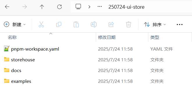
手动创建一个项目文件夹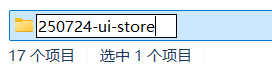 作为UI组件库的“根”目录,然后在目录下手动新建以下3个文件夹:
- storehouse:存放所有组件
- examples:演示库(仅用于开发环境调试)
- docs:使用vitepress构建的组件库说明文档
在根目录中使用pnpm init初始化项目结构,然后可以对应的修改生成package.json中的name属性。
之后在手动创建pnpm-workspace.yaml配置文件,从workspace工作区中指定需要包含的目录(也就是storehouse、example和docs三个目录),并且在配置文件中写入一下代码:
packages:- examples/*- docs- storehouse/*
建立UI组件包
UI组件库的所有组件以及和组件相关的业务都放在 storehouse目录,如components 组件包、utils工 具包、hooks钩子函数包等等,因此需要单独建立文件夹并在每个目录下初始化package.json文件声明为
NPM包,视为独立的“包”来应用。
我们先创建一个components 目录,并且在该目录下执行pnpm init生成初始化package.json文件,并将文件name属性自定义为@ui-name/components(@ui-store可以改成随意的名字)
{"name": "@ZUI/components","version": "1.0.0","description": "","main": "index.js","scripts": {"test": "echo \"Error: no test specified\" && exit 1"},"keywords": [],"author": "","license": "ISC","packageManager": "pnpm@10.12.4"
}
以此类推创建utils工 具包、hook钩子函数包,并且要注意分别修改他们的package.json文件name属性
"name": "@ZUI/utils",
"name": "@ZUI/hooks",
组件包调用
packages目录下的每个文件夹通过 pnpm init指令 创建了 packagejson 文件,已经变成了独立的包,要使每个包可以相互调用,只需要在根目录下安装依赖即可。
回到根目录,在终端执行以下指令,便可安装依赖。
pnpm i @ui-name/components --w
pnpm i @ui-name/utils --w
pnpm i @ui-name/hooks --w
我使用以上👆指令一直安装不成功,然后换了以下👇指令,使用
workspace:*协议安装pnpm add @ui-name/components@workspace:* --w pnpm add @ui-name/utils@workspace:* --w pnpm add @ui-name/hooks@workspace:* --w
命令台中出现以下👇字样就说明安装依赖成功了:
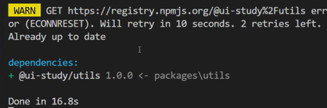
安装完成后便可在根目录的packags.json 文件的 dependencies 属性中查看已安装的包,根目录中也生成了node_modeuls依赖包文件夹。
演示库构建
演示库本质上就是一个Vue项目,所以我们在example目录中构建一个vite项目。
使用npm create vite@latest 项目名称创建项目
vite项目构建完之后,回到根目录使用pnpm install安装依赖,最后安装完成后启动项目npm run dev。
(然后也可以清理一下vite项目不需要的代码,这里就不再说明啦~)
组件配置
创建组件
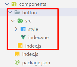
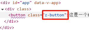
storehome是UI组件库的整个包,该目录已经建立了components目录,也就是放置所有组件的目录。
构建button组件,即是在components目录下建立button文件夹。
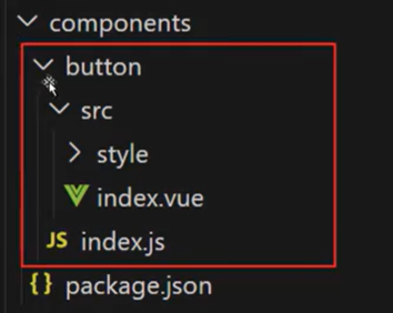
图中红框是button组件的基础结构:
-
button目录是组件的根目录; -
index.js是访问button组件的入口文件; -
src目录下的index.vue文件是button组件的UI渲染文件;<template><button>这是一个button按钮</button> </template><script> export default {name: "z-button", }; </script><style></style> -
style目录是button组件的样式文件;
注意⚠
index.vue代码定义了button组件的name为“z-button”,其中的“z-”是组件前缀。前缀是为了避免命名冲突和提高代码可读性,如同ElementPlus的“el-”、AntDesign的“a-”。所以UI组件库的前缀可以自定义,但是一定要统一。
导出组件
按需加载导出
组件导出可以在项目中多次使用,减少重复编写代码的工作量,有助于模块化开发,提高项目的可维护性和可扩展性。同时也可以将特定功能或界面的实现细节封装起来,使其他开发人也可以直接使用组件而不必关心内部实现细节。因此,我们只需要将src/index.vue文件中引入index.js并使用export defult导出并提供按需加载的方式。
在utils库中新建一个install.js,创建一个安装库的方法:
export const componentInstall = (com) => {com.install = (app) => {app.component(com.name, com);};return com;
};
这段代码定义了一个 Vue 组件动态安装工具函数,用于为组件对象自动注入
install方法,使其支持通过app.use()全局注册。
然后还要在utils目录下新建一个index.js用来导出utils目录下的所有方法
/*** utils导出文件*/
export * from "./install"
在button项目中加载组件:
button/index.js
import { componentInstall } from "@ZUI/utils"
// 导入组件
import Button from "./src/index.vue"
// 提供按需加载的方式
export const ZButton = componentInstall(Button)
// 提供全局加载的方式
export default ZButton
在components目录中新建一个index.js用于暴露所写的组件:
/*** components暴露所有组件*/
export * from "./button"
全局加载导出
全局加载导出组件同样是将所有组件,使用循环的方式批量注册组件。
在storehouse目录下新建一个storehouse.js组件,并且导入所写好的组件:
import { ZButton } from "./components/button/index.js"export default [ ZButton ]
这里说明一下这两个文件的作用:
components/index.js收集所有按需导出的组件。storehouse.js收集需要全局注册的组件列表。
继续在这个目录下新建一个index.js,这个文件用来当作组件库的入口。
/*** 组件库入口*/// 按需加载
export * from "./components/index"// 全局注册
import components from "./components.js";
// 全局加载
const install = function (app) {// 判断是否加载if (install.installed) return;// 批量加载组件components.forEach((c) => app.use(c));
};
export default install;
实现流程:
- packages 目录下新建
components.js文件,将 button 组件引入,然后使用Array数组将button组件导出。 - 将components.js文件引入到
packages/index.js文件中,然后定义函数install并定义app作为参数接收 Vue3.js 实例对象注册所有组件。 - 优先判断
installinstalled是否已安装,如果已安装,则return,反之使用forEach方法循环数据并调用app.use对象注册组件。 - 最后便是使用
export default导出函数install。
⚠:其中要注意的是,
packages/index.js文件同时导出了按需加载的组件,这是因为组件库无论是“按需加载”还是“全局注册”都是通过packages/index.js作为入口打包所有组件,因此需要在该文件中导出按需加载的组件。
演示库测试
全局注册
到演示项目当中的main.js中全局注册组件
基本语法:
import 名称随便定义 from "./storehouse/index的路径"app.use(名称随便定义)
示例:
import { createApp } from "vue";
import App from "./App.vue";
// 全局注册组件库
import ZUI from "../../../storehouse/index";const app = createApp(App);
app.use(ZUI);
app.mount("#app");
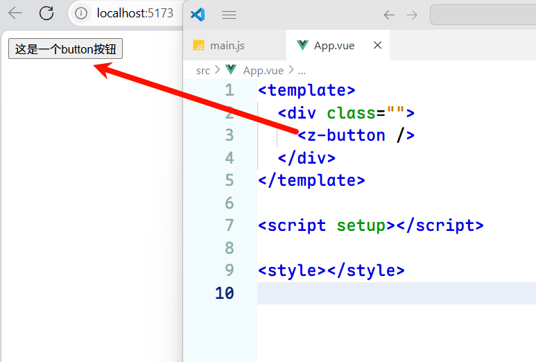
在App.vue中使用新建的组件:
<template><div class=""><z-button /></div>
</template><script setup></script><style></style>
此时我们就可以发现渲染出来了🎉😄
按需加载
按需加载是使用支持 ES Modules 方法引入的组件,好处在于按需加载的方式可以减小项目的体积,提升性能。
<template><div class=""><z-button /></div>
</template><script setup>
// 按需加载
import { ZButton } from "../../../storehouse/index";
// 也可以使用workspace别名机制
// import { ZButton } from "@ZUI/components";
</script><style></style>
⭕:因为目前我们还没有打包发布,所以只能使用
相对地址的方式。import { ZButton } from "../../../storehouse/index";当然也可以使用workspace别名机制
import { ZButton } from "@ZUI/components";
原理说明😵💫
按需加载
实现全流程:
-
组件定义
<template><button>这是一个button按钮</button> </template><script> export default {name: "z-button", }; </script><style></style> -
通过install工具包装
/*** 定义了一个 Vue 组件动态安装工具函数 * @param {*} com 组件* @returns 组件*/ export const componentInstall = (com) => {// 给组件添加install方法com.install = (app) => {// 在install方法中注册组件app.component(com.name, com);};return com; }; -
单个组件导出
/*** botton组件* storehouse/components/button/index.js*/import { componentInstall } from "@ZUI/utils" // 导入组件 import Button from "./src/index.vue" // 提供按需加载的方式 export const ZButton = componentInstall(Button) -
所有组件聚合导出
/*** components暴露所有组件* storehouse/components/index.js*/ export * from "./button" -
组件库入口暴露
/*** 组件库入口* storehouse/index.js*/// 按需加载 export * from "./components/index" -
项目按需导入
<script setup>
// 按需加载
import { ZButton } from "../../../storehouse/index";
</script>
在这里中,最重要的就是utils目录中的componentInstall方法了。这是一个高阶函数,接受一个Vue组件对象,为组件添加install方法,使其可以被app.use()安装。
当调用componentInstall(Button)时:
// 原始Button组件
const Button = { name: 'z-button', /* 其他组件选项 */ }// 经过componentInstall处理后
Button = {name: 'z-button',install(app) {app.component('z-button', Button)}// ...其他原有属性
}
详见可查看官方文档:
app.component():应用实例 API | Vue.js组件注册:组件注册 | Vue.js
全局加载
实现全流程:
-
组件预处理 → 2. 组件集中注册 → 3. 暴露全局安装方法 → 4. 项目全局注册
-
组件预处理
/*** 定义了一个 Vue 组件动态安装工具函数 * @param {*} com 组件* @returns 组件*/ export const componentInstall = (com) => {// 给组件添加install方法com.install = (app) => {// 在install方法中注册组件app.component(com.name, com);};return com; }; -
单个组件导出
/*** botton组件* storehouse/components/button/index.js*/import { componentInstall } from "@ZUI/utils" // 导入组件 import Button from "./src/index.vue" // 提供按需加载的方式 export const ZButton = componentInstall(Button) // 提供全局加载的方式 export default ZButton -
组件集中管理
/*** 组件集中管理* storehouse/index.js*/ import { ZButton } from "./components/button/index.js"export default [ ZButton ] -
全局安装入口
/*** 组件库入口* storehouse/index.js*/// 全局注册 import components from "./storehouse.js"; // 全局加载 const install = function (app) {// 判断是否加载if (install.installed) return;// 批量加载组件components.forEach((c) => app.use(c)); }; export default install; -
项目全局引入
import { createApp } from 'vue'
import App from './App.vue'
import ZUI from '@ZUI'  // 全局导入const app = createApp(App)
app.use(ZUI)  // 全局注册  // 这里会触发install方法
app.mount('#app')
参考文档:
app.use():应用实例 API | Vue.js
样式配置
BEM命名规则
BEM是由Yandex团队提出的一种CSS命名方法论,即Block(块)、Element(元素)、和Modifier(修改器)的简称,是OOCSS方法论的一种实现模式,底层仍然是面向对象的思想。
下面我们以Tabs组件为例,讲解BEM的使用方法用核心思想。
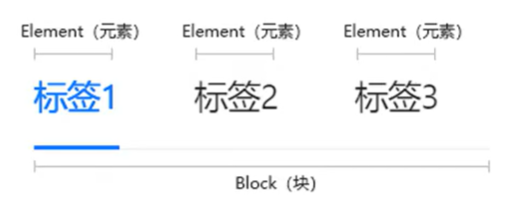
Tabs是一个完整的组件,也就是一个模块Block(块),classname名称定义为:a-tabs。Block代表一个逻辑或功能独立的组件,是结构、表现和行为的整体。其中每个切换的标签就是一个Element(元素),classname名称定义为:a-tabs_item。Element(元素)可以理解为Block(块)里面的元素。Modifier(修改器)用于描述一个Block或者Element的表现或者行为,那么就需要通过Modifier(修改器)。
Modifier(修改器)只能作用于Block(块)或者Element(元素),Modifier(修改器)是不能单独存在的。
总结:
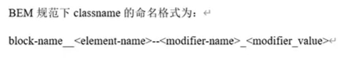
- 所有组件的命名均使用
小写字母,复合词使用连字符连接。 - Block 与 Element之间使用
双下划线连接。 - Modifier 与 Block\Element 使用
双中横杠连接。 - modifier-name 与 modifer_value 之间使用
单下划线连接。
定义命名空间
在hooks目录中新建一个index.js把所有方法暴露出去。新建一个文件夹use-namespace,里面新建index.js:
/*** BEM命名规范hooks* 提供默认命名空间和相关的BEM命名方法*/// 默认命名空间前缀
export const defaultNamespace = 'z';// 命名空间相关方法
export const useNamespace = () => {const namespace = defaultNamespace// block// element//attrreturn {namespace}
}
暴露到hooks/index.js中
export * from "./use-namespace/index"
然后在button组件的index.vue中引入方法
import { useNamespace } from "@ZUI/hooks"
const ns = useNamespace()
<template><button>这是一个button按钮</button>
</template><script>
export default {name: "z-button",
};
</script><script setup>
import { useNamespace } from "@ZUI/hooks";
const ns = useNamespace();
console.log("🚀 ~ ns:", ns);
</script><style></style>
定义block
定义生成BEM命名的方法
const _bem = (namespace, block) =>{let classname = `${namespace}-${block}`return classname
}
编写blockName方法给_bem方法传入block命名
// 命名空间相关方法
export const useNamespace = (block) => {const namespace = defaultNamespace// blockconst blockName = () => _bem(namespace, block)// element//attrreturn {namespace,blockName,}
}
<script setup>
import { useNamespace } from "@ZUI/hooks";
const ns = useNamespace("button");
console.log("🚀 ~ ns:", ns.blockName("button"));
</script>
如果发现控制台打印出🚀 ~ ns: z-button就说明成功啦🥳。
给元素绑定类名
<button :class="[ns.blockName()]">这是一个button按钮</button>
最后效果:
为什么class绑定要使用中括号?
在 Vue.js 的模板语法中,
:class(即v-bind:class)的值可以是一个字符串、对象或数组。[ns.blockName()]是一个数组,其作用是将ns.blockName()的返回值作为类名动态绑定到class上。使用了数组的形式是因为Vue的数组语法允许传递多个类名,如果未来需要追加更多类名(如
[ns.blockName(), 'extra-class']),数组语法可以直接扩展。
定义element
根据上面定义block一样举一反三出element
export const useNamespace = (block) => {//...// elementconst elementName = (element) => element ? _bem(namespace, block,element) : '';return {//...elementName}
}
const _bem = (namespace, block,element) =>{// blocklet classname = `${namespace}-${block}`// elementelement && (classname += `__${element}`)    return classname
}
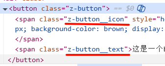
使用
<button :class="[ns.blockName()]"><spanstyle="height: 20px;width: 20px;background-color: brown;display: inline-block;":class="[ns.elementName('icon')]"></span><span :class="[ns.elementName('text')]">这是一个button按钮</span>
</button>
效果:
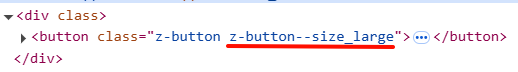
定义modifer
使用:
<button :class="[ns.blockName(), ns.modifierName('size', 'large')]">
效果:
接下来还要做一些实用性的优化,因为size属性等是需要从外部传入进来的所以我们要定义props来绑定属性值
<button :class="[ns.blockName(), ns.modifierName('size', size)]">const props = defineProps({size: {type: String,default: "medium",},
});
在外部调用:
<z-button size="large" />
定义is方法生成类名
<button:class="[ns.blockName(),ns.modifierName('size', size),ns.isName('disabled', disabled),]">const props = defineProps({// ...disabled: {type: Boolean,default: false,},
});
在外部调用:
<z-button size="mini" disabled />
还可以添加loading状态:
<button
:class="[
ns.blockName(),ns.modifierName('size', size),ns.isName('disabled', disabled),ns.isName('loading', loading),]"
>const props = defineProps({size: {type: String,default: "medium",},// 简写形式disabled: Boolean,loading: Boolean,});
定义主题
回到storehome目录,新建一个theme目录用来存放主题相关的文件。
还是和之前的componets\hooks 一样pnpm init初始化该目录,然后回到根目录添加工作空间
pnpm install @ZUI/theme -w
上面命令会报错的话就使用以下👇命令
pnpm add @ZUI/components@workspace:* --w
PS:别忘记了修改package.json中的name属性‼️
继续创建theme目录结构如下:
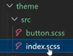
index.scss:
@use "./button.scss"
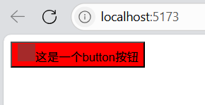
button.scss:
.z-button {background-color:red;
}
别忘记了在main.js中引入index.scss全局样式文件:
然后在示例项目中安装scss依赖
npm install -D sass-embedded
最后效果就出来啦‼️
button组件
有了之前的知识铺垫,现在我们就真正进入到制作组件的时刻啦!!!
默认样式
编写最基本的高度、圆角那些样式属性
components/button/src/index.vue
<template><div:class="[ns.blockName(),]"><span :class="[ns.elementName('text')]">这是一个button按钮</span></div>
</template>
storehouse/house/src/button.scss
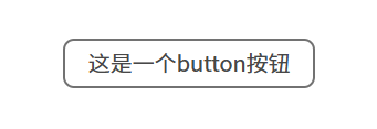
.z-button {background-color: #f4f4f4;height: 36px;min-width: 80px;padding: 0 16px;box-sizing: border-box; // 忽略padding和borderdisplay: inline-flex;align-items: center;justify-content: center;border-radius: 8px;// 把border拆解出来是因为后面会有虚线边框按钮border-width: 2px;border-color: #727272;border-style: solid;font-size: 16px;color: #484848;cursor: pointer;span {line-height: 1;}
}
目前效果:
继续添加优化效果:
文字不换行处理:
word-break:keep-all;
文本无法选中效果:
user-select:none;
彻底去掉元素在获得焦点时浏览器默认绘制的轮廓线:
outline:none;
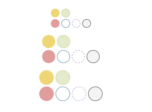
背景颜色处理
添加props属性:
<div :class="[ns.blockName(), ns.modifierName(type)]">const props = defineProps({type: {type: String,default: "primary",},});
在示例库中添加type属性值:
<z-button type="success" />
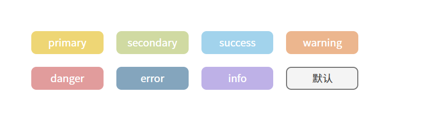
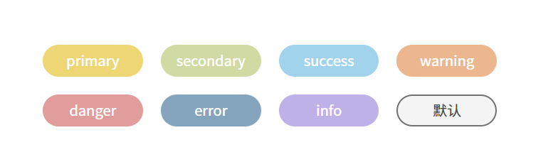
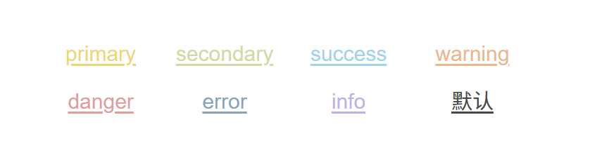
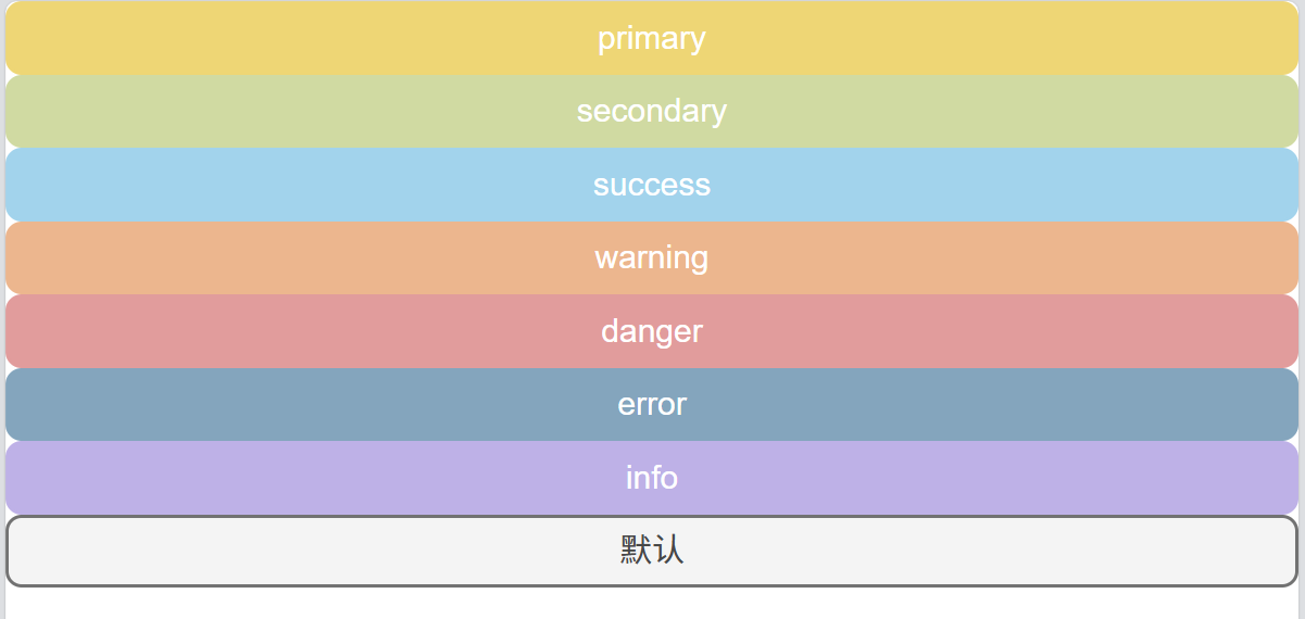
然后type属性的类名就添加写上去了,我们要拿着这个类名去编写该type的样式:

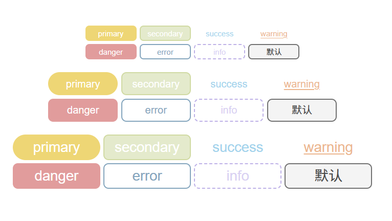
接下来美化一下整体布局,并且添加上不同主题颜色的button:
示例项目/App.vue
<template><div class="layout"><div class="box"><z-button type="primary">primary</z-button><z-button type="secondary">secondary</z-button><z-button type="success">success</z-button><z-button type="warning">warning</z-button><z-button type="danger">danger</z-button><z-button type="error">error</z-button><z-button type="info">info</z-button><z-button type=""></z-button></div></div>
</template><script setup></script><style lang="scss">
body {margin: 0;
}
.layout {height: 100vh;width: 100vw;display: flex;justify-content: center;align-items: center;.box {display: grid;grid-template-columns: 1fr 1fr 1fr 1fr;gap: 20px;}
}
</style>
button/src/index.vue
<template><div :class="[ns.blockName(), ns.modifierName(type)]"><span :class="[ns.elementName('text')]"><slot>默认</slot></span></div>
</template><script>
export default {name: "z-button",
};
</script><script setup>
import { useNamespace } from "@ZUI/hooks";
const ns = useNamespace("button");const props = defineProps({type: {type: String,default: "primary",},
});
</script><style></style>
button.scss
// 把之前的样式覆盖掉
.z-button--primary {background-color: #eed675;border-color: #eed675;color: #fff;
}
.z-button--secondary {background-color: #d0daa2;border-color: #d0daa2;color: #fff;
}
.z-button--success {background-color: #a2d3ec;border-color: #a2d3ec;color: #fff;
}
.z-button--warning {background-color: #ecb68e;border-color: #ecb68e;color: #fff;
}
.z-button--danger {background-color: #e19c9c;border-color: #e19c9c;color: #fff;
}
.z-button--error {background-color: #84a5bd;border-color: #84a5bd;color: #fff;
}
.z-button--info {background-color: #beb1e7;border-color: #beb1e7;color: #fff;
}
最后效果:
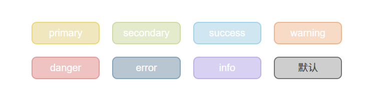
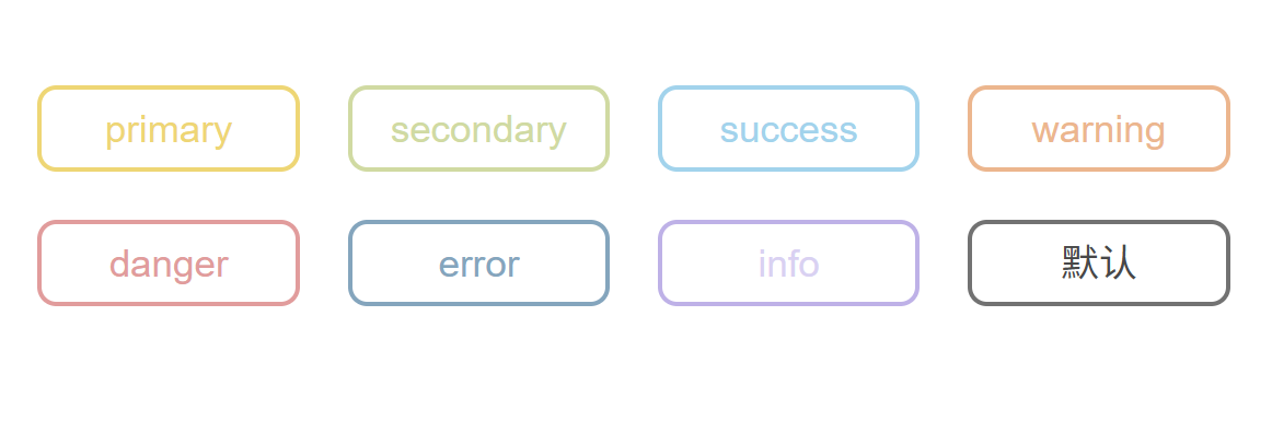
圆角状态
继续定义props:
<div:class="[ns.blockName(), ns.modifierName(type), ns.isName('round', round)]">const props = defineProps({type: {type: String,default: "primary",},round: Boolean,
});
定义样式:
.z-button {//...&.is-round {border-radius: 36px; // 只要大于等于尺寸高度就会变成圆角}
}
使用圆角:
<z-button type="primary" round>primary</z-button>
<z-button type="secondary" round>secondary</z-button>
<z-button type="success" round>success</z-button>
<z-button type="warning" round>warning</z-button>
<z-button type="danger" round>danger</z-button>
<z-button type="error" round>error</z-button>
<z-button type="info" round>info</z-button>
<z-button type="" round></z-button>
效果:
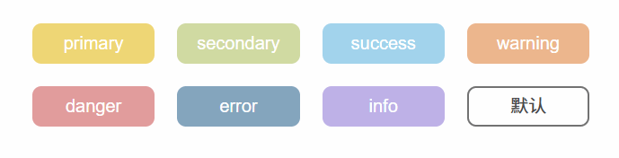
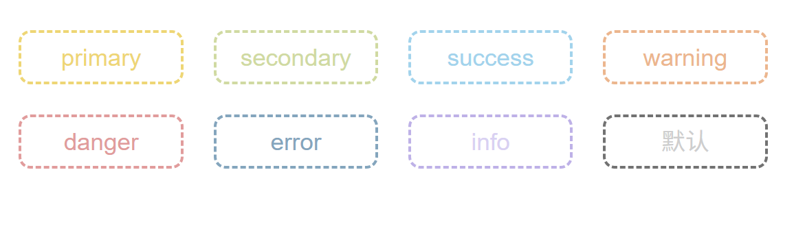
禁用效果
定义props:
<button
:class="[
ns.blockName(),ns.modifierName(type),ns.isName('round', round),ns.isName('disabled', disabled),]":disabled="disabled"
><span :class="[ns.elementName('text')]"><slot>默认</slot>
</span>
</button>const props = defineProps({type: {type: String,default: "primary",},round: Boolean,disabled: Boolean,
});
⚠注意:为了能实现禁用效果,停止任何事件触发,这里需要将div修改为button标签
定义样式:
.z-button {//...&.is-disabled {background-color: #cecece;// border-color: #ecb68e;cursor: not-allowed;}
}
// 把之前的样式覆盖掉
.z-button--primary {//...&.is-disabled {background-color: #f0e7bf;border-color: #eed675;cursor: not-allowed;}
}
.z-button--secondary {//...&.is-disabled {background-color: rgb(228, 234, 204);border-color: #d0daa2;cursor: not-allowed;}
}
.z-button--success {//...&.is-disabled {background-color: #d0e6f1;border-color: #a2d3ec;cursor: not-allowed;}
}
.z-button--warning {//...&.is-disabled {background-color: #f7dbc6;border-color: #ecb68e;cursor: not-allowed;}
}
.z-button--danger {//...&.is-disabled {background-color: #f0c3c3;border-color: #e19c9c;cursor: not-allowed;}
}
.z-button--error {//...&.is-disabled {background-color: #b7c6d0;border-color: #84a5bd;cursor: not-allowed;}
}
.z-button--info {//...&.is-disabled {background-color: #d9d1f2;border-color: #beb1e7;cursor: not-allowed;}
}
使用属性:
<z-button type="primary" disabled>primary</z-button>
<z-button type="secondary" disabled>secondary</z-button>
<z-button type="success" disabled>success</z-button>
<z-button type="warning" disabled>warning</z-button>
<z-button type="danger" disabled>danger</z-button>
<z-button type="error" disabled>error</z-button>
<z-button type="info" disabled>info</z-button>
<z-button type="" disabled></z-button>
效果:
hover效果
直接添加样式即可:
.z-button {//...&:hover {background-color: #dddddd;border-color: #dddddd;color: #fff;}&.is-disabled {//...}
}
// 把之前的样式覆盖掉
.z-button--primary {//...&:hover {background-color: #fae17b;border-color: #dac46c;color: #fff;}&.is-disabled {//...}
}
.z-button--secondary {//...&:hover {background-color: #e0eda5;border-color: #b7c18f;color: #fff;}&.is-disabled {//...}
}
.z-button--success {//...&:hover {background-color: #b6e5fc;border-color: #90c0d8;color: #fff;}&.is-disabled {//...}
}
.z-button--warning {//...&:hover {background-color: #fccda8;border-color: #d4a480;color: #fff;}&.is-disabled {//...}
}
.z-button--danger {//...&:hover {background-color: #febdbd;border-color: #b07a7a;color: #fff;}&.is-disabled {//...}
}
.z-button--error {//...&:hover {background-color: #a8c9e0;border-color: #678397;color: #fff;}&.is-disabled {//...}
}
.z-button--info {//...&:hover {background-color: #d8cbff;border-color: #9b91bc;color: #fff;}&.is-disabled {//...}
}
效果:
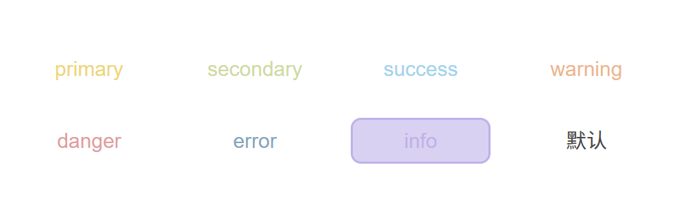
text效果
定义props:
<template><button:class="[ns.blockName(),ns.modifierName(type),ns.isName('round', round),ns.isName('disabled', disabled),ns.isName('text', text),]":disabled="disabled"><span :class="[ns.elementName('text')]"><slot>默认</slot></span></button>
</template><script setup>
import { useNamespace } from "@ZUI/hooks";
const ns = useNamespace("button");const props = defineProps({type: {type: String,default: "primary",},round: Boolean,disabled: Boolean,text: Boolean,
});
</script>
定义样式:
&.is-text {background-color: transparent;border-color: transparent;&:hover {color: #484848;background-color: #f4f4f4;border-color: #727272;}
}
&.is-disabled {background-color: #cecece;// border-color: #ecb68e;cursor: not-allowed;
}
.z-button {//.../* 默认样式 */&.is-round {border-radius: 36px; // 只要大于等于尺寸高度就会变成圆角}&:hover {background-color: #dddddd;border-color: #dddddd;color: #fff;}&.is-text {background-color: transparent;border-color: transparent;&:hover {color: #484848;background-color: #f4f4f4;border-color: #727272;}}&.is-disabled {background-color: #cecece;// border-color: #ecb68e;cursor: not-allowed;}
}
// 把之前的样式覆盖掉
/* primary */
.z-button--primary {//...&.is-text {color: #eed675;&:hover {background-color: #f9f3df;border-color: #eed675;}}&.is-disabled {&,&:hover,&:focus {background-color: #f0e7bf;border-color: #eed675;cursor: not-allowed;}}
}
/* secondary */
.z-button--secondary {//...&.is-text {color: #d0daa2;&:hover {background-color: #f4f8e5;border-color: #d0daa2;}}&.is-disabled {&,&:hover,&:focus {background-color: rgb(228, 234, 204);border-color: #d0daa2;cursor: not-allowed;}}
}
/* success */
.z-button--success {//...&.is-text {color: #a2d3ec;&:hover {background-color: #ebf8ff;border-color: #a2d3ec;}}&.is-disabled {&,&:hover,&:focus {background-color: #d0e6f1;border-color: #a2d3ec;cursor: not-allowed;}}
}
/* warning */
.z-button--warning {//...&.is-text {color: #ecb68e;&:hover {background-color: #fcefe5;border-color: #ecb68e;}}&.is-disabled {&,&:hover,&:focus {background-color: #f7dbc6;border-color: #ecb68e;cursor: not-allowed;}}
}
/* danger */
.z-button--danger {ba//...&.is-text {color: #e19c9c;&:hover {background-color: #fee9e9;border-color: #ecd7d7;}}&.is-disabled {&,&:hover,&:focus {background-color: #f0c3c3;border-color: #e19c9c;cursor: not-allowed;}}
}
/* error */
.z-button--error {//...&.is-text {color: #84a5bd;&:hover {background-color: #d1e1eb;border-color: #84a5bd;}}&.is-disabled {&,&:hover,&:focus {background-color: #b7c6d0;border-color: #84a5bd;cursor: not-allowed;}}
}
/* info */
.z-button--info {//...&.is-text {color: #beb1e7;&:hover {background-color: #ede8ff;border-color: #beb1e7;}}&.is-disabled {&,&:hover,&:focus {background-color: #d9d1f2;border-color: #beb1e7;cursor: not-allowed;}}
}
使用属性:
<z-button type="primary" text>primary</z-button>
<z-button type="secondary" text>secondary</z-button>
<z-button type="success" text>success</z-button>
<z-button type="warning" text>warning</z-button>
<z-button type="danger" text>danger</z-button>
<z-button type="error" text>error</z-button>
<z-button type="info" text disabled>info</z-button>
<z-button type="" text></z-button>
效果:
link按钮
定义props:
<button
:class="[
ns.blockName(),ns.modifierName(type),ns.isName('round', round),ns.isName('disabled', disabled),ns.isName('text', text),ns.isName('link', link),]":disabled="disabled"
>const props = defineProps({type: {type: String,default: "primary",},round: Boolean,disabled: Boolean,text: Boolean,link: Boolean,});
编写样式:
先添加默认样式:
&.is-disabled {//...}&.is-link {height: auto;min-width: auto;padding: 0;border: none;background-color: transparent;text-decoration: underline;text-underline-offset: 2px;&:hover,&.is-disabled {color: #cecece;}}
主题样式:
&.is-link {color: #eed675;&:hover,&.is-disabled {color: #f0e7bf;background-color: transparent;}}&.is-link {color: #d0daa2;&:hover,&.is-disabled {color: #e4eacc;background-color: transparent;}}&.is-link {color: #a2d3ec;&:hover,&.is-disabled {color: #d0e6f1;background-color: transparent;}}使用属性:
<z-button type="primary" link>primary</z-button><z-button type="secondary" link>secondary</z-button><z-button type="success" link>success</z-button><z-button type="warning" link>warning</z-button><z-button type="danger" link>danger</z-button><z-button type="error" link>error</z-button><z-button type="info" link>info</z-button><z-button type="" link></z-button>
效果:
block效果
block效果就会让button占领一整行,实现起来也是非常简单。
定义props:
<button
:class="[
ns.isName('block', block),]"
>const props = defineProps({block: Boolean,});
编写样式:
&.is-link {//...
}
&.is-block {width: 100%;display: flex;
}
使用属性:
<z-button type="primary" block>primary</z-button><z-button type="secondary" block>secondary</z-button><z-button type="success" block>success</z-button><z-button type="warning" block>warning</z-button><z-button type="danger" block>danger</z-button><z-button type="error" block>error</z-button><z-button type="info" block>info</z-button><z-button type="" block></z-button>
效果:
border按钮
**定义props:**定义方法同上
编写样式:
默认样式:
&.is-border {&,&:hover {color: #484848;background-color: transparent;}}&.is-bashed {border-style: dashed;&,&:hover {color: #cecece;background-color: transparent;}}
主题样式:
&.is-border {&,&:hover {color: #eed675;}
}
&.is-bashed {&,&:hover {color: #eed675;}
}&.is-border {&,&:hover {color: #d0daa2;}
}
&.is-bashed {&,&:hover {color: #d0daa2;}
}&.is-border {&,&:hover {color: #a2d3ec;}
}
&.is-bashed {&,&:hover {color: #a2d3ec;}
}&.is-border {&,&:hover {color: #ecb68e;}
}
&.is-bashed {&,&:hover {color: #ecb68e;}
}&.is-border {&,&:hover {color: #e19c9c;}
}
&.is-bashed {&,&:hover {color: #e19c9c;}
}&.is-border {&,&:hover {color: #84a5bd;}
}
&.is-bashed {&,&:hover {color: #84a5bd;}
}&.is-border {&,&:hover {color: #d9d1f2;}
}
&.is-bashed {&,&:hover {color: #d9d1f2;}
}
**使用属性:**使用方法同上
效果:
size效果
定义props:
<button:class="[//... ns.modifierName('size',size),]">size: {type: String,default: "", // size:small,default,large},
编写样式:
&.is-bashed {//...
}
&.z-button--size_small {height: 24px;font-size: 12px;padding: 0 10px;border-radius: 6px;
}
&.z-button--size_large {height: 40px;font-size: 22px;
}
使用属性:
<template><div class="layout"><div class="box"><z-button size="small" type="primary" round>primary</z-button><z-button size="small" type="secondary" disabled>secondary</z-button><z-button size="small" type="success" text>success</z-button><z-button size="small" type="warning" link>warning</z-button><z-button size="small" type="danger" block>danger</z-button><z-button size="small" type="error" border>error</z-button><z-button size="small" type="info" bashed>info</z-button><z-button size="small" type=""></z-button></div><div class="box"><z-button type="primary" round>primary</z-button><z-button type="secondary" disabled>secondary</z-button><z-button type="success" text>success</z-button><z-button type="warning" link>warning</z-button><z-button type="danger" block>danger</z-button><z-button type="error" border>error</z-button><z-button type="info" bashed>info</z-button><z-button type=""></z-button></div><div class="box"><z-button size="large" type="primary" round>primary</z-button><z-button size="large" type="secondary" disabled>secondary</z-button><z-button size="large" type="success" text>success</z-button><z-button size="large" type="warning" link>warning</z-button><z-button size="large" type="danger" block>danger</z-button><z-button size="large" type="error" border>error</z-button><z-button size="large" type="info" bashed>info</z-button><z-button size="large" type=""></z-button></div></div>
</template><script setup></script><style lang="scss">
body {margin: 0;
}
.layout {height: 100vh;width: 100vw;display: flex;flex-direction: column;justify-content: center;align-items: center;.box {margin-bottom: 20px;display: grid;grid-template-columns: 1fr 1fr 1fr 1fr;gap: 5px;}
}
</style>
效果:
圆形按钮
定义props:
ns.isName('circle', circle),circle: Boolean,
编写样式:
&.z-button--size_small {height: 24px;font-size: 12px;padding: 0 10px;border-radius: 6px;&.is-circle {width: 24px;min-width: 24px;}}&.z-button--size_large {height: 40px;font-size: 22px;&.is-circle {width: 40px;min-width: 40px;}}&.is-circle {padding: 0;width: 36px;min-width: 36px;border-radius: 36px;span {display: none;}}
使用属性:
<div class="box"><z-button circle size="small" type="primary" round>primary</z-button><z-button circle size="small" type="secondary" disabled>secondary</z-button><z-button circle size="small" type="success" text>success</z-button><z-button circle size="small" type="warning" link>warning</z-button><z-button circle size="small" type="danger" block>danger</z-button><z-button circle size="small" type="error" border>error</z-button><z-button circle size="small" type="info" bashed>info</z-button><z-button circle size="small" type=""></z-button></div><div class="box"><z-button circle type="primary" round>primary</z-button><z-button circle type="secondary" disabled>secondary</z-button><z-button circle type="success" text>success</z-button><z-button circle type="warning" link>warning</z-button><z-button circle type="danger" block>danger</z-button><z-button circle type="error" border>error</z-button><z-button circle type="info" bashed>info</z-button><z-button circle type=""></z-button></div><div class="box"><z-button circle size="large" type="primary" round>primary</z-button><z-button circle size="large" type="secondary" disabled>secondary</z-button><z-button circle size="large" type="success" text>success</z-button><z-button circle size="large" type="warning" link>warning</z-button><z-button circle size="large" type="danger" block>danger</z-button><z-button circle size="large" type="error" border>error</z-button><z-button circle size="large" type="info" bashed>info</z-button><z-button circle size="large" type=""></z-button></div>
效果:
图标效果
定义props:
<button
:disabled="disabled"
:class="[
ns.blockName(),ns.modifierName(type),ns.isName('round', round),ns.isName('disabled', disabled),ns.isName('text', text),ns.isName('link', link),ns.isName('block', block),ns.isName('border', border),ns.isName('bashed', bashed),ns.modifierName('size', size),ns.isName('circle', circle),]"
><i v-if="frontIcon" class="" :class="[ns.elementName('icon'), frontIcon]"></i>
<span :class="[ns.elementName('text')]"><slot>默认</slot>
</span>
<i v-if="backIcon" class="" :class="[ns.elementName('icon'), backIcon]"></i>
</button> // 前方图标
frontIcon: {type: String,default: "",
},// 后方图标backIcon: {type: String,default: "",},
编写样式:
column-gap: 4px; // CSS3新特性:使元素之间产生间隙/* 默认样式 */&.z-button_icon {font-size: 1em; // 继承父元素font-size大小}
使用属性:
<z-buttonfrontIcon="图标名称"backIcon="图标名称"circlesize="large"type="success"text>success</z-button>
效果:
loading效果
定义props:
<button:disabled="disabled":class="[ns.blockName(),ns.modifierName(type),ns.isName('round', round),ns.isName('disabled', disabled || loading), // 加载的同时禁用按钮ns.isName('text', text),ns.isName('link', link),ns.isName('block', block),ns.isName('border', border),ns.isName('bashed', bashed),ns.modifierName('size', size),ns.isName('circle', circle),]"><!-- 加载图标 --><i v-if="loading" class="loading"></i><!-- 前置图标 --><iv-if="frontIcon && !loading"class="":class="[ns.elementName('icon'), frontIcon]"></i><!-- 按钮文字 --><span :class="[ns.elementName('text')]"><slot>默认</slot></span><!-- 后置图标 --><iv-if="backIcon && !loading"class="":class="[ns.elementName('icon'), backIcon]"></i>
</button>loading: Boolean,
loading效果业务处理
通过函数的方式来实现自动根据异步方法来执行loading效果,
在button组件内部定义一个函数,然后通过Promise对象做一个返回。
在props中定义一个beforeChange,他是Function类型:
beforeChange: {type: Function,default: undefined,
},
在button组件绑定一个单击事件:
<button @click="handleClick"></button>const handleClick = async () => {console.log(props.beforeChange); // 打印props本身console.log(await props.beforeChange()); // 打印方法返回值
};
然后我们就可以在<z-button>中传入方法
<z-button type="primary" loading :beforeChange="fetchAPI">primary</z-button>const fetchAPI = () => {console.log("模拟调用接口");// 返回一个异步对象return new Promise((resolve) => {setTimeout(() => {resolve("调用接口成功");}, 1000);});
};
现在先模拟一个loading图标效果:
<!-- 加载图标 -->
<i v-if="loading" class="spinner"></i><style>.spinner {display: inline-block;width: 1em; /* 跟随字体大小 */height: 1em;border: 2px solid currentColor;border-top-color: transparent;border-radius: 50%;animation: spin 0.8s linear infinite;}@keyframes spin {to {transform: rotate(360deg);}
}
</style>
定一个组件内部私有的加载属性_Loading,用来专门控制内部的loading效果:
import {ref} from "vue"const _loading = ref(false)
const handleClick = async () => {// 检查 beforeChange 是否是一个函数if (typeof props.beforeChange === "function") {_loading.value = true;await props.beforeChange().then((res) => {_loading.value = false;}).catch((err) => {_loading.value = false;});}
};
给图标添加上_loading判断:
<!-- 加载图标 -->
<i v-if="loading || _loading" class="spinner"></i>
<!-- 前置图标 -->
<iv-if="frontIcon && !loading && !_loading"class="":class="[ns.elementName('icon'), frontIcon]">
</i>
<!-- 后置图标 -->
<iv-if="backIcon && !loading && !_loading"class="":class="[ns.elementName('icon'), backIcon]">
</i>
还可以优化一下使用计算属性来封装loading效果:
const isLoading = computed(() => {return props.loading || _loading.value;
});
<button:disabled="disabled || isLoading"@click="handleClick":class="[ns.blockName(),ns.modifierName(type),ns.isName('round', round),ns.isName('disabled', disabled || isLoading), // 加载的同时禁用按钮ns.isName('text', text),ns.isName('link', link),ns.isName('block', block),ns.isName('border', border),ns.isName('bashed', bashed),ns.modifierName('size', size),ns.isName('circle', circle),]"><!-- 加载图标 --><i v-if="isLoading" class="spinner"></i><!-- 前置图标 --><iv-if="frontIcon && !isLoading"class="":class="[ns.elementName('icon'), frontIcon]"></i><!-- 按钮文字 --><span :class="[ns.elementName('text')]"><slot>默认</slot></span><!-- 后置图标 --><iv-if="backIcon && !isLoading"class="":class="[ns.elementName('icon'), backIcon]"></i>
</button>
效果:
点击事件
当我们给按钮组件添加上@click事件,并且与beforeChange绑定同一个事件,就会发现,每一次触发按钮,事件都会触发两次。这是因为beforeChange触发了一次,原生JS的点击事件又触发了一次。
<z-button type="primary" @click="fetchAPI" :beforeChange="fetchAPI"
>primary
</z-button>const fetchAPI = (e) => {console.log(e);console.log("模拟调用接口");// 返回一个异步对象return new Promise((resolve, reject) => {setTimeout(() => {resolve("调用接口成功");}, 1500);});
};
为了避免JS原生点击事件触发,需要重新定义一个自定义的单击事件来覆盖掉
const emit = defineEmits(['click'])const handleClick = async (e) => {if (typeof props.beforeChange === "function") {//...} else {// 如果是点击事件emit("click", e);return;}
}
插槽效果
<span :class="[ns.elementName('text')]"><slot />
</span>
按钮组
和button按钮组件一样,只不过是一个组件把多个按钮集合在一起了。
拷贝button组件文件夹,并且修改名字为buttonGroup。
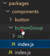
在index.vue中
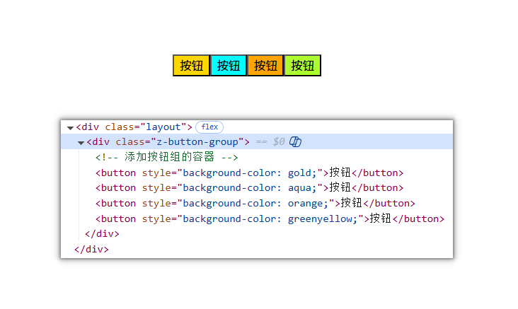
<template><div :class="[ns.blockName()]"><!-- 添加按钮组的容器 --><button style="background-color: gold">按钮</button><button style="background-color: aqua">按钮</button><button style="background-color: orange">按钮</button><button style="background-color: greenyellow">按钮</button></div>
</template><script>
export default {name: "z-button-group", // 修改组件名称为 z-button-group
};
</script><script setup>
import { useNamespace } from "@ZUI/hooks";
const ns = useNamespace("button-group"); // 修改命名空间为 button-group
</script><style></style>
在buttonGroup/index.js中导入按钮组:
import { componentInstall } from "@ZUI/utils"
// 导入组件
import ButtonGroup from "./src/index.vue"
// 提供按需加载的方式
export const ZButtonGroup = componentInstall(ButtonGroup)
// 提供全局加载的方式
export default ZButtonGroup
在components/index.js中暴露组件:
/*** components暴露所有组件* storehouse/components/index.js*/
export * from "./button"
export * from "./buttonGroup"
在storehoused.js中导出组件:
/*** 组件集中管理* storehouse/index.js*/
import { ZButton } from "./components/button/index.js"
import { ZButtonGroup } from "./components/buttonGroup/index.js"export default [ ZButton,ZButtonGroup ]
以后都要记住创建一个新组件的导出整体流程:
- 在
index.vue中修改组件名和命名空间- 在
组件/index.js中导入组件- 在
components/index.js中暴露组件- 在
storehoused.js中导出组件
在示例项目中使用:
<template><div class="layout"><z-button-group></z-button-group></div>
</template><script setup></script><style lang="scss">
body {margin: 0;
}
.layout {height: 100vh;width: 100vw;display: flex;flex-direction: column;justify-content: center;align-items: center;.box {margin-bottom: 20px;display: grid;grid-template-columns: 1fr 1fr 1fr 1fr;gap: 5px;}
}
</style>
组件出现就说明成功了🎉
编写样式
按钮组实现很简单,只需要在内部定义一个插槽,然后在外部通过传入多个button组件的形式实现:
<div :class="[ns.blockName()]"><slot /><!-- 删除掉以下👇测试内容 --><!-- 添加按钮组的容器 --><!-- <button style="background-color: gold">按钮</button><button style="background-color: aqua">按钮</button>
<button style="background-color: orange">按钮</button>
<button style="background-color: greenyellow">按钮</button> -->
</div>
示例项目中添加多个写好的按钮进去
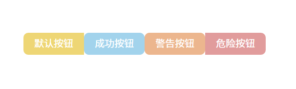
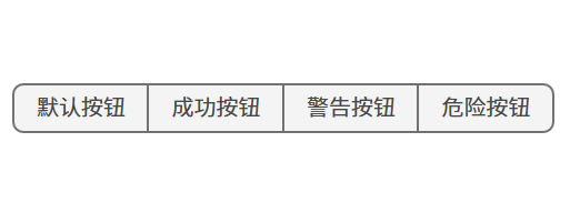
<div class="layout"><z-button-group><z-button type="primary">默认按钮</z-button><z-button type="success">成功按钮</z-button><z-button type="warning">警告按钮</z-button><z-button type="danger">危险按钮</z-button></z-button-group>
</div>
接下来就是编写样式的任务了
在theme/src目录下新建一个buttonGroup.scss文件用来编写按钮组的样式,并且在index.scss中注入:
@use "./button.scss";
@use "./buttonGroup.scss";
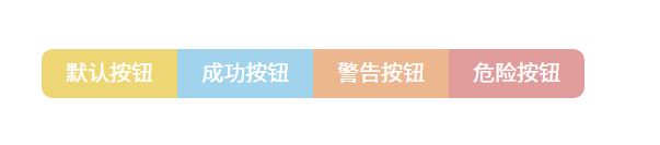
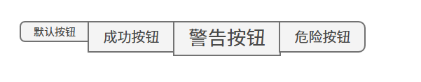
首先先处理前后两个按钮组件的圆角做处理,让最前面的按钮右边圆角设置为0,让最后面的按钮左边圆角设置为0:
.z-button-group {display: flex;flex-direction: row;justify-content: space-between;// 前后按钮的圆角处理.z-button:first-child {border-top-right-radius: 0;border-bottom-right-radius: 0;}.z-button:last-child {border-top-left-radius: 0;border-bottom-left-radius: 0;}
}
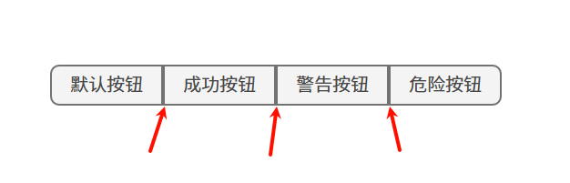
其次让中间的按钮的所有圆角设置为0,这里使用css的:not()选择器:
// 中间按钮的圆角处理
.z-button:not(:first-child):not(:last-child) {border-radius: 0;
}
目前还存在每个圆角的边框宽度叠加情况,解决办法是让按钮统一偏移
这里切换成button按钮
type=''类型查看会更明显看出问题
// 相邻按钮的间距处理
.z-button + .z-button {margin-left: -2px;
}
PS:因为按钮的border-width值为2,所以这里需要偏移2个像素
相邻兄弟选择器:
一句话概括为:“选中所有紧跟在另一个
.z-button后面的.z-button元素。”
现在边框宽度叠加情况就解决啦:
size属性处理
不建议直接在button中设置size属性,因为这样会导致按钮大小不统一的情况。
<z-button-group><z-button size="small" type="">默认按钮</z-button><z-button type="">成功按钮</z-button><z-button size="large" type="">警告按钮</z-button><z-button type="">危险按钮</z-button></z-button-group>
为了统一按钮组大小,应该直接给button-group组件添加size属性,并且在优先级方法,应该是button-group > button的size属性。
定义一个props对象
const props = defineProps({size:{type:String,default:''}
})
使用provide
import { provide,toRefs } from 'vue'provide('buttonGroupProvide', {...toRefs(props)
})
在这里使用
toRefs是为了让props具备响应式
然后在子组件中使用inject
import { ... , inject } from 'vue'const provide_size = inject("buttonGroupProvide",undefined);
最后使用注入的size
<button
:disabled="disabled || isLoading"
@click="handleClick"
:class="[
ns.blockName(),ns.modifierName(type),ns.isName('round', round),ns.isName('disabled', disabled || isLoading), // 加载的同时禁用按钮ns.isName('text', text),ns.isName('link', link),ns.isName('block', block),ns.isName('border', border),ns.isName('bashed', bashed),ns.modifierName('size', provide_size.size.value || size),ns.isName('circle', circle),]"
>
这样就实现了size大小统一:
<z-button-group size="default"><z-button size="small" type="">默认按钮</z-button><z-button type="">成功按钮</z-button><z-button size="large" type="">警告按钮</z-button><z-button type="">危险按钮</z-button>
</z-button-group>
import { reactive, toRefs } from ‘vue’
const state = reactive({ foo: 1, bar: 2 })
// 把 state 的所有属性一次性变成 ref,然后可以安全解构
const { foo, bar } = toRefs(state)
foo.value++ // state.foo 同步 +1
bar.value = 10 // state.bar 同步变成 10