css中重难点整理(vertical-align)
一、vertical-align
在学习vertical-align的时候,可能会很困惑。即使网上有一大推文章讲veitical-align,感觉看完好像懂了,等自己布局的时候用到vertical-align的时候好像对它又很陌生。这就是我在布局的时候遇到的问题。
本来vertical-align就很不好理解,网上又有很多大佬把它和line-height放在一起讲,我觉得这是造成学习这个属性困惑的原因之一。其实我认为这两个属性关系不大。
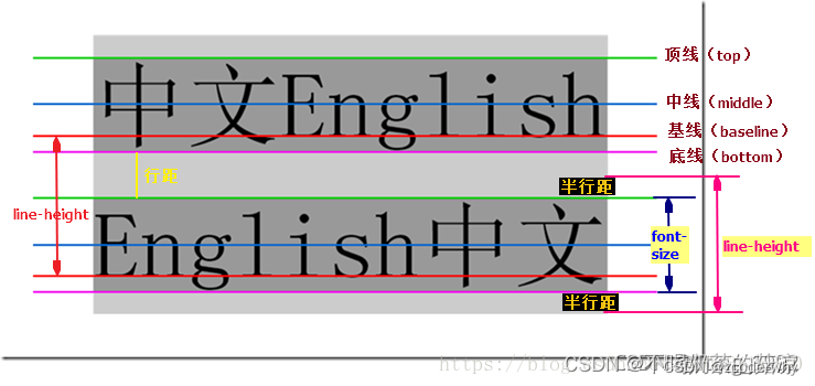
我希望看这篇文章的时候都默认了解了基本的知识点,比如行高是什么,vertical-align的官方定义,line box(行盒),inline-level 的基线,inline-level 默认基线对齐。如果对这些还不明白可以去MDN上,或者我推荐的这篇文章css vertical-align你真的很了解嘛? 仔细看看,因为这里没有介绍基本含义,只是记录我当时踩的坑。
我知道 vertical-align默认是基线对齐,也明白一个img底下为啥会多出来空白内容,而我们修改了vertical-align属性值,空白就会消失。
我疑惑的点是,我们对inline-level设置的vertical-align到底是和父元素的什么对齐,当时我有以下几点想法,但都证明是错误的。
1、inline-level设置的vertical-align始终和父元素的baseline对齐;
例如:inline-level设置了vertical-align:top;那结果应该是inline-level的top去和父元素的baseline对齐,经验证并不对
2、inline-level设置的vertical-align始终和父元素对应的子元素的vertical-align去对齐
例如:inine-level设置了vertical-align:top;那结果应该是inline-level的top和父元素的top对齐,经验证也不对。
3、元素的对齐方式始终是基线对齐,inline-level设置的vertical-align行盒相对自己来说行盒的基线就是自己设置的vertical-align的值
例如:inline-level设置了vertical-align:top;行盒的基线就变成了top,然和在将inline-level和行盒的top对齐,毋庸置疑这也是错误的。
我也不知道我在学习vertical-align怎么会有这么多错误的想法,之所以记录下来,是想让自己知道学习知识点不要过多的想当然,要仔细去看看官方到底是怎么定义的。
之所以会有这么多错误的想法,是因为vertical-align的每个值的含义区别很大,真正理解每个值的含义,那就能明白vertical-align的各种现象了。
重点来了
看W3C对vertical-align给出的定义:

官方文档的翻译:vertical-align会影响行内级块元素在一个行盒中垂直方向的位置。
我把那篇文章有两句重点的地方粘过来了
一定要仔细去看vertical-align每个值的含义
baseline
Align the baseline of the box with the baseline of the parent box. If the box does not have a baseline, align the bottom margin edge with the parent’s baseline.
将框的基线与父框的基线对齐。 如果框没有基线,则将底部边距边缘与父级的基线对齐。
middle
Align the vertical midpoint of the box with the baseline of the parent box plus half the x-height of the parent.
将框的垂直中点与父框的基线加上父框 x 高度的一半对齐。
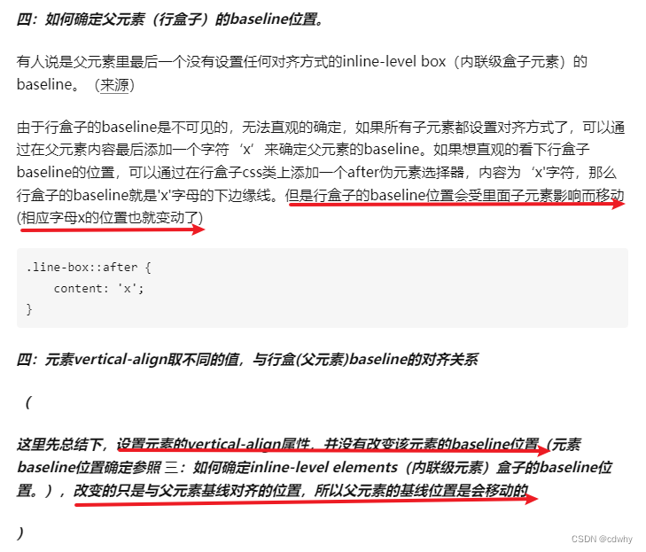
sub
Lower the baseline of the box to the proper position for subscripts of the parent’s box. (This value has no effect on the font size of the element’s text.)
将框的基线降低到父框下标的适当位置。 (此值对元素文本的字体大小没有影响。)
看这个例子
.box{width: 300px;height: 200px;text-align: center;background-color: orange;}.box img{width: 60px;vertical-align: sub;}<div class="box"><img src="./imgs/165.png" alt=""><sub>sub text</sub>xxx</div>
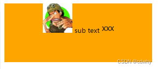
super
Raise the baseline of the box to the proper position for superscripts of the parent’s box. (This value has no effect on the font size of the element’s text.)
将框的基线提高到父框上标的正确位置。 (此值对元素文本的字体大小没有影响。)
<style>.box{width: 300px;height: 200px;text-align: center;background-color: orange;}.box img{width: 60px;vertical-align: super;}</style><div class="box"><img src="./imgs/165.png" alt=""><sup>super text</sup>xxx</div>
text-top
Align the top of the box with the top of the parent’s content area
将框的顶部与父内容区域的顶部对齐
text-bottom
Align the bottom of the box with the bottom of the parent’s content area
将框的底部与父内容区域的底部对齐
<percentage>
Raise (positive value) or lower (negative value) the box by this distance (a percentage of the ‘line-height’ value). The value ‘0%’ means the same as ‘baseline’.
百分比的值是相对该元素的line-height数值的(元素有默认行高的),具体的升高/降低数值由由该元素的line-height的值乘以百分比计算得出。相对自己baseline,升高或较低该元素一定距离。
<length>
Raise (positive value) or lower (negative value) the box by this distance. The value ‘0cm’ means the same as ‘baseline’.
该值为一定的像素数值,与vertical-align:percentage效果类似,除了移动的距离是被计算出来的。
vertical-algin和line-height真的像网上说的关系不可分割吗
我倒是觉的其实完全没必要每次将这两个一起介绍,因为它俩的关系没有那么深,一起说反而会让初学者搞蒙。
我们知道line-height是设置一行文本的高度,其实就是一个行盒的高度。
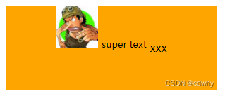
vertical-align和line-height有关联的地方就是如果父元素设置行高等于它的height,那么就是这个行盒的高度就是父元素的高度,img又设置了vertical-align:middle;所以img的中垂线和父元素的baseline+x-height的一半(字母x高度的一半)位置对齐,就是如图经典的一幕。
<style>.box{padding-left: 20px;line-height: 100px;border: 1px solid gray;}.box img{width: 60px;vertical-align: middle;}</style><div class="box"><img src="./images/slin.jpg" alt=""><span>x</span>x</div>
所以vertical-align也没有那么难吧,它和line-height也并不像网上说所谓的基友关系。
现在我们来看为什么会说像上面的设置图片只是相似垂直居中,实际上并没有真正做到居中
我们如果明白了行高就知道它会对行距做一个等分,那么文字就会是垂直居中的。但是x交叉点(x一半的位置)没有在文本中线这个位置,中线是在x一半偏上一点点的位置,即和文本x一半对齐的img也就在中线偏下一点点的位置。(我们这里说的文本的中线不是图里这个蓝色线middle,而是整行文本的中垂线)

二、水平居中方法总结
1、行内级元素
设置父元素的text-align:center
2、块级元素
设置当前块级元素margin: 0 auto;(此块级元素是有宽度的,块级元素没有设置宽度就独占一行了)
3、绝对定位
元素有宽度情况下,left:0/right:0/mafrgin:0 auto;
4、left + translate
此方法和垂直居中方法原理一样,元素设置相对定位,不用脱标(元素如果本身有需要设置了绝对定位也是这个效果);且只需要做两件事
- 让元素向下位移父元素的50%
- 让元素向上位移自身的50%
 <style>.box{height: 200px;background-color: orange;}.child{position: relative;width: 60px;height: 60px;background: darkred;left: 50%;transform: translateX(-50%);}</style><div class="box"><div class="child"></div>
</div>
5、flex
justify-content:center
三、垂直居中方法总结
1、绝对定位
元素有高度情况下,top:0/ bottom:0/margin:auto 0;
2、flex布局
弊端:
- 当前flex布局中所有的元素都会被垂直居中
- 相对来说,兼容性差一点点(基本可以忽略)
3、top + translate
<style>.box{height: 200px;background-color: orange;}.child{position: relative;width: 60px;height: 60px;background: darkred;top: 50%;transform: translateY(-50%);}</style><div class="box"><div class="child"></div></div>
四、理解auto的含义
五、BFC是什么
css最难懂部分就是属性值auto的理解、vertical-align和line-height的关系以及BFC是什么
水平居中的方法和垂直居中整理