Wpf 使用 Prism 实战开发Day09
设置模块设计
1.效果图

一.系统设置模块,主要有个性化(用于更改主题颜色),系统设置,关于更多,3个功能点。
个性化的颜色内容样式,主要是从 Material Design Themes UI简称md、提供的demo里复制代码过来使用的。
1.设置模块里面左侧导航栏(个性化、系统设置、关于更多)实现,该功能点主要用到Prism 框架的导航模块来实现。
- 整体设置界面布局,主要分上下2行,第1行是设置字体以及一条横线。第2行放置整个左侧导航栏以及展现对应的动态内容。
- 横线使用 Border 来实现 ,设置颜色属性 BorderBrush,设置粗细属性 BorderThickness
- 第2行,根据内容布局,重新在Grid 里面创建 2列。例如,1列用于放置导航栏左侧菜单,2列用于放置,当点击导航栏菜单时动态展现的内容区域。
SettingsView.xaml
<UserControl x:Class="MyToDo.Views.SettingsView"xmlns="http://schemas.microsoft.com/winfx/2006/xaml/presentation"xmlns:x="http://schemas.microsoft.com/winfx/2006/xaml"xmlns:mc="http://schemas.openxmlformats.org/markup-compatibility/2006" xmlns:d="http://schemas.microsoft.com/expression/blend/2008" xmlns:local="clr-namespace:MyToDo.Views"mc:Ignorable="d" xmlns:materialDesign="http://materialdesigninxaml.net/winfx/xaml/themes"xmlns:i="http://schemas.microsoft.com/xaml/behaviors"xmlns:prism="http://prismlibrary.com/"xmlns:ext="clr-namespace:MyToDo.Extensions"d:DesignHeight="450" d:DesignWidth="800"><Grid><Grid.RowDefinitions><RowDefinition  Height="auto"/><RowDefinition /></Grid.RowDefinitions><TextBlock Text="设置" FontSize="26" Margin="20,10"/><Border BorderBrush="#DDDDDD" BorderThickness="0,0,0,0.3"/><Grid Grid.Row="1" Margin="50"><Grid.ColumnDefinitions><ColumnDefinition  Width="220"/><ColumnDefinition /></Grid.ColumnDefinitions><!--左侧菜单栏--><ListBox x:Name="menuBar" ItemContainerStyle="{StaticResource MyListBoxItemStyle}" ItemsSource="{Binding MenuBars}"><i:Interaction.Triggers><i:EventTrigger EventName="SelectionChanged"><i:InvokeCommandAction Command="{Binding NavigateCommand}" CommandParameter="{Binding ElementName=menuBar,Path=SelectedItem}" /></i:EventTrigger></i:Interaction.Triggers><ListBox.ItemTemplate><DataTemplate><StackPanel Orientation="Horizontal" Background="Transparent"><materialDesign:PackIcon Kind="{Binding Icon}" Margin="15,0" /><TextBlock Text="{Binding Title}" Margin="10,0"/></StackPanel></DataTemplate></ListBox.ItemTemplate></ListBox><!--右侧菜单栏内容区域,动态区域。根据导航栏切换不同的页面--><ScrollViewer  Grid.Column="1"><ContentControl Margin="10,0" prism:RegionManager.RegionName="{x:Static ext:PrismManager.SettingsViewRegionName}"/></ScrollViewer></Grid></Grid>
</UserControl>
- MyListBoxItemStyle 是App.xaml 里定义的一个静态资源文件。
- App.xaml 文件源码在第3章节
PrismManager 导航区域名称管理扩展类,添加设置页区域动态展示内容区域一个名称。
public static class PrismManager{/// <summary>/// 首页区域/// </summary>public static readonly string MainViewRegionName = "MainViewReion";/// <summary>/// 设置页区域/// </summary>public static readonly string SettingsViewRegionName = "SettingsViewRegionName";}左侧导航菜单栏对应后端逻辑代码 实现
SettingsViewModel.cs
public class SettingsViewModel: BindableBase
{public SettingsViewModel(IRegionManager regionManager){MenuBars=new ObservableCollection<MenuBar>();NavigateCommand = new DelegateCommand<MenuBar>(Navigate);this.regionManager = regionManager;CreateMenuBar();}/// <summary>/// 导航命令/// </summary>public DelegateCommand<MenuBar> NavigateCommand { get; private set; }private ObservableCollection<MenuBar> menuBars;private readonly IRegionManager regionManager;/// <summary>/// 导航日志/// </summary>private IRegionNavigationJournal journal;public ObservableCollection<MenuBar> MenuBars{get { return menuBars; }set { menuBars = value; RaisePropertyChanged(); }}void CreateMenuBar(){MenuBars.Add(new MenuBar() { Icon = "Bowling", Title = "个性化", NameSpace = "SkinView" });MenuBars.Add(new MenuBar() { Icon = "CogOutline", Title = "系统设置", NameSpace = "" });MenuBars.Add(new MenuBar() { Icon = "InformationOutline", Title = "关于更多", NameSpace = "AboutView" });}/// <summary>/// 导航方法/// </summary>/// <param name="bar">菜单</param>private void Navigate(MenuBar bar){//命名空间为空,不进行导航if (bar == null || string.IsNullOrEmpty(bar.NameSpace)) return;regionManager.Regions[PrismManager.SettingsViewRegionName].RequestNavigate(bar.NameSpace);}
}
完成以上步骤后,就能显示左侧菜单导航栏了。
2.左侧菜单点击时,右侧区域需动态展示对应的内容
- 当点击对应的导航菜单,例如个性化或系统设置或关于更多时,右侧需要根据不同的导航菜单,动态展现不同的内容。
- 需要创建右侧内容区域对应的视图(V)-业务逻辑(VM)-实体类(M),俗称MVVM 模式。
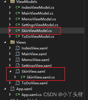
以个性化 (SkinView)为例:只需要创建SkinView.xaml 和 SkinViewModel。
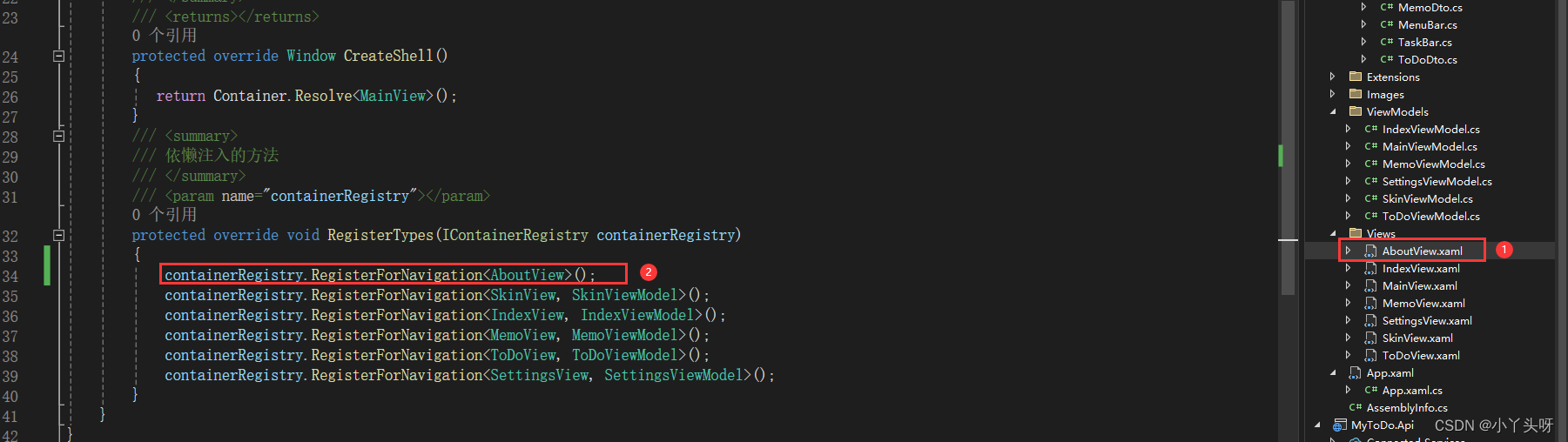
创建完毕后,需要在 App.xaml.cs 中,进行模块注入。
containerRegistry.RegisterForNavigation<SkinView, SkinViewModel>();
二.个性化(SkinView)页面功能实现

- 个性化内容页面分上下2行,只需要创建一个2行即可。
- 添加命名空间 xmlns:materialDesignColors="clr-namespace:MaterialDesignColors;assembly=MaterialDesignColors"
- UserControl.Resources 表示当前用户控件的资源文件(当前窗口的资源文件)
- RelativeSource={RelativeSource AncestorType=local:SkinView} 表示的是查找绑定,需要绑定到当前的SkinView
- 添加颜色转换器
- 转换器命名空间 xmlns:converters="clr-namespace:MyToDo.Common.Converters"
SkinView.xaml
<UserControl x:Class="MyToDo.Views.SkinView"xmlns="http://schemas.microsoft.com/winfx/2006/xaml/presentation"xmlns:x="http://schemas.microsoft.com/winfx/2006/xaml"xmlns:mc="http://schemas.openxmlformats.org/markup-compatibility/2006" xmlns:d="http://schemas.microsoft.com/expression/blend/2008" xmlns:local="clr-namespace:MyToDo.Views"xmlns:materialDesignColors="clr-namespace:MaterialDesignColors;assembly=MaterialDesignColors"xmlns:converters="clr-namespace:MyToDo.Common.Converters"mc:Ignorable="d" d:DesignHeight="450" d:DesignWidth="800"><!--当前窗口的资源文件--><UserControl.Resources><converters:ColorToBrushConverter x:Key="ColorToBrushConverter" /><DataTemplate x:Key="SwatchColorTemplate" DataType="{x:Type Color}"><Button Width="40"Height="40" BorderThickness="0" Margin="1"Background="{Binding Converter={StaticResource ColorToBrushConverter}}"Command="{Binding DataContext.ChangeHueCommand, RelativeSource={RelativeSource AncestorType=local:SkinView}}"CommandParameter="{Binding}"></Button></DataTemplate></UserControl.Resources><Grid><Grid.RowDefinitions><RowDefinition Height="auto" /><RowDefinition /></Grid.RowDefinitions><StackPanel Orientation="Horizontal" Margin="0,10"><TextBlock Text="浅色"/><ToggleButton Margin="8 0 16 0" IsChecked="{Binding IsDarkTheme}"/><TextBlock Text="深色"/></StackPanel><ItemsControl Grid.Row="1" ItemsSource="{Binding Swatches}"><ItemsControl.ItemTemplate><DataTemplate DataType="{x:Type materialDesignColors:ISwatch}"><StackPanel Orientation="Horizontal"><TextBlock Width="80"VerticalAlignment="Center"Text="{Binding Name, Mode=OneTime}" /><ItemsControl ItemTemplate="{StaticResource SwatchColorTemplate}" ItemsSource="{Binding Hues, Mode=OneTime}"><ItemsControl.ItemsPanel><ItemsPanelTemplate><VirtualizingStackPanel Orientation="Horizontal" /></ItemsPanelTemplate></ItemsControl.ItemsPanel></ItemsControl></StackPanel></DataTemplate></ItemsControl.ItemTemplate></ItemsControl></Grid>
</UserControl>
SkinViewModel.cs
public class SkinViewModel: BindableBase
{public SkinViewModel(){ChangeHueCommand = new DelegateCommand<object>(ChangeHue);}private bool _isDarkTheme=true;public bool IsDarkTheme {get => _isDarkTheme;set{if(SetProperty(ref _isDarkTheme, value)){ModifyTheme(theme => theme.SetBaseTheme(value ? Theme.Dark : Theme.Light));}}}public IEnumerable<ISwatch> Swatches { get; } = SwatchHelper.Swatches;public DelegateCommand<object> ChangeHueCommand {  get; private set; }private readonly PaletteHelper paletteHelper = new PaletteHelper();private void ChangeHue(object? obj){var hue = (Color)obj!;Theme theme = (Theme)paletteHelper.GetTheme();theme.PrimaryLight = new ColorPair(hue.Lighten());theme.PrimaryMid = new ColorPair(hue);theme.PrimaryDark = new ColorPair(hue.Darken());paletteHelper.SetTheme(theme);}private static void ModifyTheme(Action<Theme> modificationAction){PaletteHelper paletteHelper = new PaletteHelper();Theme theme = (Theme)paletteHelper.GetTheme();modificationAction?.Invoke(theme);paletteHelper.SetTheme(theme);}
}
ColorToBrushConverter.cs 颜色转换器
[ValueConversion(typeof(Color), typeof(Brush))]public class ColorToBrushConverter : IValueConverter{public object? Convert(object? value, Type targetType, object? parameter, CultureInfo culture){if (value is Color color){SolidColorBrush rv = new(color);rv.Freeze();return rv;}return Binding.DoNothing;}public object? ConvertBack(object? value, Type targetType, object? parameter, CultureInfo culture){if (value is SolidColorBrush brush){return brush.Color;}return default(Color);}}三.系统设置页以及关于更多页
- 系统设置页是空,可根据需求开发
- 关于更多页,也就是一些简介
例如,关于更多页设计。第一步,添加一个 用户控件,并且名称为AboutView.xaml。第二步,对用户控件进行注入。然后写功能。。。
注:个性化页面代码,均从Md框架中搬运过来的!!!