position:sticky-粘性吸附布局
一、描述
就是在一个滚动的容器里,将一个子元素设置为postion:sticky 在元素显示在可视区域内,显示的效果与position:relative 一致,当元素被滑动出可视区域外是,显示效果与position:fixed一致
二、注意事项
1、父元素需要存在滚动(overflow:auto,overflow:scroll),否则postion:sticky不生效;
2、sticky元素必须配置top、right、bottom、left其中之一,否则postion:sticky不生效;
3、父元素的高度不能低于sticky元素元素高度,否则postion:sticky不生效;
三、效果
1、吸顶效果
【1】code
html
<div class="parent-content"><div class="sticky">吸顶</div><div class="content"><p>我是内容</p><p>我是内容</p>   <p>我是内容</p>   <p>我是内容</p>   <p>我是内容</p>   <p>我是内容</p>   <p>我是内容</p>   <p>我是内容</p>   <p>我是内容</p>   <p>我是内容</p>   <p>我是内容</p>   <p>我是内容</p>   <p>我是内容</p>   </div>
</div>
css
.parent-content {width: 400px;height: 400px;background-color: #bfbfbf;overflow: auto;
}
.sticky{position:sticky;top:0;width: 100%;height: 40px;background-color: lightseagreen;}
.content {width: 100%;height: 600px;background-color:thistle;
}
效果
默认效果

滚动效果

2、折叠面板
html:
<button (click)='createComponent()'>创建组件</button>
<button (click)='removeComponent()'>删除组件</button>
<ng-container #container></ng-container>
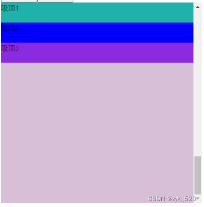
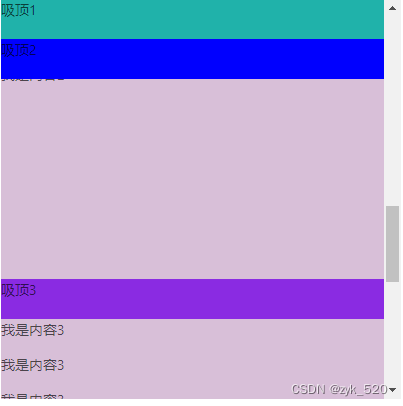
<div class="parent-content"><div class="sticky sticky-1">吸顶1</div><div class="content"><p>我是内容</p><p>我是内容</p> <p>我是内容</p> <p>我是内容</p> <p>我是内容</p> <p>我是内容</p> <p>我是内容</p> <p>我是内容</p> <p>我是内容</p> <p>我是内容</p> <p>我是内容</p> <p>我是内容</p> <p>我是内容</p> </div><div class="sticky sticky-2">吸顶2</div><div class="content"><p>我是内容2</p><p>我是内容2</p> <p>我是内容2</p> <p>我是内容2</p> <p>我是内容2</p> <p>我是内容2</p> <p>我是内容2</p><p>我是内容2</p> <p>我是内容2</p> <p>我是内容2</p> <p>我是内容2</p> <p>我是内容2</p> </div><div class="sticky sticky-3">吸顶3</div><div class="content"><p>我是内容3</p><p>我是内容3</p> <p>我是内容3</p> <p>我是内容3</p> <p>我是内容3</p> <p>我是内容3</p> </div>
</div>
css
.parent-content {width: 400px;height: 400px;background-color: #bfbfbf;overflow: auto;
}
.content {width: 100%;height: 600px;background-color:thistle;
}.sticky {position:sticky;  width: 100%;height: 40px;}.sticky-1 {top:0;background-color: lightseagreen;}.sticky-2 {top:40px; /* top值是sticky内容1倍 */background-color:blue;}.sticky-3 {top:80px;  /* top值是sticky内容2倍 */background-color:blueviolet;}
效果;
默认效果

滚动时效果
折叠后效果