前端-CSS-day4
目录
1、浮动-基本使用
2、浮动-产品布局
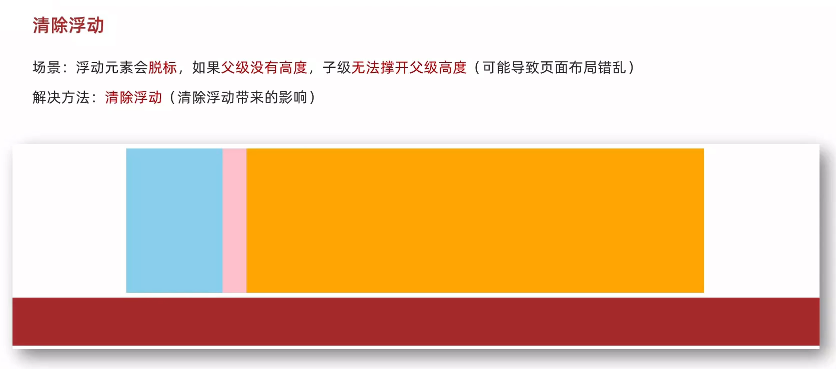
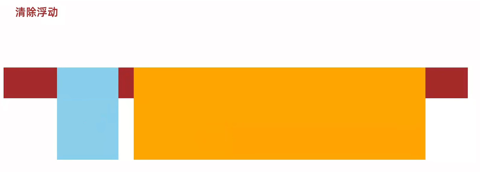
3、浮动-清除浮动
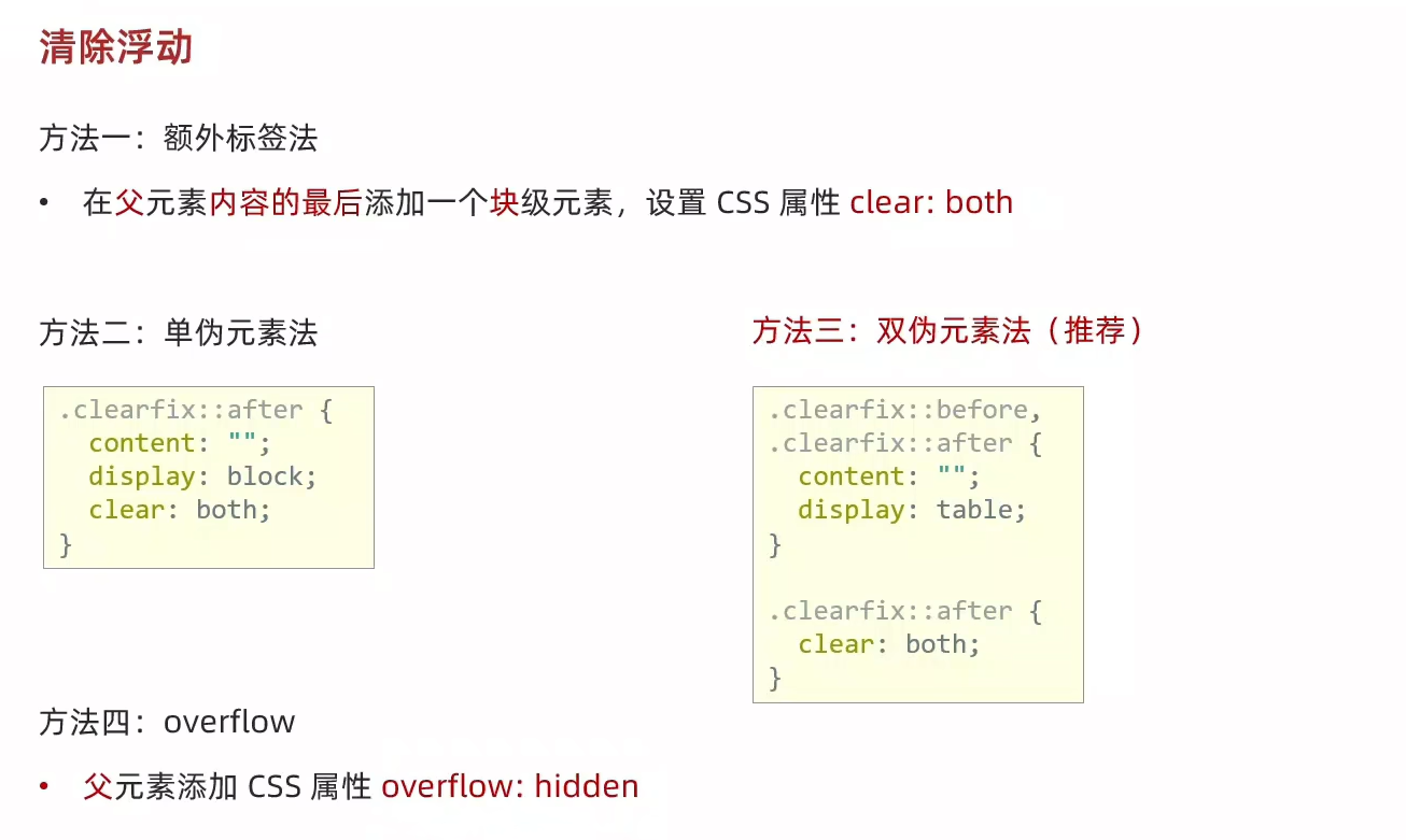
4、清除浮动-额外标签法
5、清除浮动-单伪元素法
6、清除浮动-双伪元素法
7、清除浮动-overflow
8、flex布局-体验
9、flex布局-组成
10、flex布局-主轴对齐方式
11、flex布局-侧轴对齐方式
12、flex布局-修改主轴方向
13、flex布局-弹性伸缩比
14、flex布局-弹性换行
15、flex布局-行对齐方式
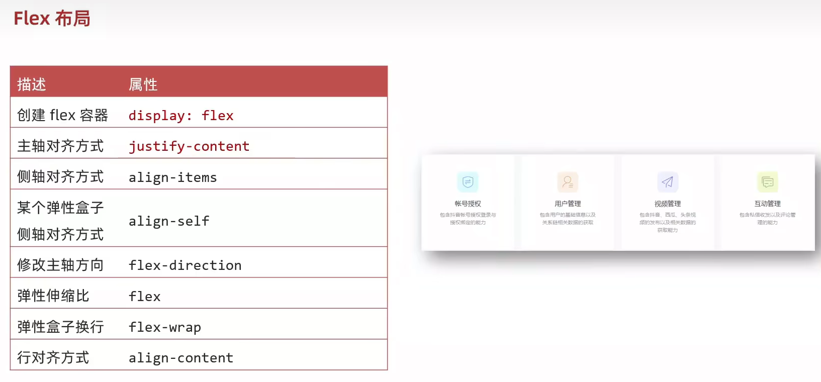
16、抖音解决方案
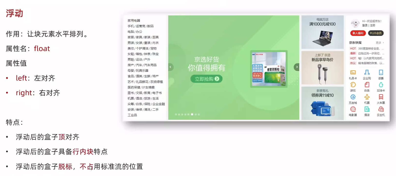
1、浮动-基本使用
<!DOCTYPE html>
<html lang="en">
<head><meta charset="UTF-8"><meta name="viewport" content="width=device-width, initial-scale=1.0"><title>浮动-基本使用</title><style>/* 特点:顶对齐;具备行内块显示模式特点;浮动的盒子会脱标 */.one {width: 100px;height: 100px;background-color: brown;float: left;}.two {width: 200px;height: 200px;background-color: orange;/* float: left; */float: right;}</style>
</head>
<body><div class="one">one</div><div class="two">two</div>
</body>
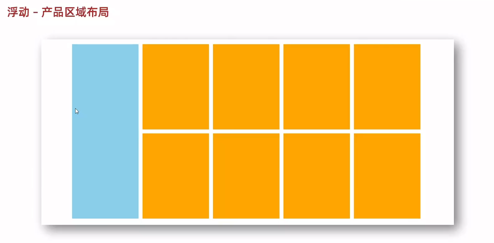
</html>2、浮动-产品布局
<!DOCTYPE html>
<html lang="en">
<head><meta charset="UTF-8"><meta name="viewport" content="width=device-width, initial-scale=1.0"><title>浮动-产品布局</title><style>* {margin: 0;padding: 0;}li {list-style: none;}.product {margin: 50px auto;width: 1226px;height: 628px;background-color: pink;}.left {float: left;width: 234px;height: 628px;background-color: skyblue;}.right {float: right;width: 978px;height: 628px;background-color: brown;}.right li {float: left;margin-right: 14px;margin-bottom: 14px;width: 234px;height: 300px;background-color: orange;}/* 第四个li和第八个li 去掉右侧的margin */.right li:nth-child(4n) {margin-right: 0;}/* 细节:如果父级宽度不够,浮动的盒子会掉下来 */</style>
</head>
<body><!-- 版心:左右,右面:8个产品 -> 8个 li --><div class="product"><div class="left"></div><div class="right"><ul><li></li><li></li><li></li><li></li><li></li><li></li><li></li><li></li></ul></div></div>
</body>
</html>
3、浮动-清除浮动
<!DOCTYPE html>
<html lang="en">
<head><meta charset="UTF-8"><meta name="viewport" content="width=device-width, initial-scale=1.0"><title>浮动-清除浮动</title><style>.top {margin: 10px auto;width: 1200px;/*height: 300px;*/background-color: pink;}.left {float: left;width: 200px;height: 300px;background-color: skyblue;}.right {float: right;width: 950px;height: 300px;background-color: orange;}.bottom {height: 100px;background-color: brown;}</style>
</head>
<body><div class="top"><div class="left"></div><div class="right"></div></div><div class="bottom"></div>
</body>
</html>
4、清除浮动-额外标签法

<!DOCTYPE html>
<html lang="en">
<head><meta charset="UTF-8"><meta name="viewport" content="width=device-width, initial-scale=1.0"><title>清除浮动-额外标签法</title><style>.top {margin: 10px auto;width: 1200px;/*height: 300px;*/background-color: pink;}.left {float: left;width: 200px;height: 300px;background-color: skyblue;}.right {float: right;width: 950px;height: 300px;background-color: orange;}.bottom {height: 100px;background-color: brown;}.clearfix {clear: both;}</style>
</head>
<body><div class="top"><div class="left"></div><div class="right"></div><div class="clearfix"></div></div><div class="bottom"></div>
</body>
</html>
5、清除浮动-单伪元素法

<!DOCTYPE html>
<html lang="en">
<head><meta charset="UTF-8"><meta name="viewport" content="width=device-width, initial-scale=1.0"><title>清除浮动-单伪元素法</title><style>.top {margin: 10px auto;width: 1200px;/*height: 300px;*/background-color: pink;}.left {float: left;width: 200px;height: 300px;background-color: skyblue;}.right {float: right;width: 950px;height: 300px;background-color: orange;}.bottom {height: 100px;background-color: brown;}/* 单伪元素法 */.clearfix::after {content: "";display: block;clear: both;}</style>
</head>
<body><div class="top clearfix"><div class="left"></div><div class="right"></div></div><div class="bottom"></div>
</body>
</html>
6、清除浮动-双伪元素法
<!DOCTYPE html>
<html lang="en">
<head><meta charset="UTF-8"><meta name="viewport" content="width=device-width, initial-scale=1.0"><title>清除浮动-双伪元素法</title><style>.top {margin: 10px auto;width: 1200px;/*height: 300px;*/background-color: pink;}.left {float: left;width: 200px;height: 300px;background-color: skyblue;}.right {float: right;width: 950px;height: 300px;background-color: orange;}.bottom {height: 100px;background-color: brown;}/* 双伪元素法 *//* before 解决外边距塌陷问题 */.clearfix::before,.clearfix::after {content: "";display: table;}/* after 清除浮动 */.clearfix::after {clear: both;}</style>
</head>
<body><div class="top clearfix"><div class="left"></div><div class="right"></div></div><div class="bottom"></div>
</body>
</html>
7、清除浮动-overflow

<!DOCTYPE html>
<html lang="en">
<head><meta charset="UTF-8"><meta name="viewport" content="width=device-width, initial-scale=1.0"><title>清除浮动-overflow</title><style>.top {margin: 10px auto;width: 1200px;/*height: 300px;*/background-color: pink;/* overflow */overflow: hidden;}.left {float: left;width: 200px;height: 300px;background-color: skyblue;}.right {float: right;width: 950px;height: 300px;background-color: orange;}.bottom {height: 100px;background-color: brown;}</style>
</head>
<body><div class="top"><div class="left"></div><div class="right"></div></div><div class="bottom"></div>
</body>
</html>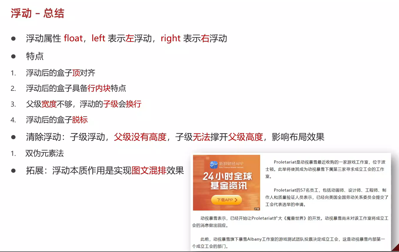
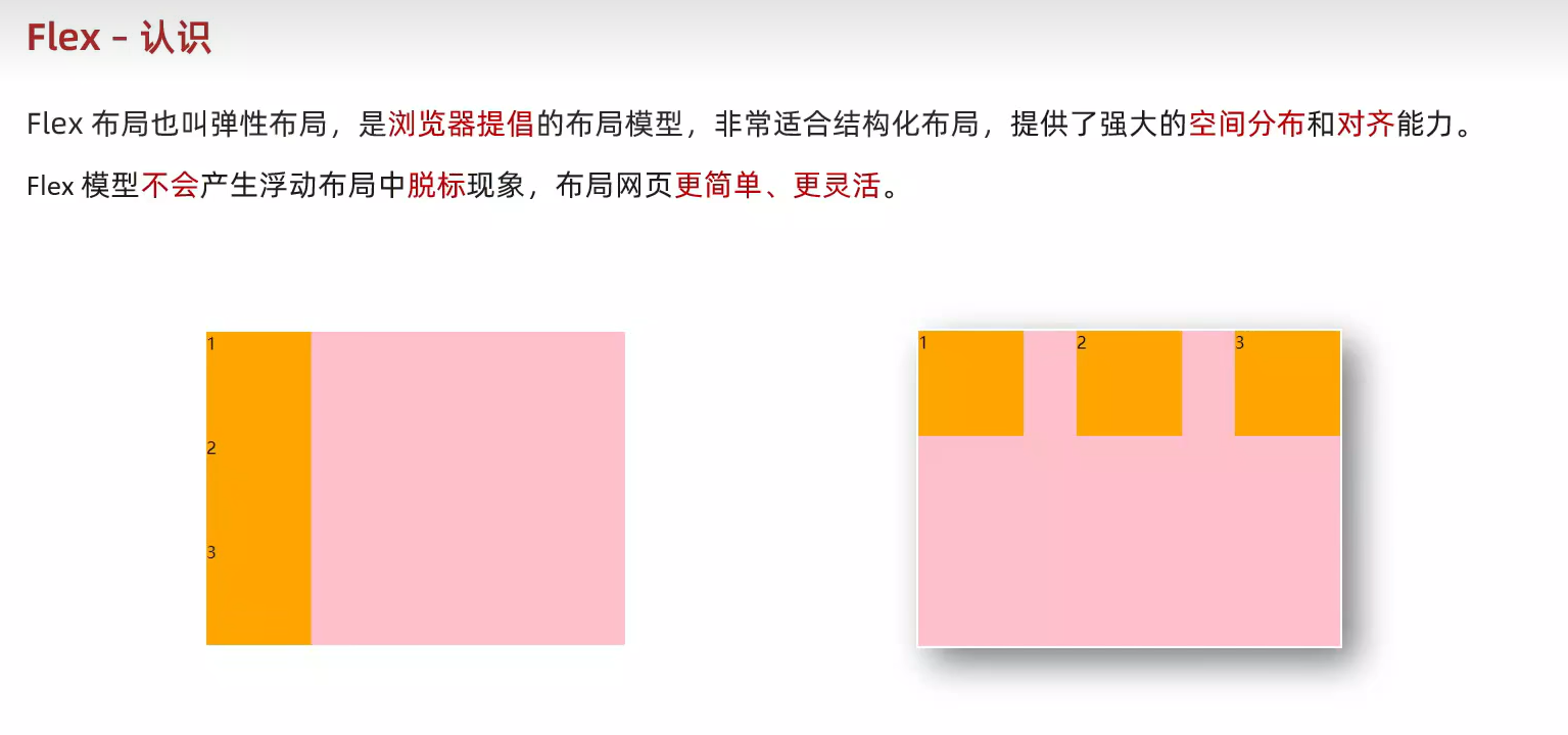
8、flex布局-体验
<!DOCTYPE html>
<html lang="en">
<head><meta charset="UTF-8"><meta name="viewport" content="width=device-width, initial-scale=1.0"><title>flex布局_体验</title><style>.box {display: flex;justify-content: space-between;height: 300px;border: 1px solid #000;}.box div {width: 200px;height: 100px;background-color: pink;}</style>
</head>
<body><div class="box"><div>1</div><div>2</div><div>3</div></div>
</body>
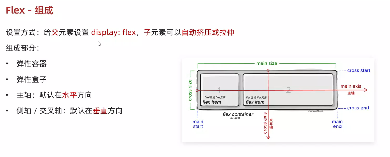
</html>9、flex布局-组成
<!DOCTYPE html>
<html lang="en">
<head><meta charset="UTF-8"><meta name="viewport" content="width=device-width, initial-scale=1.0"><title>flex布局_组成</title><style>/* 弹性容器 */.box {display: flex;height: 300px;border: 1px solid #000;}/* 弹性盒子:沿着主轴方向排列 */.box div {width: 200px;/* height: 100px; */background-color: pink;}</style>
</head>
<body><div class="box"><div>1</div><div>2</div><div>3</div><div>1</div><div>2</div><div>3</div><div>1</div><div>2</div><div>3</div></div>
</body>
</html>
10、flex布局-主轴对齐方式
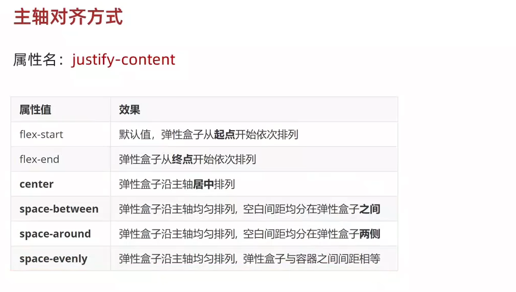
<!DOCTYPE html>
<html lang="en">
<head><meta charset="UTF-8"><meta name="viewport" content="width=device-width, initial-scale=1.0"><title>flex布局_主轴对齐方式</title><style>.box {display: flex;/* 左对齐 *//* justify-content: flex-start; *//* 右对齐 *//* justify-content: flex-end; *//* 居中 */justify-content: center; /* 父级剩余的尺寸分配成间距 *//* 弹性盒子之间的间距相等 */justify-content: space-between;/* 间距出现在弹性盒子的两侧 *//* 视觉效果:弹性盒子之间的间距是两端间距的2倍 */justify-content: space-around;/* 各个间距都相等 */justify-content: space-evenly;height: 300px;border: 1px solid #000;}.box div {width: 200px;height: 100px;background-color: pink;}</style>
</head>
<body><div class="box"><div>1</div><div>2</div><div>3</div></div>
</body>
</html>
11、flex布局-侧轴对齐方式
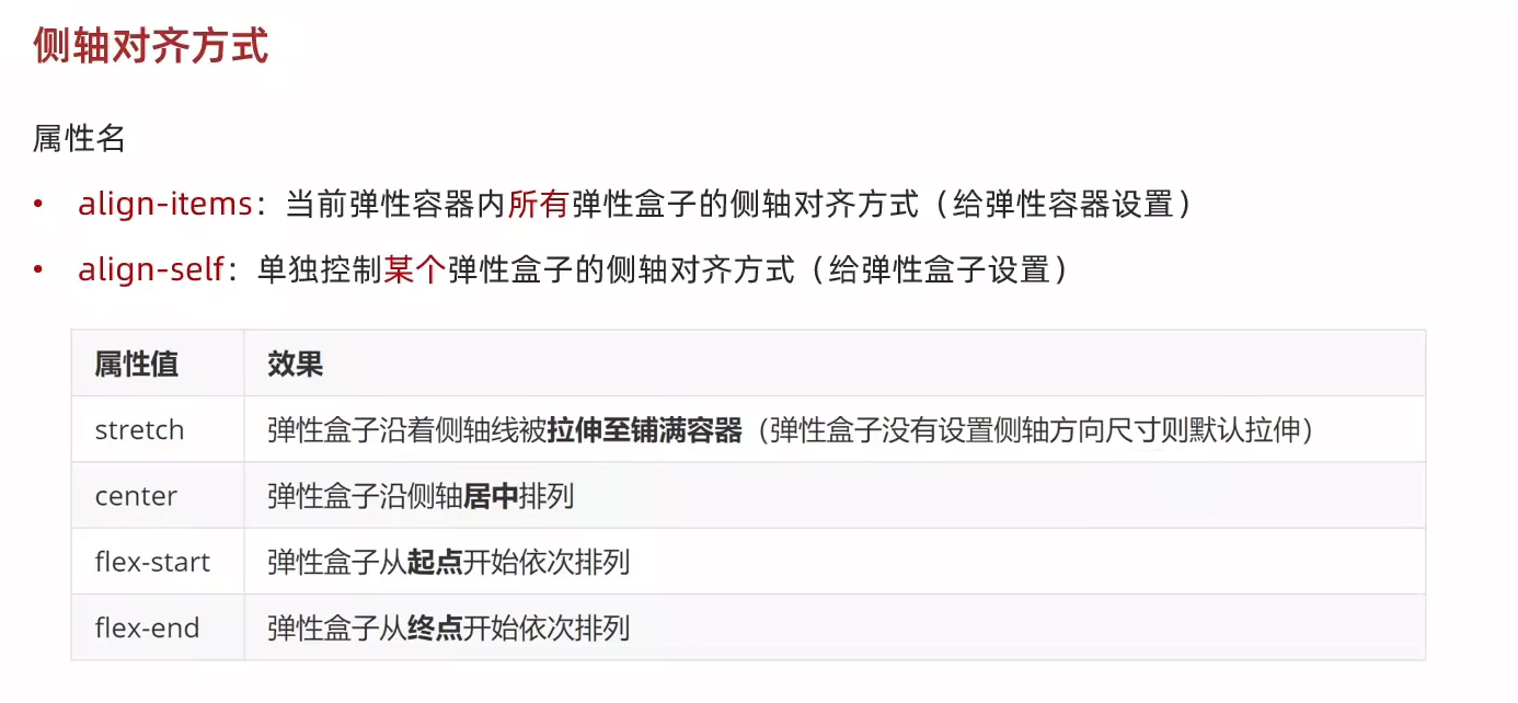
<!DOCTYPE html>
<html lang="en">
<head><meta charset="UTF-8"><meta name="viewport" content="width=device-width, initial-scale=1.0"><title>flex布局-侧轴对齐方式</title><style>.box {display: flex;/* 弹性盒子在侧轴方向没有尺寸才能拉伸 *//* align-items: stretch; *//* align-items: center; *//* align-items: flex-start; */align-items: flex-end;height: 300px;border: 1px solid #000;}/* 第二个div,测轴居中对齐 */.box div:nth-child(2) {align-self: center;}.box div {width: 200px;height: 100px;background-color: pink;}</style>
</head>
<body><div class="box"><div>1</div><div>2</div><div>3</div></div>
</body>
</html>
12、flex布局-修改主轴方向
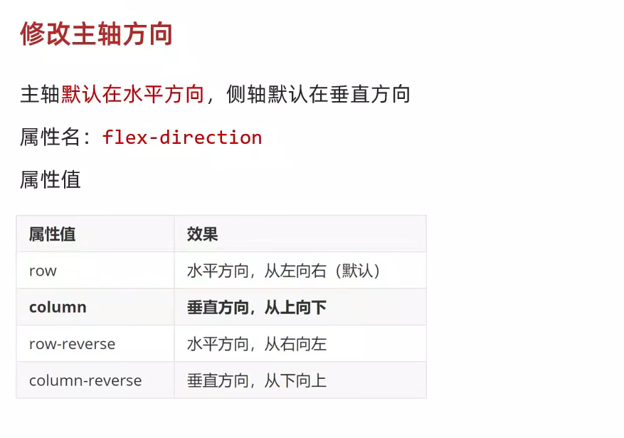
<!DOCTYPE html>
<html lang="en">
<head><meta charset="UTF-8"><meta name="viewport" content="width=device-width, initial-scale=1.0"><title>flex布局-修改主轴方向</title><style>.box {display: flex;/* 修改主轴方向,垂直方向为主轴,侧轴自动变换到水平方向 */flex-direction: column;/* 主轴为垂直方向,视觉效果:垂直居中 */justify-content: center;/* 侧轴为水平方向,视觉效果:水平居中 */align-items: center;width: 150px;height: 120px;background-color: pink;}img {width: 32px;height: 32px;}</style>
</head>
<body><div class="box"><img src="./images/1.png" alt=""><span>媒体</span></div>
</body>
</html>
13、flex布局-弹性伸缩比
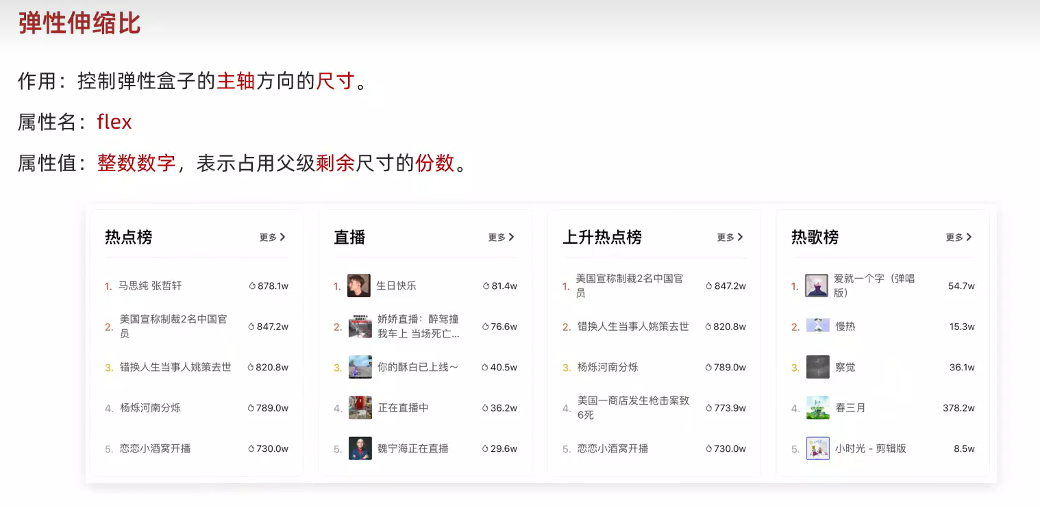
<!DOCTYPE html>
<html lang="en">
<head><meta charset="UTF-8"><meta name="viewport" content="width=device-width, initial-scale=1.0"><title>flex布局_弹性伸缩比</title><style>/* 默认情况下,主轴方向尺寸是靠内容撑开,侧轴默认拉伸 */.box {display: flex;flex-direction: column;height: 300px;border: 1px solid #000;}.box div {/* height: 100px; */background-color: pink;}.box div:nth-child(1) {width: 200px;}.box div:nth-child(2) {flex: 1;}.box div:nth-child(3) {flex: 2;}</style>
</head>
<body><div class="box"><div>1</div><div>2</div><div>3</div></div>
</body>
</html>
14、flex布局-弹性换行
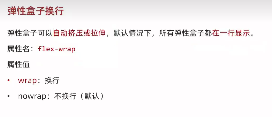
<!DOCTYPE html>
<html lang="en">
<head><meta charset="UTF-8"><meta name="viewport" content="width=device-width, initial-scale=1.0"><title>flex布局-弹性换行</title><style>.box {display: flex;flex-wrap: wrap;/* 不换行 *//* flex-wrap: nowrap; */justify-content: space-between;height: 300px;border: 1px solid #000;}.box div {width: 200px;height: 100px;background-color: pink;}</style>
</head>
<body><div class="box"><div>1</div><div>2</div><div>3</div><div>4</div><div>5</div><div>6</div><div>7</div><div>8</div><div>9</div></div>
</body>
</html>
15、flex布局-行对齐方式
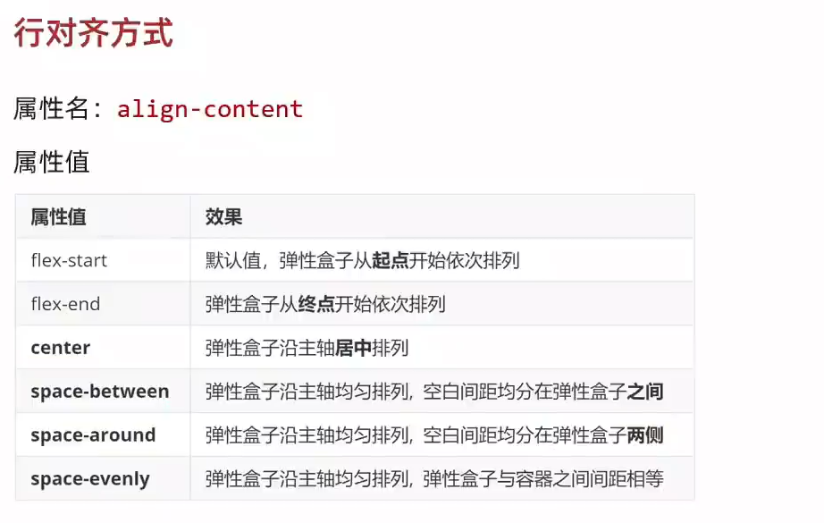
<!DOCTYPE html>
<html lang="en">
<head><meta charset="UTF-8"><meta name="viewport" content="width=device-width, initial-scale=1.0"><title>flex布局-行对齐方式</title><style>.box {display: flex;flex-wrap: wrap;justify-content: space-between;/* 调整行对齐方式:对单行弹性盒子不生效 *//* align-content: flex-start; *//* align-content: flex-end; *//* align-content: center; */align-content: space-between;align-content: space-around;align-content: space-evenly;height: 400px;border: 1px solid #000;}.box div {width: 200px;height: 100px;background-color: pink;}</style>
</head>
<body><div class="box"><div>1</div><div>2</div><div>3</div><div>4</div><div>5</div><div>6</div><div>7</div><div>8</div><div>9</div></div>
</body>
</html>
16、抖音解决方案
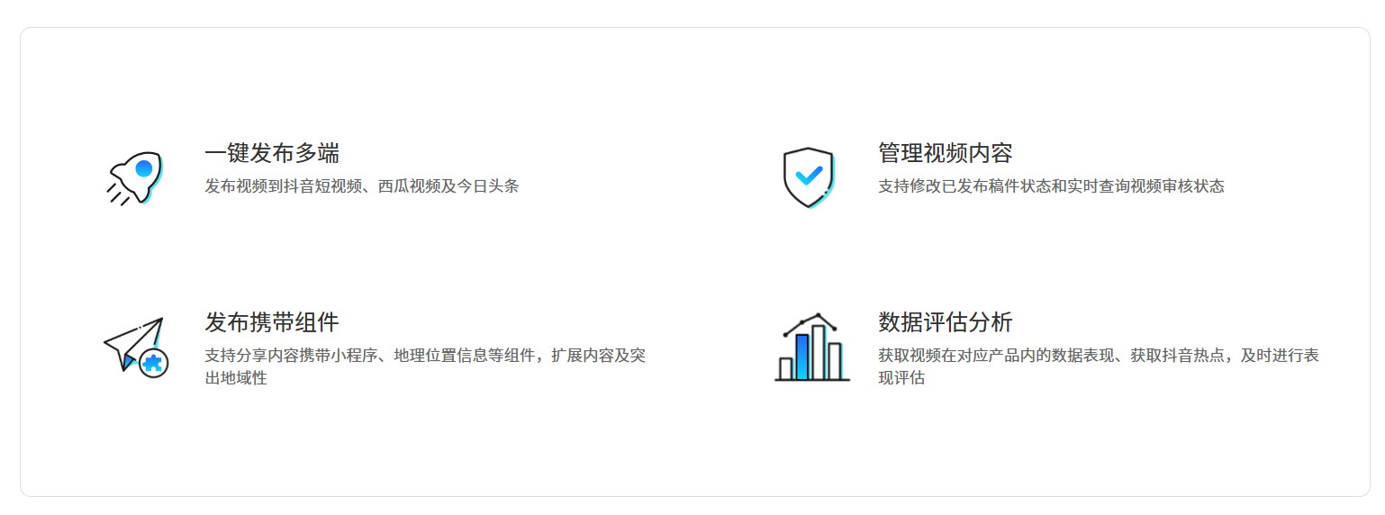
<!DOCTYPE html>
<html lang="en">
<head><meta charset="UTF-8"><meta name="viewport" content="width=device-width, initial-scale=1.0"><title>抖音解决方案</title><style>* {margin: 0;padding: 0;box-sizing: border-box;}li {list-style: none;}.box {margin: 50px auto;width: 1200px;height: 418px;border: 1px solid #ddd;border-radius: 10px;}.box ul {display: flex;/* 弹性盒子换行 */flex-wrap: wrap;/* 调整主轴对齐方式 */justify-content: space-between;/* 调整行对齐方式 */align-content: space-between;padding: 90px 40px 90px 60px;height: 418px;}.box li {display: flex;width: 500px;height: 88px;/* background-color: pink; */}.box .pic {margin-right: 15px;}.box .text h4 {line-height: 40px;font-size: 20px;font-weight: 400;color: #333;}.box .text p {font-size: 14px;color: #666;}</style>
</head>
<body><div class="box"><ul><li><div class="pic"><img src="./images/1.svg" alt=""></div><div class="text"><h4>一键发布多端</h4><p>发布视频到抖音短视频、西瓜视频及今日头条</p></div></li><li><div class="pic"><img src="./images/2.svg" alt=""></div><div class="text"><h4>管理视频内容</h4><p>支持修改已发布稿件状态和实时查询视频审核状态</p></div></li><li><div class="pic"><img src="./images/3.svg" alt=""></div><div class="text"><h4>发布携带组件</h4><p>支持分享内容携带小程序、地理位置信息等组件,扩展内容及突出地域性</p></div></li><li><div class="pic"><img src="./images/4.svg" alt=""></div><div class="text"><h4>数据评估分析</h4><p>获取视频在对应产品内的数据表现、获取抖音热点,及时进行表现评估</p></div></li></ul></div>
</body>
</html>