WPF 常用控件
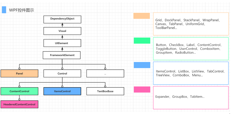
WPF六种常用控件:布局控件、内容控件、带标题内容控件、条目控件、带标题条目控件和特殊内容控件(如:TextBox,TextBlock,Image等)。
实例链接:WPF常用控件实例
Window(窗体)
Winodw窗体派生自ContentControl,有一个Content属性,里面可以放一个任意控件。Window常用属性:Icon设置窗体的图标,ShowInTaskbar 是否在任务栏项目窗体图标,WindowState 窗口显示方式,WindowStyle窗体类型,WindowStartupLocation窗体显示位置,ResizeMode窗体条件。日常开发中最常用的是,去掉原生的Window边框,实现自定义背景且圆角带阴影的窗体,Xaml代码如下:
<Window x:Class="WpfControlDemo.MainWindow"xmlns="http://schemas.microsoft.com/winfx/2006/xaml/presentation"xmlns:x="http://schemas.microsoft.com/winfx/2006/xaml"xmlns:d="http://schemas.microsoft.com/expression/blend/2008"xmlns:mc="http://schemas.openxmlformats.org/markup-compatibility/2006"xmlns:local="clr-namespace:WpfControlDemo"mc:Ignorable="d"Width="800" Height="400"Title="MainWindow" WindowStyle="None" WindowStartupLocation="CenterScreen"  AllowsTransparency="True" Background="Transparent"MouseLeftButtonDown="Window_MouseLeftButtonDown" ><Grid><Border CornerRadius="15" Background="White" Margin="15"><Border.Effect><DropShadowEffect Color="Gray" ShadowDepth="0" BlurRadius="5"></DropShadowEffect></Border.Effect></Border></Grid>
</Window>
鼠标按住窗体拖动,后台代码如下:
private void Window_MouseLeftButtonDown(object sender, MouseButtonEventArgs e){this.DragMove();//允许鼠标拖动窗体}Border (边框)
通过于布局元素一起使用,只能包含单个控件,可以设置圆角(CornerRadius),边框(BorderBrush:边框颜色,BorderThickness:边框线条粗细)和效果(effect)等。
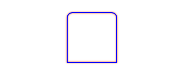
<Border Width="100" Height="100" CornerRadius="10,10,0,0" BorderBrush="Blue" BorderThickness="2"><Border.Effect><DropShadowEffect Color="Orange" ShadowDepth="0" BlurRadius="5"></DropShadowEffect></Border.Effect></Border>Button(按键)
按键有常用属性Content(标签显示),Click(点击事件),Command(绑定命令),IsDefault(用户按下Enter键,相当于点击该按键),IsCancel(用户按下Esc键,相当于点击该按键)。
<Button Content="按键" Width="100" Height="30" IsDefault="True" Click="Button_Click" Grid.Row="1"/>ReapButton(重复按键)
作用是当用户鼠标左键按住该按钮时,会一直触发点击事件,主要应用于一些播放器的快进等功能。
常用属性 | 描述 |
Delay | 表示从用户按下鼠标左键到开始重复发送Click事件的延迟时间(毫秒) |
Interval | 按键持续按下左键,,每次发送Click事件的时间间隔(毫秒 |
<RepeatButton Delay="100" Interval="1000" Click="repButton_Click"/>TextBox(文本框,用于用户文字输入)
常用属性 | 描述 |
Text | 文本内容 |
TextWrapping | 文本是否自动换行,默认一行显示 |
TextAlignment | 文本对齐方式 |
<TextBox Width="100" Height="30" Grid.Column="1" TextWrapping="Wrap" TextAlignment="Center" Text="设置TextWrapping后超出文字会换行"/>PasswordBox(密码框,可隐藏用户输入)
常用属性 | 描述 |
Password | 密码文本信息 |
PasswordChar | 密码字符,默认是圆点 |
VerticalContentAlignment & HorizontalContentAlignment | 设置内部密码文本的对齐方式 |
RichTextBox
RichTextBox 控件允许您查看和编辑文本、段落、图像、表格和其他富文本格式的内容,展现文本内容丰富,对System.Windows.Documents.FlowDocument对象进行丰富操作的编辑控件。
常用属性 | 描述 |
Document | 获取或设置RichTextBox的SystemWindows.Documents.FlowDocument表示的内容 |
IsDocumentEnabled | 用户是否可以交互(RichTextBox中的UIElement和 ContentElement中的对象),false用户将无法操作文档内容进行交互 |
Selection | 当前选定内容 |
TextBlock(轻量级的文本控件)
轻量级的文本控件,多用于一些简短的标题或文字,或者成为内容控件的子元素作为文本呈现用,不可编辑,属性与TextBox相似,超出文本显示省略号可以设置TextTrimming="CharacterEllipsis"。
<TextBlock x:Name="txtb" Width="100" TextTrimming="CharacterEllipsis" Text="超长文本显示省略号"/>RadioButton(单选框)
常用属性 | 描述 |
Content | 显示内容 |
GroupName | 组名,这个在使用中需要注意,如果多个RadioButton设置了同一个组名,那么它们之间是互斥的,只有一个能被选中,不同组的不互斥 |
IsChecked | 是否选中的状态 |
<StackPanel ><RadioButton IsChecked="True" Content="男" GroupName="sex" Grid.Row="2" /><RadioButton  Content="女" GroupName="sex" Grid.Row="2" />
</StackPanel>CheckBox(多选框)
常用属性 | 描述 |
Content | 显示内容 |
IsThreeState | 确定控件是否支持两个或三个状态,默认为false,支持三个状态 |
IsChecked | 是否选中的状态 |
<StackPanel Orientation="Horizontal"  Height="40"><CheckBox Content="羽毛球" Margin="5" IsChecked="True"></CheckBox><CheckBox Content="足球" Margin="5" IsThreeState="True"></CheckBox><CheckBox Content="篮球" Margin="5"></CheckBox>
</StackPanel>Image(图片控件)
用于展示图片,主要属性就是Source(图片资源路径)。图片路径请参考:WPF 调用图片路径,或资源图片
<Image Height="100" Width="100" Source="1.png" Stretch="Uniform"/>ComboBox(组合框)
组合框是一组带有下拉列表的选择控件,通过单击控件上的箭头可显示或隐藏下拉列表。
常用属性 | 描述 |
IsDropDownOpen | 获取或设置组合框下拉列表是否展开 |
IsEditable | 获取或设置启用或禁用编辑文本框中文本的 ComboBox |
IsReadOnly | 获取或设置所选内容只读不可编辑 |
ListBox(列表控件)
ListBox 是一个 ItemsControl,这意味着它可以包含任何类型的对象的集合。
<ListBox Grid.Row="2" Grid.Column="1" Width="80" Height="100"><ListBoxItem><StackPanel Orientation="Horizontal"><TextBlock Text="1" VerticalAlignment="Center" Margin="0,0,10,0"/><Button Width="40" Height="20" Content="ok"/></StackPanel></ListBoxItem><ListBoxItem><StackPanel Orientation="Horizontal"><TextBlock Text="2" VerticalAlignment="Center" Margin="0,0,10,0"/><Button Width="40" Height="20" Content="ok"/></StackPanel></ListBoxItem>
</ListBox>
ListView
ListView 控件是派生自 ListBox 的 ItemsControl 控件。 通常,该控件的项为数据集合的成员,并且表示为 ListViewItem 对象。 ListViewItem 是一个 ContentControl 且只能包含单个子元素。 但是,该子元素可以是任何视觉元素。若要为 ListView 控件的内容指定视图模式,请设置 View 属性。WPF提供的一个视图模式为 GridView,可在具有可自定义列的表格中显示数据项集合。
<Window.Resources><ObjectDataProvider x:Key="EmployeeInfoDataSource" ObjectType="{x:Type ds:EmployeeInfoDataSource}"/>
</Window.Resources>
<Grid><ListView ItemsSource="{Binding Source={StaticResource EmployeeInfoDataSource}}" Grid.Column="2" Grid.RowSpan="2" Width="200" Height="200"><ListView.View><GridView AllowsColumnReorder="true" ColumnHeaderToolTip="Employee Information"><GridViewColumn DisplayMemberBinding="{Binding Path=FirstName}" Header="First Name" Width="100"/><GridViewColumn DisplayMemberBinding="{Binding Path=LastName}" Width="100"><GridViewColumnHeader>Last Name<GridViewColumnHeader.ContextMenu><ContextMenu  Name="LastNameCM"><MenuItem Header="Ascending" /><MenuItem Header="Descending" /></ContextMenu></GridViewColumnHeader.ContextMenu></GridViewColumnHeader></GridViewColumn><GridViewColumn DisplayMemberBinding="{Binding Path=EmployeeNumber}" Header="Employee No." Width="100"/></GridView></ListView.View></ListView>
</Grid>
public class EmployeeInfoData{public string FirstName { get; set; }public string LastName { get; set; }public string EmployeeNumber { get; set; }}public class EmployeeInfoDataSource:ObservableCollection<EmployeeInfoData>{public EmployeeInfoDataSource(){Add(new EmployeeInfoData{FirstName = "Xue",LastName = "Xiao",EmployeeNumber = "101"});Add(new EmployeeInfoData{FirstName = "Qiang",LastName = "Xiao",EmployeeNumber = "102"});Add(new EmployeeInfoData{FirstName = "Ming",LastName = "Xiao",EmployeeNumber = "103"});}}GridView(列绑定控件)
GridView视图模式是ListView控件的视图模式中的一种。GridView及其辅助类能让你在表中来查看集合中的数据项,且可以通过表头来进行交互(表头是个按钮,可以给它加各种交互功能,如排序)。ListView是ListBox派生类,而GridView是ViewBase的派生类,ListView的View属性是一个ViewBase类型的对象,所以,GridView可以作为ListView的View来使用而不能作为独立的控件来使用。
布局控件请参考:WPF布局元素
其他控件:
Menu:菜单控件
GroupBox:分组框
Expander:伸展控件
Lable:标签控件 等...
WPF除了这些基础控件外,还支持用户定义控件:用户控件UserConrol(多个控件组合),CustomerControl自定义控件(改造或者新建控件),通过模板,样式,触发器,能创建丰富多彩的控件。
本文参考:https://blog.csdn.net/qq_39847278/article/details/127652570
实例链接:WPF常用控件实例