SwiftUI 常用组件和属性(SwiftUI初学笔记)
本文为初学SwiftUI笔记。记录SwiftUI常用的组件和属性。
组件
共有属性(View的属性)
             Image("toRight").resizable().background(.red) // 背景色.shadow(color: .black, radius: 2, x: 9, y: 15) //阴影.frame(width: 30, height: 30) // 宽高 可以只设置宽或者高.offset(x: 10,y: 10) //显示位置偏移(原来的位置可能还继续占位).position(CGPoint(x: 175, y: 100)) //绝对位置 这个配置的是中心点的位置
//            //相对于其他组件的间距.padding(EdgeInsets(top: 10, leading: 50, bottom: 50, trailing: 50)).scenePadding(.trailing) // 填充此视图所沿的一组边。.border(.blue, width: 12) // 边框颜色和宽度.cornerRadius(15) // 圆角.clipShape(Circle()) //裁减成圆形.mask(Circle()) //遮罩.onTapGesture { // 点击事件print("你好啊")}
Text
Text展示文案
            Image("toRight").resizable().background(.red) // 背景色.shadow(color: .black, radius: 2, x: 9, y: 15) //阴影.frame(width: 30, height: 30) // 宽高 可以只设置宽或者高.offset(x: 10,y: 10) //显示位置偏移(原来的位置可能还继续占位)
//            //相对于其他组件的间距.padding(EdgeInsets(top: 10, leading: 50, bottom: 50, trailing: 50)).scenePadding(.trailing) // 填充此视图所沿的一组边。.border(.blue, width: 12) // 边框颜色和宽度.cornerRadius(15) // 圆角.overlay(Color.blue.clipShape(Circle()))//覆盖一个图形.rotation3DEffect(.degrees(60), axis: (x: 1, y: 0, z: 0))//3D旋转.rotationEffect(.degrees(20), anchor:UnitPoint(x: 0, y: 0)) //2D旋转.onTapGesture { // 点击事件print("你好啊")}
Image
Image展示图片
Image("toRight") //如果不设置大小会自动读取图片大小//允许重新设置大小,调用了这个才能设置大小 ,capInsets为间距 resizingMode为渲染模式.resizable(capInsets: EdgeInsets(), resizingMode: .tile).interpolation(.high)//插值,大图片用高插值,优化展示.antialiased(true) //抗锯齿
ProgressView
ProgressView是进度条
import SwiftUIstruct ProgressTest: View {@State var timer = Timer.TimerPublisher(interval: 0.03, runLoop: .main, mode: .common).autoconnect()@State var value:Double = 0.0var body: some View {List{//菊花 无法定义颜色 ProgressView()//线性进度条 无法隐藏 Label ProgressView("完成量", value: value, total: 100).accentColor(.red)//自定义 StyleProgressView("工程进度",value: value, total: 100).progressViewStyle(MyProgressViewStyle())}.onAppear {timer = Timer.TimerPublisher(interval: 0.03, runLoop: .main, mode: .common).autoconnect()}.onReceive(timer) { _ inif value < 100 {value += 2}}}
}//定义方法都大同小异。
struct MyProgressViewStyle:ProgressViewStyle{let foregroundColor:Colorlet backgroundColor:Colorinit(foregroundColor:Color = .blue,backgroundColor:Color = .orange){self.foregroundColor = foregroundColorself.backgroundColor = backgroundColor}func makeBody(configuration: Configuration) -> some View {GeometryReader{ proxy inZStack(alignment:.topLeading){backgroundColorRectangle().fill(foregroundColor).frame(width:proxy.size.width * CGFloat(configuration.fractionCompleted ?? 0.0))}.clipShape(RoundedRectangle(cornerRadius: 10)).overlay(configuration.label.foregroundColor(.white))}}
}
Button
按钮
Button(action: { //点击事件}, label: { //这个里面放的东西相当于水平布局Image(systemName: "clock")Text("Click Me")Text("Subtitle")
})
如果只有文字可以直接这样
Button("Click Me") {// 点击事件
}
布局组件
VStack
垂直布局
alignment是对齐方式 包括leading、trailing、center
spacing 是内部组件间距
VStack(alignment:.leading, spacing: 20){
}
HStack
水平布局
alignment是对齐方式 包括 包括bottom、top、firstTextBaseline、lastTextBaseline、center
spacing 是内部组件间距
HStack(alignment:.bottom, spacing: 20){}
ZStack
堆叠布局,后面的组件叠在前面的组件之上
alignment 包括leading、trailing、bottom、top、bottomLeading、topLeading、bottomtrailing、toptrailing、center
//ZStack(alignment: .bottomTrailing){}
Group
把多个组件组合到一起,解决布局最多只能有10个内部组件问题,他里面的组件遵循外面的布局的布局方式。另外还有个组件GroupBox,是带一个文案的Group。
LazyStack
懒加载的Stack,需要跟scrollView配合使用,只会加载当前页面显示的item,必须有循环创建,否则无法出现懒加载效果
颜色
使用系统提供色
Text().background(.yellow)
自定义颜色
Text().background(Color(UIColor(displayP3Red: 1.0, green: 0.0, blue: 0.0, alpha: 1.0))
使用Asset中定义的颜色,下面的8FD3F4是命名为此的asset中的颜色
Color("8FD3F4")
渐变色
LinearGradient(gradient: Gradient(colors: [Color.blue, Color.green]), startPoint: .leading, endPoint: .trailing)
形状
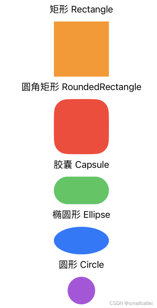
如上形状的代码:
VStack {Spacer()Group{Text("矩形 Rectangle")Rectangle().fill(Color.orange).frame(width: 100, height: 100)}Group{Text("圆角矩形 RoundedRectangle")RoundedRectangle(cornerRadius: 25, style: .continuous).fill(Color.red).frame(width: 100, height: 100)}Group{Text("胶囊 Capsule")Capsule().fill(Color.green).frame(width: 100, height: 50)Text("椭圆形 Ellipse")Ellipse().fill(Color.blue).frame(width: 100, height: 50)}Group{Text("圆形 Circle")Circle().fill(Color.purple).frame(width: 100, height: 50)}Spacer()}
其他
在 UIKit 中使用 SwiftUI
let vc = UIHostingController(rootView: Text("Hello World")) // 包装出来一个 UIViewController
let view = vc.view // 可以获取 view