【鸿蒙应用ArkTS开发系列】-自定义底部菜单列表弹窗
文章目录
- 前言
- 创建Demo工程
- 创建dialog 文件夹
- 创建ListMenu 接口
- 创建自定义弹窗 ListMenuDialog
- 使用自定义弹窗
- 打包测试
- 效果演示
- 默认效果
- 菜单带图标效果
- 设置文本颜色效果
- 不同文本颜色效果
- 无标题效果
前言
上一篇文章中我们实现了选择图片、选择文件、拍照的功能 。
链接在这里,大家有兴趣可以点击 《【鸿蒙应用ArkTS开发系列】- 选择图片、文件和拍照功能实现》 。
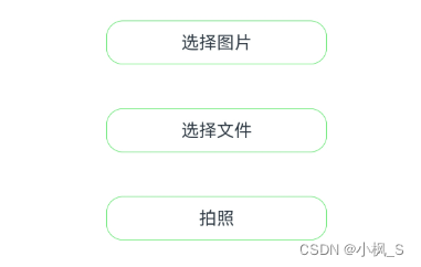
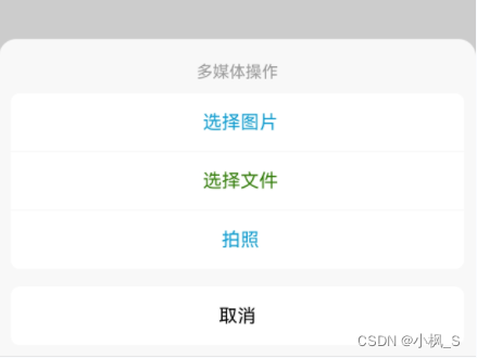
之前的效果
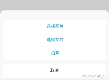
这一节我们要实现的效果
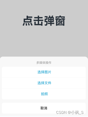
上一节 我们是在页面布局中使用三个按钮来作为入口,但是有些场景,我们希望应用以底部菜单弹窗的形式来与用户进行操作交互。那在鸿蒙原生应用中,一个自定义的底部菜单列表弹窗应该怎么实现呢,这一节,我们来讲下这个基础知识。
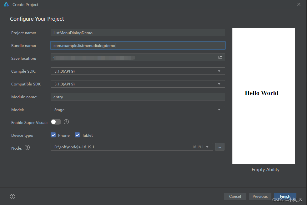
创建Demo工程
我们使用Empty Ability 模板创建一个Demo工程。

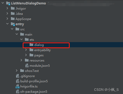
创建dialog 文件夹
创建ListMenu 接口
在src->main->ets ->dialog 文件夹下创建ListMenu.ets文件,完整代码如下:
/*** 菜单*/
export interface ListMenu {id: string;text: string | Resource;icon?: Resource;fontColor?: ResourceColor;onItemClick?: () => void;
}
这里我们对底部菜单列表的菜单选项数据进行抽象,抽取出通用字段:
- id 唯一字段
- text 显示的菜单文本
- icon 文本左侧显示的图标,非必传
- fontColor 文本颜色 非必传
- onItemClick 点击事件
下面我们来看下自定义弹窗类的代码实现。
创建自定义弹窗 ListMenuDialog
在src->main->ets ->dialog 文件夹下创建ListMenuDialog.ets文件,完整代码如下:
/*** 自定义底部列表菜单弹窗*/
import { ListMenu } from './ListMenu';@CustomDialog
export struct ListMenuDialog {@Prop title: string = '';@State titleVisible: boolean = true;@State menuArray: ListMenu[] = [];controller: CustomDialogController;onCancel?: () => void;@StylesitemPressedStyle() {.backgroundColor('#e2e2e2')}@StylesitemNormalStyle() {.backgroundColor(Color.White)}build() {Column() {Text(this.title).fontColor('#999999').fontSize(14).margin({ top: 10 }).maxLines(1).visibility(this.titleVisible ? Visibility.Visible : Visibility.None)if (this.menuArray.length > 0) {Scroll() {Column() {ForEach(this.menuArray, (item: ListMenu, index: number) => {this.MenuItem(item, index)}, (index: number) => {return index.toString();})}}.backgroundColor(Color.White).borderRadius(8).margin({ top: 10 }).constraintSize({maxHeight: '40%'})}Text('取消').width('100%').height(50).fontColor(Color.Black).fontSize(16).margin({ top: 15 }).backgroundColor(Color.White).textAlign(TextAlign.Center).borderRadius(8).stateStyles({normal: this.itemNormalStyle,pressed: this.itemPressedStyle}).onClick(() => {if (this.controller) {this.controller.close();}if (this.onCancel) {this.onCancel();}})}.padding(10).alignItems(HorizontalAlign.Center).width('100%').backgroundColor('#f8f8f8').borderRadius({topLeft: 15,topRight: 15})}@BuilderMenuItem(item: ListMenu, index: number) {Row() {Image(item.icon).width(30).height(30).visibility(item.icon ? Visibility.Visible : Visibility.None)Text(item.text).fontColor(item.fontColor ? item.fontColor : Color.Black).fontSize(16).textAlign(TextAlign.Center).margin({ left: 5 })}.width('100%').height(50).alignItems(VerticalAlign.Center).justifyContent(FlexAlign.Center).borderStyle({ bottom: BorderStyle.Solid }).borderColor('#f8f8f8').borderWidth({bottom: index === this.menuArray.length - 1 ? 0 : 1}).stateStyles({normal: this.itemNormalStyle,pressed: this.itemPressedStyle}).onClick(() => {if (this.controller) {this.controller.close();}if (item.onItemClick) {item.onItemClick();}})}
}
下面我们对这个自定义弹窗代码进行一些讲解:
-
首先我们定义一个ListMenuDialog 的结构体;
export struct ListMenuDialog 。 -
使用@CustomDialog装饰器
我们使用@CustomDialog装饰这个ListMenuDialog 结构体,表明我们这个结构体是一个自定义对话框。 -
定义自定义弹窗控制器CustomDialogController
通过定义CustomDialogController,在弹窗内部可以触发弹窗的打开跟关闭。 -
title
弹窗标题,这里定义为Prop, 可以与页面进行状态同步,对于有弹窗标题动态修改的场景,可以使用到。 -
titleVisible
控制标题是否显示,如果弹窗没有标题,通过传递false进行设置标题不显示。 -
menuArray
列表菜单数据源 ,通过使用ForEach进行遍历调用 我们MenuItem子项 绘制列表UI。 -
MenuItem
这个是菜单项UI布局方法,我们使用@Builder装饰。 -
分隔线
通过给Item设置 border,绘制底部边框来实现分隔线的效果。 -
菜单按下点击色
通过设置 stateStyles,给Item配置两个@Style装饰的样式itemNormalStyle 跟itemPressedStyle,来实现按下Item显示一个点击效果。
这样我们就完成了一个自定义底部菜单列表弹窗,下面我们在页面中来进行实际使用。
使用自定义弹窗
我们在Index.ets 中添加如下代码:
import { ListMenu } from '../dialog/ListMenu';
import { ListMenuDialog } from '../dialog/ListMenuDialog';@Entry
@Component
struct Index {@State message: string = '点击弹窗';private customDialogController: CustomDialogController;build() {Row() {Column() {Text(this.message).fontSize(50).fontWeight(FontWeight.Bold).onClick(this.showBottomDialog.bind(this))}.width('100%')}.height('100%')}showBottomDialog() {const menuList: ListMenu[] = [{id: '1',text: '选择图片',fontColor: $r("app.color.blue_089ed9"),onItemClick: () => {console.log('点击了选择图片');}},{id: '2',text: '选择文件',fontColor: $r("app.color.blue_089ed9"),onItemClick: () => {console.log('点击了选择文件');}},{id: '3',text: '拍照',fontColor: $r("app.color.blue_089ed9"),onItemClick: () => {console.log('点击了拍照');}},];this.customDialogController = new CustomDialogController({builder: ListMenuDialog({title: '多媒体操作',menuArray: menuList,controller: this.customDialogController}),cancel: () => {console.log('点击了取消');},autoCancel: true,alignment: DialogAlignment.Bottom,customStyle: true});this.customDialogController.open();}hideBottomDialog() {this.customDialogController.close();}
}
我们定义了一个CustomDialogController 弹窗控制器,这里我们对CustomDialogController的一些属性进行下讲解,
- builder:
这个是设置一个@CustomDialog装饰的弹窗对象,这里使用我们上面创建的ListMenuDialog自定义弹窗。 - cancel:
这个是弹窗取消时候会触发的回调函数。 - autoCancel:
true 可以通过触击弹窗外空白处使得弹窗关闭,false ,则不可以。 - alignment:
这个是弹窗的显示位置,这里我们设置为DialogAlignment.Bottom,在底部弹出。 - customStyle :
这个是是否自定义弹窗样式,我们是自定义弹窗,设置为true即可。
我们通过构建一个弹窗控制器来控制弹窗的显示跟关闭,通过构建ListMenuDialog对象来配置弹窗数据源和显示样式,包括标题,标题是否显示,弹窗菜单的样式。 那接下来我们直接运行demo看下效果。
打包测试
打包安装到真机上,需要我们给项目配置签名信息。我们点击File -> Project Structure ->Project ,选择 Signing Configs面板,勾选 Support HarmonyOS 跟Automatically generate signature,自动生成调试签名,生成完毕后,运行安装到手机上。
效果演示
默认效果
const menuList: ListMenu[] = [{id: '1',text: '选择图片',fontColor: $r("app.color.blue_089ed9")},

菜单带图标效果
const menuList: ListMenu[] = [{id: '1',text: '选择图片',icon: $r('app.media.ic_picture'),onItemClick: () => {console.log('点击了选择图片');}},{id: '2',text: '选择文件',icon: $r('app.media.ic_file'),onItemClick: () => {console.log('点击了选择文件');}}]

设置文本颜色效果

const menuList: ListMenu[] = [{id: '1',text: '选择图片',fontColor: $r("app.color.blue_089ed9"),onItemClick: () => {console.log('点击了选择图片');}},{id: '2',text: '选择文件',fontColor: $r("app.color.blue_089ed9"),onItemClick: () => {console.log('点击了选择文件');}}
]
不同文本颜色效果
const menuList: ListMenu[] = [{id: '1',text: '选择图片',fontColor: $r("app.color.blue_089ed9"),onItemClick: () => {console.log('点击了选择图片');}},{id: '2',text: '选择文件',fontColor: $r("app.color.green_2f7e04"),onItemClick: () => {console.log('点击了选择文件');}}
]
无标题效果
builder: ListMenuDialog({menuArray: menuList,controller: this.customDialogController}),
大家也可以 在 ListMenu中增加一些其他的字段属性来拓展弹窗样式,比如图标的大小、文本的对齐方式等等。
那本章内容就到此结束,谢谢大家的阅读! 有疑问的可以在评论区留言交流。