尚硅谷css3笔记
目录
一、新增长度单位
二、新增盒子属性
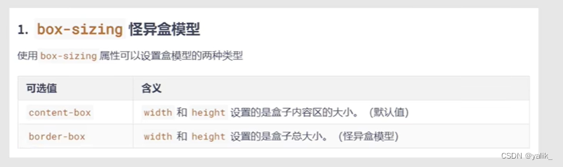
1.border-box 怪异盒模型
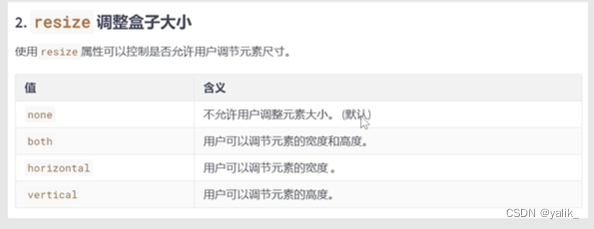
2.resize 调整盒子大小
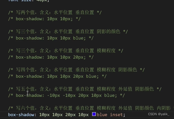
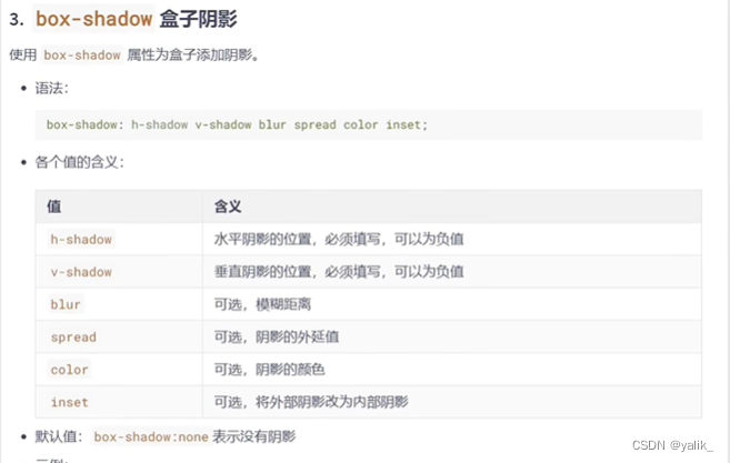
3.box-shadow 盒子阴影
案例:鼠标悬浮盒子上时,盒子有一个过度的阴影效果
三、新增背景属性
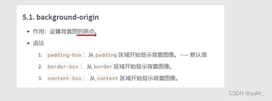
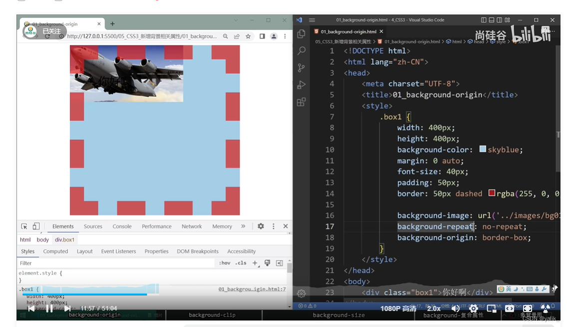
1.background-origin 设置背景图的原点
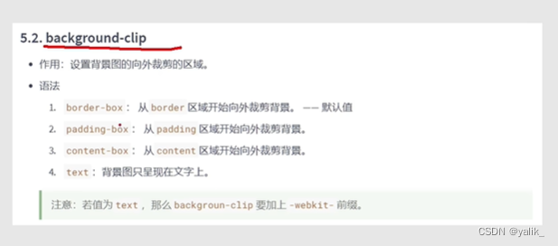
2.background-clip 设置背景图向外裁剪的区域
案例:让背景图呈现在文字上
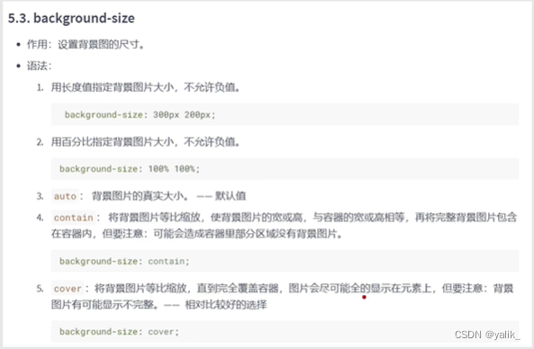
3.background-size 设置背景图的尺寸
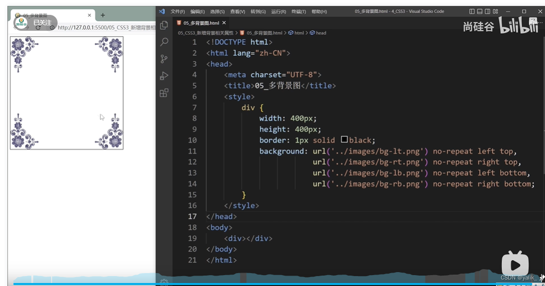
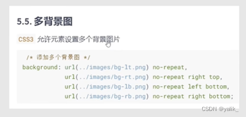
4.多背景图,用逗号隔开
四、新增文本属性
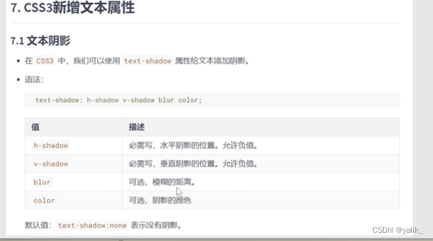
1.text-shadow 文本阴影
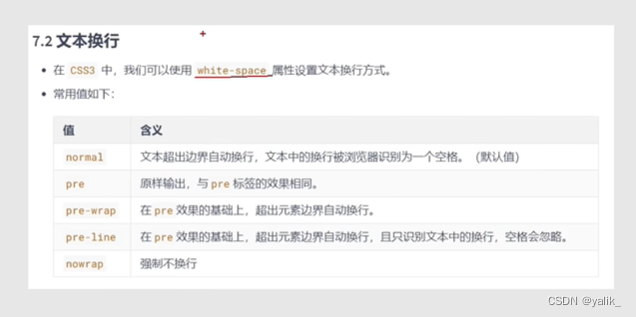
2.white-space 文本换行
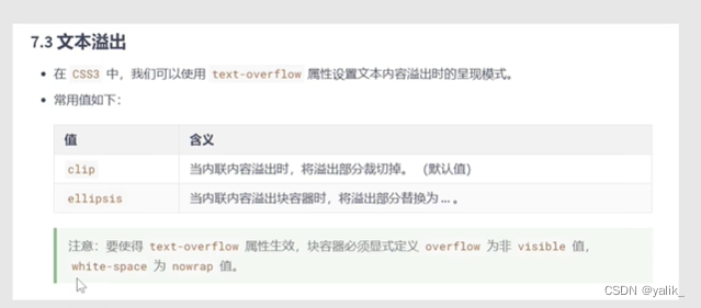
3.text-overflow 文本溢出
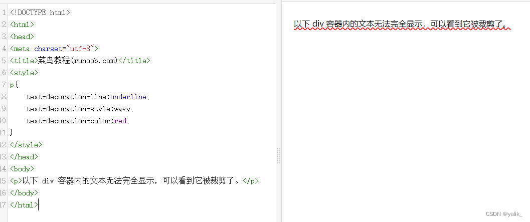
案例:一行超出的文本用...表示
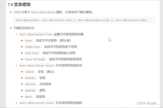
4.text-decoration 文本修饰
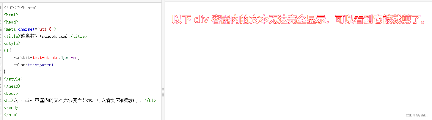
5.-webkit-text-stroke 文本描边
五、新增渐变
1.linear-gradient 线性渐变
2.radial-gradient 径向渐变
3.重复渐变
4.案例
六、web字体
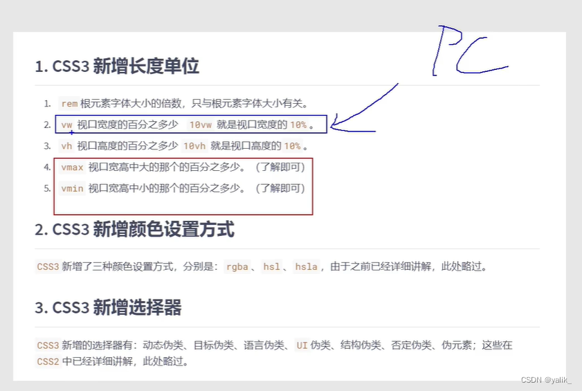
一、新增长度单位
①vw:相对于视口宽度的百分比
②vh:相对于视口高度的百分比
div{width:20vw;height:20vh;
}
二、新增盒子属性
1.border-box 怪异盒模型
div{width:200px;height:200px;border:5px solid #fff;box-sizing:boeder-box;
}
2.resize 调整盒子大小
resize一定要和overflow一起用
<div class="box1"><div class="box2"></div>
</div>.box1{width:400px;height:400px;resize:both;overflow:scroll;background:orange;
}.box2{width:800px;height:800px;background:blue;
}
3.box-shadow 盒子阴影
案例:鼠标悬浮盒子上时,盒子有一个过度的阴影效果
div{width:300px;height:300px;background:orange;transition:1s linear all;
}div:hover{box-shadow:0 0 10px black;
}
三、新增背景属性
1.background-origin 设置背景图的原点
div{width:200px;height:200px;padding:20px;border:20px dashed pink;background-color:bule;background-image:url("../../image.png");background-repeat:no-repeat;background-origin:border-box;
}
2.background-clip 设置背景图向外裁剪的区域
案例:让背景图呈现在文字上
1.设置字体颜色为透明色
2.设置background-clip:text
3.在background-clip前加上私有前缀

3.background-size 设置背景图的尺寸
4.多背景图,用逗号隔开
不能用background-image
四、新增文本属性
1.text-shadow 文本阴影
h1{background:black;text-shadow:0 0 20px red;color:#fff;margin:0 auto;
}
2.white-space 文本换行
3.text-overflow 文本溢出
案例:一行超出的文本用...表示
div{width:200px;text-overflow:ellipsis;overflow:hidden;white-space:nowrap;
}
4.text-decoration 文本修饰
p{text-decoration-line:underline;text-decoration-style:wavy;text-decoration-color:red;
}
5.-webkit-text-stroke 文本描边
h1{-webkit-text-stroke:1px red;color:transparent;
}

五、新增渐变
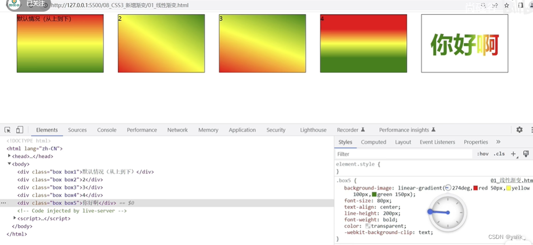
1.linear-gradient 线性渐变
.box1{height:200px;background-image: linear-gradient(red, yellow,green);
}.box2{height:200px;background-image: linear-gradient(to right top, red, yellow,green);//往右上角
}.box3{height:200px;background-image: linear-gradient(30deg, red, yellow,green); //顺时针偏转30度
}.box4{height:200px;background-image: linear-gradient(red 50px, yellow 100px,green 150px);
}.box5{height: 200px;background-image: linear-gradient(red 50px, yellow 100px,green 150px);-webkit-background-clip:text;color:transparent;font-size:80px;text-align:center;
}
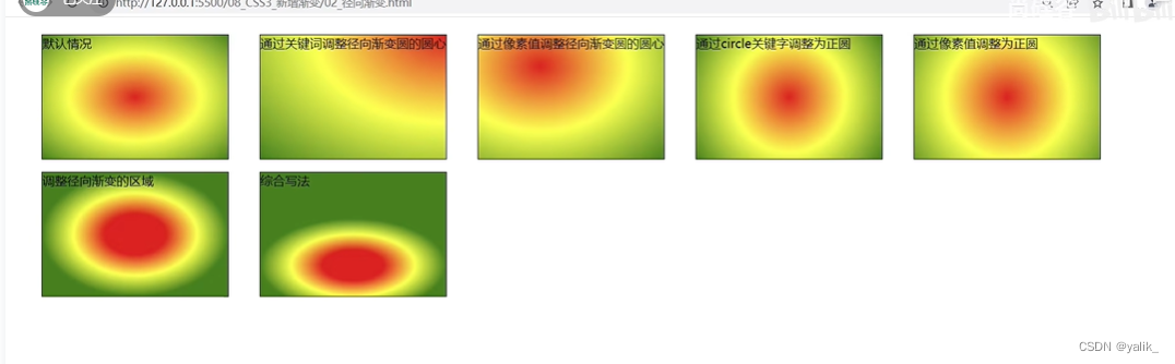
2.radial-gradient 径向渐变
.box1{width:300px;height:200px;background-image: radial-gradient(red, yellow,green);//默认从圆心四散
}.box2{width:300px;height:200px;background-image: radial-gradient(at right top, red, yellow,green);//调整圆心的位置
}.box3{width:300px;height:200px;background-image: radial-gradient(at 100px 50px, red, yellow,green);
}.box4{width:300px;height:200px;background-image: radial-gradient(circle, red, yellow,green);
}.box5{width:300px;height:200px;background-image: radial-gradient(200px 200px, red, yellow,green);//半径为200px
}.box6{width:300px;height:200px;background-image: radial-gradient(red 50px, yellow 100px ,green 150px);//从圆心开始,50px红色,100px黄色,150px绿色}.box7{width:300px;height:200px;background-image: radial-gradient(100px 50px at 150px 150px,red, yellow,green);//圆心x100px y100px 半径x100px y50px}
3.重复渐变
在设有具体像素值的线性渐变或者径向渐变前加上repeating-
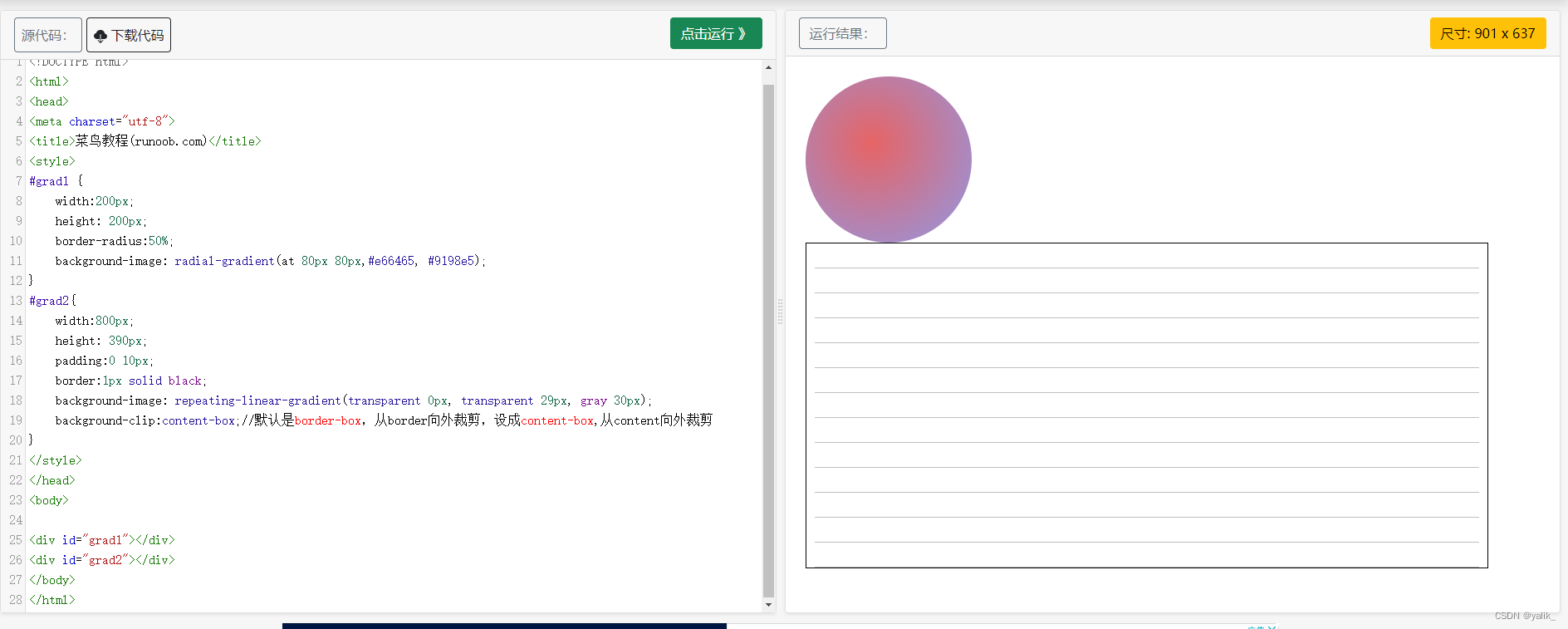
4.案例
书签页 立体的球
#grad1 {width:200px;height: 200px;border-radius:50%;background-image: radial-gradient(at 80px 80px,#e66465, #9198e5);
}
#grad2{width:800px;height: 390px;padding:0 10px;border:1px solid black;background-image: repeating-linear-gradient(transparent 0px, transparent 29px, gray 30px);background-clip:content-box;//默认是border-box,从border向外裁剪,设成content-box,从content向外裁剪
}