echarts甘特图 一个值多条线
先看图

这里我们用到的是 series :type:custom 自定义,但是这里我遇到一个问题,就是不过你在series里push多少数据,图表上显示的都是在同一水平线,用了好多方法都不好使,
renderItem: (params, api) => {//开发者自定义的图形元素渲染逻辑,是通过书写 renderItem 函数实现的var categoryIndex = api.value(0); //这里使用 api.value(0) 取出当前 dataItem 中第一个维度的数值。var start = api.coord([api.value(1), categoryIndex]); // 这里使用 api.coord(...) 将数值在当前坐标系中转换成为屏幕上的点的像素值。var end = api.coord([api.value(2), categoryIndex]);var height = 10;return {type: "rect", // 表示这个图形元素是矩形。还可以是 'circle', 'sector', 'polygon' 等等。shape: echarts.graphic.clipRectByRect({// 矩形的位置和大小。x: start[0],y: start[1] - height / 2,width: end[0] - start[0],height: height,},{// 当前坐标系的包围盒。x: params.coordSys.x,y: params.coordSys.y,width: params.coordSys.width,height: params.coordSys.height,}),style: api.style(),};},图: 重叠在一起 ,
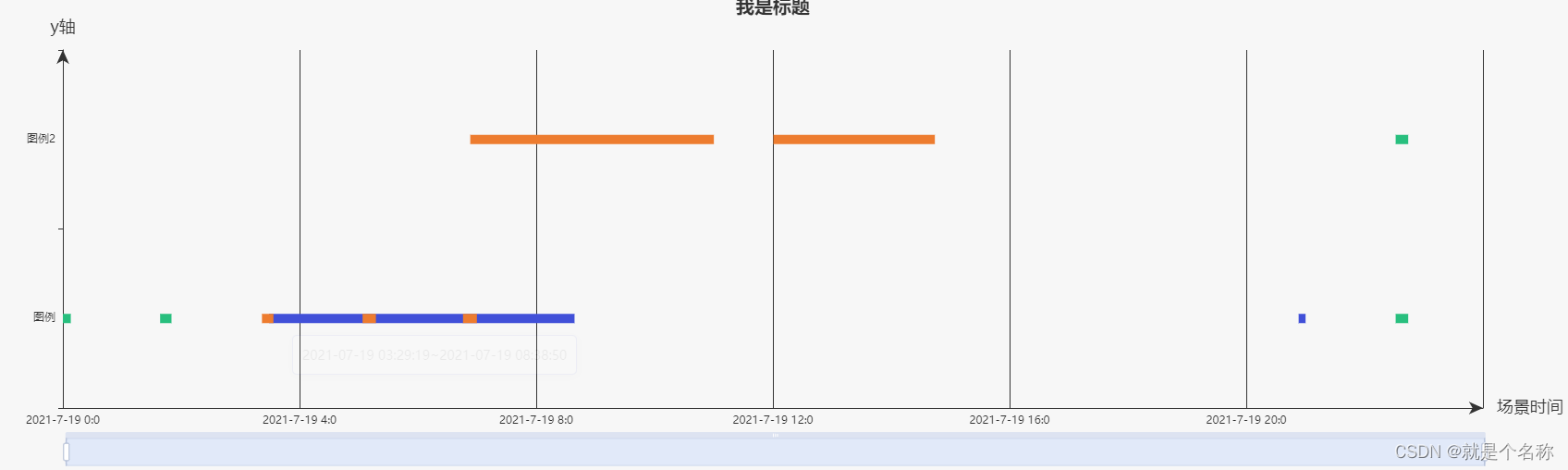
最后用了最后使用了里面renderItem 返回的 y轴定位解决的(有好的方法可以和我说)。
renderItem: (params, api) => {//开发者自定义的图形元素渲染逻辑,是通过书写 renderItem 函数实现的var categoryIndex = api.value(0); //这里使用 api.value(0) 取出当前 dataItem 中第一个维度的数值。var start = api.coord([api.value(1), categoryIndex]); // 这里使用 api.coord(...) 将数值在当前坐标系中转换成为屏幕上的点的像素值。var end = api.coord([api.value(2), categoryIndex]);var height = 10;return {type: "rect", // 表示这个图形元素是矩形。还可以是 'circle', 'sector', 'polygon' 等等。y:10,shape: echarts.graphic.clipRectByRect({// 矩形的位置和大小。x: start[0],y: start[1] - height / 2,width: end[0] - start[0],height: height,},{// 当前坐标系的包围盒。x: params.coordSys.x,y: params.coordSys.y,width: params.coordSys.width,height: params.coordSys.height,}),style: api.style(),};},全部代码
<template><div ref="echart" id="echart" class="echart"></div>
</template><script setup>
import { nextTick, onMounted, ref } from "vue";
import * as echarts from "echarts";let showData = [[{value: [0, "2021-07-19 03:29:19", "2021-07-19 08:38:50", 0],},{value: [0, "2021-07-19 20:53:07", "2021-07-19 21:00:08", 1],},],[{value: [0, "2021-07-19 00:00:00", "2021-07-19 00:08:02", 0],},{value: [0, "2021-07-19 01:38:37", "2021-07-19 01:50:08", 1],},{value: [0, "2021-07-19 22:31:30", "2021-07-19 22:44:13", 2],},{value: [1, "2021-07-19 20:53:07", "2021-07-19 11:00:08", 0],},{value: [1, "2021-07-19 22:31:30", "2021-07-19 22:44:13", 0],},],[{value: [0, "2021-07-19 03:21:54", "2021-07-19 03:33:30", 0],},{value: [0, "2021-07-19 05:03:56", "2021-07-19 05:17:26", 1],},{value: [0, "2021-07-19 06:45:45", "2021-07-19 06:59:49", 2],},{value: [1, "2021-07-19 06:53:07", "2021-07-19 11:00:08", 0],},{value: [1, "2021-07-19 12:00:30", "2021-07-19 14:44:13", 1],},],
];// 分配y值
const produceSeries = (data) => {let len = data.length;let step = len % 2 == 1 ? -5 : 2;let series = [];data.map((val, index) => {if (step == -5) {series.push(configSeriec(val, index, 0));step = step + 15;return;}if (index % 2 == 0) {series.push(configSeriec(val, index, step));step = step + 15;} else {series.push(configSeriec(val, index, -step));step = step + 15;}});function configSeriec(val, index, step) {return {type: "custom",renderItem: (params, api) => {//开发者自定义的图形元素渲染逻辑,是通过书写 renderItem 函数实现的var categoryIndex = api.value(0); //这里使用 api.value(0) 取出当前 dataItem 中第一个维度的数值。var start = api.coord([api.value(1), categoryIndex]); // 这里使用 api.coord(...) 将数值在当前坐标系中转换成为屏幕上的点的像素值。var end = api.coord([api.value(2), categoryIndex]);var height = 10;return {type: "rect", // 表示这个图形元素是矩形。还可以是 'circle', 'sector', 'polygon' 等等。y: step,shape: echarts.graphic.clipRectByRect({// 矩形的位置和大小。x: start[0],y: start[1] - height / 2,width: end[0] - start[0],height: height,},{// 当前坐标系的包围盒。x: params.coordSys.x,y: params.coordSys.y,width: params.coordSys.width,height: params.coordSys.height,}),style: api.style(),};},encode: {x: [1, 2], // data 中『维度1』和『维度2』对应到 X 轴y: 0, // data 中『维度0』对应到 Y 轴},itemStyle: {normal: {color: function (params) {//return colorTheme[params.value[0]];return colorTheme[index];},},},data: val,};}return series;
};let option = {title: {text: "我是标题",x: "center",textStyle: {fontSize: 20,color: "#333333",},},tooltip: {enterable: true,backgroundColor: "rgba(255,255,255,1)", //背景颜色(此时为默认色)borderRadius: 5, //边框圆角padding: 10, // [5, 10, 15, 20] 内边距textStyle: {color: "#000",},position: function (point, params, dom, rect, size) {dom.innerHTML = params.value[1] + "~" + params.value[2];},},legend: {//图例data: "我是图例",left: "90px",top: 22,itemWidth: 16,itemHeight: 16,selectedMode: false, // 图例设为不可点击textStyle: {color: "#333333",fontSize: 16,},},toolbox: {show: true,feature: {saveAsImage: {},},},xAxis: {name: "场景时间",nameTextStyle: {color: "#333333",fontSize: 18,},type: "time",splitNumber: 6,max: "2021-07-20 00:00:00",min: "2021-07-19 00:00:00", //将data里最小时间的整点时间设为min,否则min会以data里面的min为开始进行整点递增axisLabel: {show: true,formatter: function (value) {//在这里写你需要的时间格式var t_date = new Date(value);return ([t_date.getFullYear(),t_date.getMonth() + 1,t_date.getDate(),].join("-") +" " +[t_date.getHours(), t_date.getMinutes()].join(":"));},},splitLine: {show: true,lineStyle: {color: "#333333",},},axisLine: {show: true,color: "#333333",symbol: ["none", "arrow"],lineStyle: {color: "#333333",width: 1,type: "solid",},},},yAxis: {name: "y轴",nameTextStyle: {color: "#333333",fontSize: 18,},axisLine: {color: "#333333",lineStyle: {color: "#333333",},symbol: ["none", "arrow"],},axisLabel: {show: true,textStyle: {color: "#333333", //这里用参数代替了},},data: ["图例", "图例2"],},dataZoom: [{show: true,realtime: true,start: 0,end: 100,xAxisIndex: [0, 1],},{type: "inside",realtime: true,start: 30,end: 70,xAxisIndex: [0, 1],},],series: produceSeries(showData),
};let echart = ref();
onMounted(() => {nextTick(() => {console.log(echart.value);let myChart = echarts.init(echart.value);myChart.setOption(option);});
});
</script>
<style  lang="less">
.echart {width: 100%;height: 600px;
}
</style>