CSS样式中的布局、字体、响应式布局
目录
- 一、使用内联块级元素布局
- 二、使用float布局
- 三、使用弹性盒子布局
- 四、服务器字体
- 五、响应式布局
相关文章
- 积累CSS样式属性:padding、margin、display:flex、font、position、cursor、:hover、:nth-child()、border-radius
一、使用内联块级元素布局
- 让想要横着的元素(
left、mid、right)变成内联块级元素。
示例
<body><div class="top"><div class="left">left</div><div class="mid">mid</div><div class="right">right</div></div><div class="bottom"></div>
</body>
.top{width: 800px;background: red;
}.left{width: 200px;height: 100px;background: greenyellow;display:inline-block;
}.mid{width: 200px;height: 100px;background: bisque;display:inline-block;
}.right{width: 200px;height: 100px;background: blueviolet;display:inline-block;
}.bottom{width: 800px;height: 100px;background: palevioletred;
}
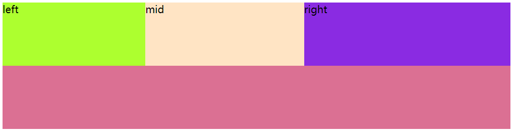
效果图:
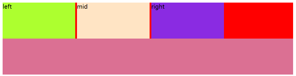
问题1: left、mid、right元素之间有空隙。
原因: html中元素之间换行,浏览器解析为一个空格。
解决方案:
- 方案一:元素首尾相连
- 方案二:改为
span标签;问题:内容多或不适合使用span标签的内容 - 方案三:将父级(
top)设置字体大小为0font-size:0;;问题:由于继承性,left、mid、right字体也消失了,需要在相对于的子集中设置有效的字体大小
问题2: 想将子集均匀的分散开,需要计算,有可能无法均分。
解决方案: 可以使用margin元素;但依然可能分散的不均匀。
问题3: 每个子集都要写一遍,代码冗余。
二、使用float布局
- 哪些元素想要浮动,可使用
float属性
示例
<body><div class="top"><div class="left">left</div><div class="mid">mid</div><div class="right">right</div></div><div class="bottom"></div>
</body>
.top{width: 800px;background: red;
}.left{width: 200px;height: 100px;background: greenyellow;float: left;/* 浮动 */
}.mid{width: 200px;height: 100px;float: left;background: bisque;
}.right{width: 200px;height: 100px;float: left;background: blueviolet;
}.bottom{width: 800px;height: 100px;background: palevioletred;
}
效果图:
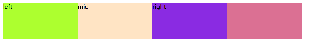
解决了上面的空隙问题。
新问题: 父级元素被覆盖了。
原因: 父级元素没有设置高,原来父级元素由子集内容撑着,现在脱离了父级,父级元素高变为了0。
解决方案:
- 方案一:父级元素设置高。
- 方案二:不设置父级元素的高度,在父级上使用超出部分隐藏掉
overflow:hidden,可以使父级元素随子集元素中最高的而变化。
上述的问题2和问题3没有解决。
三、使用弹性盒子布局
- 让父级元素变为弹性盒子。
- 弹性盒子会配套其他属性一起使用,这些属性没有继承性。
- 1.
flex-direction - 2.
justify-content - 3.
order - 4.
flex复合属性 - 5.
align-items - 6.
align-content
- 1.
<body><div class="top"><div class="left">left</div><div class="mid">mid</div><div class="right">right</div></div><div class="bottom"></div>
</body>
.top{width: 800px;background: red;display: flex;
}.left{width: 200px;height: 100px;background: greenyellow;
}.mid{width: 200px;height: 100px;
}.right{width: 200px;height: 100px;background: blueviolet;
}.bottom{width: 800px;height: 100px;background: palevioletred;
}
效果图:
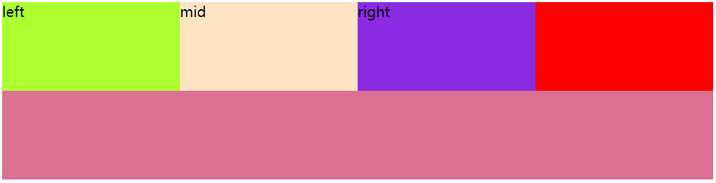
上面的问题都解决了。
1. flex-direction
- 控制弹性盒子内子元素的排列方向
- 作用在父级元素上
属性值
row:横向(默认值),从左到右row-reverse:反转,从右到左column:竖着,从上到下column-reverse:反转,从下到上
2. justify-content
- 控制弹性盒子内子元素的分布方式
- 作用在父级元素上
属性值
flex-start:分布在开始位置flex-end:分布在结束位置center:分布在中间位置space-between:分散开,空白在元素之间space-around:空白在元素两边space-evenly:空白均匀的分布
3. order
- 控制子元素的排列顺序
- 作用在具体元素上
属性值
- 数字:整数
4. flex复合属性
- 是复合属性
- 作用在子元素上
4.1 flex-grow:拉伸因子
- 子元素占满父级
- 子元素均匀分占父级,拉伸因子都为1
属性值: 整数
示例:
.top{width: 800px;background: red;display: flex;
}.left{width: 200px;height: 100px;background: greenyellow;flex-grow: 1;
}.mid{width: 200px;height: 100px;flex-grow: 2;background: bisque;
}.right{width: 200px;height: 100px;flex-grow: 5;background: blueviolet;
}.bottom{width: 800px;height: 100px;background: palevioletred;
}
效果图:
4.2 flex-shrink:压缩因子
- 子元素宽超过父级元素的宽度,弹性盒子默认等比压缩
- 作用在子元素上
属性值: 整数
4.3 flex-basis:基准因子
- 以谁为基准做拉伸或压缩。
5. align-items
- 控制弹性盒子内子元素在垂直方向上的分布方式。
- 作用在父级元素上
属性值: flex-start:顶部(左边)对齐flex-end:底部(右边)对齐center:中间对齐
6. align-content
- 控制弹性盒子内子元素多行的分布方式
- 与
flex-wrap配合使用
属性值: flex-start:开始位置flex-end:结束位置center:中间位置space-between:空白在行和行之间space-around:空白在行上下两测space-evenly:空白均匀的分布
7. flex-wrap:wrap
- 弹性盒子内子元素换行
- 作用在父级元素上
四、服务器字体
字体的其他属性还可以查看积累CSS样式属性:padding、margin、display:flex、font、position、cursor、:hover、:nth-child()、border-radius这篇文章中的相关内容。
- 使用的字体可以放在项目里,一起打包
- 从网上下载下来的后缀为:ttf、otf
定义服务器字体
- 使用
@font-face - 可以定义多个
基本格式
<style>@font-face {font-family: ;src: url();}</style>
font-family:字体的名字
注意:font-family放在选择器里面表示,使用哪种字体;放在@font-face里面表示定义字体的名字src:字体资源的地址format:字体资源的类型,属性值如下:- TrueType,是ttf格式的资源
- OpenType,是otf格式的资源
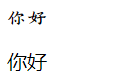
示例:
<!DOCTYPE html>
<html lang="en">
<head><meta charset="UTF-8"><meta name="viewport" content="width=device-width, initial-scale=1.0"><title>Document</title><style>div{font-family: 'aaa';}@font-face {font-family: 'aaa';src: url(../font/ZiHunDunHuangJingYunKai\(ShangYongXuShouQuan\)-2.ttf) format(TrueType);}@font-face {font-family: 'bbb';src: url(../font/GongFanNuFangTi\(TaoBaoSouGongFanZiKuKeMaiDanZiShouQuan\)-2.ttf);}</style>
</head>
<body><div>你好</div><p>你好</p>
</body>
</html>
效果图:
五、响应式布局
- 使用的式
@madia 设备类型
基本格式
@media screen {}
screen:屏幕,大部分使用的都是屏幕设备screen前可以加not:意思是除了屏幕,别的设备都去检测screen前可以加only:意思是只检测屏幕screen后可以加设备类型width:max-width:最大宽度,设备不到XXpx,走这里面的样式min-width:最小宽度
- 样式冲突的走响应式布局,不冲突的样式走外面的
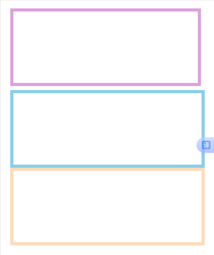
示例:
box-sizing: border-box;:加上这句,width/height设置整个盒子的尺寸,不再是内容的尺寸了
<body><div class="contaner"><div class="item1"></div><div class="item2"></div><div class="item3"></div></div>
</body>
.contaner{width: 750px;display: flex;flex-wrap: wrap;margin: 100px auto;
}
.item1{box-sizing: border-box;width: 300px;height: 200px;border: 8px solid plum;margin: 0px 10px 10px 0px;
}
.item2{box-sizing: border-box;width: 420px;height: 200px;border: 8px solid skyblue;
}
.item3{box-sizing: border-box;width: 700px;height: 200px;border: 8px solid peachpuff;
}
@media screen and (max-width:700px){/* 屏幕尺寸不到700走这套样式 */.contaner{width: 500px;}.item1{width: 500px;}.item2{width: 500px;}.item3{width: 500px;}
}
效果图:
浏览器屏幕大于700px:
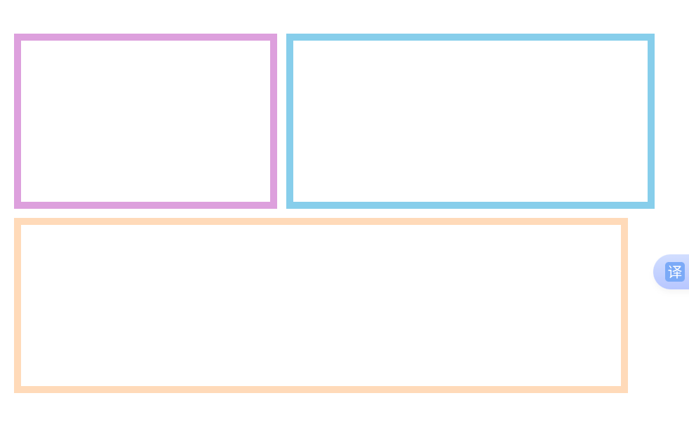
浏览器屏幕下于700px: