QML视图与代理控件
QML作为Qt框架中的声明式UI语言,提供了丰富的视图和代理控件来构建现代化用户界面。本文将深入探讨QML中八大核心组件:SwipeView、ScrollView、SplitView、StackView、TabBar以及ItemDelegate、ButtonDelegate、SwipeDelegate三大代理控件,通过技术原理、使用方法和实际案例的结合,帮助开发者掌握这些强大工具的应用技巧。
滑动视图:SwipeView
SwipeView是QML中实现滑动视图的核心组件,它允许用户通过手势滑动在不同页面之间切换,广泛应用于图片浏览器、教程引导和仪表盘等场景。
基本实现原理:
SwipeView继承自Container类,内部管理多个子页面,并通过手势识别处理水平或垂直滑动事件。其核心工作机制是:
- 使用Flickable处理触摸输入和滑动动画
- 维护当前页面索引(currentIndex)和页面总数(count)
- 提供平滑的过渡动画效果
基础实现代码:
import QtQuick 2.15
import QtQuick.Controls 2.15ApplicationWindow {visible: truewidth: 640height: 480SwipeView {id: swipeViewanchors.fill: parentcurrentIndex: 0Page {Rectangle { color: "lightblue"; Text { text: "Page 1"; anchors.centerIn: parent } }}Page {Rectangle { color: "lightgreen"; Text { text: "Page 2"; anchors.centerIn: parent } }}Page {Rectangle { color: "pink"; Text { text: "Page 3"; anchors.centerIn: parent } }}}PageIndicator {anchors.bottom: parent.bottomanchors.horizontalCenter: parent.horizontalCentercount: swipeView.countcurrentIndex: swipeView.currentIndex}
}关键属性详解:
orientation:控制滑动方向,默认为Qt.Horizontal(水平),可设置为Qt.Vertical实现垂直滑动interactive:布尔值,控制是否允许用户手势滑动,编程切换时可设为falsecurrentIndex:当前显示页面的索引,支持双向绑定contentChildren:动态操作子项的列表属性
高级应用场景:
- 与TabBar联动:实现标签页与滑动视图的同步控制
Column {anchors.fill: parentTabBar {id: tabBarcurrentIndex: swipeView.currentIndexTabButton { text: "Stats" }TabButton { text: "Home" }TabButton { text: "Settings" }}SwipeView {id: swipeViewcurrentIndex: tabBar.currentIndex// ... pages ...}
}- 动态页面管理:结合Loader实现懒加载,提升性能
SwipeView {id: swipeViewComponent.onCompleted: {addPage("Page1.qml")addPage("Page2.qml")}function addPage(source) {var component = Qt.createComponent(source)if (component.status === Component.Ready)addItem(component.createObject(swipeView))}
}性能优化技巧:
- 对复杂页面使用Loader延迟加载
- 合理设置clip属性为true避免过度绘制
- 对于固定数量页面,优先使用静态加载
- 避免在页面中使用过多嵌套或复杂元素
SwipeView的简洁API和强大功能使其成为QML中实现滑动导航的首选组件,通过合理配置可以满足从简单到复杂的各种交互需求。
滚动视图:ScrollView
ScrollView是QML中处理内容滚动的核心组件,它提供了可滚动区域,当内容超出可视范围时自动显示滚动条。
基础架构分析:
ScrollView内部使用Flickable作为基础,结合ScrollBar控件实现完整的滚动体验。其设计特点包括:
- 自动计算内容尺寸(contentWidth/contentHeight)
- 支持鼠标滚轮和触摸屏手势
- 可定制的滚动条外观和行为
基本实现示例:
import QtQuick 2.15
import QtQuick.Controls 2.15ScrollView {id: scrollViewwidth: 300height: 200clip: true// 内容项必须明确设置宽度Column {width: scrollView.availableWidth // 关键绑定Repeater {model: 50Rectangle {width: scrollView.availableWidthheight: 40color: index % 2 ? "#f0f0f0" : "#ffffff"Text { text: "Item " + index; anchors.centerIn: parent }}}}
}
核心属性详解:
| 属性 | 类型 | 默认值 | 说明 |
|---|---|---|---|
contentWidth | real | 0 | 内容区域宽度,需显式设置 |
contentHeight | real | 0 | 内容区域高度 |
viewport | Item | 只读 | 视口项,用于绑定内容宽度 |
clip | bool | false | 是否裁剪超出部分,建议设为true |
wheelEnabled | bool | true | 是否启用鼠标滚轮滚动 |
scrollSpeed | real | 50 | 滚轮滚动速度(像素/步) |
高级应用技巧:
- 动态滚动控制:
Button {text: "Scroll to Bottom"onClicked: scrollView.ScrollBar.vertical.position = 1.0
}Button {text: "Scroll to Top"onClicked: scrollView.ScrollBar.vertical.position = 0.0
}- 嵌套滚动区域:
ScrollView {width: 400; height: 400Column {width: parent.width// 水平滚动区域ScrollView {width: parent.widthheight: 200contentWidth: 800Row {spacing: 10Repeater {model: 20Rectangle { width: 100; height: 180; color: "lightblue" }}}}// 垂直滚动内容Repeater {model: 20Rectangle { width: parent.width; height: 60; color: "lightgreen" }}}
}
常见问题解决:
- 内容不滚动:
// 错误做法 - 内容宽度未绑定
Label { width: implicitWidth }// 正确做法 - 绑定到视口宽度
Label { width: ScrollView.viewport.width }- 性能优化:
- 对大数据集使用动态加载
- 避免在滚动区域内使用复杂元素或过多嵌套
- 合理使用clip属性防止过度绘制
- 考虑使用ListView代替大量静态内容
ScrollView作为QML中处理溢出的标准解决方案,通过灵活的配置和丰富的API,能够满足各种滚动需求,从简单文本到复杂界面都能胜任。
分割视图:SplitView
SplitView是QML中创建可调整大小分割区域的强大组件,它允许用户通过拖动分隔条来动态调整各区域大小,非常适合需要灵活布局的应用程序。
核心概念:
SplitView通过在子项之间插入可拖动的分隔条(handle),实现了灵活的布局调整能力。其主要特点包括:
- 支持水平和垂直两种布局方向
- 每个子项可以设置最小、最大和首选尺寸
- 自动处理分隔条的拖拽逻辑
- 允许自定义分隔条的外观和行为
基本实现示例:
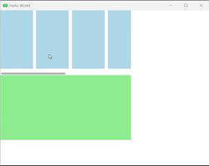
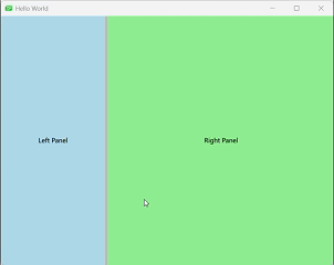
import QtQuick 2.15
import QtQuick.Controls 2.15ApplicationWindow {visible: truewidth: 800height: 600SplitView {id: splitViewanchors.fill: parentorientation: Qt.Horizontal// 左侧面板Rectangle {id: leftPanelcolor: "lightblue"SplitView.minimumWidth: 100SplitView.preferredWidth: 200Text { text: "Left Panel"; anchors.centerIn: parent }}// 分隔条handle: Rectangle {implicitWidth: 6implicitHeight: 6color: SplitHandle.pressed ? "#81e889" : (SplitHandle.hovered ? Qt.lighter("#c0c0c0") : "#c0c0c0")}// 右侧面板Rectangle {id: rightPanelcolor: "lightgreen"SplitView.fillWidth: trueText { text: "Right Panel"; anchors.centerIn: parent }}}
}
关键属性解析:
布局控制属性:
orientation:布局方向(Qt.Horizontal或Qt.Vertical)handle:分隔条的自定义组件resizing:是否允许调整大小(只读)
子项附加属性:
SplitView.minimumWidth/Height:最小允许尺寸SplitView.maximumWidth/Height:最大允许尺寸SplitView.preferredWidth/Height:首选尺寸SplitView.fillWidth/Height:是否填充剩余空间
高级应用场景:
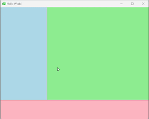
- 嵌套分割布局:
SplitView {anchors.fill: parentorientation: Qt.Vertical// 顶部水平分割区域SplitView {orientation: Qt.HorizontalSplitView.fillHeight: trueRectangle { SplitView.minimumWidth: 100SplitView.preferredWidth: 200color: "lightblue" }Rectangle { SplitView.fillWidth: truecolor: "lightgreen" }}// 底部固定区域Rectangle {SplitView.minimumHeight: 50SplitView.preferredHeight: 80color: "lightpink"}
} 
- 自定义分隔条样式:
SplitView {id: splitViewanchors.fill: parenthandle: Rectangle {//自定义分隔栏id: handleDelegateimplicitWidth: 6implicitHeight: 6color: SplitHandle.pressed ? "#81E899" :(SplitHandle.hovered ? Qt.lighter("#F4C2C6", 1.1) : "#F4C2C6")}Rectangle {implicitWidth: 200SplitView.maximumWidth: 400color: "lightblue"Label {text: "View 1"anchors.centerIn: parent}}Rectangle {id: centerItemSplitView.minimumWidth: 50SplitView.fillWidth: true //当所有布局完成之后,是否占据剩下的空间color: "lightgray"Label {text: "View 2"anchors.centerIn: parent}}Rectangle {implicitWidth: 200color: "lightgreen"Label {text: "View 3"anchors.centerIn: parent}}} 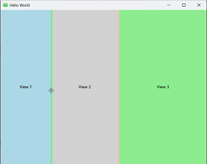
实际应用案例:
- IDE界面布局:
SplitView {anchors.fill: parentorientation: Qt.Horizontal// 文件浏览器Rectangle {SplitView.minimumWidth: 150color: "lightgreen"}// 编辑区域SplitView {orientation: Qt.VerticalSplitView.fillWidth: trueRectangle {SplitView.minimumHeight: 100SplitView.fillHeight: truecolor: "lightgray"}Rectangle {SplitView.minimumHeight: 80SplitView.preferredHeight: 120color: "lightgreen"}}// 属性面板Rectangle {SplitView.minimumWidth: 150color: "lightgray"}}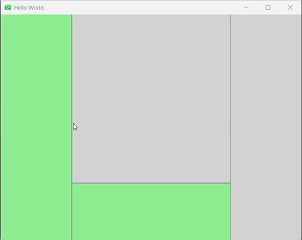
性能优化与注意事项:
- 避免在可调整大小的区域中使用过于复杂的元素
- 为每个区域设置合理的minimum/preferred尺寸,防止用户调整得过小或过大
- 考虑使用Loader延迟加载非活动区域的内容
- 对于频繁调整的布局,可以使用LayoutMirroring处理RTL(从右到左)布局需求
SplitView的强大之处在于它提供了接近专业桌面应用的布局能力,通过合理的配置和嵌套,可以实现各种复杂的界面布局,满足专业应用程序的需求。
栈式导航:StackView
StackView是QML中实现页面导航的核心组件,它采用堆栈管理机制,允许开发者在不同页面之间进行层级导航,非常适合移动应用和多步骤流程的实现。
核心概念:
StackView基于经典的堆栈数据结构(后进先出),提供页面导航功能。其主要特点包括:
- 页面压栈(push)和出栈(pop)操作
- 自动管理页面转换动画
- 支持参数传递和返回值的处理
- 内置导航历史记录
基本实现示例:
import QtQuick 2.15
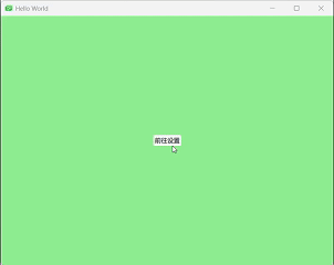
import QtQuick.Controls 2.15ApplicationWindow {visible: truewidth: 400height: 600StackView {id: stackViewanchors.fill: parentinitialItem: mainPage}Component {id: mainPagePage {Button {text: "前往设置"anchors.centerIn: parentonClicked: stackView.push(detailsPage, {itemId: 123})}background: Rectangle{color: "lightgreen"}}}Component {id: detailsPagePage {property int itemIdLabel {text: "Setting "anchors.centerIn: parent}Button {text: "返回主页面"anchors.top: parent.toponClicked: stackView.pop()}background: Rectangle{color: "lightyellow"}}}}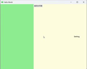
导航操作详解:
- push操作:将新页面推入堆栈并显示
stackView.push(pageComponent, {properties: value})
stackView.push(urlToQmlFile)
stackView.push(itemInstance)- pop操作:从堆栈弹出当前页面并返回上一页
stackView.pop()
stackView.pop(null) // 返回初始页面
var poppedItem = stackView.pop() // 获取被弹出的页面- replace操作:用新页面替换当前页面
stackView.replace(pageComponent)
stackView.replace(urlToQmlFile)
stackView.replace(itemInstance)- clear操作:清空整个堆栈
stackView.clear()过渡动画定制:
StackView允许自定义页面切换动画,通过配置各种Transition实现个性化效果:
StackView {id: stackViewanchors.fill: parentpushEnter: Transition {PropertyAnimation {property: "opacity"from: 0to: 1duration: 300}}pushExit: Transition {PropertyAnimation {property: "x"from: 0to: -widthduration: 300}}popEnter: Transition {PropertyAnimation {property: "x"from: widthto: 0duration: 300}}popExit: Transition {PropertyAnimation {property: "opacity"from: 1to: 0duration: 300}}
}
StackView的导航模式符合用户对移动应用行为的普遍预期,通过合理的配置和扩展,可以构建出既美观又功能强大的导航系统,满足从简单到复杂的各种应用场景需求。
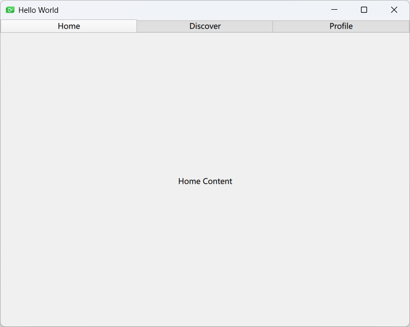
选项卡导航:TabBar
TabBar是QML中实现选项卡式导航的核心组件,它通常与SwipeView或StackLayout结合使用,为用户提供直观的模块切换方式。
设计理念:
TabBar基于传统的选项卡式界面模式,主要特点包括:
- 水平排列的按钮集合,每个按钮对应一个内容视图
- 自动管理当前选中状态
- 支持文本和图标组合显示
- 与各种视图组件无缝集成
基础实现示例:
import QtQuick 2.15
import QtQuick.Controls 2.15
import QtQuick.Layouts 1.15ApplicationWindow {visible: truewidth: 400height: 600ColumnLayout {anchors.fill: parentTabBar {id: tabBarLayout.fillWidth: trueTabButton { text: "Home" }TabButton { text: "Discover" }TabButton { text: "Profile" }}StackLayout {Layout.fillWidth: trueLayout.fillHeight: truecurrentIndex: tabBar.currentIndexItem { Label { text: "Home Content"; anchors.centerIn: parent } }Item { Label { text: "Discover Content"; anchors.centerIn: parent } }Item { Label { text: "Profile Content"; anchors.centerIn: parent } }}}
} 
核心属性解析:
| 属性 | 类型 | 说明 |
|---|---|---|
currentIndex | int | 当前选中选项卡的索引 |
contentHeight | real | 内容高度,用于计算总隐式高度 |
contentWidth | real | 内容宽度,用于计算总隐式宽度 |
position | enum | 选项卡位置(TabBar.Header/Footer) |
高级应用场景:
- 与SwipeView集成:
ColumnLayout {anchors.fill: parentTabBar {id: tabBarcurrentIndex: swipeView.currentIndexTabButton { text: "Page 1" }TabButton { text: "Page 2" }TabButton { text: "Page 3" }}SwipeView {id: swipeViewcurrentIndex: tabBar.currentIndexLayout.fillWidth: trueLayout.fillHeight: truePage {background:Rectangle{color: "lightblue"}}Page {background:Rectangle{color: "lightgreen"}}Page {background:Rectangle{color: "lightgray"}}}} 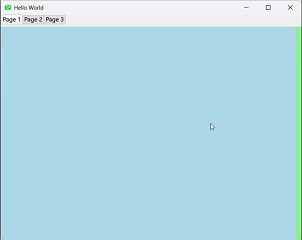
- 自定义选项卡样式:
TabBar {id: tabBarwidth: parent.widthbackground: Rectangle {color: "#f0f0f0"border.color: "#c0c0c0"}TabButton {text: "Home"background: Rectangle {color: tabBar.currentIndex === 0 ? "#e0e0e0" : "transparent"radius: 4}}TabButton {text: "Discover"// 类似样式...}
}响应式设计技巧:
- 自适应宽度处理:
TabBar {width: Math.min(implicitWidth, parent.width)scrollable: true // 启用滚动当宽度不足时
}- 移动端底部导航:
ApplicationWindow {// ...footer: TabBar {position: TabBar.Footer// ...}
}
TabBar作为经典的导航模式,在移动和桌面应用中都有广泛应用,通过QML的灵活性和表现力,可以创建出既美观又功能丰富的选项卡式界面。
代理控件:ItemDelegate、ButtonDelegate与SwipeDelegate
QML中的代理(Delegate)控件是模型-视图架构中的关键组成部分,负责定义数据项的可视化呈现和交互行为。本节将深入探讨三种常用代理控件:ItemDelegate、ButtonDelegate和SwipeDelegate。
ItemDelegate:基础项目代理
ItemDelegate是最基础的代理类型,适用于大多数列表项需求。
核心特性:
- 支持文本和图标显示
- 自动处理点击反馈
- 适应不同主题和平台样式
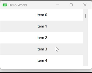
基本用法:
import QtQuick 2.15
import QtQuick.Controls 2.15ListView {width: 200; height: 300model: 10delegate: ItemDelegate {width: parent.widthtext: "Item " + indexicon.source: "qrc:/icons/item.png"onClicked: console.log("Clicked:", index)}
}自定义样式:
ListView {id:listviewwidth: 320height: 240focus: truemodel: Qt.fontFamilies()anchors.centerIn: parentdelegate: ItemDelegate {id: delegatewidth: listview.widthhighlighted: ListView.isCurrentItemcontentItem: Row {spacing: 10Rectangle {width: 20; height: 20radius: 10color: delegate.highlighted ? "red" : "gray"}Text {text: modelDatacolor: delegate.highlighted ? "white" : "black"}}background: Rectangle {color: delegate.highlighted ? "#4000ff00" : "transparent"}onClicked: {listview.currentIndex = index}}ScrollIndicator.vertical: ScrollIndicator{}} 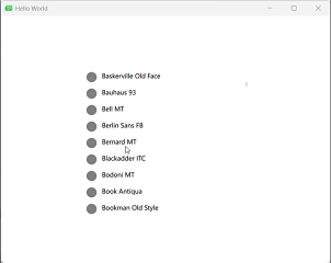
ButtonDelegate:按钮式代理
ButtonDelegate结合了按钮行为与列表项特性,适合需要丰富交互的场景。
实现原理:
通过继承ItemDelegate并增强其交互能力,ButtonDelegate提供:
- 多种按钮状态可视化反馈(pressed, hovered等)
- 支持自定义点击处理
- 灵活的布局控制
在ListView中的应用:
import QtQuick
import QtQuick.ControlsWindow {width: 640height: 480visible: truetitle: qsTr("Hello World")ListView {width: 140height: 240x: 20y: 20model: ["Option1", "Option2", "Option3"]delegate: CheckDelegate {text: modelDataonCheckedChanged: {console.log(modelData + " checked: " + checked)}}}ListView {width: 140height: 240x: 200y: 20model: ["Option1", "Option2", "Option3"]delegate: RadioDelegate {text: modelDataonCheckedChanged: {console.log(modelData + " checked: " + checked)}}}ListView {width: 140height: 240x: 400y: 20model: ["Option1", "Option2", "Option3"]delegate: SwitchDelegate {text: modelDataonCheckedChanged: {console.log(modelData + " checked: " + checked)}}}} 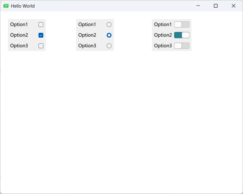
SwipeDelegate:滑动操作代理
SwipeDelegate是专为移动端设计的特殊代理,支持通过滑动手势触发附加操作。
核心特性:
- 左右滑动显示隐藏操作
- 内置平滑过渡动画
- 可自定义操作按钮样式
完整滑动删除实现:
import QtQuick
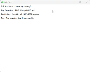
import QtQuick.ControlsWindow {width: 640height: 480visible: truetitle: qsTr("Hello World")ListView {id: listViewanchors.fill: parentmodel: ListModel {ListElement { sender: "Bob Bobbleton"; title: "How are you going?" }ListElement { sender: "Rug Emporium"; title: "SALE! All rugs MUST go!" }ListElement { sender: "Electric Co."; title: "Electricity bill 15/07/2016 overdue" }ListElement { sender: "Tips"; title: "Five ways this tip will save your life" }}delegate: SwipeDelegate {id: swipeDelegatetext: sender + " - " + titlewidth: listView.widthrequired property string senderrequired property string titlerequired property int index //required property确保数据模型必须提供这些属性,否则会报错ListView.onRemove: sequentialAnimation.start() //ListView删除一个项 删除时触发动画//在删除项时播放动画,高度收缩至0后移除SequentialAnimation {id : sequentialAnimationPropertyAction {target: swipeDelegateproperty: "ListView.delayRemove"value: true // 延迟实际移除,确保动画完成}NumberAnimation {target: swipeDelegateproperty: "height"to: 0easing.type: Easing.InOutQuad}PropertyAction {target: swipeDelegateproperty: "ListView.delayRemove"value: false // 允许移除}}//右滑--Label没有显试定义宽度--实际宽度为text的宽度加padding间隔swipe.right: Label {id: deleteLabeltext: qsTr("Delete")color: "white"verticalAlignment: Label.AlignVCenterpadding: 12height: parent.heightanchors.right: parent.rightSwipeDelegate.onClicked: listView.model.remove(index)background: Rectangle {color: deleteLabel.SwipeDelegate.pressed ? Qt.darker("limegreen", 1.1) : "limegreen"}}//滑动之后// swipe.behind: Rectangle {// implicitHeight: parent.height// implicitWidth: parent.width// color: "limegreen"// }}}
} 
代理控件作为模型-视图架构中的表现层,直接决定了用户体验的质量。通过合理选择和配置代理类型,可以创建出既美观又高效的列表界面,满足各种交互需求。
综合应用案例与最佳实践
在前述章节中,我们分别探讨了QML中各种视图和代理控件的使用方法,本节将通过几个综合案例展示如何将这些组件有机结合,构建出功能完善、用户体验良好的实际应用界面。
设置界面实现
功能需求:
- 左侧分类导航,右侧内容区域
- 支持分组设置项
- 多种交互控件(开关、滑块等)
- 自适应布局
实现代码:
import QtQuick
import QtQuick.Controls
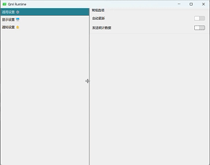
import QtQuick.LayoutsApplicationWindow {visible: truewidth: 800height: 600//分隔栏SplitView {anchors.fill: parentorientation: Qt.Horizontal// 左侧导航ScrollView {id: navScrollSplitView.minimumWidth: 150SplitView.preferredWidth: 200ListView {id: navListmodel: ListModel {ListElement { title: "通用设置 ⚙" }ListElement { title: "显示设置 🖥️"}ListElement { title: "通知设置 🔔" }}delegate: ItemDelegate {width: parent.widthtext: titlehighlighted: navList.currentIndex === indexonClicked: {navList.currentIndex = indexsettingsStack.currentIndex = index}}}}// 右侧内容区域StackLayout {id: settingsStackSplitView.fillWidth: true// 通用设置ScrollView {contentWidth: parent.widthGridLayout {width: settingsStack.widthcolumns: 2rowSpacing: 15columnSpacing: 10GroupBox {title: "常规选项"Layout.columnSpan: 2Layout.fillWidth: trueGridLayout {columns: 2rowSpacing: 8width: parent.widthLabel { text: "自动更新" }Switch { Layout.alignment: Qt.AlignRight }Label { text: "发送统计数据" }Switch { Layout.alignment: Qt.AlignRight }}}// 更多设置组...}}// 其他设置页面...}}
}
总结
核心组件对比:
| 组件 | 适用场景 | 优势 | 局限性 |
|---|---|---|---|
| SwipeView | 滑动浏览内容、教程引导、图片浏览 | 手势支持、流畅动画、简单易用 | 不适合复杂布局 |
| ScrollView | 内容超出显示区域、长文本、表单 | 自动滚动条、灵活内容布局 | 性能敏感场景需优化 |
| SplitView | 可调整布局的桌面应用、IDE、工具软件 | 灵活空间分配、专业外观 | 移动端体验不佳 |
| StackView | 多步骤流程、移动应用导航 | 页面堆栈管理、过渡动画 | 深层导航可能复杂 |
| TabBar | 模块切换、功能分类 |