echarts4r 教程1:Get Started
❝写在前面
本文为 R 语言 echarts4r 包的学习笔记。本着自己学习、分享他人的态度,分享学习笔记,希望能对大家有所帮助。软件可能随时更新,建议配合官方文档一起阅读。
目录
-
1 Video & Article -
2 Your first plot -
3 Options -
4 Navigate options
❝官网教程:https://echarts4r.john-coene.com/articles/get_started
欢迎来到 echarts4r,让我们一起来探索一下这个包吧。
-
echarts4r包的所有函数都以e_开头。 -
它所有的 Shiny 代理都以 _p结尾。 -
所有 echarts4r绘图均使用e_charts初始化。 -
所有函数都是 |>友好的。 -
大多数函数都有以 _结尾的 escape hatches。
1 Video & Article
感谢 Sharon Machlis,提供了一个介绍 echarts4r 的精彩视频和文章。
视频:https://youtu.be/OBJxIWEFHdo
文章:https://www.infoworld.com/article/3607068/plot-in-r-with-echarts4r.html
2 Your first plot
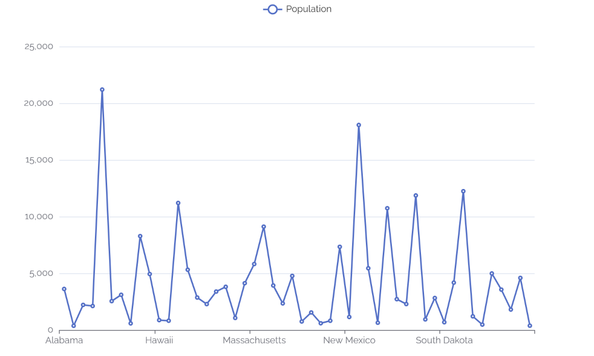
让我们构建一个折线图,加载库并将数据通过管道传输到 e_charts。如果您对 |> 不满意,可以使用 e_charts(mtcars, wt)。
# prepare data
df <- state.x77 |>
  as.data.frame() |>
  tibble::rownames_to_column("State")

library(echarts4r) # load echarts4r

df |>
  e_charts(x = State) |> # initialise and set x
  e_line(serie = Population) # add a line
如果您对裸列名称不满意,可以使用以 _ 结尾的 escape hatches。
df |>
  e_charts_("State") |>
  e_line_("Population")
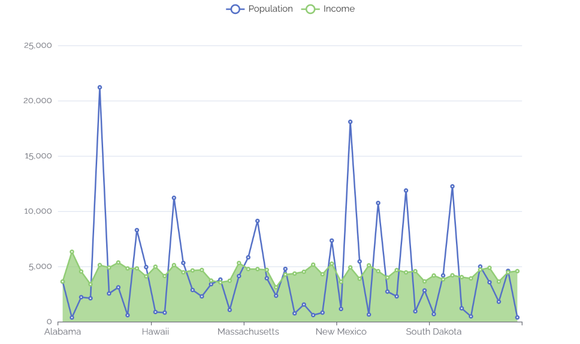
最简单的方法是使用 |> 运算符添加绘图和选项。
df |>
  e_charts(State) |> # initialise and set x
  e_line(Population) |>  # add a line
  e_area(Income) # add area
3 Options
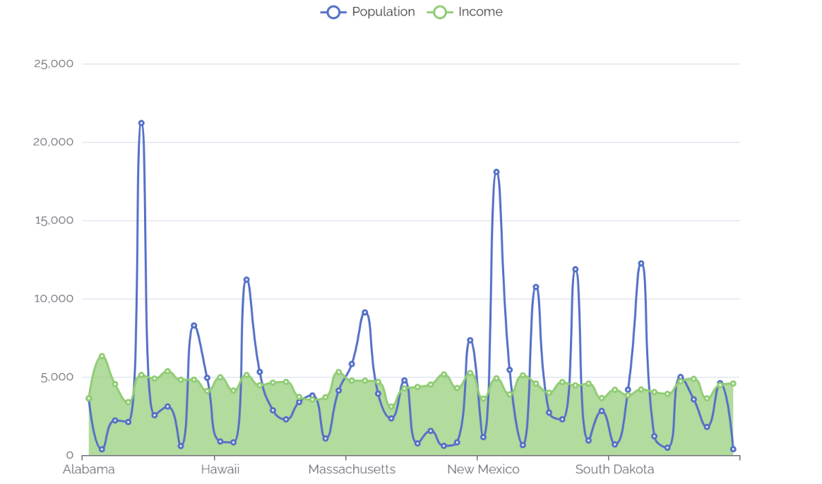
我们还可以改变线条,使它们变得 smooth。
df |>
  e_charts(State) |> # initialise and set x
  e_line(Population, smooth = TRUE) |>  # add a line
  e_area(Income, smooth = TRUE) # add area
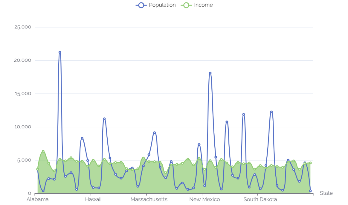
让我们使用便捷函数 e_axis_labels 来标记轴。
df |>
  e_charts(State) |> # initialise and set x
  e_line(Population, smooth = TRUE) |>  # add a line
  e_area(Income, smooth = TRUE) |>  # add area
  e_axis_labels(x = "State") # axis labels
我们可以使用 13 个内置主题之一,请参阅 ?e_theme 获取完整列表,我们还将使用 e_title 添加标题。
df |>
  e_charts(State) |> # initialise and set x
  e_line(Population, smooth = TRUE) |>  # add a line
  e_area(Income, smooth = TRUE) |>  # add area
  e_axis_labels(x = "State") |> # axis labels
  e_title("US States", "Population & Income") |>  # Add title & subtitle
  e_theme("infographic") # theme
图例和标题有点接近,让我们将图例移到画布的另一部分。
df |>
  e_charts(State) |> # initialise and set x
  e_line(Population, smooth = TRUE) |>  # add a line
  e_area(Income, smooth = TRUE) |>  # add area
  e_axis_labels(x = "State") |> # axis labels
  e_title("US States", "Population & Income") |>  # Add title & subtitle
  e_theme("infographic") |>  # theme
  e_legend(right = 0) # move legend to the bottom

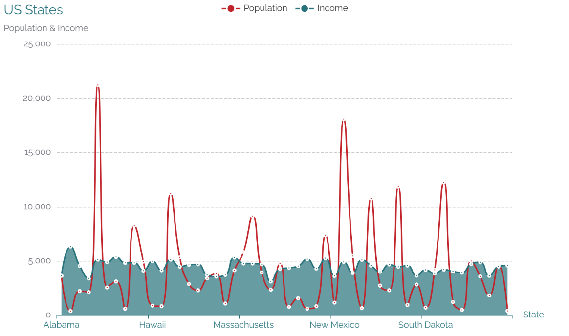
添加一个 tooltip,其中有很多选项,这里我们使用 trigger = "axis" 来通过轴而不是单个数据点来触发 tooltip。
df |>
  e_charts(State) |> # initialise and set x
  e_line(Population, smooth = TRUE) |>  # add a line
  e_area(Income, smooth = TRUE) |>  # add area
  e_axis_labels(x = "State") |> # axis labels
  e_title("US States", "Population & Income") |>  # Add title & subtitle
  e_theme("infographic") |>  # theme
  e_legend(right = 0) |>  # move legend to the bottom
  e_tooltip(trigger = "axis") # tooltip

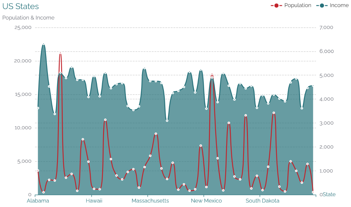
最后,我们目前正在同一轴上绘制人口和收入,让我们通过为收入指定一个额外的轴,将它们分别放在各自的 y 轴上。
注意:双 y 轴是一个糟糕的主意,它仅用于演示目的。
df |>
  e_charts(State) |> # initialise and set x
  e_line(Population, smooth = TRUE) |>  # add a line
  e_area(Income, smooth = TRUE, y_index = 1) |>  # add area
  e_axis_labels(x = "State") |> # axis labels
  e_title("US States", "Population & Income") |>  # Add title & subtitle
  e_theme("infographic") |>  # theme
  e_legend(right = 0) |>  # move legend to the bottom
  e_tooltip(trigger = "axis") # tooltip
4 Navigate options
echarts4r 是高度可定制的,有太多的选项,无法将它们全部硬编码在包中,但请放心;它们可用,并且可以传递给 ...。您将在官方文档中找到所有这些选项: https://echarts.apache.org/en/option.html。
例如,tooltip 的文档如下所示:

因此,如果我们想将 tooltip 更改为 axisPointer,我们可以通过将列表传递给 axisPointer 来实现。
df |>
  e_charts(State) |> # initialise and set x
  e_line(Population, smooth = TRUE) |>  # add a line
  e_area(Income, smooth = TRUE) |>  # add area
  e_x_axis(name = "States") |>  # add x axis name
  e_title("US States", "Population & Income") |>  # Add title & subtitle
  e_theme("infographic") |>  # theme
  e_legend(right = 0) |> # move legend to the bottom
  e_tooltip(
    axisPointer = list(
      type = "cross"
    )
  )
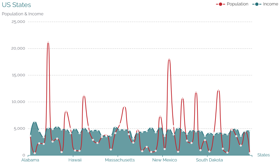
一旦你意识到 R 中的 JSON ~= list,那就很容易了。
您已经了解了基础知识,请转到 advanced 部分或浏览网站以了解如何添加多个链接图表、在地球仪上绘图、使用 shiny 包等等。
注:本文为个人学习笔记,仅供大家参考学习,不得用于任何商业目的。如有侵权,请联系作者删除。

本文由 mdnice 多平台发布