Python数据可视化(三)(pyecharts)
分享一些python-pyecharts作图小技巧,用于展示汇报。
一、特点
- 任何元素皆可配置
- pyecharts只支持python原生的数据类型,包括int,float,str,bool,dict,list
- 动态展示,炫酷的效果,给人视觉冲击力
# 安装
pip install pyecharts from pyecharts import options as opts #全局配置
from pyecharts.globals import ThemeType # 主题chart.render('idx_name_Completion%.html') #保存为网页,可进一步嵌入到ppt
chart.render_notebook() #直接查看结果
二、常用图形
(1)漏斗图
功能:用于呈现不同阶段数据流变化的情况
示例代码:
from pyecharts.charts import Funnel
x=['visit','shoppingcar','order','pay','done']
y=[1000,890,500,300,280]
data=[i for i in zip(x,y)]
chart=Funnel()
chart.add(series_name='headcount',data_pair=data,sort_='ascending',gap=15,label_opts=opts.LabelOpts(is_show=True,position='inside'),tooltip_opts=opts.TooltipOpts(trigger='item',formatter='{a}:{c}'))chart.set_global_opts(title_opts=opts.TitleOpts(title='e_buy_funnle',pos_left='left'),legend_opts=opts.LegendOpts(is_show=False))
chart.render('e_buy_funnle.html')
(2)散点图(带有涟漪效果)
功能:同时比较2个指标的数据比较
示例代码:
from pyecharts.charts import EffectScatterx=[28,16,34,25,35,46,20,40] # data['x'].tolist()
y=[45,25,78,46,18,35,94,27] # data['y'].tolist()chart=EffectScatter()
chart.add_xaxis(x)
chart.add_yaxis(series_name='age,shopping($)',y_axis=y,label_opts=opts.LabelOpts(is_show=False),symbol_size=15)
chart.set_global_opts(title_opts=opts.TitleOpts(title='salse-scatter'),yaxis_opts=opts.AxisOpts(type_='value',name='shopping($)',name_location='middle',name_gap=40),xaxis_opts=opts.AxisOpts(type_='value',name='age',name_location='middle',name_gap=40),tooltip_opts=opts.TooltipOpts(trigger='item',formatter='{a}:{c}'))
chart.render('lianyi-scatter.html')
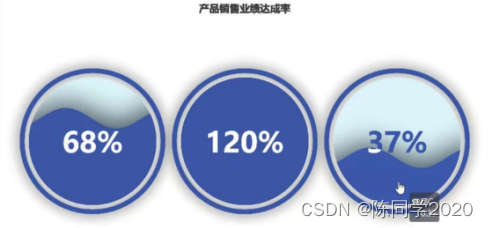
(3)水球图
功能:适用于展示单个或多个百分数
示例代码:
from pyecharts.charts import Liquida=68
t=100
chart=Liquid()
chart.add(series_name='productA',data=[a/t],shape='circle'  # 改变形状,如圆形、矩形rect、箭头pin等)
chart.set_global_opts(title_opts=opts.TitleOpts(title='sales',pos_left='center'))
chart.render('sales.html')
from pyecharts.charts import Liquida=68
b=120
c=37
t=100
chart=Liquid()chart.set_global_opts(title_opts=opts.TitleOpts(title='sales',pos_left='center'))
chart.add(series_name='productA',data=[a/t],center=['20%','50%'] # 指定水球中心点在图表中的位置)
chart.add(series_name='productB',data=[b/t],center=['50%','50%'])
chart.add(series_name='productC',data=[c/t],center=['80%','50%'])
chart.render('sales-2.html')
(4)仪表盘
功能:适用于展示单个或多个百分比
示例代码:
from pyecharts.charts import Gaugechart=Gauge()
chart.add(series_name='idx_name',data_pair=[('Completion%','62.25')],split_number=10 #平均分割段数,radius='50%' # 设置仪表盘半径,title_label_opts=opts.LabelOpts(font_size=20,color='red',font_family='Microsoft YaHei'))
chart.set_global_opts(tooltip_opts=opts.TooltipOpts(is_show=True,formatter='{a}<br/>{b}:{c}%')  # a = idx_name,b=done%,c=62.25,<br/>表示换行,legend_opts=opts.LegendOpts(is_show=False))chart.render('idx_name_Completion%.html')
chart.render_notebook()

(5)词云图
功能:展示关键词频数的图表
示例代码:
from pyecharts.charts import WordCloud#data=pd.read_excel('')
name=['流浪地球2','满江红','熊出没','无名','英雄'] #data['movies']
value=[1000,1200,500,300,280] #data['ticket']
data1=[z for z in zip(name,value)]
chart=WordCloud()
chart.add('ticket',data_pair=data1,word_size_range=[6,20],shape='diamond') # shape可改变词云图的外形轮廓chart.set_global_opts(title_opts=opts.TitleOpts(title='ticket analysis',title_textstyle_opts=opts.TextStyleOpts(font_size=30)) ,tooltip_opts=opts.TooltipOpts(is_show=True))
chart.render('ticket-wordcount.html')
三、嵌入到ppt
具体方法参考:https://blog.csdn.net/zjkpy_5/article/details/123264097
参考《Python爬虫、数据分析与可视化——从入门到精通》,感谢原作者。