CSS基本布局理解(测试)——WEB开发系列38
对CSS学习已经接近尾声,下面你可以对以下两道“小卡拉米”测试进行测试下CSS理解程度。
题 1:基于栅格布局的现代博客首页设计
题目要求:
创建一个博客首页布局,包含一个顶部导航栏、一个主要的内容区域(左侧为博客文章列表,右侧为一个侧边栏显示推荐内容),以及一个底部的页脚。要求使用 栅格布局 来分割页面,顶部导航栏固定在顶部,内容区域左右分栏。
代码示例:
<!DOCTYPE html>
<html lang="zh">
<head><meta charset="UTF-8"><meta name="viewport" content="width=device-width, initial-scale=1.0"><title>博客首页</title><style>* {margin: 0;padding: 0;box-sizing: border-box;}body {font-family: Arial, sans-serif;line-height: 1.6;}.container {display: grid;grid-template-rows: 80px 1fr 100px;grid-template-columns: 1fr 3fr 1fr;grid-template-areas: "header header header""sidebar main main""footer footer footer";min-height: 100vh;}header {grid-area: header;background-color: #333;color: #fff;display: flex;justify-content: center;align-items: center;font-size: 24px;}.sidebar {grid-area: sidebar;background-color: #f4f4f4;padding: 20px;}.main-content {grid-area: main;padding: 20px;background-color: #fff;}footer {grid-area: footer;background-color: #333;color: #fff;text-align: center;display: flex;justify-content: center;align-items: center;}</style>
</head>
<body><div class="container"><header>导航栏</header><aside class="sidebar">侧边栏推荐内容</aside><section class="main-content"><h2>博客文章标题</h2><p>这是博客文章的内容。你可以在这里测试文本和图片布局。</p></section><footer>页脚信息</footer></div>
</body>
</html>
示例注解:
栅格布局的使用:使用 grid-template-rows 和 grid-template-columns 将页面分为三行三列。第一行是顶部导航栏,第二行分为左右两栏,第三行是页脚。通过 grid-template-areas 确定每个区域的布局位置。
顶部导航栏:header 元素被设置在第一行,占据整个页面宽度,居中显示导航文字。
内容区域:main-content 和 sidebar 分别设置在栅格的中间部分,主内容区域宽度是侧边栏的三倍,符合现代博客的布局风格。
页脚:footer 固定在页面底部,跨越整个页面宽度,并居中显示内容。
响应式设计:通过 grid 的灵活性,你可以轻松扩展布局,适应不同屏幕大小。
题 2:基于 Flexbox 和浮动的响应式电商产品页面
题目要求:
创建一个电商网站的产品详情页面,包括顶部的产品图片展示区、描述区、以及一个放置推荐产品的底部区域。要求通过 弹性盒布局 完成产品图片和描述区的布局,底部的推荐产品使用 浮动布局。
代码示例:
<!DOCTYPE html>
<html lang="zh">
<head><meta charset="UTF-8"><meta name="viewport" content="width=device-width, initial-scale=1.0"><title>Apple</title><style>* {margin: 0;padding: 0;box-sizing: border-box;}body {font-family: Arial, sans-serif;background-color: aliceblue;}.product-section {display: flex;justify-content: space-between;padding: 20px;background-color: #f9f9f9;}.product-image {max-width: 2%;flex: 1;margin-right: 20px;}.product-image img {max-width: 100%;height: auto;display: block;}.product-details {flex: 2;}.product-details h2 {margin-bottom: 20px;}.recommendation-section {margin: 20px;overflow: hidden;}.recommendation-item {float: center;width: 100%;margin: 1.66%;background-color: #eee;padding: 10px;text-align: center;}.recommendation-item img {max-width: 100%;height: auto;}@media (max-width: 768px) {.product-section {flex-direction: column;}.recommendation-item {width: 100%;margin-bottom: 20px;}}</style>
</head>
<body><div class="product-section"><div class="product-image"><img src="01.jpg" alt="产品图片"></div><div class="product-details"><h2>Apple</h2><p>这里是Apple,是的,就是Apple!</p></div></div><div class="recommendation-section"><div class="recommendation-item"><img src="02.jpg" alt="推荐产品1"><p>iPhone 16 Pro</p></div><div class="recommendation-item"><img src="03.jpg" alt="推荐产品2"><p>iPhone 16 </p></div><div class="recommendation-item"><img src="04.jpg" alt="推荐产品3"><p>Apple Watch Ultra 2</p></div></div>
</body>
</html>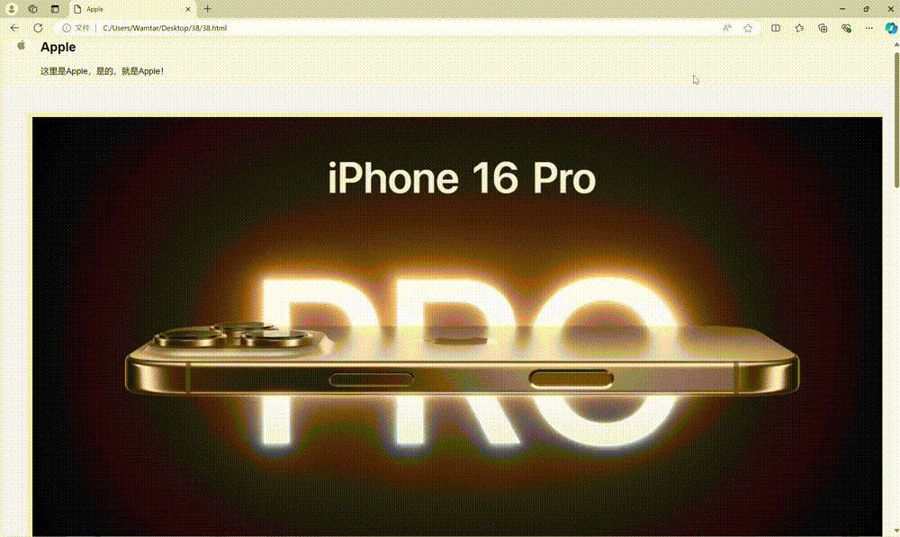
示例注解:
弹性盒布局的使用:product-section 区域使用了 flexbox 布局,product-image 和 product-details 分别占据 1 和 2 的比例,保证图片和描述部分在大屏幕上呈现合理的比例。
图片自适应:img 标签通过 max-width: 100% 确保图片不会超出其父容器,且可以根据容器大小自适应缩放。
浮动布局的使用:底部的推荐产品区域采用浮动布局,每个推荐产品使用 float: left 并设置固定宽度,使它们并排排列。同时使用 overflow: hidden 清除浮动。
响应式设计:使用媒体查询(@media)调整布局,使页面在移动设备上显示更加友好。当屏幕宽度小于 768px 时,产品图片和描述区垂直排列,推荐产品区域的每个项目宽度为 100%。