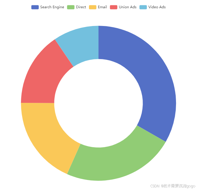
vue---echarts环形图
1、完整代码直接可以cv
<template><div id="main1"></div>
</template><script>
import * as echarts from 'echarts';
// import { mapState } from 'vuex';
// import { Alarm_Device } from '../utils/api.js';
export default {name: 'PieChart',data() {return {chart: null,data: [{ value: 1048, name: '人体探测器', itemStyle: { color: '#4f7ff7' } },{ value: 262, name: '生命体征探测器', itemStyle: { color: '#be71f2' } },{ value: 210, name: '防摔倒探测器', itemStyle: { color: '#7586f5' } },{ value: 140, name: '智能床垫', itemStyle: { color: '#6ee497' } },{ value: 90, name: '智能手表', itemStyle: { color: '#4ebfff' } }]};},computed: {// ...mapState(['login']),},mounted() {this.initChart();this.registerUser()},beforeDestroy() {if (this.chart) {this.chart.dispose();}},methods: {getItemStyleByName(name) {// 根据设备名称返回对应的颜色const colorMap = {'人体探测器': '#4f7ff7','生命体征探测器': '#be71f2','防摔倒探测器': '#7586f5','智能床垫': '#6ee497','智能手表': '#4ebfff'};return { color: colorMap[name] || '#ffffff' }; // 如果名称未找到,则默认为白色},initChart() {const chartDom = document.getElementById('main1');this.chart = echarts.init(chartDom);const options = this.getChartOptions();this.chart.setOption(options);},getChartOptions() {const total = this.data.reduce((sum, item) => sum + item.value, 0);const dataWithPercentage = this.data.map(item => ({value: item.value,name: item.name,percentage: `${(item.value / total * 100).toFixed(1)}%`,itemStyle: item.itemStyle}));return {title: {text: '总数量',subtext: '100%',left: 'center',top: '40%',left: '29%',textAlign: 'center',textStyle: {fontSize: 18,fontWeight: 'bold',color: '#ffffff'},subtextStyle: {fontSize: 17,color: '#ffffff'}},legend: {orient: 'vertical',right: '16%',top: 'center',textStyle: {color: '#fff',  // 图例文字颜色fontSize: 12,   // 图例文字大小},formatter: (name) => {const item = dataWithPercentage.find(d => d.name === name);return item ? `${item.name} ${item.percentage}` : name;},},tooltip: {trigger: 'item',},label: {show: true,color: '#fff',  // 设置文字颜色为白色position: 'outside',formatter: ({ data }) => `${data.percentage}` // 只显示百分比},emphasis: {label: {show: true,fontSize: 20,fontWeight: 'bold',color: '#fff'  // 确保在强调状态下文字依然为白色},},labelLine: {show: true,lineStyle: {color: '#fff'  // 设置指引线的颜色为白色}},series: [{name: '',type: 'pie',radius: ['40%', '70%'],center: ['30%', '50%'], // 将中心位置设置为垂直和水平的中点data: dataWithPercentage,// 移除startAngle和endAngle,以显示完整的圆形},],};},},
};
</script><style scoped>
#main1 {width: 560px;height: 180px;
}
</style>
2、初始化
initChart() {// 获取 DOM 元素,通过其 ID 获取到的元素将作为 ECharts 实例的容器const chartDom = document.getElementById('main1');// 初始化 ECharts 实例,传入上面获取的 DOM 元素this.chart = echarts.init(chartDom);// 获取图表的配置项,这些配置项用于定义图表的类型、数据、样式等const options = this.getChartOptions();// 设置图表的配置项// 这一步将配置项应用到 ECharts 实例中,渲染出图表this.chart.setOption(options);
}
所有的基本上都是先获取容器盒子,然后初始化echarts,最后配置options
3、配置解释
getChartOptions() {// 计算数据总量,用于计算百分比const total = this.data.reduce((sum, item) => sum + item.value, 0);// 为每个数据项计算百分比,并保留原有的 itemStyleconst dataWithPercentage = this.data.map(item => ({value: item.value,name: item.name,percentage: `${(item.value / total * 100).toFixed(1)}%`, // 计算并格式化百分比itemStyle: item.itemStyle // 保留原有的样式}));return {// 图表标题配置title: {text: '总数量', // 主标题文本subtext: '100%', // 副标题文本left: 'center', // 主标题水平居中top: '40%', // 主标题垂直位置left: '29%', // 主标题水平位置textAlign: 'center', // 主标题文本对齐方式textStyle: {fontSize: 18, // 主标题字体大小fontWeight: 'bold', // 主标题字体粗细color: '#ffffff' // 主标题字体颜色},subtextStyle: {fontSize: 17, // 副标题字体大小color: '#ffffff' // 副标题字体颜色}},// 图例配置legend: {orient: 'vertical', // 图例垂直排列right: '16%', // 图例水平位置top: 'center', // 图例垂直居中textStyle: {color: '#fff',  // 图例文字颜色fontSize: 12,   // 图例文字大小},// 格式化图例文字,显示名称和百分比formatter: (name) => {const item = dataWithPercentage.find(d => d.name === name);return item ? `${item.name} ${item.percentage}` : name;},},// 提示框配置tooltip: {trigger: 'item', // 鼠标悬停在项上触发提示框},// 标签配置label: {show: true, // 显示标签color: '#fff',  // 标签文字颜色position: 'outside', // 标签位置在图形外部formatter: ({ data }) => `${data.percentage}` // 标签只显示百分比},// 高亮显示配置emphasis: {label: {show: true, // 高亮时显示标签fontSize: 20, // 高亮时标签字体大小fontWeight: 'bold', // 高亮时标签字体粗细color: '#fff'  // 高亮时标签字体颜色},},// 标签线配置labelLine: {show: true, // 显示标签线lineStyle: {color: '#fff'  // 标签线颜色}},// 系列数据配置series: [{name: '', // 系列名称type: 'pie', // 图表类型为饼图radius: ['40%', '70%'], // 饼图的半径范围,内环到外环center: ['30%', '50%'], // 饼图中心位置,水平和垂直的百分比位置data: dataWithPercentage, // 使用带有百分比的数据// 移除 startAngle 和 endAngle 使饼图显示完整的圆形},],};
}