Day10-网页布局实战CSS3
一 补充
1 画三角形
<!DOCTYPE html>
<html lang="en">
<head><meta charset="UTF-8"><meta http-equiv="X-UA-Compatible" content="IE=edge"><meta name="viewport" content="width=device-width, initial-scale=1.0"><title>Document</title><style>.box{width: 0;border: 5px red solid;/* 设置顶部边框线透明 */border-top-color: transparent;/* 设置左部边框线透明 */border-left-color: transparent;/* 设置右部边框线透明 */border-right-color: transparent;}</style>
</head>
<body><div class="box"></div>
</body>
</html>
2 伪元素选择器
<!DOCTYPE html>
<html lang="en">
<head><meta charset="UTF-8"><meta http-equiv="X-UA-Compatible" content="IE=edge"><meta name="viewport" content="width=device-width, initial-scale=1.0"><title>Document</title><style>.box{width: 200px;height: 200px;border: 1px red solid;}/* 伪元素选择器作用:在div内部创建一个伪元素before:在div主体内容之前创建伪元素after:在div主体内容之后创建伪元素*/.box::before{/* content不能省略 */content: "";/* display用来表示元素的类型 */display: block;width: 50px;height: 50px;background-color: green;}.box::after{content: "";display: block;width: 50px;height: 50px;background-color: blue;}</style>
</head>
<body><div class="box">我是一个div</div>
</body>
</html>
二 定位案例
案例1-贯穿案例-回到顶部


案例2-贯穿案例-二维码弹窗

<!DOCTYPE html>
<html lang="en">
<head><meta charset="UTF-8"><meta http-equiv="X-UA-Compatible" content="IE=edge"><meta name="viewport" content="width=device-width, initial-scale=1.0"><title>Document</title><style>.icon-ewm-box img{width: 80px;height: 80px; }.ewm-fa{position: relative;}.icon-ewm-box{width: 80px;height: 80px;position: absolute;top: 20px;left: -30px;display: none;}/* 用伪元素画三角请 */.icon-ewm-box::before{content: "";display: block;width: 0px;border: 5px solid red;margin: 0 auto;border-left-color: transparent;border-right-color: transparent;border-top-color: transparent;}/* 移动鼠标 显示三角形 */.ewm-fa:hover .icon-ewm-box{display: block;}</style>
</head>
<body><div class="icon"><img src="./images/grzx.png" alt=""><a class="ewm-fa" href=""><img src="./images/ewm.png" alt=""><div class="icon-ewm-box"><img src="./images/smewm.png" alt=""></div></a><img src="./images/gwc.png" alt=""></div>
</body>
</html>
案例3-二级下拉菜单

<!DOCTYPE html>
<html lang="en">
<head><meta charset="UTF-8"><meta http-equiv="X-UA-Compatible" content="IE=edge"><meta name="viewport" content="width=device-width, initial-scale=1.0"><title>Document</title><style>/* 一级菜单 */.one-menu{position: relative;}.one-menu > li{/* 去除无序列表列表项的小圆点 */list-style: none;background-color: aqua;width: 50px;margin: 20px 0;}/* 二级菜单 */.two-menu {position: absolute;top: 0;left: 100px;/* 让二级菜单影藏 */display: none;}.two-menu li{width: 100px;background-color: pink;list-style: none;}.one-li:hover .two-menu{display: block;}</style>
</head>
<body><ul class="one-menu"><li class="one-li">手机<ul class="two-menu"><li>红米手机</li><li>oppo手机</li></ul></li><li class="one-li">家电<ul class="two-menu"><li>小米电视</li><li>格力空调</li></ul></li><li class="one-li">粮油<ul class="two-menu"><li>大米</li><li>食用油</li></ul></li></ul></body>
</html>
案例4-贯穿案例-二级下拉菜单


三 CSS动画
1 阴影效果
box-shadow: 水平偏移量 垂直偏移量 模糊度  阴影颜色
box-shadow: 10px 10px 10px red

<!DOCTYPE html>
<html lang="en">
<head><meta charset="UTF-8"><meta http-equiv="X-UA-Compatible" content="IE=edge"><meta name="viewport" content="width=device-width, initial-scale=1.0"><title>Document</title><style>.box{width: 200px;height: 200px;border: 1px red solid;/*  box-shadow:水平偏移量  垂直偏移量  模糊度 颜色   */box-shadow: 10px 10px 10px red;}</style>
</head>
<body><div class="box"></div>
</body>
</html>
2 背景渐变
background: linear-gradient(red,green,blue);
基本案例

<style>.box{width: 300px;height: 200px;background: linear-gradient(red,green,blue);}</style><div class="box"></div>
色标

色标:在颜色的后面设置颜色的显示范围,控制每一个颜色到底占多少位置
<style>.box{width: 300px;height: 200px;/* 0%~20%是红色,20%~40%是红色到绿色的渐变,40%~70%是绿色,70%~100%是蓝色 */background: linear-gradient(red 0% 20%,green 40% 70%,blue 70% 100%);}</style><div class="box"></div>
方向
background:linear-gradient(角度,起始颜色,结束颜色)
方向可以用角度 30deg表示,也可以用如下英文单词表示
| 英文单词 | |
|---|---|
| to top | 从下到上 |
| to bottom | 从上到下 |
| to right | 从左到右 |
| to left | 从右到左 |
如:
/* 渐变方向 */.box3{width: 200px;height: 200px;border: 1px black solid;/* 渐变方向使用角度表示 *//* background: linear-gradient(45deg,red 0% 50%,green 60% 80%,blue); *//* 渐变方向还可以使用英文单词表示to topto bottomto leftto right*/background: linear-gradient(to right,red 0% 50%,green 60% 80%,blue); }<div class="box3"></div>
案例-利用渐变色使文字显示的更清晰
<!DOCTYPE html>
<html lang="en">
<head><meta charset="UTF-8"><meta http-equiv="X-UA-Compatible" content="IE=edge"><meta name="viewport" content="width=device-width, initial-scale=1.0"><title>Document</title><style>.box{width: 100%;height: 400px;background-image: url("http://img.crawler.qq.com/lolwebschool/0/JAutoCMS_LOLWeb_7b19c73a1974944397b300ee3a739097/0");}.box div{height: 100%;color: white;text-align: center;font-size: 25px;background: linear-gradient(to bottom,rgba(0,0,0,0.5),rgba(0,0,0,0.1));}</style>
</head>
<body><div class="box"><div>游戏下载新手指引资料库云顶之弈攻略中心开发者基地海克斯战利品库英雄联盟宇宙点券充值</div></div>
</body>
</html>
3 过渡
- css3给我们提供的某种动态的效果,当元素从一种样式转换成另一种样式时,使其平滑过渡
- 一般情况下来说,过渡都是搭配hover来使用的
案例1-从背景过度到文字

<!DOCTYPE html>
<html lang="en">
<head><meta charset="UTF-8"><meta http-equiv="X-UA-Compatible" content="IE=edge"><meta name="viewport" content="width=device-width, initial-scale=1.0"><title>Document</title><style>.top{width: 50px;height: 50px;border: 1px gray solid;background-image: url("./img/gt1.png");background-repeat: no-repeat;background-position: center;}.top div{width: 50px;height: 50px;background-color: #900000;color: white;opacity: 0;/* 过度 *//* 元素哪些属性过度 */transition-property: all;/* 过度时间 */transition-duration: 1s;}.top:hover div{opacity: 1;}</style>
</head>
<body><div class="top"><div>去购物</div></div>
</body>
</html>
案例2-贯穿项目-二级菜单
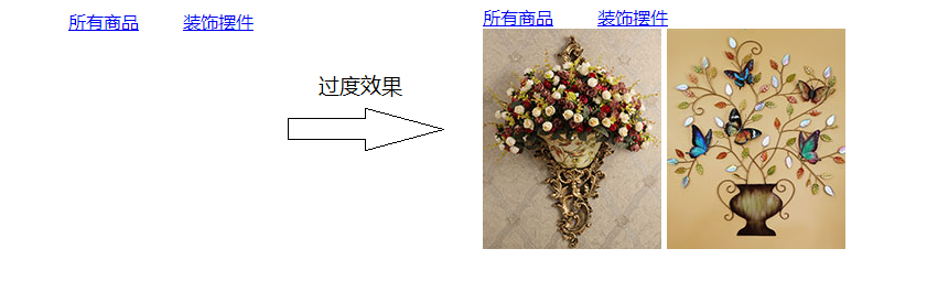
<!DOCTYPE html>
<html lang="en">
<head><meta charset="UTF-8"><meta http-equiv="X-UA-Compatible" content="IE=edge"><meta name="viewport" content="width=device-width, initial-scale=1.0"><title>Document</title><style>ul{list-style: none;display: flex;position: relative;}li{margin: 0 20px;}/* 设置div的初始样式 */.list1,.list2{position: absolute;width: 400px;height: 0px;/* 溢出隐藏 */overflow: hidden;/* 过度 transition: 过度属性 过度时间  */transition: all 1s;}/* 搭配hover实现过度 */li:hover .list1{height: 300px;}li:hover .list2{height: 100px;}</style>
</head>
<body><ul><li><a href="#">所有商品</a><div class="list1"><img src="./images/nav1.jpg" alt="">  <img src="./images/nav2.jpg" alt="">  </div></li><li><a href="#">装饰摆件</a><div class="list2">插画花艺 千花花瓶</div></li></ul>
</body>
</html>