【python分析实战】成本:揭示电商平台月度开支与成本结构占比 - 过于详细 【收藏】
重点关注本文思路,用python分析,方便大家实验复现,代码每次都用全量的,其他工具自行选择。
全文3000字,阅读10min,操作1小时
企业案例实战欢迎关注专栏 每日更新:https://blog.csdn.net/cciehl/category_12615648.html
背景
一家电商公司希望分析其过去一年的各项成本,包括材料、劳动力、市场营销、固定成本和杂项支出。目标是了解成本结构,识别成本控制和优化的机会。
实施步骤
首先,收集并整理全年各月份的成本数据。
使用Python的数据分析和可视化库(如Pandas和Matplotlib)进行分析或者其他工具
对生成的图表进行深入分析,提取关键洞察。
成本数据
每个月提供了五种成本类型(材料、劳动力、市场营销、固定成本和杂项支出)的具体数字和对应的用量,并计算了每个月的总成本
import pandas as pd
import numpy as np
# 设置随机数种子以确保数据的一致性
np.random.seed(42)
# 创建模拟的月份数据
months = ['January', 'February', 'March', 'April', 'May', 'June','July', 'August', 'September', 'October', 'November', 'December']
# 创建不同成本类型的模拟数据,包括总成本和用量
data = {'Month': months,'Material Cost ($)': np.random.randint(10000, 30000, size=12),'Material Quantity': np.random.randint(100, 300, size=12),'Labor Cost ($)': np.random.randint(8000, 25000, size=12),'Labor Hours': np.random.randint(200, 500, size=12),'Marketing Cost ($)': np.random.randint(5000, 15000, size=12),'Marketing Campaigns': np.random.randint(1, 5, size=12),'Fixed Cost ($)': np.random.randint(4000, 8000, size=12),'Fixed Assets': np.random.randint(10, 20, size=12)
}
# 转换为DataFrame
cost_df = pd.DataFrame(data)
pd.set_option('expand_frame_repr', False)
print(cost_df)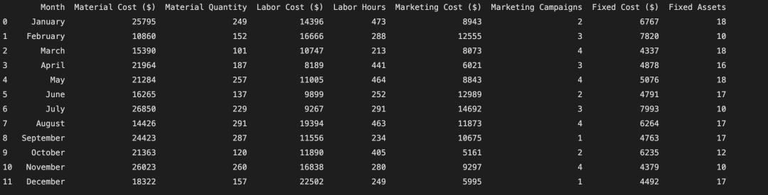
初步的分析
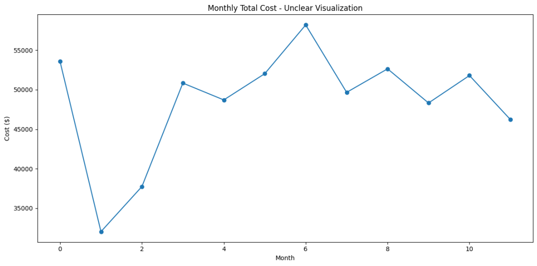
分析方法: 初始分析仅涉及计算每个月的总成本和成本构成,并通过简单的趋势图展示。
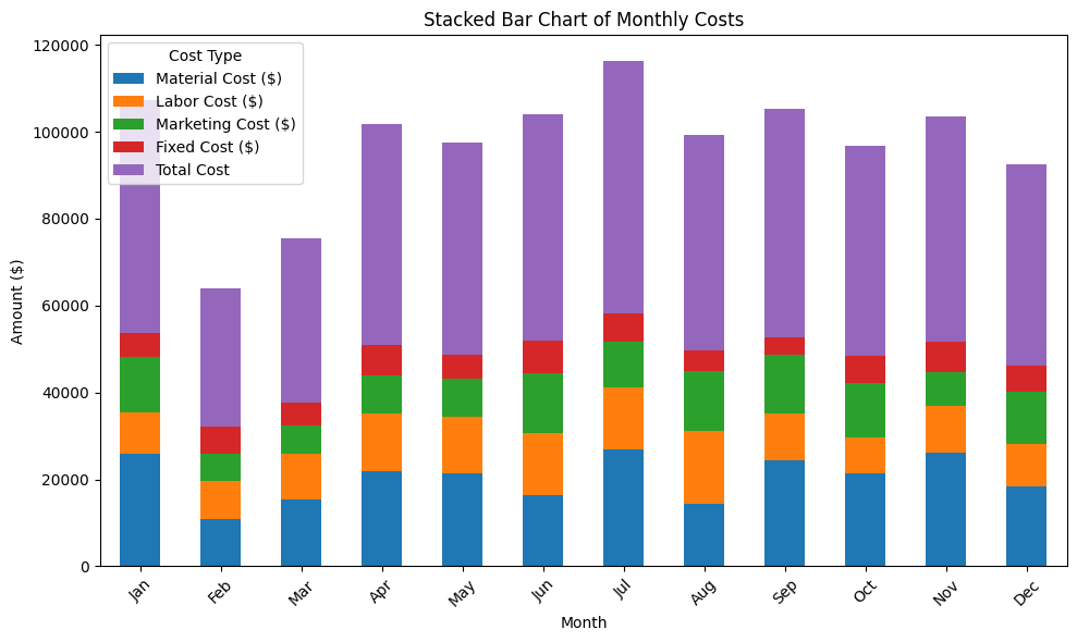
成本构成组成图,可以看到主要的成本应该是材料费用,但是具体占比多少其实还看不清楚,然后波动趋势的话 因为组合型柱形图没法做每个月的对比
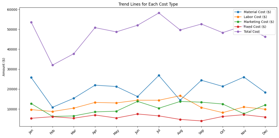
成本构成趋势图,如果仔细看的话,可以看到材料费用的波动比较大,但是原因是什么不清楚,因为费用跟使用情况有关系
这个是一个热力图,可以看到材料和市场活动的波动会比较大,导致的总成本的波动也比较大

问题:
-
缺乏细节:总成本的展示忽略了成本结构的复杂性,无法识别哪些成本类型对总支出的贡献最大。
-
无法识别趋势:没有展示各成本类型随时间的变化趋势,难以分析季节性变化或特定事件对成本的影响。
-
决策困难:缺少深入分析,管理层难以基于这些数据做出有针对性的成本控制或优化决策。
代码
import pandas as pd
import numpy as np
import matplotlib.pyplot as plt
import seaborn as sns
np.random.seed(42)
# Creating DataFrame from provided data
cost_data = {'Month': months,'Material Cost ($)': np.random.randint(10000, 30000, size=12),'Labor Cost ($)': np.random.randint(8000, 25000, size=12),'Marketing Cost ($)': np.random.randint(5000, 15000, size=12),'Fixed Cost ($)': np.random.randint(4000, 8000, size=12),
}
cost_df = pd.DataFrame(cost_data)
cost_df['Total Cost'] = cost_df['Material Cost ($)']+cost_df['Labor Cost ($)']+cost_df['Marketing Cost ($)']+cost_df['Fixed Cost ($)']
plt.figure(figsize=(12, 6))
plt.plot(cost_df.index, cost_df['Total Cost'], marker='o')
plt.title('Monthly Total Cost - Unclear Visualization')
plt.ylabel('Cost ($)')
plt.xlabel('Month')
plt.xticks()
plt.tight_layout()
plt.show()
# Set 'Month' as index
cost_df.set_index('Month', inplace=True)
# 1. Stacked Bar Chart for Monthly Costs
cost_df.plot(kind='bar', stacked=True, figsize=(10, 6))
plt.title('Stacked Bar Chart of Monthly Costs')
plt.ylabel('Amount ($)')
plt.xticks(rotation=45)
plt.legend(title='Cost Type')
plt.tight_layout()
plt.show()
# 2. Trend Line Chart for Each Cost Type
plt.figure(figsize=(12, 6))
for column in cost_df.columns:plt.plot(cost_df.index, cost_df[column], marker='o', label=column)
plt.title('Trend Lines for Each Cost Type')
plt.xticks(rotation=45)
plt.ylabel('Amount ($)')
plt.legend()
plt.tight_layout()
plt.show()
# 3. Heatmap for Monthly Costs
# Creating a new DataFrame suitable for heatmap
heatmap_data = cost_df.T # Transpose to get cost types as rows and months as columns
plt.figure(figsize=(12, 6))
sns.heatmap(heatmap_data, cmap="YlGnBu", annot=True, fmt="d")
plt.title('Heatmap of Monthly Costs')
plt.xlabel('Month')
plt.ylabel('Cost Type')
plt.tight_layout()
plt.show()改进后的分析
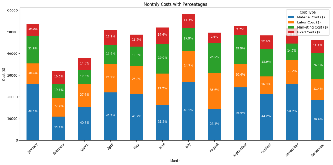
为了克服这些限制,我们需要采用更合理的数据可视化方法,首先是查看各项占比,组合柱形图如果不展示各项占比,这个图的会变得很难解读,所以从图中可以看出材料费用的占比在30%-50%左右,还有就是劳动力成本,这两个成本需要重点分析。
代码
import matplotlib.pyplot as plt
import pandas as pd
import numpy as np
np.random.seed(42) # 确保结果可复现
months = ['January', 'February', 'March', 'April', 'May', 'June', 'July', 'August', 'September', 'October', 'November', 'December']
# 使用提供的数据创建DataFrame
cost_data = {'Month': months,'Material Cost ($)': np.random.randint(10000, 30000, size=12),'Labor Cost ($)': np.random.randint(8000, 25000, size=12),'Marketing Cost ($)': np.random.randint(5000, 15000, size=12),'Fixed Cost ($)': np.random.randint(4000, 8000, size=12),
}
cost_df = pd.DataFrame(cost_data)
# 计算每个月总成本
cost_df['Total Cost ($)'] = cost_df.drop('Month', axis=1).sum(axis=1)
# 计算各成本项占总成本的比例
for column in cost_df.columns[1:-1]: # 排除'Month'和'Total Cost ($)'cost_df[f'{column} Percentage'] = (cost_df[column] / cost_df['Total Cost ($)']) * 100
# 绘制各成本项的柱状图
cost_df.set_index('Month').iloc[:, :4].plot(kind='bar', stacked=True, figsize=(14, 7))
plt.title('Monthly Costs with Percentages')
plt.ylabel('Cost ($)')
# 添加占比标签
for i, month in enumerate(cost_df['Month']):total_cost = cost_df.loc[i, 'Total Cost ($)']cumulative_height = 0for column in cost_df.columns[1:5]: # 选择四个成本列cost = cost_df.loc[i, column]percentage = (cost / total_cost) * 100label_y_position = cumulative_height + cost / 2 # 计算标签的y位置plt.text(i, label_y_position, f'{percentage:.1f}%', ha='center', color='white', fontsize=9)cumulative_height += cost
plt.xticks(rotation=45)
plt.legend(title='Cost Type')
plt.tight_layout()
plt.show()接着需要去掉用量的影响,因为成本金额大不一定有问题,可能是量也比较大,我们构建一个单位成本的指标,单位成本是指对应成本总额除以相应的量度(如材料成本除以材料量,劳动力成本除以工时等。
这里是单位材料成本和单位劳动力成本,可以看到在3月、10月的单位材料成本大涨,经过分析发现这两个月进入了一批新的材料比以往的采购价都更贵。发现单位工时成本在2月和12月上涨比较多,是因为这两个月招聘了高技术的人才,之后下降是由于上线了平台系统提高了整体的工作效率。
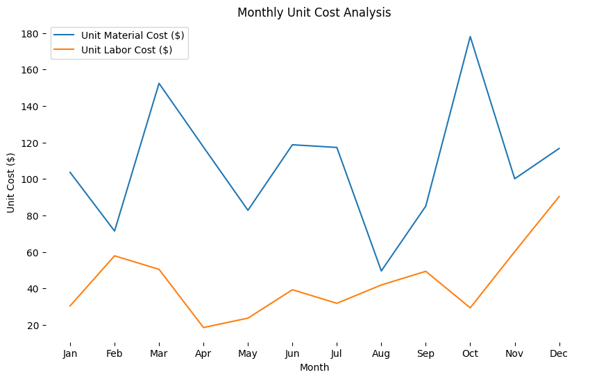
单位成本代码
import matplotlib.pyplot as plt
import pandas as pd
import numpy as np
# 设置随机数种子以确保数据的一致性
np.random.seed(42)
# 创建模拟的月份和成本数据
months = ['Jan', 'Feb', 'Mar', 'Apr', 'May', 'Jun', 'Jul', 'Aug', 'Sep', 'Oct', 'Nov', 'Dec']
data = {'Month': months,'Material Cost ($)': np.random.randint(10000, 30000, size=12),'Material Quantity': np.random.randint(100, 300, size=12),'Labor Cost ($)': np.random.randint(8000, 25000, size=12),'Labor Hours': np.random.randint(200, 500, size=12),
}
cost_df = pd.DataFrame(data)
cost_df['Unit Material Cost ($)'] = cost_df['Material Cost ($)'] / cost_df['Material Quantity']
cost_df['Unit Labor Cost ($)'] = cost_df['Labor Cost ($)'] / cost_df['Labor Hours']
# 绘制没有网格线和边框的折线图
plt.figure(figsize=(10, 6))
plt.plot(cost_df['Month'], cost_df['Unit Material Cost ($)'], label='Unit Material Cost ($)')
plt.plot(cost_df['Month'], cost_df['Unit Labor Cost ($)'], label='Unit Labor Cost ($)')
plt.title('Monthly Unit Cost Analysis')
plt.xlabel('Month')
plt.ylabel('Unit Cost ($)')
plt.legend()
# 移除边框
plt.gca().spines['top'].set_visible(False)
plt.gca().spines['right'].set_visible(False)
plt.gca().spines['bottom'].set_visible(False)
plt.gca().spines['left'].set_visible(False)
# 移除网格线
plt.grid(False)
plt.show()总结
除了要在展示的时候能更清晰的从图中看出具体的数值外,我们在分析成本的时候需要去掉用量的因素的影响,单位成本是一个常见的分析指标