matplotlib:热图、箱形图、小提琴图、堆叠面积图、雷达图、子图
简介:在数字化的世界里,从Web、HTTP到App,数据无处不在。但如何将这些复杂的数据转化为直观、易懂的信息?本文将介绍六种数据可视化方法,帮助你更好地理解和呈现数据。
热图 (Heatmap):热图能有效展示用户在网页或应用界面上的点击分布。例如,它可以用来分析用户最常点击的网页区域,帮助优化页面布局和用户体验。
箱形图 (Box Plot):箱形图非常适合分析网站访问时间或服务器响应时间等数据。它能展示数据的中位数、四分位数和异常值,对于发现性能瓶颈或优化响应策略尤为有用。
小提琴图 (Violin Plot):当你需要更深入地了解数据分布时,小提琴图是一个好选择。比如,在分析App的使用时长时,它不仅显示了数据的分布范围,还展示了数据密度。
堆叠面积图 (Stacked Area Chart):堆叠面积图适用于展示网站流量或应用使用量随时间的变化。通过堆叠不同来源的访问量,你可以直观地看到各部分对总流量的贡献。
雷达图 (Radar Chart):雷达图是比较不同产品或服务性能的理想工具。例如,对比不同的Web服务,你可以在多个维度(如响应时间、用户满意度、访问量)上进行全面比较。
历史攻略:
matplotlib:散点图、饼状图
Python:opencv画点、圆、线、多边形、矩形
Python:数据可视化pyechart
python:数据可视化 - 动态
案例源码:
# -*- coding: utf-8 -*-
# time: 2024/01/13 08:18
# file: plt_demo.py
# 公众号: 玩转测试开发
import matplotlib.pyplot as plt
import seaborn as sns
import numpy as np# case1 - 热图 (Heatmap) - 模拟数据:页面区域的点击率
click_data = np.random.rand(10, 10)
sns.heatmap(click_data, cmap='viridis')
plt.title('Web Page Click Heatmap')
plt.show()# case2 - 箱形图 (Box Plot) - 模拟数据:网站每天的响应时间
response_times = np.random.normal(loc=300, scale=50, size=365)sns.boxplot(response_times)
plt.title('Daily Website Response Times')
plt.xlabel('Response Time (ms)')
plt.show()# case3 - 小提琴图 (Violin Plot) - 模拟数据:App每日使用时长
usage_times = np.random.normal(loc=120, scale=30, size=1000)sns.violinplot(data=usage_times)
plt.title('Daily App Usage Times')
plt.xlabel('Usage Time (minutes)')
plt.show()# case4 - 堆叠面积图 (Stacked Area Chart) - 模拟数据:三个来源的网站流量
source1 = np.random.rand(365)
source2 = np.random.rand(365)
source3 = np.random.rand(365)plt.stackplot(range(365), source1, source2, source3, labels=['Source 1', 'Source 2', 'Source 3'])
plt.title('Website Traffic by Source')
plt.xlabel('Day of Year')
plt.ylabel('Traffic')
plt.legend(loc='upper left')
plt.show()# case5 - 雷达图 (Radar Chart) - 模拟数据:Web服务的性能指标
labels = ['Response Time', 'User Satisfaction', 'Feature Richness', 'Ease of Use', 'Reliability']
stats = [3, 5, 2, 4, 5]
stats2 = [4, 3, 3, 2, 5]
stats3 = [2, 4, 5, 5, 3]# 为雷达图创建角度数组
num_vars = len(labels)
angles = np.linspace(0, 2 * np.pi, num_vars, endpoint=False).tolist()
angles += angles[:1] # 闭合图形stats = stats + stats[:1]
stats2 = stats2 + stats2[:1]
stats3 = stats3 + stats3[:1]fig, ax = plt.subplots(figsize=(6, 6), subplot_kw=dict(polar=True))# 绘制雷达图
ax.plot(angles, stats, 'o-', linewidth=2)
ax.fill(angles, stats, alpha=0.25)
ax.plot(angles, stats2, 'o-', linewidth=2)
ax.fill(angles, stats2, alpha=0.25)
ax.plot(angles, stats3, 'o-', linewidth=2)
ax.fill(angles, stats3, alpha=0.25)# 设置角度标签
ax.set_thetagrids(np.degrees(angles[:-1]), labels)plt.title('Web Service Performance Comparison')
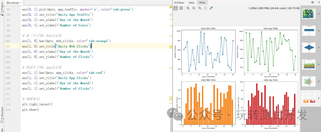
plt.show()# case6 - 子图数据:模拟Web和App的用户行为数据
days = np.arange(1, 31)
web_traffic = np.random.randint(100, 1000, size=30)
app_traffic = np.random.randint(100, 1000, size=30)
web_clicks = np.random.randint(10, 100, size=30)
app_clicks = np.random.randint(10, 100, size=30)# 创建子图布局
fig, axs = plt.subplots(2, 2, figsize=(12, 10))# 第一个子图:Web流量
axs[0, 0].plot(days, web_traffic, marker='o', color='tab:blue')
axs[0, 0].set_title('Daily Web Traffic')
axs[0, 0].set_xlabel('Day of the Month')
axs[0, 0].set_ylabel('Number of Users')# 第二个子图:App流量
axs[0, 1].plot(days, app_traffic, marker='s', color='tab:green')
axs[0, 1].set_title('Daily App Traffic')
axs[0, 1].set_xlabel('Day of the Month')
axs[0, 1].set_ylabel('Number of Users')# 第三个子图:Web点击量
axs[1, 0].bar(days, web_clicks, color='tab:orange')
axs[1, 0].set_title('Daily Web Clicks')
axs[1, 0].set_xlabel('Day of the Month')
axs[1, 0].set_ylabel('Number of Clicks')# 第四个子图:App点击量
axs[1, 1].bar(days, app_clicks, color='tab:red')
axs[1, 1].set_title('Daily App Clicks')
axs[1, 1].set_xlabel('Day of the Month')
axs[1, 1].set_ylabel('Number of Clicks')# 调整布局
plt.tight_layout()
plt.show()
运行结果:
结论:选择合适的可视化方法不仅能帮助我们更快地理解数据,还能让我们的分析结果更容易被他人理解。无论是数据分析师、产品经理还是营销人员,掌握这些技巧都将使你在数据洪流中游刃有余。欢迎分享你的数据可视化经验,一起探讨如何让数据说话。