CSS——标准流、浮动、Flex布局
1、标准流
标准流也叫文档流,指的是标签在页面中默认的排布规则,例如:块元素独占一行,行内元素可以一行显示多个。

2、浮动
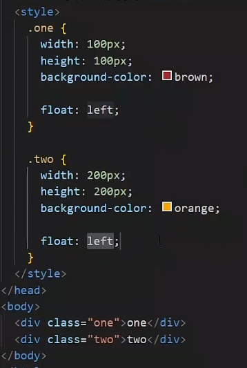
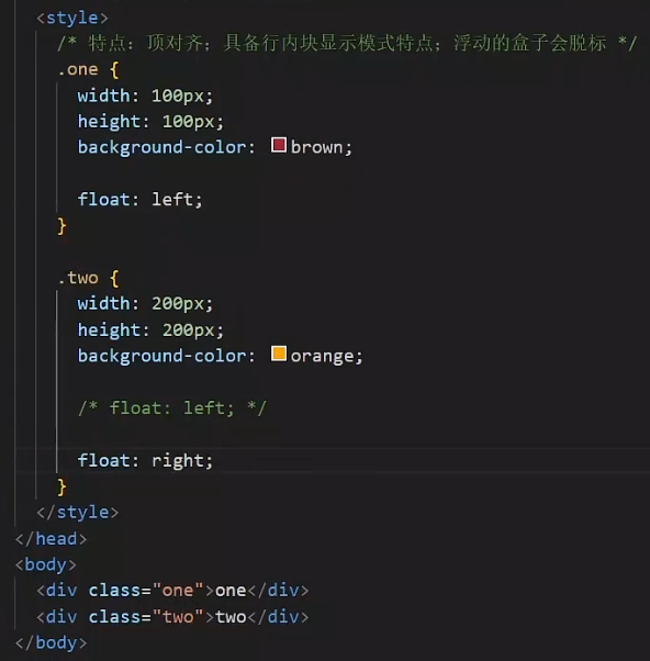
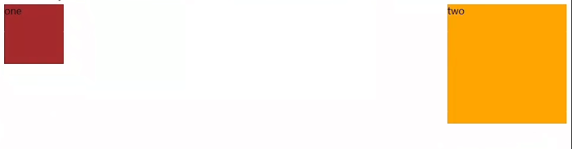
作用:让块元素水平排列
属性名:float
属性值:
- left:左对齐
- right:右对齐

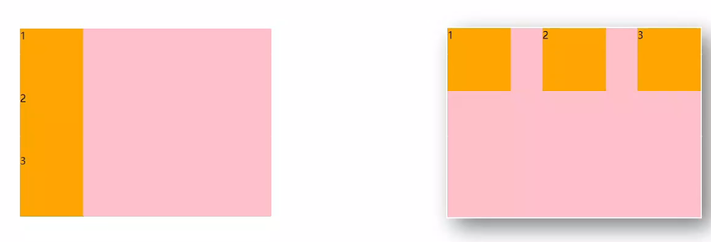
2.1 浮动-产品布局
<!DOCTYPE html>
<html lang="en">
<head><meta charset="UTF-8"><meta name="viewport" content="width=device-width, initial-scale=1.0"><title>Document</title><style>* {margin: 0;padding: 0;}li {list-style: none;}.product {margin: 50px auto;width: 1226px;height: 628px;background-color: pink;}.left {float:left;width: 234px;height: 628px;background-color: skyblue;}.right {float: right;width: 978px;height: 628px;background-color: brown;}.right li {float: left;margin-right: 14px;margin-bottom: 14px;width: 234px;height: 300px;background-color: orange;}/* 第四个li和第八个li 去掉右侧的margin */.right li:nth-child(4n) {margin-right: 0;}/* 细节:如果父级宽度不够,浮动的盒子会掉下来 */</style>
</head>
<body><!-- 版心:左右,右面:8个产品 --> 8个li --><div class="product"><div class="left"></div><div class="right"><ul><li></li><li></li><li></li><li></li><li></li><li></li><li></li><li></li></ul></div></div>
</body>
</html>
2.2 清除浮动
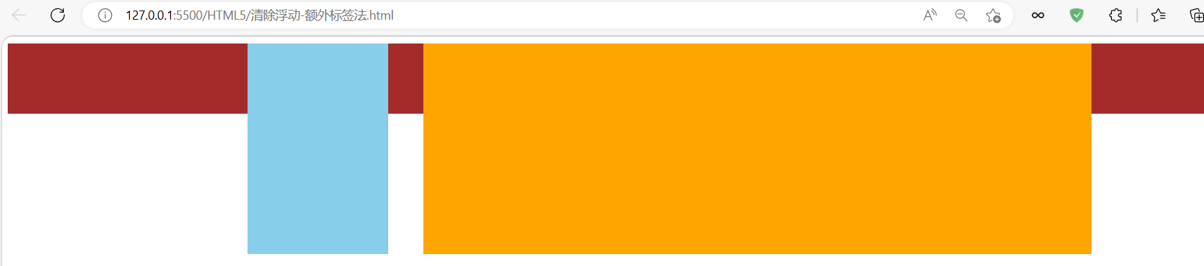
场景:浮动元素会脱标,如果父级没有高度,子级无法撑开父级高度(可能导致页面布局错乱)
解决方法:清除浮动(清除浮动带来的影响)
2.2.1 方法一:额外标签法
在父元素内容的最后添加一个块级元素,设置CSS属性clear:both
使用浮动已经产生影响的效果图
<!DOCTYPE html>
<html lang="en">
<head><meta charset="UTF-8"><meta name="viewport" content="width=device-width, initial-scale=1.0"><title>Document</title><style>.top {margin: 10px auto;width: 1200px;/* height: 300px; */background-color: pink;}.left {float: left;width: 200px;height: 300px;background-color: skyblue;}.right {float: right;width: 950px;height: 300px;background-color: orange;}.bottom {height: 100px;background-color: brown;}.clearfix {clear: both;}</style>
</head>
<body><div class="top"><div class="left"></div><div class="right"></div><div class="clearfix"></div></div><div class="bottom"></div>
</body>
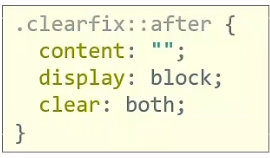
</html>2.2.2 方法二:单伪元素法
<!DOCTYPE html>
<html lang="en">
<head><meta charset="UTF-8"><meta name="viewport" content="width=device-width, initial-scale=1.0"><title>Document</title><style>.top {margin: 10px auto;width: 1200px;/* height: 300px; */background-color: pink;}.left {float: left;width: 200px;height: 300px;background-color: skyblue;}.right {float: right;width: 950px;height: 300px;background-color: orange;}.bottom {height: 100px;background-color: brown;}/* 单伪元素法 */.clearfix::after {content: "";display: block;clear: both;}</style>
</head>
<body><div class="top clearfix"><div class="left"></div><div class="right"></div></div><div class="bottom"></div>
</body>
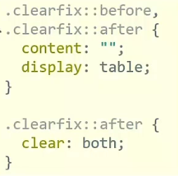
</html>2.2.3 方法三:双伪元素法(推荐)
<!DOCTYPE html>
<html lang="en">
<head><meta charset="UTF-8"><meta name="viewport" content="width=device-width, initial-scale=1.0"><title>Document</title><style>.top {margin: 10px auto;width: 1200px;/* height: 300px; */background-color: pink;}.left {float: left;width: 200px;height: 300px;background-color: skyblue;}.right {float: right;width: 950px;height: 300px;background-color: orange;}.bottom {height: 100px;background-color: brown;}/*before解决外边距塌陷问题*//* 双伪元素法 */.clearfix::before,.clearfix::after {content: "";display: table;}/*after 清除浮动*/.clearfix::after {clear: both;}</style>
</head>
<body><div class="top clearfix"><div class="left"></div><div class="right"></div></div><div class="bottom"></div>
</body>
</html>
2.2.4 overflow
父元素添加CSS属性 overflow:hidden
<!DOCTYPE html>
<html lang="en">
<head><meta charset="UTF-8"><meta name="viewport" content="width=device-width, initial-scale=1.0"><title>Document</title><style>.top {margin: 10px auto;width: 1200px;/* height: 300px; */background-color: pink;overflow: hidden;}.left {float: left;width: 200px;height: 300px;background-color: skyblue;}.right {float: right;width: 950px;height: 300px;background-color: orange;}.bottom {height: 100px;background-color: brown;}</style>
</head>
<body><div class="top"><div class="left"></div><div class="right"></div></div><div class="bottom"></div>
</body>
</html>
总结:
- 浮动属性float,left表示左浮动,right表示右浮动
- 特点:
- 浮动后的盒子顶对齐
- 浮动后的盒子具备行内块特点
- 父级宽度不够,浮动的子级会换行
- 浮动后的盒子脱标
- 清除浮动:子级浮动,父级没有高度,子级无法撑开父级高度,影响布局效果
- 双伪元素法
- 单伪元素法
- 额外标签法
- 父元素添加CSS属性 overflow:hidden
- 拓展:浮动本质作用是实现图文混排效果
3、flex布局
flex布局也叫弹性布局,是浏览器提倡的布局模型,非常适合结构化布局,提供了强大的空间分布和对齐能力。
flex模型不会产生浮动布局中脱标现象,布局网页更简单、更灵活。
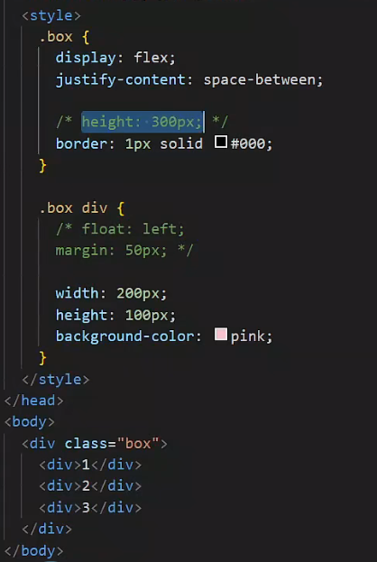
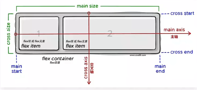
3.1 flex-组成
设置方式:给父元素设置display:flex,子元素可以自动挤压或拉伸
组成部分:
- 弹性容器
- 弹性盒子
- 主轴:默认在水平方向
- 侧轴 / 交叉轴:默认在垂直方向
3.2 flex布局
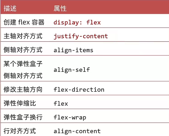
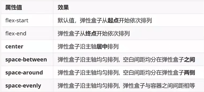
3.2.1 主轴对齐方式
属性名:justify-content
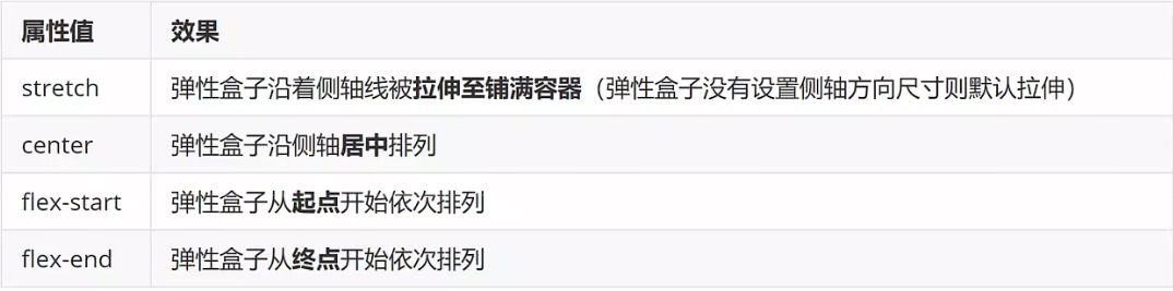
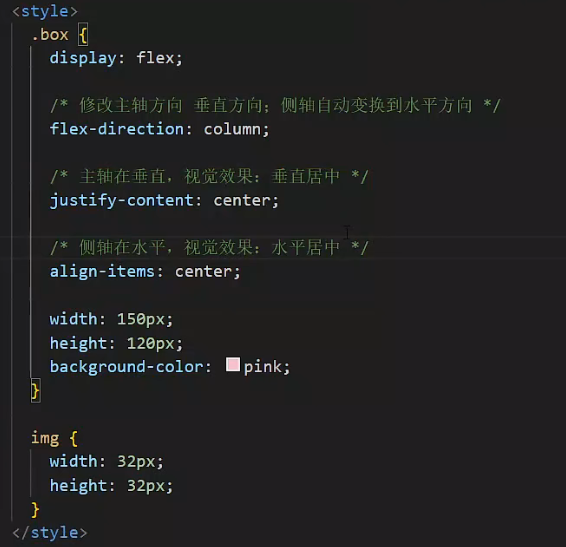
3.2.2 侧轴对齐方式
属性名:
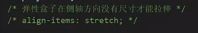
- align-items:当前弹性容器内所有的弹性盒子的侧轴对齐方式(给弹性容器设置)
- align-self:单独控制某个弹性盒子的侧轴对齐方式(给弹性盒子设置)
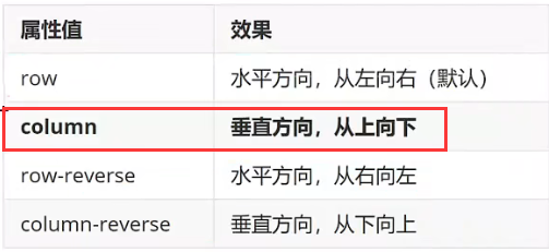
3.2.3 修改主轴方向
主轴默认在水平方向,侧轴默认在垂直方向
属性名:flex-direction
属性值:
3.2.4 弹性伸缩比
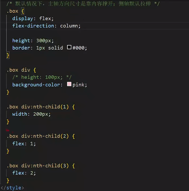
作用:控制弹性盒子的主轴方向的尺寸
属性名:flex
属性值:整数数字,表示占用父级剩余尺寸的份数。
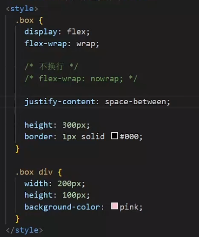
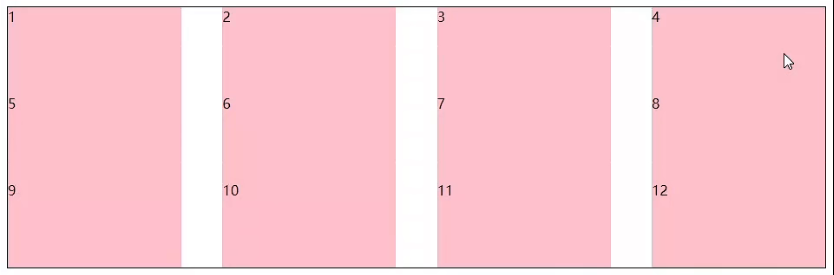
3.2.5 弹性盒子换行
弹性盒子可以自动挤压或拉伸,默认情况下,所有弹性盒子都在一行显示。
属性名:flex-wrap
属性值
- wrap:换行
- nowrap:不换行(默认)
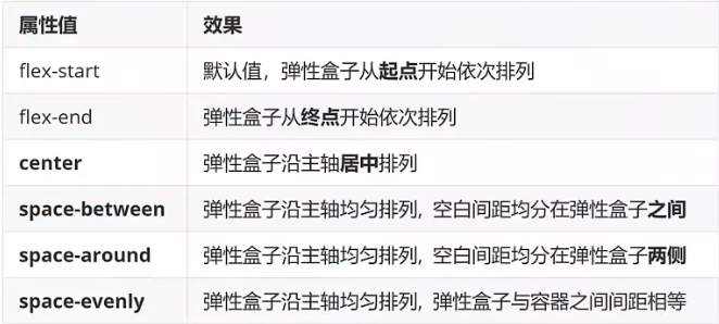
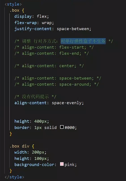
3.2.6 行对齐方式
属性名:align-content
属性值
综合案例-抖音解决方案
标签结构:div > ul > li*4
ul样式:
- flex布局
- 弹性换行 flex-wrap:wrap
- 主轴对齐方式:space-between
- 行对齐方式:space-between
<!DOCTYPE html>
<html lang="en">
<head><meta charset="UTF-8"><meta name="viewport" content="width=device-width, initial-scale=1.0"><title>Document</title><style>* {margin: 0;padding: 0;box-sizing: border-box;}li {list-style: none;}.box {margin: 50px atuo;width: 1200px;height: 418px;background-color: #ddd;border-radius: 10px;}.box ul {display: flex;/* 弹性盒子换行 */flex-wrap: wrap;/* 调整主轴对齐方式 */justify-content: space-between;/* 调整行对方式 */align-content: space-between;padding: 90px 40px 90px 60px;height: 418px;}.box li {display: flex;width: 500px;height: 88px;/* background-color: pink; */}.box .pic {margin-right: 15px;}.box .text h4 {line-height: 40px;font-size: 20px;font-weight: 400;color: #333;}.box .text p {font-size: 14px;color: #666;}</style>
</head>
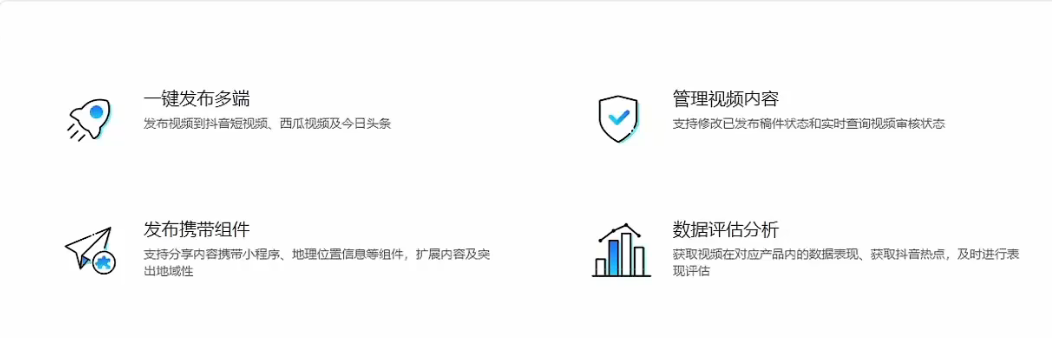
<body><div class="box"><ul><li><div class="pic"><img src="../photo/9.png" alt=""></div><div class="text"><h4>一键发布多端</h4><p>发布视频到抖音短视频、西瓜视频及今日头条</p></div></li><li><div class="pic"><img src="../photo/10.png" alt=""></div><div class="text"><h4>管理视频内容</h4><p>支持修改已发布稿件状态和实时查询视频审核状态</p></div></li><li><div class="pic"><img src="../photo/11.png" alt=""></div><div class="text"><h4>发布携带组件</h4><p>支持分享内容携带小程序、地理位置信息等组件,扩展内容及突出地域性</p></div></li><li><div class="pic"><img src="../photo/12.png" alt=""></div><div class="text"><h4>数据评估分析</h4><p>获取视频在对应产品内的数据表现、获取抖音热点,及时进行表现评估</p></div></li></ul></div>
</body>
</html>