python画气泡标尺图
目录
- 渐变气泡图
- 彩色气泡图
在进行实验结果分析的时候,气泡标尺图能非常清晰对不同的结果进行多维度的比较,特别是在深度学习模型大小和精度进行比较的时候非常合适使用,以下是几个例子。
渐变气泡图
import seaborn as sns
import matplotlib.pyplot as plt
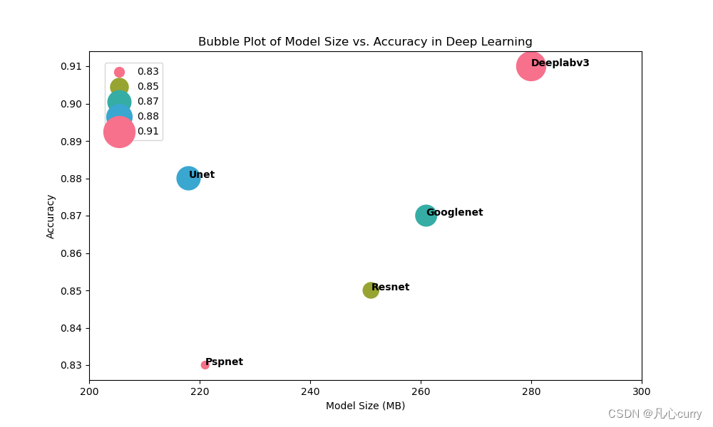
import pandas as pddata = pd.DataFrame({'Model Size (MB)': [251, 218, 261, 280, 221],'Accuracy': [0.85, 0.88, 0.87, 0.91, 0.83],'Model Name': ['Resnet', 'Unet', 'Googlenet', 'Deeplabv3', 'Pspnet']
})# Create a bubble plot with larger circle sizes for different accuracies and a different colormap
plt.figure(figsize=(10, 6))
plot = sns.scatterplot(data=data, x='Model Size (MB)', y='Accuracy', size='Accuracy', hue='Accuracy', sizes=(100, 1000), cmap='viridis')
plt.title('Bubble Plot of Model Size vs. Accuracy in Deep Learning')
plt.xlabel('Model Size (MB)')
plt.ylabel('Accuracy')# Customize the legend and move it inside the plot to the upper left corner
plt.legend(title='Accuracy')
plt.gca().legend(loc='upper left', bbox_to_anchor=(0.02, 0.98))# Add model names near the circles
for line in range(0, data.shape[0]):plot.text(data['Model Size (MB)'][line], data['Accuracy'][line], data['Model Name'][line], horizontalalignment='left', size='medium', color='black', weight='semibold')# Adjust X-axis tick spacing
plt.xticks([200, 220, 240, 260, 280, 300])plt.show()
示例图:
彩色气泡图
import seaborn as sns
import matplotlib.pyplot as plt
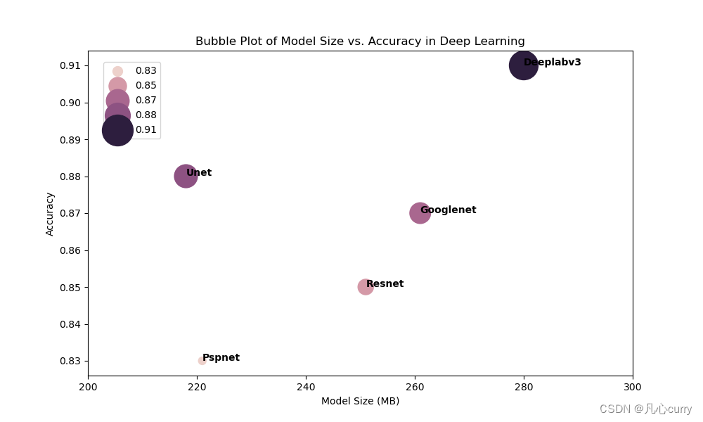
import pandas as pddata = pd.DataFrame({'Model Size (MB)': [251, 218, 261, 280, 221],'Accuracy': [0.85, 0.88, 0.87, 0.91, 0.83],'Model Name': ['Resnet', 'Unet', 'Googlenet', 'Deeplabv3', 'Pspnet']
})# Define a bright and colorful color palette
bright_palette = sns.color_palette("husl", as_cmap=True)# Create a bubble plot with larger circle sizes for different accuracies and the defined color palette
plt.figure(figsize=(10, 6))
plot = sns.scatterplot(data=data, x='Model Size (MB)', y='Accuracy', size='Accuracy', hue='Accuracy', sizes=(100, 1000), palette=bright_palette)
plt.title('Bubble Plot of Model Size vs. Accuracy in Deep Learning')
plt.xlabel('Model Size (MB)')
plt.ylabel('Accuracy')# Customize the legend and move it inside the plot to the upper left corner
plt.legend(title='Accuracy')
plt.gca().legend(loc='upper left', bbox_to_anchor=(0.02, 0.98))# Add model names near the circles
for line in range(0, data.shape[0]):plot.text(data['Model Size (MB)'][line], data['Accuracy'][line], data['Model Name'][line], horizontalalignment='left', size='medium', color='black', weight='semibold')# Adjust X-axis tick spacing
plt.xticks([200, 220, 240, 260, 280, 300])plt.show()
示例图: