qml基础语法
文章目录
- 基础语法
- 例子
- 属性
- 例子
- 核心元素
- 元素
- item
- Rectangle
- Text
- 例子
- Image
- 例子
- MouseArea
- 例子
- Component(组件)
- 例子
- 简单变换
- 例子
- 定位器
- Column
- Row
- Grid
- Flow
- Repeater
- 布局
- Input
- Keys
基础语法
QML是一种用于描述对象如何相互关联的声明式语言。
QtQuick是一个基于QML的框架。
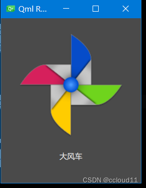
例子
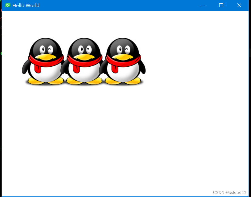
import QtQuick
import QtQuick.WindowRectangle {id:rootwidth: 220;height: 260color:"#4A4A4A"Image {id: imagex:(parent.width-width)/2; y:20source: "../../images/pinwheel.png"}Text {y:image.height+image.y+20text: "大风车"color:"white"horizontalAlignment: Text.AlignHCenterwidth: parent.width}
}
注解
1、import语句导入一个模块。qt6可以不写版本号,自动加载最高版本的模块。
2、对于单行注释,可以使用//,对于多行注释,可以通过/* */进行注释。就像在C/C++和JavaScript中一样。
3、每个QML文件都需要有一个唯一的根元素,就像HTML一样。
4、元素声明形式为:type{ }。
5、元素可以有属性,形式为:name:value。
6、QML文档中的任意元素可以通过使用其id(不带引号的标识符)进行访问。
7、元素可以嵌套,这意味着父元素可以有子元素。子元素可以使用parent关键字访问父元素。
属性
属性是一个简单的键值对,例如:width: 100; text: 'Greetings’ ; color: ‘#FF0000’ 。
属性具有类型,并且可以具有初始值。
例子
    import QtQuickimport QtQuick.Window
Rectangle
{width:300;height:300;Text{// (1) identifierid: thisLabel// (2) set x- and y-positionx: 24; y: 16// (3) bind height to 2 * widthheight: 2 * width// (4) custom propertyproperty int times: 24// (5) property aliasproperty alias anotherTimes: thisLabel.times// (6) set text appended by valuetext: "thisLable " + anotherTimes// (7) font is a grouped propertyfont.family: "Ubuntu"font.pixelSize: 24// (8) KeyNavigation is an attached propertyKeyNavigation.tab: thatLabel// (9) signal handler for property changesonHeightChanged: console.log('height:', height)// focus is need to receive key eventsfocus: false// change color based on focus valuecolor: focus ? "red" : "black"}Text {id: thatLabeltext: "thatLabel " + thisLabel.timesKeyNavigation.tab: thisLabel// focus is need to receive key eventsfocus: !thisLabel.focus// (1) handler for text changes. Need to use function to capture parametersonTextChanged: (text)=>/*function(text)*/ { console.log("text changed to:", text) }// change color based on focus valuecolor: focus ? "red" : "black"Keys.onSpacePressed: {increment()}Keys.onEscapePressed: {text = ''}//JS函数function increment(){thisLabel.times+=1}}
}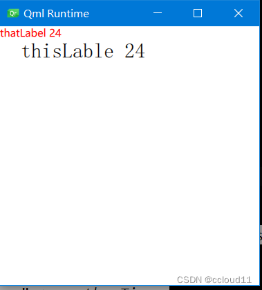
点击tab键可以切换焦点。
按下空格键可以递增times变量。
注解
1、id是用于引用QML文件(在QML中称为“document”)中的元素。id在文档中必须是唯一的,不能重置为其他值。(类似于C++的引用。)
2、属性可以设置值,具体取决于其类型。如果没有为属性指定值,将使用默认初始值。
3、属性可以依赖于一个或多个其他属性。这称为绑定。
4、可以使用property限定符向元素添加新属性,后跟类型、名称和可选的初始值(property<类型><名称>:<值>)。
5、声明属性的另一种重要方式是使用别名关键字(property alias<名称>:<引用>)。
6、基于int的值将自动转换为字符串类型。每次次times属性更改时都会更新文本。
7、编写grouped property的另一种方法是font{family:“Ubuntu”; pixelSize:24}。
8、快速切换焦点。
9、可以为属性提供处理程序。属性更改后被调用。
核心元素
元素
元素可以分为视觉元素和非视觉元素。
- 视觉元素(如Rectangle)具有几何形状,
- 非视觉元素(Timer)提供一般功能,通常用于控制视觉元素。
item
Item是所有视觉元素的基础元素,因此所有其他视觉元素都从Item继承。它本身并不绘制任何东西,但定义了所有视觉元素的共同属性:
几何属性(Geometry):
- x、y:用于定义元素展开的左上角位置
- z:用于定义堆叠顺序。
- width、 height:用于表示范围
布局处理: - anchors:(左、右、上、下、垂直和水平中心)相对于其他元素进行定位。
- 可选项margins
- 键处理
- Key和KeyNavigation属性用于控制键处理
- focus属性用启用键处理。
变换 - scale和rotate变换以及x、y、z变换的通用transform属性列表,以及transformOrigin。
视觉 - opacity用于控制透明度,visible用于显示/隐藏元素,clip用于限制对元素边界的绘制操作,smooth用于增强渲染质量。
状态定义 - states用于动画化状态更改。
- 包含所有支持的状态列表、当前state属性和transitions列表属性。
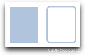
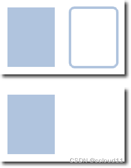
Rectangle
Rectangle扩展了Item,为其添加填充颜色。此外,还支持border.color和border.width。要创建圆角矩形,可以使用radius属性。
Rectangle { id: rect1 x: 12; y: 12 width: 76; height: 96 color: "lightsteelblue"
} Rectangle { id: rect2 x: 112; y: 12 width: 76; height: 96 border.color: "lightsteelblue" border.width: 4 radius: 8
}
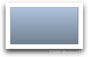
除了填充颜色和边框,矩形还支持自定义渐变:
Rectangle { id: rect3x: 212; y: 12 width: 76; height: 96 gradient: Gradient { GradientStop { position: 0.0; color: "lightsteelblue" } GradientStop { position: 1.0; color: "slategray" } } border.color: "slategray"
}
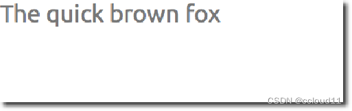
Text
要显示文本,可以使用Text元素。它最显著的属性是字符串类型的text属性。元素根据给定的文本和使用的字体(例如font.family、font.pixelSize等)计算其初始宽度和高度。要更改文本的颜色,只需使用color属性。
例子
Text { text: "The quick brown fox" color: "#303030" font.family: "Ubuntu" font.pixelSize: 28
}
- 可以使用horizontalAlignment和verticalAlignment属性对齐文本。使用style和styleColor属性,允许以轮廓、凸起和凹陷模式渲染文本。
- elide属性允许将省略符位置设置为文本的左侧、右侧或中间。
- 如果不希望省略符模式的“…”出现,但仍希望看到全文,可以使用wrapMode属性包装文本(仅在显式的设置了宽度时有效)。
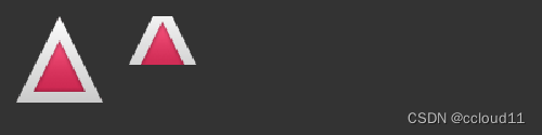
Image
Image元素能够以各种格式(例如PNG、JPG、GIF、BMP、WEBP)显示图像。有关支持的图像格式的完整列表,请参阅Qt文档。除了提供图像URL的source属性外,它还包含一个控制大小调整行为的fillMode。
例子
Image { x: 12; y: 12 // width: 64 // height: 72 source: "assets/triangle_red.png"
} Image { x: 12+64+12; y: 12 // width: 72 height: 72/2 source: "assets/triangle_red.png" fillMode: Image.PreserveAspectCrop clip: true
}
MouseArea
MouseArea这是一个矩形的不可见项,可以在其中捕获鼠标事件。
例子
Rectangle { id: rect1 x: 12; y: 12 width: 76; height: 96 color: "lightsteelblue" MouseArea { id: area width: parent.width height: parent.height onClicked: rect2.visible = !rect2.visible
} Rectangle { id: rect2 x: 112; y: 12 width: 76; height: 96 border.color: "lightsteelblue" border.width: 4 radius: 8
} 
Component(组件)
组件是可重用的元素。QML提供了创建组件的不同方法。目前,最简单的形式是基于文件的组件:
在文件中放置QML元素并为该文件提供元素名(例如Button.qml)来创建的。然后就可以像Qt Quick模块中的其他元素一样使用该组件。
例子
Button.qml
import QtQuickItem {id:rootproperty alias text:label.textsignal clickedRectangle {// our inlined button uiid: buttonx: 12; y: 12width: 116; height: 26color: "lightsteelblue"border.color: "slategrey"Text {id:labelanchors.centerIn: parenttext: "Start"}MouseArea {anchors.fill: parentonClicked: {root.clicked()}}}
}
import QtQuick
import QtQuick.WindowWindow {width: 640height: 480visible: truetitle: qsTr("Hello World")Button{text:"开始"onClicked: {text1.text="按钮被点击"}}Text { // text changes when button was clickedid: text1x: 12;y: 76width: 116;height: 26text: "waiting ..."horizontalAlignment: Text.AlignHCenter}}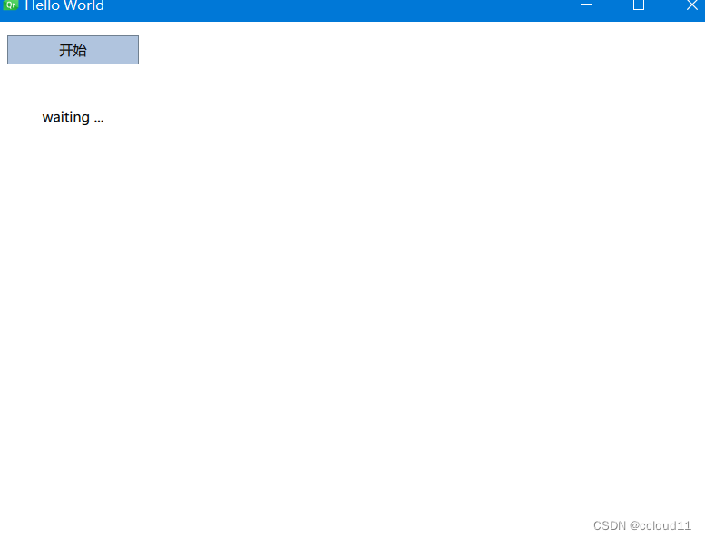
简单变换
包括平移、旋转和缩放操作。
- 平移:通过改变x、y位置完成简单的平移。
- 旋转:值以度(0-360)表示。
- 缩放:大于1表示放大,小于1表示缩小。
在展示示例之前,介绍一个小助手:ClickableImage元素。一个带有鼠标区域的图像。
例子
ClickableImage.qml
import QtQuickImage {id: rootsignal clickedMouseArea {anchors.fill: parentonClicked: root.clicked()}
}
import QtQuick
import QtQuick.WindowWindow {width: 640height: 480visible: truetitle: qsTr("Hello World")MouseArea{anchors.fill: parentonClicked:{qq1.x = 50;qq2.rotation = 0;qq3.rotation = 0;qq3.scale = 1.0;}}ClickableImage{x:50;y:68;id:qq1source: "../../images/qq.png"onClicked:{x+=10;}}ClickableImage{x:150;y:68;id:qq2source: "../../images/qq.png"onClicked:{rotation+=10;}}ClickableImage{x:250;y:68;id:qq3source: "../../images/qq.png"onClicked:{rotation+=10;scale+=0.1;}}
}
定位器
QML中有许多用于定位的元素。这些称为定位器,其中Qt Quick模块提供以下功能:Row、Column、Grid和Flow。
// RedSquare.qml import QtQuick Rectangle {
width: 48
height: 48
color: "#ea7025"
border.color: Qt.lighter(color)
}
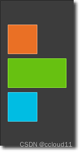
Column
// ColumnExample.qml import QtQuick DarkSquare { id: root width: 120 height: 240 Column { id: column anchors.centerIn: parent spacing: 8 RedSquare { } GreenSquare { width: 96 } BlueSquare { }
}
}
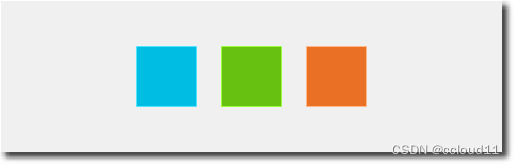
Row
Row元素将其子项彼此相邻放置,从左到右或从右到左,具体取决于layoutDirection属性。同样,spacing用于分隔子项。
import QtQuick BrightSquare { id: root width: 400; height: 120 Row { id: row anchors.centerIn: parent spacing: 20 BlueSquare { } GreenSquare { } RedSquare { }
}
}
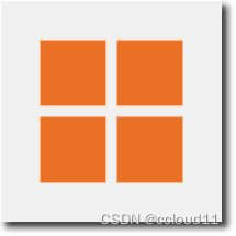
Grid
Grid元素在网格中排列其子元素。通过设置rows和columns属性,可以约束行或列的数量。属性flow和layoutDirection用于控制项添加到网格的顺序,而spacing控制分隔子项的空间量。
import QtQuick BrightSquare { id: root width: 160 height: 160 Grid { id: grid rows: 2 columns: 2 anchors.centerIn: parent spacing: 8 RedSquare { } RedSquare { } RedSquare { } RedSquare { } }
}
Flow
import QtQuickBrightSquare { id: root width: 160 height: 160 Flow { anchors.fill: parent anchors.margins: 20 spacing: 20 RedSquare { } BlueSquare { } GreenSquare { } }
}
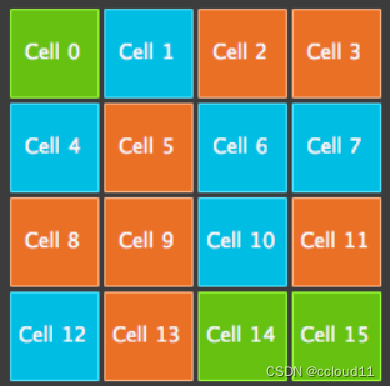
Repeater
import QtQuick
DarkSquare{id:rootwidth: 252;height: 252property var colorArray:["#00bde3", "#67c111", "#ea7025"]Grid{//columns默认值为4anchors.centerIn: parentanchors.margins: 8spacing: 4Repeater{model:16Rectangle{id:rectproperty int colorIndex: Math.floor(Math.random()*3)color: root.colorArray[colorIndex]width: 56; height:56Text {anchors.centerIn: parenttext:"Cell"+/*parent.index*/rect.Positioner.indexcolor:'white'}}}}
}
布局
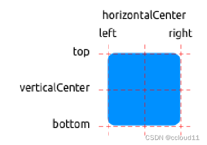
QML可以用锚来布局项目。锚定的概念是Item的基础,可用于所有可视化QML元素。
- 文本元素除了top、bottom、left、right、horizontalCenter、verticalCenter锚外,还有baseline锚
- 每个锚都有一个偏移。对于top、bottom、left、right锚,它们称为边距。对于horizontalCenter、verticalCenter和baseline,它们称为偏移。
import QtQuick
import QtQuick.WindowWindow {width: 640height: 480visible: truetitle: qsTr("Hello World")GreenSquare {//        BlueSquare {//            anchors.fill: parent//            anchors.margins: 8//            text: '(1)'//        }//        BlueSquare{//            text: '(2)'//            anchors.left: parent.left//            y:8//            anchors.margins: 8//        }//        BlueSquare{//            text: '(3)'//            anchors.left: parent.right//        }//        BlueSquare{//            id:blue1//            text: '(4-1)'//            y:8//            anchors.horizontalCenter: parent.horizontalCenter//            anchors.margins: 8//            height:25//        }//        BlueSquare{//            text: '(4-2)'//            anchors.top: blue1.bottom//            anchors.horizontalCenter: parent.horizontalCenter//            anchors.margins: 8//            height:25//            width:75//        }//        BlueSquare{
//            text: '(5)'
//            anchors.centerIn: parent
//        }BlueSquare{text: '(6)'anchors.horizontalCenter: parent.horizontalCenteranchors.horizontalCenterOffset: -12anchors.verticalCenter: parent.verticalCenter}}}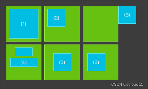
Input
- 允许用户输入一行文本。元素支持输入约束,如validator、inputMask、echoMode。
- 可以在文本输入中单击以更改焦点。使用KeyNavigation属性可以通过键盘更改焦点。
TLineEditV1.qml
FocusScope{width: 200;height:50Rectangle{anchors.fill: parentcolor:'lightsteelblue'border.color: "gray"}property alias text: input.textproperty alias input: inputTextInput{id:inputanchors.fill: parentanchors.margins: 2focus:true//wrapMode:Text.WordWrap}
}
使用tab键进行导航。焦点不会更改为input2。仅使用focus:true是不够的。问题是,当焦点转移到input2元素时,TlineEditV1内的顶级项接收到焦点,并且没有将焦点转发到TextInput。为了防止这种情况,QML提供了FocusScope。
import QtQuick
import QtQuick.WindowWindow {width: 640height: 480visible: truetitle: qsTr("Hello World")//    Rectangle{
//        width:200;height:80;
//        color: "linen"
//        TextInput {
//            id: input1
//            x: 8; y: 8
//            width: 96; height: 20
//            focus: true
//            text: "Text Input 1"
//            KeyNavigation.tab: input2
//        }//        TextInput {
//            id: input2
//            x: 8; y: 36
//            width: 96; height: 20
//            text: "Text Input 2"
//            KeyNavigation.tab: input1
//        }//    }TLineEditV1{id:input1text: "Text input 1"input.font.pixelSize: 16height: input.font.pixelSize+10input.color: 'white'focus:trueKeyNavigation.tab: input2}TLineEditV1{id:input2text: "Text input 2"input.font.pixelSize: 16y:input1.y+input1.height+12height: input.font.pixelSize+10input.color: 'white'KeyNavigation.tab: input1}
}
Keys
允许基于某些按键执行代码。例如,要移动和缩放一个正方形,我们可以使用上、下、左和右键来平移元素,使用加号和减号键来缩放元素。
import QtQuick
import QtQuick.WindowRectangle {width: 400; height: 200Rectangle{id:squarewidth: 100;height:100color:'green'border.color: Qt.lighter(color)}focus: trueKeys.onLeftPressed: square.x -= 8Keys.onRightPressed: square.x += 8Keys.onUpPressed: square.y -= 8Keys.onDownPressed: square.y += 8Keys.onPressed: function(event){switch(event.key){case Qt.Key_Plus:square.scale+=0.2;break;case Qt.Key_Minus:square.scale-=0.2;break;}}
}
完整代码链接