echarts一些配置项的使用
前言:我是自己最近写项目用到的,我做个整理;
一. 基本使用
1.具有大小(宽高)的div ,id唯一;
例如:
<div id="crewEchart"></div>2.在项目中引入:
import * as echarts from "echarts";3.写一个关于他的方法,在mounted的时候调用:
mounted() {this.setEcharts()//你自己起一个功能相关的名字就行;}4.在methods中写他的配置项:
methods:{setWarnEcharts(){},
}
二.配置项
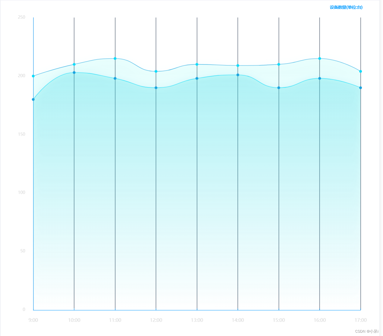
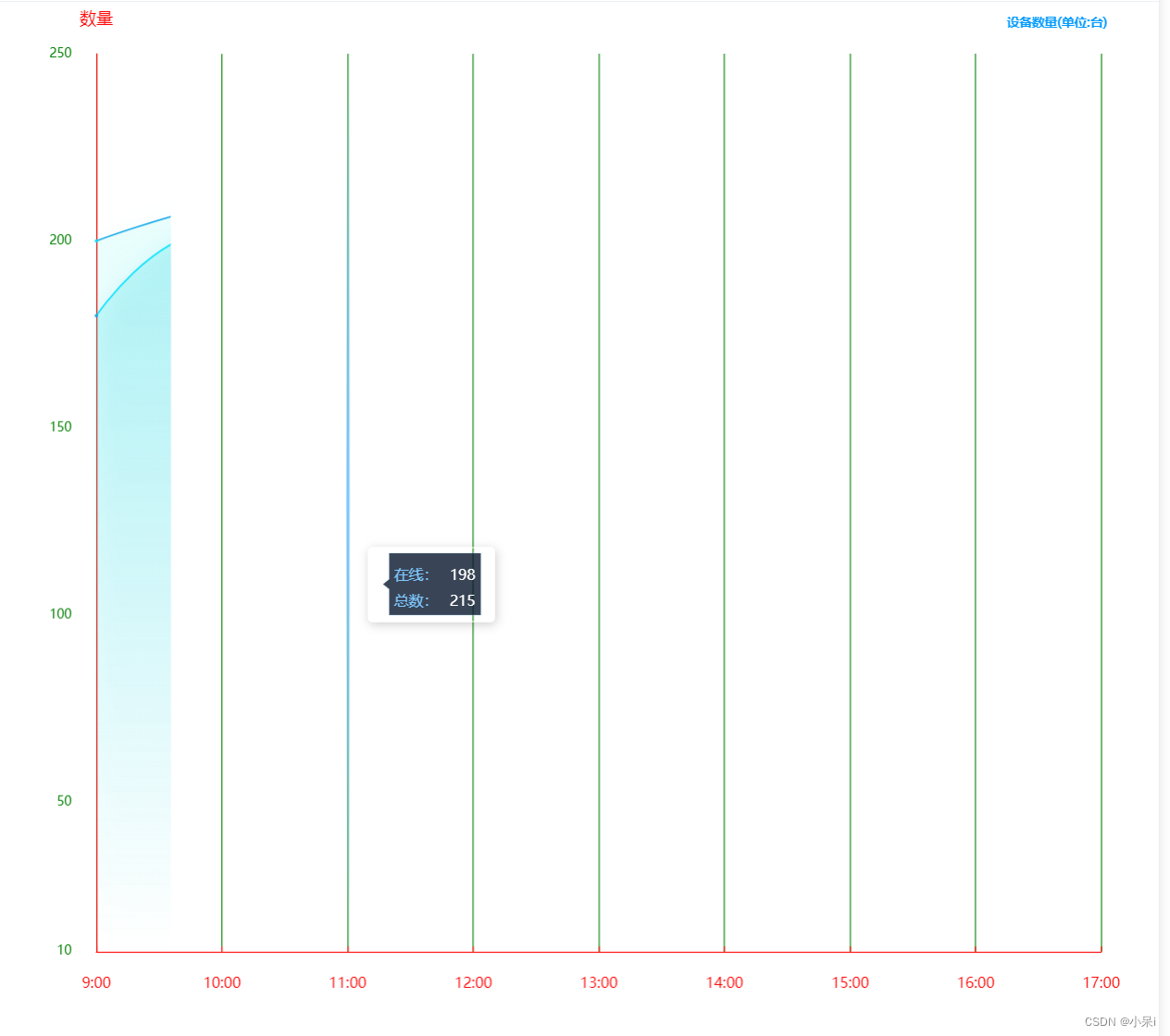
以折线图为例:
1.图:
2.代码:
methods:{setWarnEcharts(){let xLabel =['9:00', '10:00', '11:00', '12:00', '13:00', '14:00', '15:00', '16:00', '17:00']
let online = ["180", "203", "198", "190", "198", "201", "190", "198", "190"]
let sum = ["200", "210", "215", "204", "210", "209", "210", "215", "204",]option = {title: {text: '设备数量(单位:台)',top: 10,right: '4%',bottom: '2%',textStyle: {color: '#0099FF',fontSize: 12,fontFamily: 'Microsoft YaHei'}},grid: {top: 50,left: '6%',right: '5%',bottom: '8%',containLabel: true},tooltip: {trigger: 'axis',backgroundColor:'transparent',axisPointer: {lineStyle: {type: 'solid',width: 3,color: {type: 'linear',x: 0,y: 0,x2: 0,y2: 1,colorStops: [{offset: 0,color: 'rgba(126,199,255,0)' // 0% 处的颜色}, {offset: 0.5,color: 'rgba(126,199,255,1)' // 100% 处的颜色}, {offset: 1,color: 'rgba(126,199,255,0)' // 100% 处的颜色}],global: false // 缺省为 false}},},formatter: (p) => {let dom = `<div style="width: 100px;height: 50px;;color:#fff;position: relative;"><svg style="position: absolute;top: 50%;left: 50%;transform: translateX(-50%) translateY(-50%);" class="svg" xmlns="http://www.w3.org/2000/svg" width="100" height="71" viewBox="0 0 84 55"><defs><style>.cls-1 {fill: #07172c;fill-opacity: 0.8;stroke: #a7d8ff;stroke-linejoin: round;stroke-opacity: 0.2;stroke-width: 1px;fill-rule: evenodd;}</style></defs><path id="矩形_419" data-name="矩形 419" class="cls-1" d="M266,595h74v50H266V624.046L261,620l5-3.984V595Z"transform="translate(-258.5 -592.5)" /></svg><div style="padding: 4px 8px 4px 14px;display: flex;justify-content: center;align-items: center;flex-direction: column;position: relative;z-index: 1;"><div style="margin-bottom: 4px;width:100%;display:${p[0]?'flex':'none'};justify-content:space-between;align-items:center;"><span style="font-size:14px;color:#7ec7ff;">${p[0]?p[0].seriesName:''}</span><span style="font-size:14px;color:#fff;">${p[0]?p[0].data:''}</span></div><div style="width:100%;height:100%;display:${p[1]?'flex':'none'};justify-content:space-between;align-items:center;"><span style="font-size:14px;color:#7ec7ff;">${p[1]?p[1].seriesName:''}</span><span style="font-size:14px;color:#fff;">${p[1]?p[1].data:''}</span></div></div></div>`return dom}},xAxis: [{type: 'category',boundaryGap: false,axisLine: { //坐标轴轴线相关设置。数学上的x轴lineStyle: {color: '#0099FF'},},axisLabel: { //坐标轴刻度标签的相关设置textStyle: {show: true,color: '#DBDBDB',padding: 16,fontSize: 14},formatter: function(data) {return data}},splitLine: {show: true,lineStyle: {color: '#192a44'},},axisTick: {show: true,inside: true},data: xLabel}],yAxis: [{//name: '数量',nameTextStyle: {color: "#7ec7ff",fontSize: 16,padding: 10},min: 0,splitLine: {show: false,lineStyle: {color: '#2AF4F7'},},axisLine: {show: true,lineStyle: {color: "#0099FF"},},axisLabel: {show: true,textStyle: {color: '#DBDBDB',padding: 16},formatter: function(value) {if (value === 0) {return value}return value}},axisTick: {show: false,},}],series: [{name: '在线:',type: 'line',symbol: 'circle', showAllSymbol: true,symbolSize: 8,smooth: true,lineStyle: {normal: {width: 1,color: "rgba(10,219,250,1)", // 线条颜色},//borderColor: 'rgba(0,0,0,.4)',},itemStyle: {color: "rgba(25,163,223,1)",borderColor: "#646ace",borderWidth: 0},tooltip: {show: true},areaStyle: { //区域填充样式normal: {//线性渐变,前4个参数分别是x0,y0,x2,y2(范围0~1);相当于图形包围盒中的百分比。如果最后一个参数是‘true’,则该四个值是绝对像素位置。color: new echarts.graphic.LinearGradient(0, 0, 0, 1, [{offset: 0,color: "rgba(50,228,228,0.3)"},{offset: 1,color: "rgba(50,228,228,0)"}], false),shadowColor: 'rgba(25,163,223,0.5)', //阴影颜色shadowBlur: 20 //shadowBlur设图形阴影的模糊大小。配合shadowColor,shadowOffsetX/Y, 设置图形的阴影效果。}},data: online}, {name: '总数:',type: 'line',symbol: 'circle', showAllSymbol: true,symbolSize: 8,smooth: true,lineStyle: {normal: {width: 1,color: "#19a3df", // 线条颜色},borderColor: 'rgba(0,0,0,.4)',},itemStyle: {color: "rgba(10,219,250,1)",borderColor: "#646ace",borderWidth: 0},tooltip: {show: true},areaStyle: { //区域填充样式normal: {stack: true,//线性渐变,前4个参数分别是x0,y0,x2,y2(范围0~1);相当于图形包围盒中的百分比。如果最后一个参数是‘true’,则该四个值是绝对像素位置。color: new echarts.graphic.LinearGradient(0, 0, 0, 1, [{offset: 0,color: "rgba(10,810,224,0.1)"},{offset: 1,color: "rgba(10,810,224,0)"}], false),shadowColor: 'rgba(10,219,250, 0.5)', //阴影颜色shadowBlur: 20 //shadowBlur设图形阴影的模糊大小。配合shadowColor,shadowOffsetX/Y, 设置图形的阴影效果。}},data: sum}]
};let len = 0
setInterval(()=>{if(len === xLabel.length){len = 0}myChart.dispatchAction({type: 'showTip',seriesIndex: 0,dataIndex: len,})len ++
}, 1000)},
}
三.单项介绍
1.以上图为例,简单介绍几个修改echarts的方法
主要是通过修改option来调整echarts图
1.修改标题:
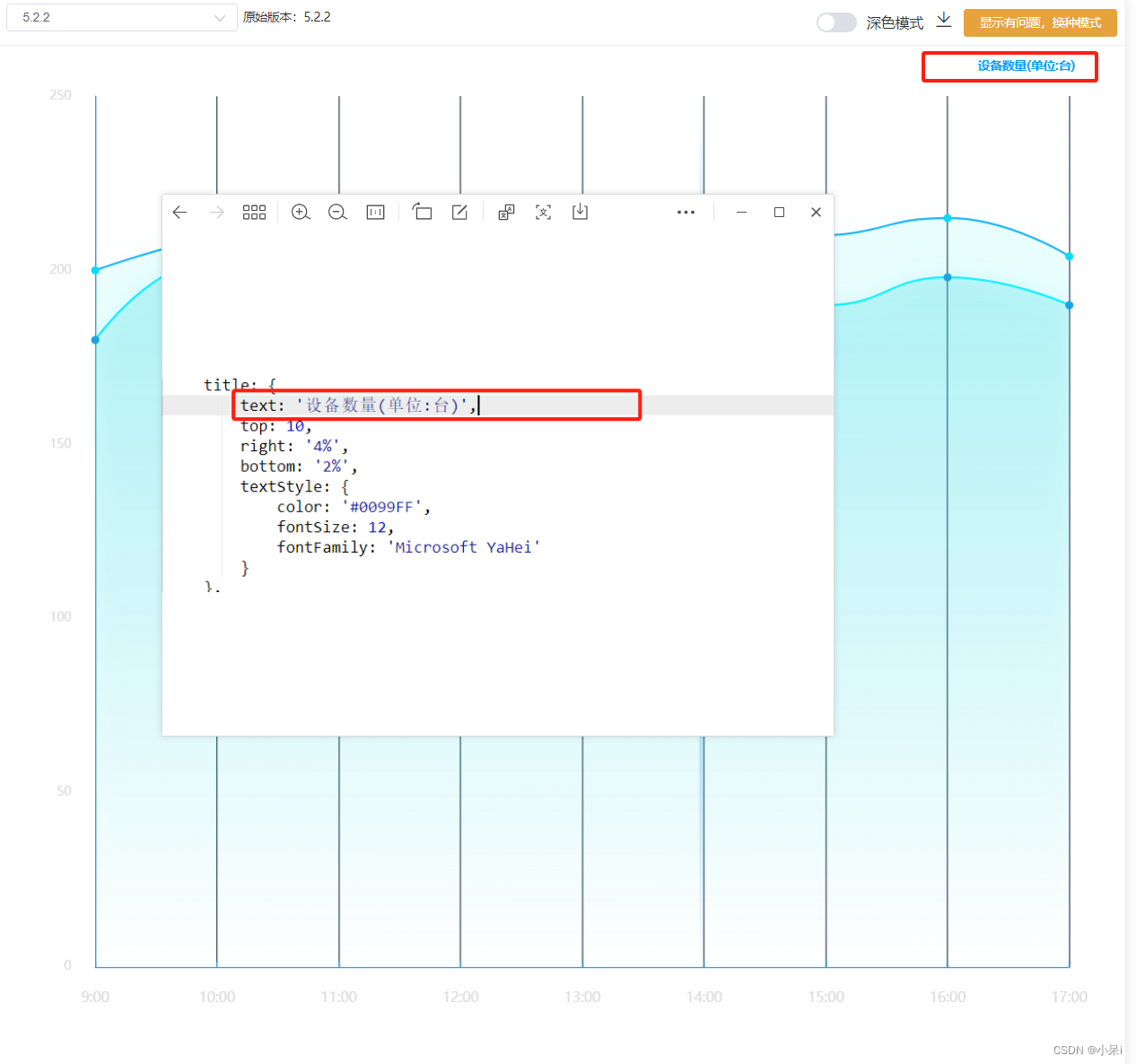
title: {text: '设备数量(单位:台)',//修改文字内容top: 10,//文字位置right: '4%',bottom: '2%',textStyle: {//文字样式color: '#0099FF',//文字颜色fontSize: 12,//文字大小fontFamily: 'Microsoft YaHei'//文字字体}},2.grid网格
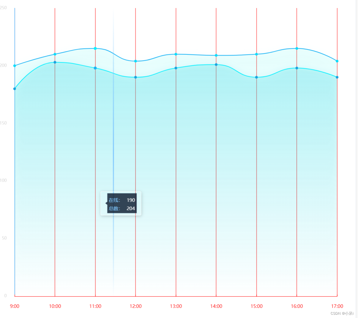
grid: {//这个是调整echarts图片整体的位置top: 50,//距离上面多少left: '6%',//左边right: '5%',//右边bottom: '8%',//下面containLabel: true,//我不知道这个},3.tooltip提示信息

tooltip: {//提示信息,当鼠标放在图表上展示的内容,红框选中部分trigger: 'axis',backgroundColor:'red',axisPointer: {lineStyle: {//线的样式,绿框选中部分type: 'solid',width: 3,color: {type: 'linear',x: 0,y: 0,x2: 0,y2: 1,colorStops: [{offset: 0,color: 'rgba(126,199,255,0)' // 0% 处的颜色}, {offset: 0.5,color: 'rgba(126,199,255,1)' // 100% 处的颜色}, {offset: 1,color: 'rgba(126,199,255,0)' // 100% 处的颜色}],global: false // 缺省为 false}},},formatter: (p) => {//这个可以用来自定义let dom = `<div style="width: 100px;height: 50px;;color:#fff;position: relative;"><svg style="position: absolute;top: 50%;left: 50%;transform: translateX(-50%) translateY(-50%);" class="svg" xmlns="http://www.w3.org/2000/svg" width="100" height="71" viewBox="0 0 84 55"><defs><style>.cls-1 {fill: #07172c;fill-opacity: 0.8;stroke: #a7d8ff;stroke-linejoin: round;stroke-opacity: 0.2;stroke-width: 1px;fill-rule: evenodd;}</style></defs><path id="矩形_419" data-name="矩形 419" class="cls-1" d="M266,595h74v50H266V624.046L261,620l5-3.984V595Z"transform="translate(-258.5 -592.5)" /></svg><div style="padding: 4px 8px 4px 14px;display: flex;justify-content: center;align-items: center;flex-direction: column;position: relative;z-index: 1;"><div style="margin-bottom: 4px;width:100%;display:${p[0]?'flex':'none'};justify-content:space-between;align-items:center;"><span style="font-size:14px;color:#7ec7ff;">${p[0]?p[0].seriesName:''}</span><span style="font-size:14px;color:#fff;">${p[0]?p[0].data:''}</span></div><div style="width:100%;height:100%;display:${p[1]?'flex':'none'};justify-content:space-between;align-items:center;"><span style="font-size:14px;color:#7ec7ff;">${p[1]?p[1].seriesName:''}</span><span style="font-size:14px;color:#fff;">${p[1]?p[1].data:''}</span></div></div></div>`return dom}},4.x轴设置: xAxis
xAxis: [{type: 'category',boundaryGap: false,axisLine: { //坐标轴轴线相关设置。数学上的x轴lineStyle: {color: 'red',//x轴线的颜色},},axisLabel: { //坐标轴刻度标签的相关设置textStyle: {//x轴文字的样式设置show: true,color: 'red',//x轴文字的颜色padding: 16,fontSize: 14},formatter: function(data) {return data}},splitLine: {show: true,lineStyle: {color: 'red',//竖线颜色},},axisTick: {show: true,inside: true},data: xLabel,//x轴数据}],5.y轴设置:yAxis
yAxis: [{name: '数量',//y轴名字nameTextStyle: {//y轴文字样式设置color: "#7ec7ff",fontSize: 16,padding: 10},min: 10,//y轴的最小值splitLine: {show: false,lineStyle: {color: '#2AF4F7'},},axisLine: {//y轴线的颜色show: true,lineStyle: {color: "#0099FF"},},axisLabel: {show: true,textStyle: {color: 'green',//y轴文字的颜色padding: 16},formatter: function(value) {//这里可以自定义,对y轴数据进行处理if (value === 0) {return value}return value}},axisTick: {show: false,},}],6.series 主要是调整他,折线图 饼图 等等,上面设置了横纵坐标,接下来设置内容...

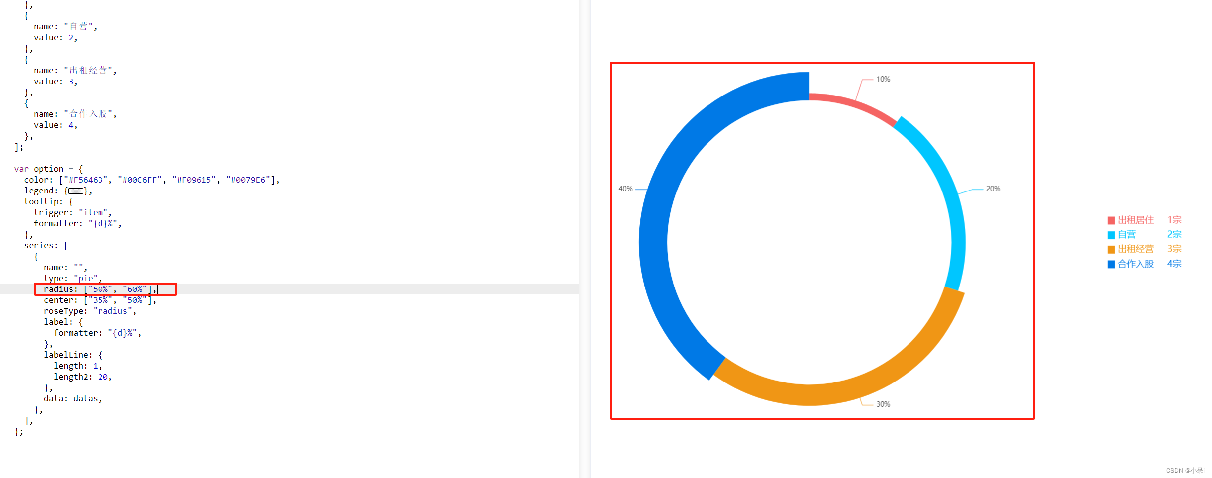
series: [{//一个{}表示第一条数据name: '在线1111:',type: 'line',symbol: 'circle', showAllSymbol: true,symbolSize: 8,smooth: true,lineStyle: {normal: {width: 1,color: "red", // 线条颜色},//borderColor: 'rgba(0,0,0,.4)',},itemStyle: {color: "yellow",borderColor: "#646ace",borderWidth: 0},tooltip: {show: true},areaStyle: { //区域填充样式normal: {//线性渐变,前4个参数分别是x0,y0,x2,y2(范围0~1);相当于图形包围盒中的百分比。如果最后一个参数是‘true’,则该四个值是绝对像素位置。color: new echarts.graphic.LinearGradient(0, 0, 0, 1, [{offset: 0,color: "rgba(50,228,228,0.3)"},{offset: 1,color: "rgba(50,228,228,0)"}], false),shadowColor: 'rgba(25,163,223,0.5)', //阴影颜色shadowBlur: 20 //shadowBlur设图形阴影的模糊大小。配合shadowColor,shadowOffsetX/Y, 设置图形的阴影效果。}},data: online}, {name: '总数2222:',type: 'line',symbol: 'circle', showAllSymbol: true,symbolSize: 8,smooth: true,lineStyle: {normal: {width: 1,color: "#19a3df", // 线条颜色},borderColor: 'rgba(0,0,0,.4)',},itemStyle: {color: "rgba(10,219,250,1)",borderColor: "#646ace",borderWidth: 0},tooltip: {show: true},areaStyle: { //区域填充样式normal: {stack: true,//线性渐变,前4个参数分别是x0,y0,x2,y2(范围0~1);相当于图形包围盒中的百分比。如果最后一个参数是‘true’,则该四个值是绝对像素位置。color: new echarts.graphic.LinearGradient(0, 0, 0, 1, [{offset: 0,color: "rgba(10,810,224,0.1)"},{offset: 1,color: "rgba(10,810,224,0)"}], false),shadowColor: 'rgba(10,219,250, 0.5)', //阴影颜色shadowBlur: 20 //shadowBlur设图形阴影的模糊大小。配合shadowColor,shadowOffsetX/Y, 设置图形的阴影效果。}},data: sum}]7.还有饼图的两个属性 radius和 center
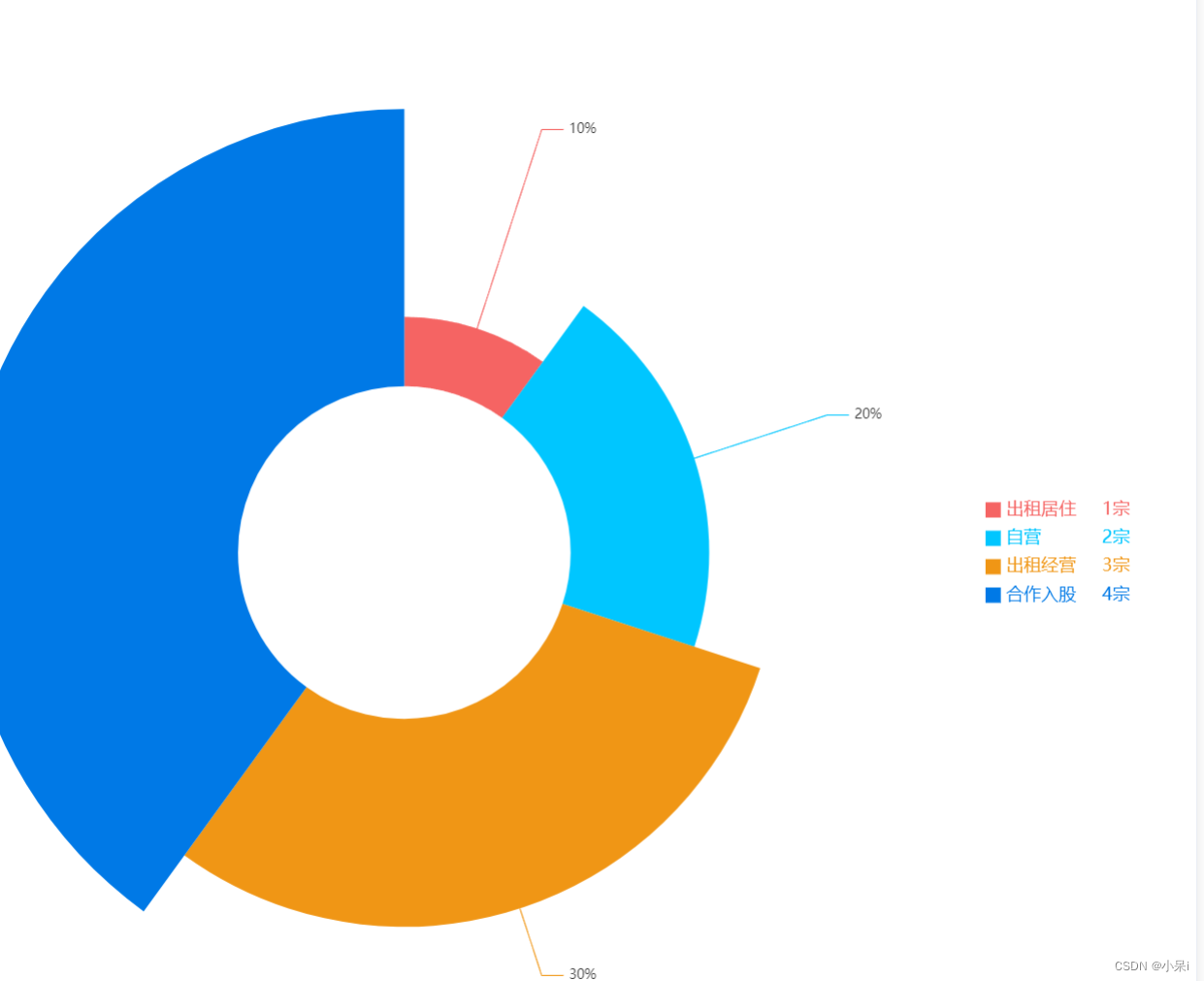
let datas = [{name: "出租居住",value: 1,},{name: "自营",value: 2,},{name: "出租经营",value: 3,},{name: "合作入股",value: 4,},];var option = {color: ["#F56463", "#00C6FF", "#F09615", "#0079E6"],legend: {itemHeight: 14,itemWidth: 14,icon: "rect",orient: "vertical",top: "center",right: "5%",textStyle: {align: "left",color: "#",verticalAlign: "middle",rich: {name: {width:80, fontSize: 16,},value: { width:20, align:"right",fontFamily: "Medium",fontSize: 16,},rate: {width:10,align:"right",fontSize: 16,},},},data: datas,formatter: (name) => {if (datas.length) {const item = datas.filter((item) => item.name === name)[0];return `{name|${name}}{value| ${item.value}} {rate| 宗}`;}},},tooltip: {trigger: "item",formatter: "{d}%",},series: [{name: "",type: "pie",radius: ["30%", "80%"],center: ["35%", "50%"],roseType: "radius",label: {formatter: "{d}%",},labelLine: {length: 1,length2: 20,},data: datas,},],};radius:["里面的圆的大小","外圆大小"];
center: ["echarts距离左边的距离", "echarts距离上边的距离"],