R实现地图相关图形绘制
大家好,我是带我去滑雪!
地图相关图形绘制具有许多优点,这些优点使其在各种领域和应用中非常有用。例如:地图相关图形提供了一种直观的方式来可视化数据,使数据更容易理解和分析。通过地图,可以看到数据的空间分布,识别趋势和模式,并从中获取有关地理位置的见解。下面使用R语言绘制地图相关图。
(1)数据
使用美国50个州2005年的收入分配不均等指数,其中的6个收入不均等指数,除了泰尔熵指数之外,均介于0到1之间,数值越大代表收入分配越不均匀。详细数据在文末。
(2)收入不均等指数数据整理与点状图绘制
library(lattice)
ineq50=read.csv("ineq50.csv", header=F)
names(ineq50)=c("ATKIN05","GINI","RMEANDEV","THEIL","TOP1","TOP10")
save(ineq50, file="ineq50.RData")
load("ineq50.RData")
attach(ineq50)
vn=colnames(ineq50)
j=2
index=ineq50[,vn[j]]
data=data.frame(name = state.name,region = state.region,y=index)
name=state.name
region=state.region
dotplot(reorder(name, index)~index, ineq50, main=c("Inequality Index"),xlab=vn[j])输出结果:
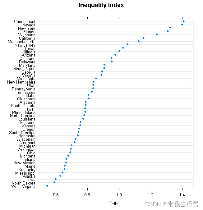
通过图像可以发现,康涅狄格州的收入分配最不平均,西弗吉尼亚州则最好。
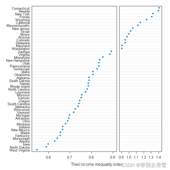
(3)实现切段绘图
b=0.9 # Define cutting point
cuts =shingle(index,intervals = rbind(c(0, b),c(b, 2)))
dotplot(reorder(name, index) ~ index| cuts , ineq50,
strip = FALSE, layout = c(2, 1), levels.fos = 1:50,
scales = list(x = "free"), between = list(x = 0.5),
xlab = "Theil income inequality index",
par.settings = list(layout.widths = list(panel = c(2, 1))))输出结果:
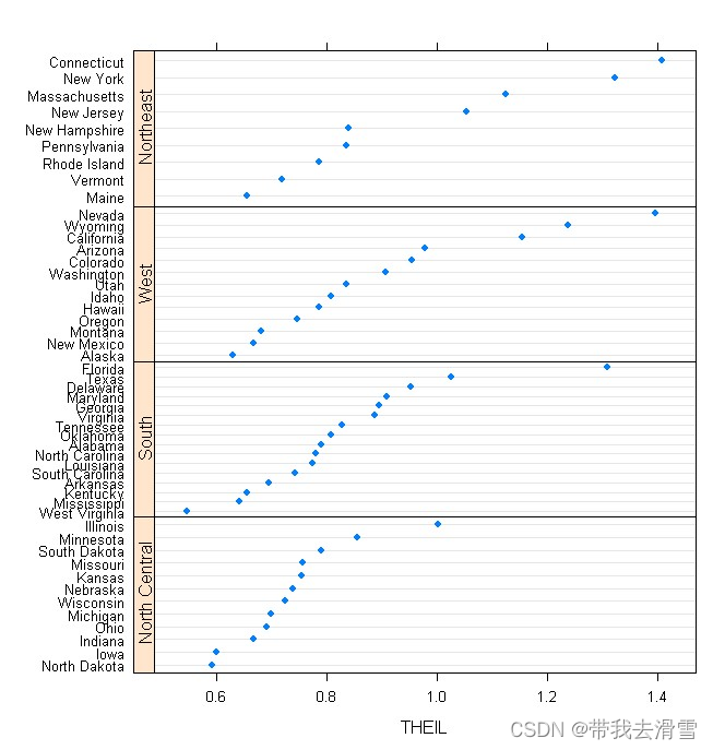
(4)按地理区域呈现收入不均等指数数据
ineq50$region=with(ineq50, reorder(region, index, median))
ineq50$name=with(ineq50,reorder(reorder(name, index), as.numeric(region)))dotplot(name~ index | region, ineq50, strip = F, strip.left = T, layout = c(1, 4),
scales = list(y = list(relation = "free")),xlab = vn[j])输出结果:
(5)在美国地图上呈现收入不均等指数
state.info = data.frame(name = state.name,long = state.center$x,lat = state.center$y,y=index)
library(maps)
state.map = map("state", plot=FALSE, fill = FALSE)
panel.3dmap = function(..., rot.mat, distance, xlim, ylim, zlim,
xlim.scaled, ylim.scaled, zlim.scaled)
{
scaled.val = function(x, original, scaled) {
scaled[1] + (x - original[1]) * diff(scaled) / diff(original)
}
m = ltransform3dto3d(rbind(scaled.val(state.map$x, xlim, xlim.scaled),
scaled.val(state.map$y, ylim, ylim.scaled),zlim.scaled[1]),
rot.mat, distance)
panel.lines(m[1,], m[2,], col = "grey76")
}cloud(index ~ long + lat, state.info,
subset = !(name %in% c("Alaska", "Hawaii")),
panel.3d.cloud = function(...) {
panel.3dmap(...)
panel.3dscatter(...)
},
type = "h", scales = list(draw = FALSE), zoom = 1.2,xlim = state.map$range[1:2],
ylim = state.map$range[3:4],xlab = NULL, ylab = NULL, zlab = NULL,
aspect = c(diff(state.map$range[3:4])/diff(state.map$range[1:2]), 0.3),
panel.aspect = 0.75, lwd = 2, screen = list(z = 30, x = -70),
par.settings = list(axis.line = list(col = "transparent"),
box.3d = list(col = "transparent", alpha = 0)))输出结果:
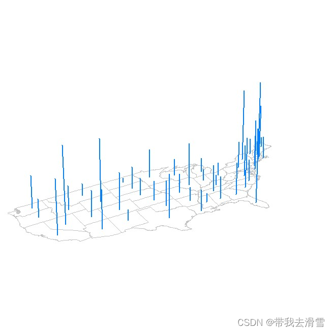
可以发现,收入分配不均匀的州多集中在美国的东部和西部。
需要数据集的家人们可以去百度网盘(永久有效)获取:
链接:https://pan.baidu.com/s/1E59qYZuGhwlrx6gn4JJZTg?pwd=2138
提取码:2138
更多优质内容持续发布中,请移步主页查看。
点赞+关注,下次不迷路!