echarts画一个简单的饼图 中间是空的 环有两种颜色一种是底色 一种是百分比的颜色

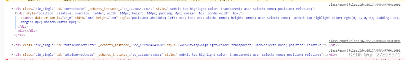
//dom打印出来大概是什么样子下方有个图可以作为参考
ecInit(correctRate, processAnalysisVO.correctRate, (100-processAnalysisVO.correctRate));//如效果图//饼图  function ecInit(dom, correctRate, errorRate) {var dom = dom; //就是你要放入的盒子元素var myChart = echarts.init(dom);option = {tooltip: {show: false,trigger: 'item',formatter: "{a} : {c} ({d}%)"},title: {text: correctRate + '%',  //图形标题,配置在中间对应效果图的80%left: "center",top: "36%",textStyle: {color: "#ffb500",fontSize: 16,align: "center"}},series: [{type: 'pie',radius: ['70%', '90%'],  //设置内外环半径,两者差值越大,环越粗hoverAnimation: false,  //移入图形是否放大label: {     //对应效果图中的Angular显示与否以及设置样式// show: true,// position: 'center',normal: {show: true,position: 'center',padding: [0, 0, 20, 0],  //设置字angular的边距fontSize: 16,}},labelLine: {normal: {  //label线不显示show: false}},data: [{                  value: correctRate,  //对应显示的部分数据即80%itemStyle: {normal: {color: '#ffb500',}}},{value: errorRate,itemStyle: {normal: {color: '#f0f2f5'}}}]}]};myChart.setOption(option, true);}
所谓的底色就是错误的颜色而已