【css】渐变
渐变是设置一种颜色或者多种颜色之间的过度变化。
两种渐变类型:
-
线性渐变(向下/向上/向左/向右/对角线)
-
径向渐变(由其中心定义)
1、线性渐变
语法:background-image: linear-gradient(direction, color-stop1, color-stop2, ...);
其中direction是方向,值可以有bottom、right、top、left 。如果该参数参数值前面添加了to,则是渐变沿着相应的方向移动。如果省略了to,则为两个参数组合的方向,比如bottom right:右下角方向。
其中从上到下是默认的方向,可以不用添加direction参数。
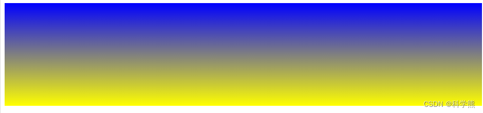
1.1 默认方向
代码:
<head>
<style>
#grad1 {height: 200px;background-color: blue; /* 针对不支持渐变的浏览器 */background-image: linear-gradient(blue, yellow);
}
</style>
</head>
<body><div id="grad1"></div></body>
渲染效果:
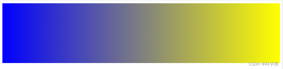
1.2、从左到右
代码:
<head>
<style>
#grad1 {height: 200px;background-color: blue; /* 针对不支持渐变的浏览器 */background-image: linear-gradient(to right,blue, yellow);
}
</style>
</head>
<body><div id="grad1"></div></body>
渲染效果:
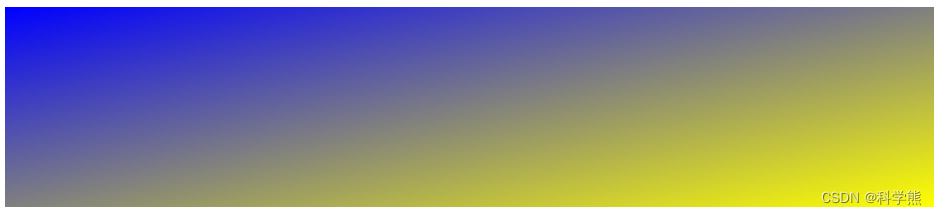
1.3 右下角
代码:
<style>
#grad1 {height: 200px;background-color: blue; /* 针对不支持渐变的浏览器 */background-image: linear-gradient(to bottom right,blue, yellow);
}
</style>
</head>
<body><div id="grad1"></div></body>
渲染效果:
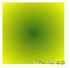
2、径向渐变
径是指圆形的直径的径,以圆心为出发点,沿着径向渐变,和箭靶的效果差不多。
语法:
/* 在容器中心的渐变,从红色开始,变成蓝色,最后变成绿色 */
radial-gradient(circle at center, red 0, blue, green 100%)
边缘形状可以是圆形(circle)或椭圆形(ellipse)
形式语法
<radial-gradient()> = radial-gradient( [ <ending-shape> || <size> ]? [ at <position> ]? , <color-stop-list> ) <size> = <extent-keyword> |<length [0,∞]> |<length-percentage [0,∞]>{2} <position> = [ left | center | right ] || [ top | center | bottom ] |[ left | center | right | <length-percentage> ] [ top | center | bottom | <length-percentage> ]? |[ [ left | right ] <length-percentage> ] && [ [ top | bottom ] <length-percentage> ] <color-stop-list> = <linear-color-stop> , [ <linear-color-hint>? , <linear-color-stop> ]# <extent-keyword> = closest-corner |closest-side |farthest-corner |farthest-side <length-percentage> = <length> |<percentage> <linear-color-stop> = <color> &&<length-percentage>? <linear-color-hint> = <length-percentage>
代码:
<style>
#grad1 {height: 200px;width:200px;background-color: blue; /* 针对不支持渐变的浏览器 */background-image: radial-gradient(circle at center,#33691e, yellow);
}
</style>
</head>
<body><div id="grad1"></div></body>
渲染效果:
关于径向渐变的详细介绍可以参考MDN Web Docs社区