uniapp快速入门系列(3)- CSS技巧与布局
章节二:CSS技巧与布局
- 1. uniapp中的样式编写
- 2. 常见布局技巧与实例解析
- 2.1 水平居中布局
- 2.2 垂直居中布局
- 2.3 等高布局
- 2.4 响应式布局
- 3. CSS动画与过渡效果
在uniapp中,我们使用CSS来设置页面的样式和布局。本章将介绍一些在uniapp中常用的CSS技巧和布局实例,帮助你更好地美化页面和实现各种布局效果。
1. uniapp中的样式编写
在uniapp中,我们可以在.vue文件中使用 <style> 标签来编写样式。可以直接编写常规的CSS样式,也可以使用预编译的CSS工具,比如Sass或Less。
uniapp支持以下几种方式来引入样式:
- 在 .vue 文件中直接编写样式,不使用外部文件;
- 在 .vue 文件中引入外部的 .css 或 .scss 文件;
- 使用 scoped 属性将样式限制在当前组件内,避免样式污染其他组件。
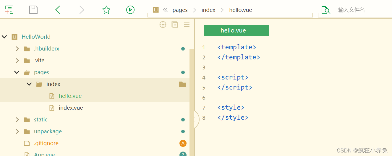
我们在第一章中使用HBuilderX中创建的HelloWorld项目中添加一个hello.vue:
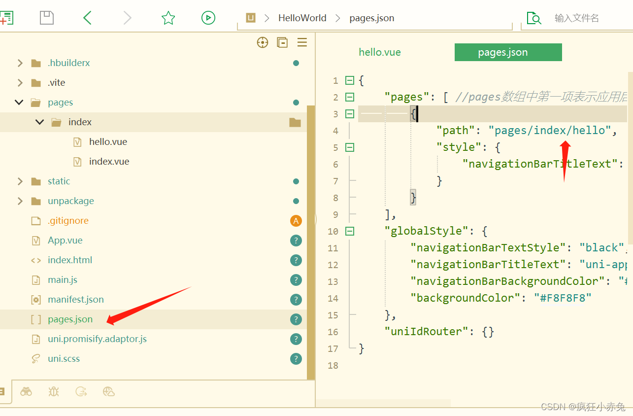
并在pages.json中将原来的默认路径更改为hello,如下:
下面是一个简单的示例,演示了如何在uniapp中编写样式:
<template><view class="container"><view class="box">Hello, Uniapp!</view></view>
</template><script>
export default {name: 'HelloWorld'
}
</script><style>
.container {display: flex;justify-content: center;align-items: center;height: 100vh;background-color: #f5f5f5;
}.box {width: 200px;height: 200px;background-color: #ff0000;color: #fff;text-align: center;line-height: 200px;font-size: 20px;
}
</style>
在这个示例中,我们创建了一个名为 HelloWorld 的组件,使用了 display: flex 实现了页面的居中布局,background-color 设置了背景颜色,color 设置了字体颜色,text-align 和 line-height 用于居中文本,width 和 height 设置了盒子的尺寸。
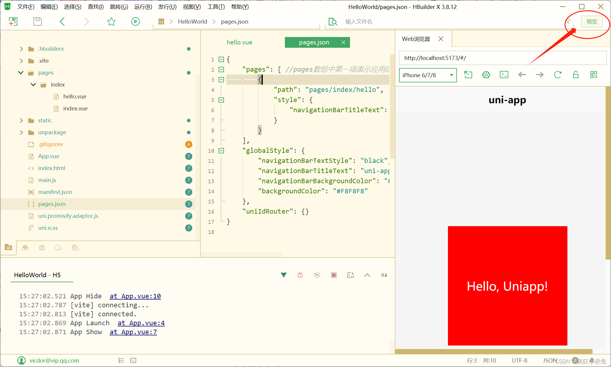
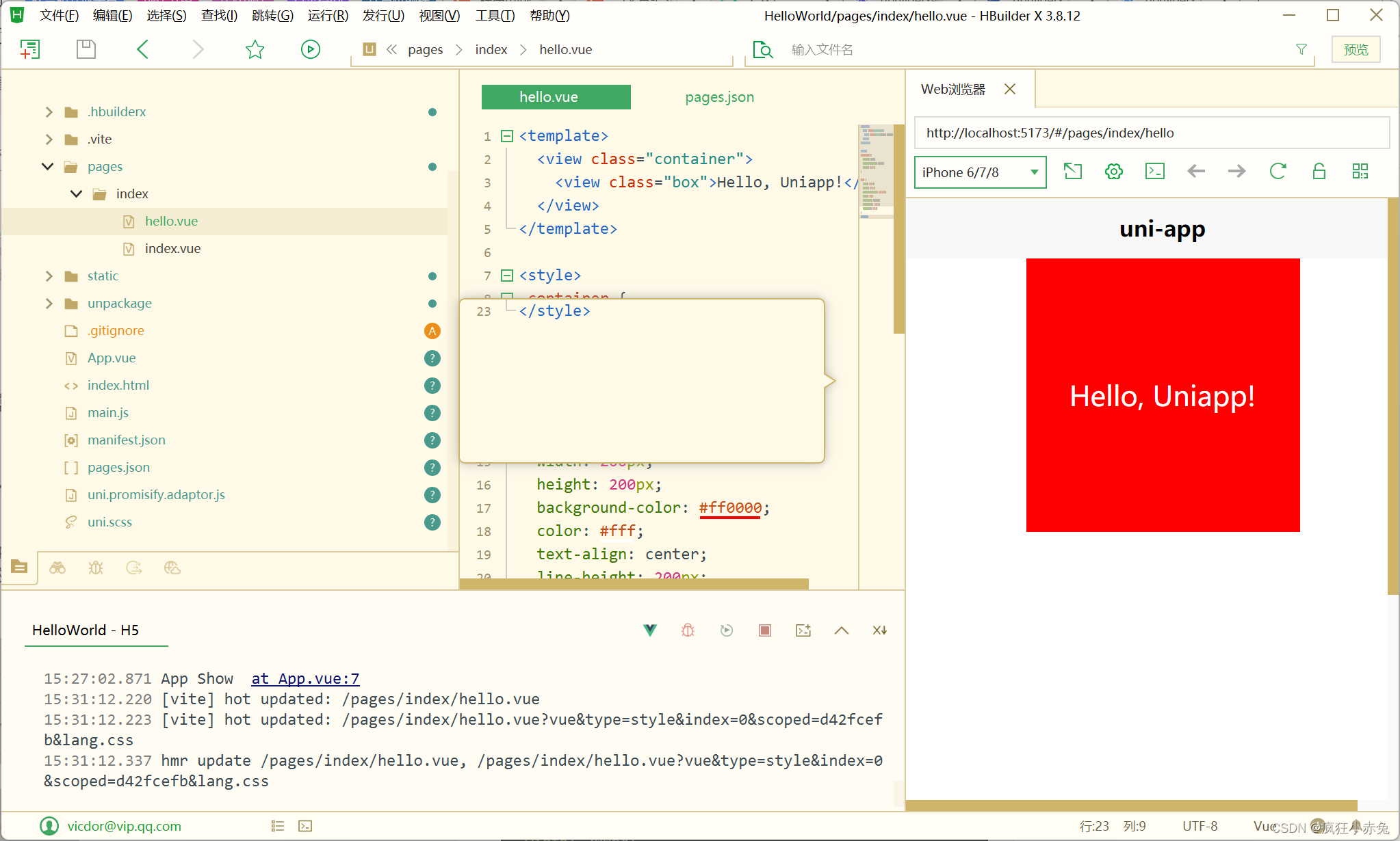
将以上代码完全复制到hello.vue中,保存并点击右上角预览查看效果如下:
2. 常见布局技巧与实例解析
2.1 水平居中布局
在uniapp中实现水平居中布局可以使用 display: flex 和 justify-content: center 的组合。下面是一个示例,展示了如何实现水平居中布局:
<template><view class="container"><view class="box">Hello, Uniapp!</view></view>
</template><style>
.container {display: flex;justify-content: center;height: 100vh;
}.box {width: 200px;height: 200px;background-color: #ff0000;color: #fff;text-align: center;line-height: 200px;font-size: 20px;
}
</style>
在这个示例中,我们使用了 display: flex 将 .container 中的元素水平排列,然后使用 justify-content: center 将元素水平居中。
2.2 垂直居中布局
在uniapp中实现垂直居中布局可以使用 display: flex 和 align-items: center 的组合。下面是一个示例,展示了如何实现垂直居中布局:
<template><view class="container"><view class="box">Hello, Uniapp!</view></view>
</template><style>
.container {display: flex;justify-content: center;align-items: center;height: 100vh;
}.box {width: 200px;height: 200px;background-color: #ff0000;color: #fff;text-align: center;line-height: 200px;font-size: 20px;
}
</style>
在这个示例中,我们使用了 display: flex 将 .container 中的元素垂直排列,并使用 justify-content: center 和 align-items: center 将元素水平和垂直居中。
请注意,justify-content: center 是用于水平居中的,而 align-items: center 是用于垂直居中的。

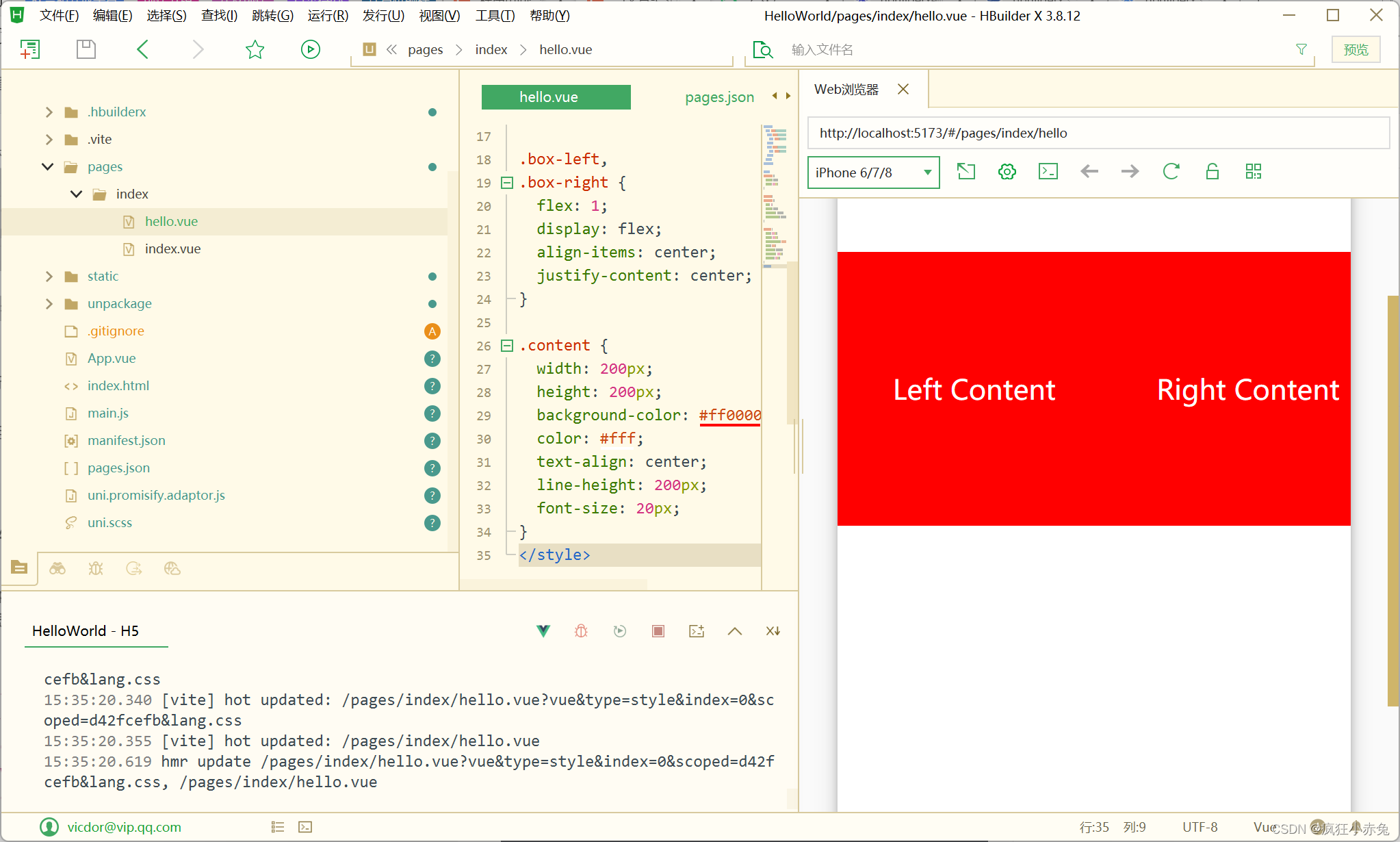
2.3 等高布局
在uniapp中实现等高布局可以使用 flex 弹性布局和自适应高度的方式。下面是一个示例,展示了如何实现等高布局:
<template><view class="container"><view class="box-left"><view class="content">Left Content</view></view><view class="box-right"><view class="content">Right Content</view></view></view>
</template><style>
.container {display: flex;height: 400px;
}.box-left,
.box-right {flex: 1;display: flex;align-items: center;justify-content: center;
}.content {width: 200px;height: 200px;background-color: #ff0000;color: #fff;text-align: center;line-height: 200px;font-size: 20px;
}
</style>
在这个示例中,我们创建了一个容器 .container 并将其高度设置为400px,然后使用 display: flex 和 flex: 1 将 .box-left 和 .box-right 的宽度设置为相等,并使用 align-items: center 和 justify-content: center 将内容居中。
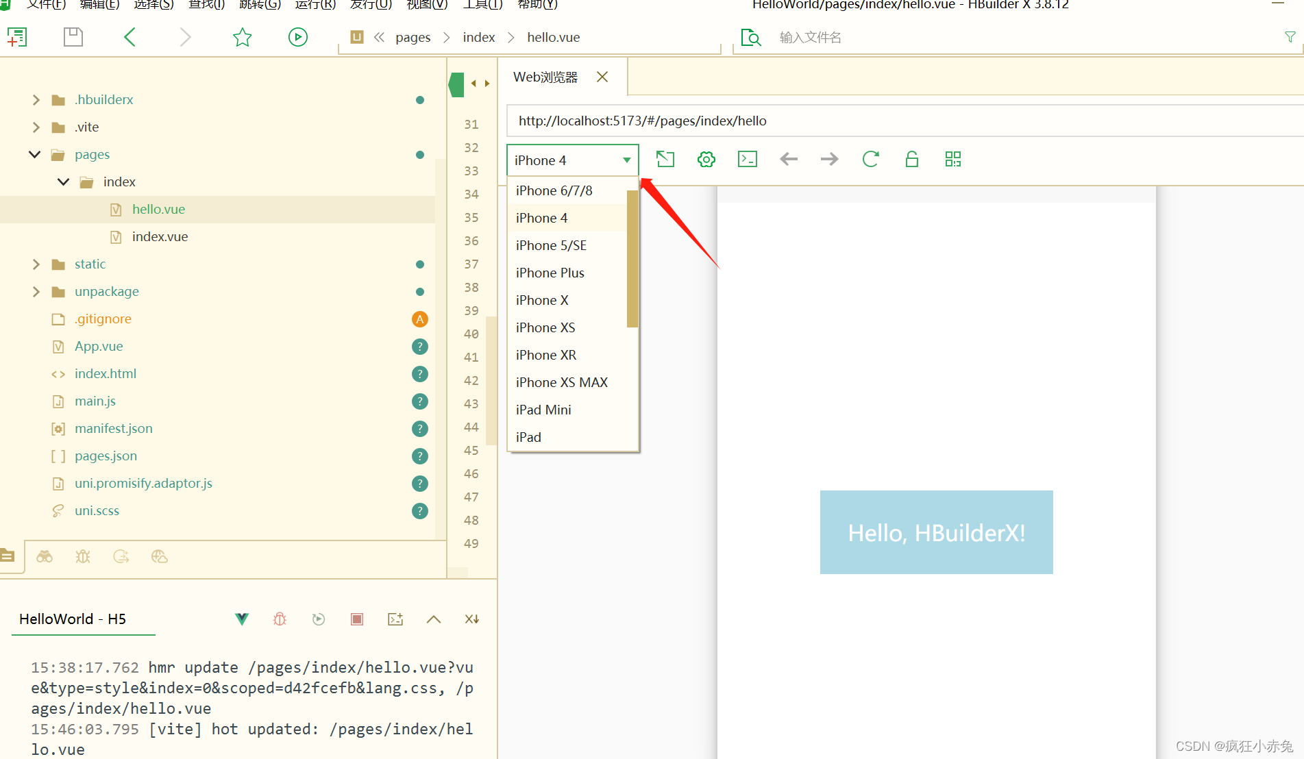
2.4 响应式布局
当在HBuilderX中创建一个hello.vue文件时,可以按如下方式编写响应式布局的代码:
<template><div class="container"><div :class="['box', isSmallScreen ? 'small-box' : '']">Hello, HBuilderX!</div></div>
</template><script>
export default {data() {return {isSmallScreen: false};},mounted() {this.checkScreenSize();window.addEventListener('resize', this.checkScreenSize);},destroyed() {window.removeEventListener('resize', this.checkScreenSize);},methods: {checkScreenSize() {this.isSmallScreen = window.innerWidth < 768;}}
};
</script><style scoped>
.container {display: flex;justify-content: center;align-items: center;height: 100vh;
}.box {padding: 20px;background-color: lightblue;color: white;font-size: 24px;
}.small-box {font-size: 16px;
}
</style>
这段代码包含了一个包含响应式样式的hello组件。它根据屏幕尺寸动态添加/删除一个CSS类来改变文字大小。组件会在mounted钩子中添加窗口大小监听器,并在组件销毁时移除监听器。
在<template>部分,我们有一个div.container来居中显示内容。内部的div.box是一个包含Hello, HBuilderX!文本的div。根据isSmallScreen的值,我们将其添加到div.box的class属性中以改变样式。
在<script>部分,我们将isSmallScreen设置为false,在mounted钩子中添加了一个屏幕大小检测函数并将其绑定到resize事件上。在destroyed钩子中,我们移除了窗口大小监听器。最后,在checkScreenSize方法中,我们根据窗口的innerWidth大小更新isSmallScreen的值。
在<style>部分,我们使用了scoped属性来确保样式仅作用于当前组件。.container采用flex布局来居中显示内容。.box设置了一些样式,如背景颜色、文字颜色和字体大小。.small-box用于在较小的屏幕上改变文字大小。
我们在预览窗口可以切换不同预览机型预览页面在不同屏幕的展现效果
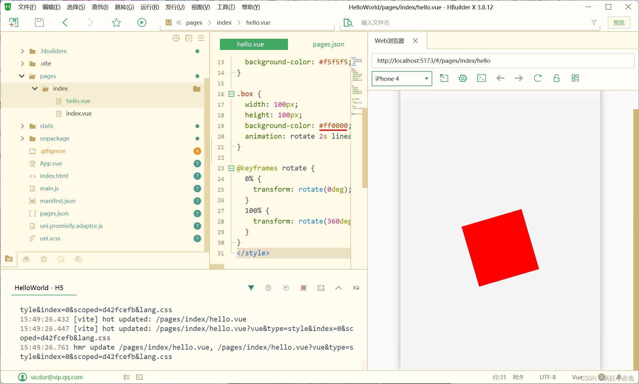
3. CSS动画与过渡效果
uniapp支持使用CSS动画和过渡效果为页面添加动态效果。你可以通过CSS的 @keyframes 规则来定义动画,然后通过 animation 属性将动画应用到元素上。
下面是一个示例,展示了如何在uniapp中实现一个简单的动画效果:
<template><view class="container"><view class="box"></view></view>
</template><style>
.container {display: flex;justify-content: center;align-items: center;height: 100vh;background-color: #f5f5f5;
}.box {width: 100px;height: 100px;background-color: #ff0000;animation: rotate 2s linear infinite;
}@keyframes rotate {0% {transform: rotate(0deg);}100% {transform: rotate(360deg);}
}
</style>
在这个示例中,我们创建了一个容器 .container 并将其居中显示,然后创建了一个盒子 .box,并为其应用了一个名为 rotate 的动画,持续时间为2秒,使用线性变换方式,并无限循环播放动画。在 @keyframes 规则中定义了动画的具体属性,从0%到100%逐步旋转360度。
除了使用CSS动画,uniapp还支持使用过渡效果为元素添加平滑的过渡效果。你可以通过CSS的 transition 属性定义动画过渡的属性、持续时间和动画曲线。
下面是一个示例,展示了如何在uniapp中实现一个简单的过渡效果:
<template><view class="container"><view class="box" :class="{'active': isActive}" @click="toggleActive"></view></view>
</template><style>
.container {display: flex;justify-content: center;align-items: center;height: 100vh;background-color: #f5f5f5;
}.box {width: 100px;height: 100px;background-color: #ff0000;transition: transform 0.3s ease;
}.box.active {transform: scale(1.5);
}
</style><script>
export default {data() {return {isActive: false}},methods: {toggleActive() {this.isActive = !this.isActive;}}
}
</script>
在这个示例中,我们创建了一个容器 .container 并将其居中显示,然后创建了一个盒子 .box,并通过 :class 属性和 isActive 数据绑定的方式来控制是否应用 .active 样式,这样就可以根据 isActive 的值来切换过渡效果。在 .box 的样式中,我们使用 transition 属性定义了 transform 属性的过渡效果,持续时间为0.3秒,并使用了缓动动画曲线。在 .box.active 的样式中,我们定义了过渡后的样式,这里使用了 transform: scale(1.5) 来实现缩放效果。

以上是uniapp中常用的CSS技巧和布局实例,以及如何使用CSS动画和过渡效果增强页面的动态效果。希望对你有所启发,让你的uniapp应用更加出色!