视区单位vw, vh简介以及可实际应用场景

基本概念
vw和vh:视口单位中的“视口”,桌面端指的是浏览器的可视区域,不包含任务栏标题栏以及底部工具栏的浏览器区域大小。1vw等于视口宽度的1%。1vh等于视口高度的1%。vmin和vmax:vmin为当前vw和vh中较小的一个值;vmax为较大的一个值。
怎么证明
你猜
是浏览器内部宽度大小(window.innerWidth)?是整个浏览器的宽度大小(window.outerWidth)?还是显示器的宽度大小(screen.width)?
上代码
<!DOCTYPE html>
<html lang="en"><head><meta charset="UTF-8"><meta http-equiv="X-UA-Compatible" content="IE=edge"><meta name="viewport" content="width=device-width, initial-scale=1.0"><title>Document</title><style>img {width: 10vw;height: 10vh;}</style>
</head><body><img src="https://cdn.pixabay.com/photo/2021/09/02/16/48/cat-6593947_1280.jpg" alt=""><script>let num1 = window.innerWidth;let num2 = window.outerWidth;let num3 = screen.width;let imgWidth = document.querySelector('img').width;console.log('浏览器内部宽度大小', num1);console.log('整个浏览器的宽度大小', num2);console.log('显示器的宽度大小', num3);console.log('图片现在的宽度', imgWidth)console.log('--------------------')let num11 = window.innerHeight;let num22 = window.outerHeight;let num33 = screen.height;let imgHeight = document.querySelector('img').height;console.log('浏览器内部高度大小', num11);console.log('整个浏览器的高度大小', num22);console.log('显示器的高度大小', num33);console.log('图片现在的宽度', imgHeight)</script>
</body></html>
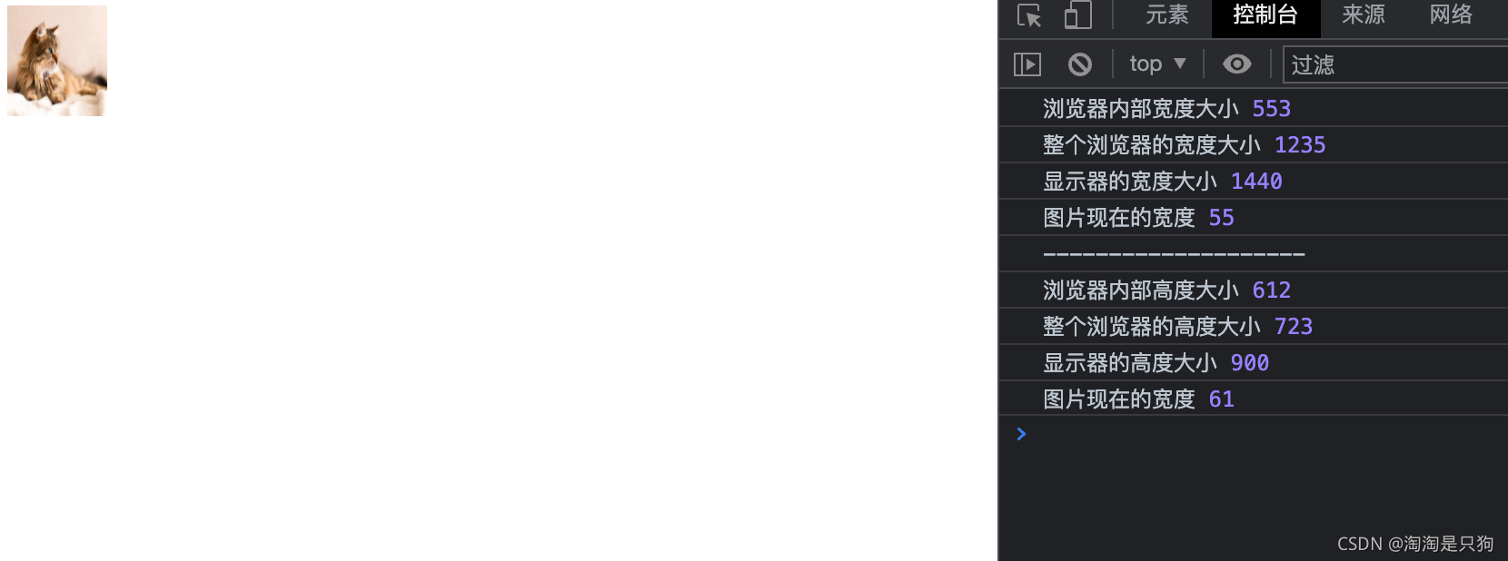
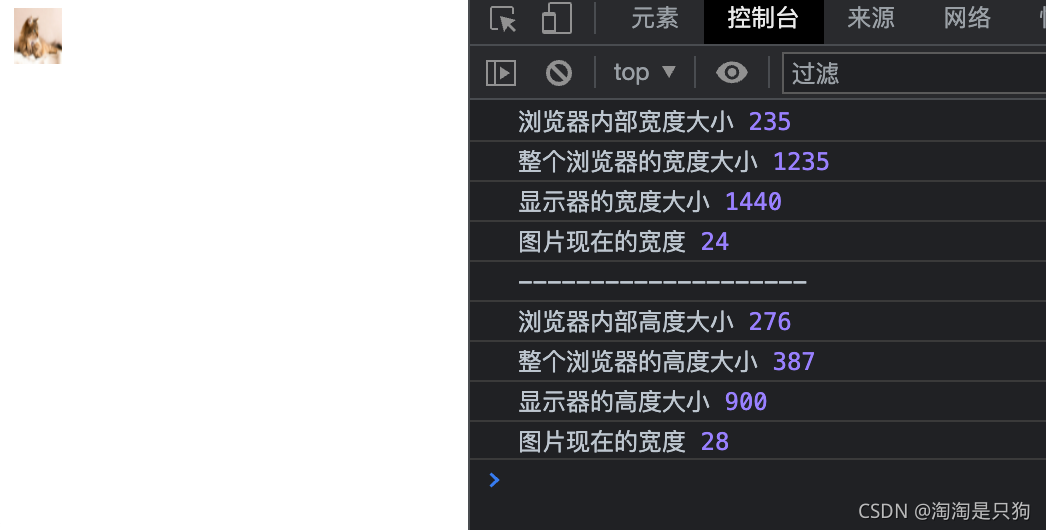
“视区”所指为浏览器内部的可视区域大小,即window.innerWidth/window.innerHeight大小,不包含任务栏标题栏以及底部工具栏的浏览器区域大小。
应用场景
响应垂直居中
设置margin的上下间距,使之heigit + margin-top +margin-bottom = 100 ,width + margin-left + margin-right = 100 ,就能够响应垂直居中
<div class="box"></div>
<style>.box {width: 50vw;height: 50vh;margin: 25vh auto;background-color: aquamarine;}
</style>
栅格布局
<div class="col-2"></div>
<div class="col-4"></div>
<div class="col-5"></div>
<div class="col-8"></div>
<style>div {height: 100px;background-color: aquamarine;margin: 10px;}.col-2 {float: left;width: 50vw;}.col-4 {float: left;width: 25vw;}.col-5 {float: left;width: 20vw;}.col-8 {float: left;width: 5vw;}
</style>
Office Word效果
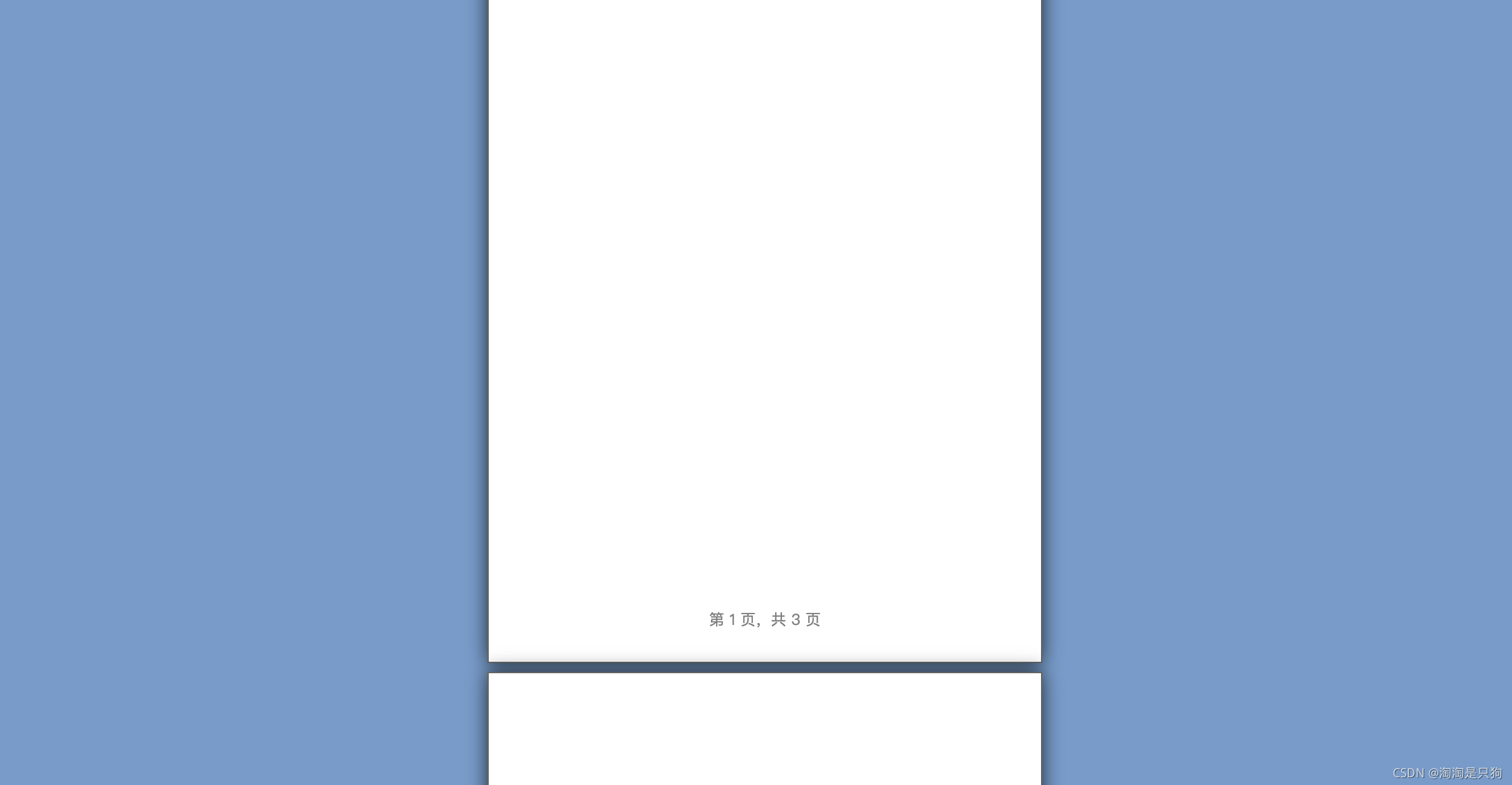
<!DOCTYPE htmlPUBLIC "-//W3C//DTD XHTML 1.0 Transitional//EN" "http://www.w3.org/TR/xhtml1/DTD/xhtml1-transitional.dtd">
<html xmlns="http://www.w3.org/1999/xhtml"><head><meta http-equiv="Content-Type" content="text/html; charset=utf-8" /><meta http-equiv="description" content="CSS3 vh, vw单位实现类似office word效果 » 张鑫旭-鑫空间-鑫生活" /><meta name="description" content="张鑫旭web前端学习实例页面 CSS3 vh, vw单位实现类似office word效果" /><meta name="keywords" content="css3, vh, vw, office word" /><meta name="author" content="张鑫旭, zhangxixnu" /><title>CSS3 vh, vw单位实现类似office word效果 » 张鑫旭-鑫空间-鑫生活</title><style>body {background-color: #789BC9;}page {display: block;height: 98vh;width: 69.3vh;margin: 1vh auto;padding: 12vh;border: 1px solid #646464;box-shadow: 0 0 15px rgba(0, 0, 0, .75);box-sizing: border-box;background-color: white;position: relative;}page:after {content: attr(data-page);color: graytext;font-size: 12px;text-align: center;bottom: 4vh;position: absolute;left: 10vh;right: 10vh;}a {color: #34538b;font-size: 14px;}</style>
</head><body><page></page><page></page><page></page><script>(function () {if (typeof window.screenX === "number") {var elePages = document.querySelectorAll("page"), lenPage = elePages.length;for (var i = 0; i < lenPage; i += 1) {elePages[i].setAttribute("data-page", "第 " + (i + 1) + " 页,共 " + lenPage + " 页");}} else {alert("浏览器太老了,五福消受啊!");}})();</script>
</body></html>